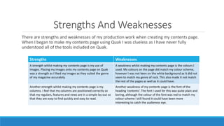
1) The document discusses the strengths and weaknesses of creating a contents page for a magazine using Quak software. A strength was using images that suited the rock music genre, while weak points included font choice and color scheme.
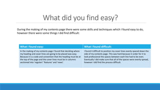
2) When making the contents page, positioning columns and headings was easy but evenly spacing cover lines down the side was difficult.
3) Comparing a preliminary contents page to the final one, the author's Quak skills improved with the final page using more tools and planning. Not planning the preliminary page resulted in rushed photos and unclear conventions.