The document summarizes what the author has learned from taking a preliminary magazine task and developing it into a full product. Some key lessons learned include:
- The importance of color choice, titles, and barcodes for professional magazine design.
- Double page spreads need varied writing styles, colors, and exciting photographs.
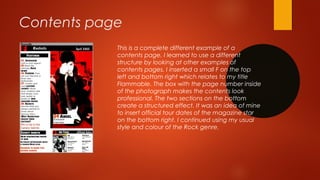
- Contents pages require a structured design with page numbers and section breaks.
- Developing a magazine fully is time-consuming and requires skills in layout, design, editing, and photography.
Looking back at your preliminary task, what do you feel you have learnt in the progression from it to the full product?
my response to the evaluation question
Looking back at your preliminary task, what do you feel you have learnt in the progression from it to the full product?
my response to the evaluation question
This my 7th evaluation presentation in relation to my media product. It will be looked at by examiners, but if you would like to leave comment, please feel free to do so.
The perfect Sundabet Slot mudah menang Promo new member Animated PDF for your conversation. Discover and Share the best GIFs on Tenor
Admin Ramah Cantik Aktif 24 Jam Nonstop siap melayani pemain member Sundabet login via apk sundabet rtp daftar slot gacor daftar
Explore the multifaceted world of Muntadher Saleh, an Iraqi polymath renowned for his expertise in visual art, writing, design, and pharmacy. This SlideShare delves into his innovative contributions across various disciplines, showcasing his unique ability to blend traditional themes with modern aesthetics. Learn about his impactful artworks, thought-provoking literary pieces, and his vision as a Neo-Pop artist dedicated to raising awareness about Iraq's cultural heritage. Discover why Muntadher Saleh is celebrated as "The Last Polymath" and how his multidisciplinary talents continue to inspire and influence.
thGAP - BAbyss in Moderno!! Transgenic Human Germline Alternatives ProjectMarc Dusseiller Dusjagr
thGAP - Transgenic Human Germline Alternatives Project, presents an evening of input lectures, discussions and a performative workshop on artistic interventions for future scenarios of human genetic and inheritable modifications.
To begin our lecturers, Marc Dusseiller aka "dusjagr" and Rodrigo Martin Iglesias, will give an overview of their transdisciplinary practices, including the history of hackteria, a global network for sharing knowledge to involve artists in hands-on and Do-It-With-Others (DIWO) working with the lifesciences, and reflections on future scenarios from the 8-bit computer games of the 80ies to current real-world endeavous of genetically modifiying the human species.
We will then follow up with discussions and hands-on experiments on working with embryos, ovums, gametes, genetic materials from code to slime, in a creative and playful workshop setup, where all paticipant can collaborate on artistic interventions into the germline of a post-human future.
2137ad Merindol Colony Interiors where refugee try to build a seemengly norm...luforfor
This are the interiors of the Merindol Colony in 2137ad after the Climate Change Collapse and the Apocalipse Wars. Merindol is a small Colony in the Italian Alps where there are around 4000 humans. The Colony values mainly around meritocracy and selection by effort.
The Legacy of Breton In A New Age by Master Terrance LindallBBaez1
Brave Destiny 2003 for the Future for Technocratic Surrealmageddon Destiny for Andre Breton Legacy in Agenda 21 Technocratic Great Reset for Prison Planet Earth Galactica! The Prophecy of the Surreal Blasphemous Desires from the Paradise Lost Governments!
2137ad - Characters that live in Merindol and are at the center of main storiesluforfor
Kurgan is a russian expatriate that is secretly in love with Sonia Contado. Henry is a british soldier that took refuge in Merindol Colony in 2137ad. He is the lover of Sonia Contado.
1. Question 7
Looking back at your preliminary task, what do you feel you have
learned from the progression of it to the full product?
Evaluation
2. Front Cover
Before After
The title is
not big
enough
and
appears
invisible
The title
is big
enough
and the
frame
puts it
in focus
and
creates
an eye
catcher
3. Front cover
The colour choice is wrong
As the main image is not in
focus and the writing is white
and therefore it is hard to
identify the writing on the
cover.
The barcode is missing
And the cover line looks better
On top of the page
I have learned
that colour
choice is the most
important factor
and a barcode
makes a
magazine
appear in a
professional way
4. Double page spread The title looks boring
As it does not have a specific colour
or form
Two columns
are usually
nicer on a
double page
spread,
however the
writing is not
perfect yet.
The white space does
not look nice
The
photograph
was the only
factor I was
happy with
from the
beginning
and didn’t
apply any
changes or
corrections.
5. Double page spread I changed the colour and writing of
The main title. I have learned that
red is always a
Great colour for titles.
The professional
photographs
Make the double page
spread look more
Interesting and exciting.
This sentence is darker
in order to provocate
The reader with
The statement.
I have learned
that a double
page spread
needs to
include
different types
and styles of
writings and
colours. A
double page
spread should
always include
as many
exciting
photographs
as possible.
7. Contents page
This was my first draft of a contents page. I personally believe that the
structure and choice of photographs is not bad, however the writing and
style is not perfect. The writing is too big and the style of it looks too
simple and unprofessional. The title contents seems to disappear behind
the black box.
The contents page looks too wild and messy.
8. Contents page
This is a complete different example of a
contents page. I learned to use a different
structure by looking at other examples of
contents pages. I inserted a small F on the top
left and bottom right which relates to my title
Flammable. The box with the page number inside
of the photograph makes the contents look
professional. The two sections on the bottom
create a structured effect. It was an idea of mine
to insert official tour dates of the magazine star
on the bottom right. I continued using my usual
style and colour of the Rock genre.
9. Summary
From the examples shown I have learned how to create a
professional looking contents page, double page spread and
front cover.
I have learned how to use different editing programmes and their
facilities.
I have learned how to take professional looking photographs
I have learned that creating a magazine is very time-consuming
and needs a big time investment.
10. Photographs
I have learned that a good
photograph needs good
lighting, an extraordinary make
up and a very good editing
program.