Design Fundamentals                                                                         de
Beaufort

        Shading,Tinting, Intensity, Tones
Assignment:
       Hue is not the only characteristic of color. Each hue can be mixed with other hues to create a
       broad range of chromatic browns, blacks, and grays, as well as lightened to produce tints, and
       darkened to produce shades . Additionally each color can be slowly de- saturated to produce a
       gray of equal value . In this way, literally millions of colors can be conceived each with a specific
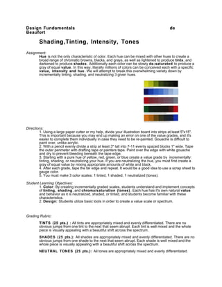
       value, intensity and hue . We will attempt to break this overwhelming variety down by
       incrementally tinting, shading, and neutralizing 3 given hues.


Directions:
        1. Using a large paper cutter or my help, divide your illustration board into strips at least 5"x15".
        This is important because you may end up making an error on one of the value grades, and it's
        easier to complete them individually in case they need to be re-painted. Gouache is difficult to
        paint over, unlike acrylic.
        2. With a pencil evenly divide a strip at least 3" tall into 7-11 evenly spaced blocks 1" wide. Tape
        the outer perimeter with drafting tape or painters tape. Paint over the edge with white gouache
        and dry to prevent bleeding beneath the tape edge.
        3. Starting with a pure hue of yellow, red, green, or blue create a value grade by incrementally:
        tinting, shading, or neutralizing your hue. If you are neutralizing the hue, you must first create a
        gray of equal value by mixing appropriate amounts of white and black.
        4. After each grade, tape the far edge and repeat. It would be a good idea to use a scrap sheet to
        gauge color.
        5. You must make 3 color scales: 1 tinted, 1 shaded, 1 neutralized (tones).

Student Learning Objectives:
        1. Color: By creating incrementally graded scales, students understand and implement concepts
        of tinting, shading, and chroma/saturation (tones) . Each hue has it's own natural value
        and behavior as it is neutralized, shaded, or tinted, and students become familiar with these
        characteristics.
        2. Design: Students utilize basic tools in order to create a value scale or spectrum.


Grading Rubric:
        TINTS (25 pts.) : All tints are appropriately mixed and evenly differentiated. There are no
        obvious jumps from one tint to the next that seem abrupt. Each tint is well mixed and the whole
        piece is visually appealing with a beautiful shift across the spectrum.
        SHADES (25 pts.): All shades are appropriately mixed and evenly differentiated. There are no
        obvious jumps from one shade to the next that seem abrupt. Each shade is well mixed and the
        whole piece is visually appealing with a beautiful shift across the spectrum.
        NEUTRAL TONES (25 pts.): All tones are appropriately mixed and evenly differentiated.
There are no obvious jumps from one tone to the next that seem abrupt. Each tone is well mixed
       and the whole piece is visually appealing with a beautiful shift across the spectrum.
       CRAFT/PROFESSIONALISM (25pts): The project is neat and precise, there are no
       blemishes, spills, errant marks, bleed -unders, or scuffs that distract the viewer. The paint is
       evenly applied and does not appear streaky or splotchy.


100 points total

Shading, tinting, intensity, tones

  • 1.
    Design Fundamentals de Beaufort Shading,Tinting, Intensity, Tones Assignment: Hue is not the only characteristic of color. Each hue can be mixed with other hues to create a broad range of chromatic browns, blacks, and grays, as well as lightened to produce tints, and darkened to produce shades . Additionally each color can be slowly de- saturated to produce a gray of equal value . In this way, literally millions of colors can be conceived each with a specific value, intensity and hue . We will attempt to break this overwhelming variety down by incrementally tinting, shading, and neutralizing 3 given hues. Directions: 1. Using a large paper cutter or my help, divide your illustration board into strips at least 5"x15". This is important because you may end up making an error on one of the value grades, and it's easier to complete them individually in case they need to be re-painted. Gouache is difficult to paint over, unlike acrylic. 2. With a pencil evenly divide a strip at least 3" tall into 7-11 evenly spaced blocks 1" wide. Tape the outer perimeter with drafting tape or painters tape. Paint over the edge with white gouache and dry to prevent bleeding beneath the tape edge. 3. Starting with a pure hue of yellow, red, green, or blue create a value grade by incrementally: tinting, shading, or neutralizing your hue. If you are neutralizing the hue, you must first create a gray of equal value by mixing appropriate amounts of white and black. 4. After each grade, tape the far edge and repeat. It would be a good idea to use a scrap sheet to gauge color. 5. You must make 3 color scales: 1 tinted, 1 shaded, 1 neutralized (tones). Student Learning Objectives: 1. Color: By creating incrementally graded scales, students understand and implement concepts of tinting, shading, and chroma/saturation (tones) . Each hue has it's own natural value and behavior as it is neutralized, shaded, or tinted, and students become familiar with these characteristics. 2. Design: Students utilize basic tools in order to create a value scale or spectrum. Grading Rubric: TINTS (25 pts.) : All tints are appropriately mixed and evenly differentiated. There are no obvious jumps from one tint to the next that seem abrupt. Each tint is well mixed and the whole piece is visually appealing with a beautiful shift across the spectrum. SHADES (25 pts.): All shades are appropriately mixed and evenly differentiated. There are no obvious jumps from one shade to the next that seem abrupt. Each shade is well mixed and the whole piece is visually appealing with a beautiful shift across the spectrum. NEUTRAL TONES (25 pts.): All tones are appropriately mixed and evenly differentiated.
  • 2.
    There are noobvious jumps from one tone to the next that seem abrupt. Each tone is well mixed and the whole piece is visually appealing with a beautiful shift across the spectrum. CRAFT/PROFESSIONALISM (25pts): The project is neat and precise, there are no blemishes, spills, errant marks, bleed -unders, or scuffs that distract the viewer. The paint is evenly applied and does not appear streaky or splotchy. 100 points total