Download to read offline
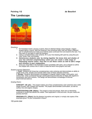


The document provides instructions for a landscape painting assignment using complementary colors. Students are directed to: 1) Draw an abstract organic shape design split between two illustration boards joined with tape. 2) Fill the shapes with paint using a complementary color scheme of pure colors, tones, tints, and shades on each side. 3) More advanced students can create neutral colors by mixing the tones, tints, and shades of the two complementary colors. 4) Outline the shapes with a black marker once painting is complete. The assignment objectives, grading rubric, and point system are also outlined.


