Download as PDF, PPTX


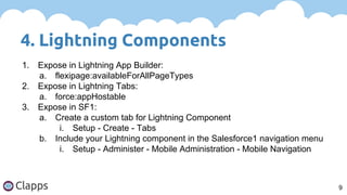
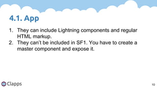


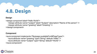
![4.8. Design
25
1. Only Boolean, Integer or String attributes can be
exposed in design files.
2. Use ‘datasource’ attribute to render a field as a picklist
in the App Builder.
a. Use String for a picklist.
b. Use String[] for a multi-picklist.
i. This never worked for me. Any ideas?](https://image.slidesharecdn.com/sdgseptiembrelightning-150918211533-lva1-app6891/85/September-SDG-Lightning-25-320.jpg)


This document provides an introduction and overview of Salesforce Lightning, including: 1. What is Lightning and its main components like Lightning Components, App Builder, and Schema Builder. 2. Instructions for getting started with Lightning including creating a developer org and enabling Lightning Components. 3. An overview of key aspects of building Lightning apps and components like App and Component structure, Controllers, Helpers, and Design files.