1st Design for Student Identity Page
•
0 likes•193 views

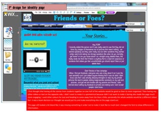
This document provides the first design ideas for an identity page. The designer initially thought stories from students should be together on one side with other media on the opposite side to keep it organized but not symmetrical and boring. Different colors were used for text and headings to complement the main blue color of the website. The page still looked bland, so the font was changed to distinguish different types of information and avoid too much text.

Recommended
More Related Content
What's hot
What's hot (19)
Viewers also liked
Viewers also liked (15)
Similar to 1st Design for Student Identity Page
Similar to 1st Design for Student Identity Page (20)
More from Sara
More from Sara (20)
Recently uploaded
Recently uploaded (20)
1st Design for Student Identity Page
- 1. 1st design for identity page I first thought that having all the stories from students together on one half of the website would be good as then its more organised. Then having any other videos or text on the opposite side, i didn’t want to make it a symmetrical because didn’t not want to make it boring also made the page much more engaging. I used other colours for text and heading to come away from the blue a little, personally the whole website would be a different colour but it was a team decision so i thought we would just try and make everything else on the page stand out. The page still looked a bit bland like it was missing something.In order not to make it look like to much text i changed the font to show difference in information.