Download to read offline


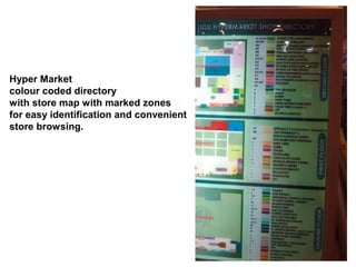
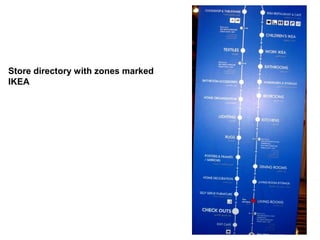
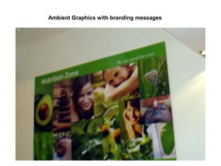
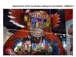
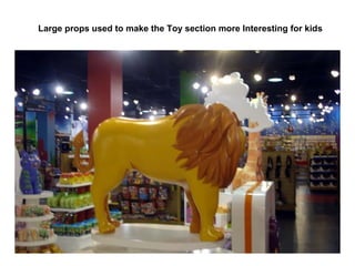
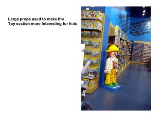
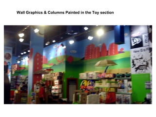
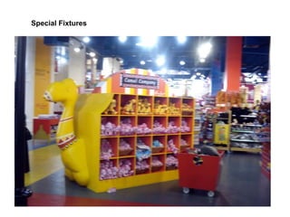
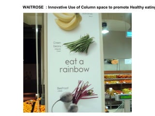
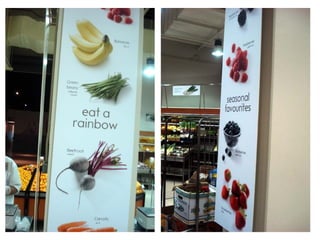
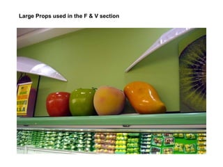
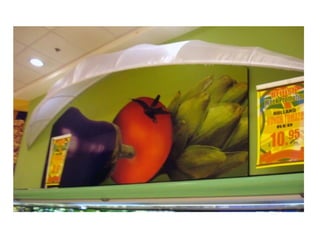
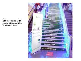

The document describes features of a hypermarket store layout that help customers navigate and browse sections more easily. It notes the store has a colour-coded directory and map with marked zones, an IKEA-branded store directory, and graphics and large props used to make the toy section more interesting for kids. It also mentions an innovative use of column space at Waitrose to promote healthy eating and a staircase with information on the next level.


