Download as PDF, PPTX


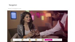
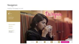
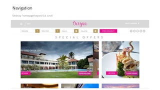


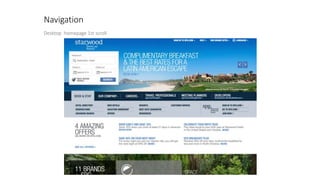
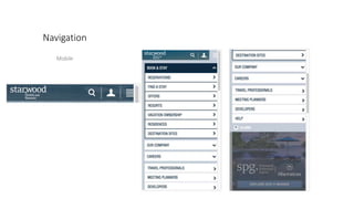
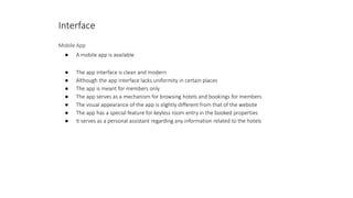

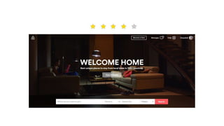
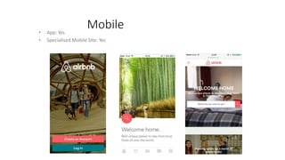
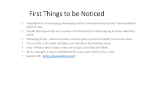


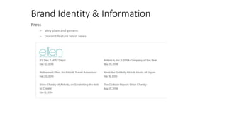
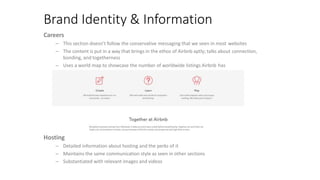
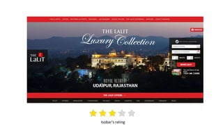

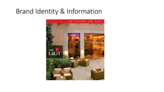
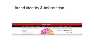

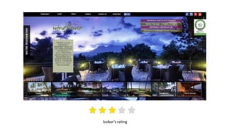
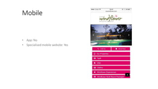
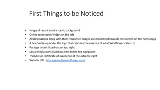
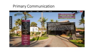
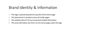
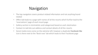

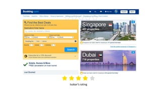
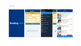
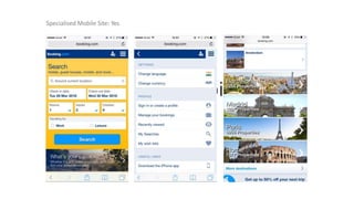
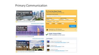
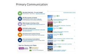
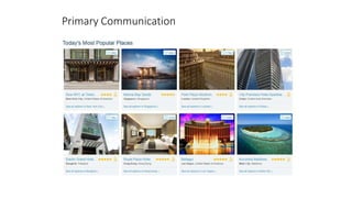

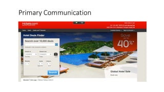
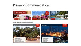
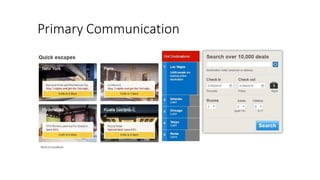
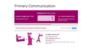

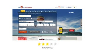
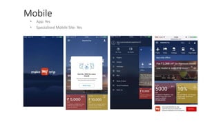
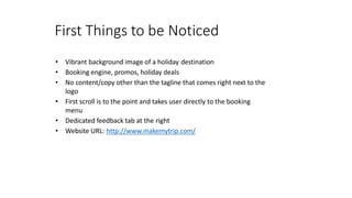
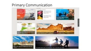
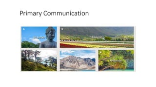
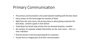
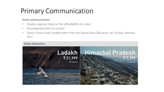
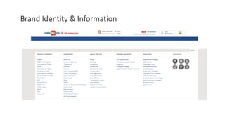


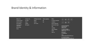

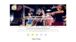
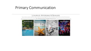
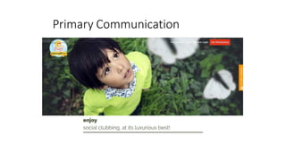
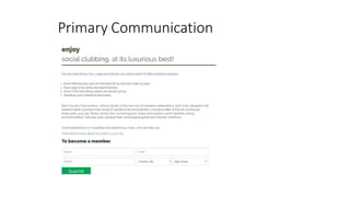


The document provides a summary and analysis of various hotel and vacation rental websites. It begins by analyzing the Turyaa Hotels website and provides details on the design, navigation, identity, and interface. It then analyzes websites for Starwood Hotels, Airbnb, The Lalit, and Windflower resorts. For each, it examines things like page load time, visual design, navigation, use of imagery, and how they communicate their brand identity and primary offerings. The document aims to understand how these companies present themselves online through a website audit.


