Download as PDF, PPTX


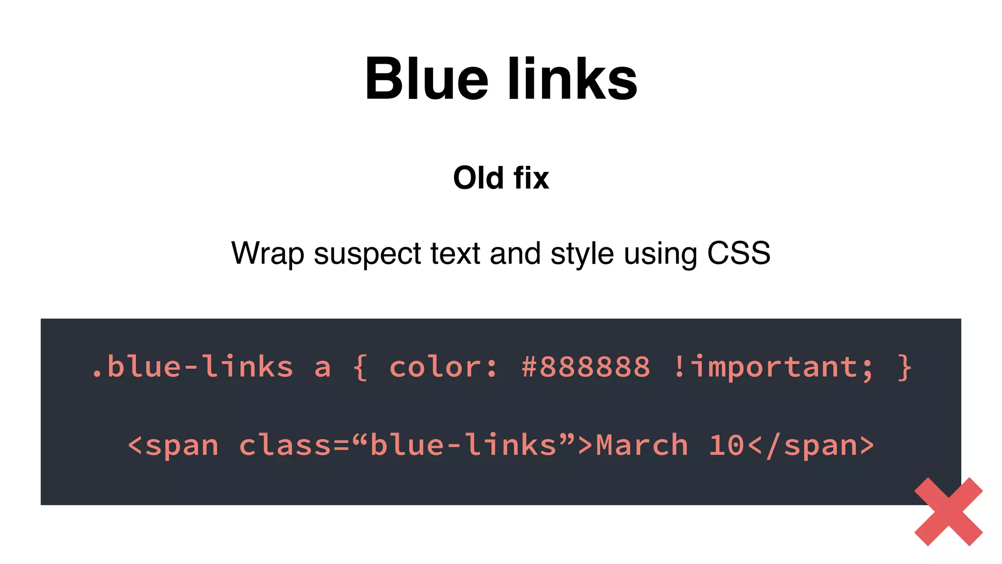
![New fix
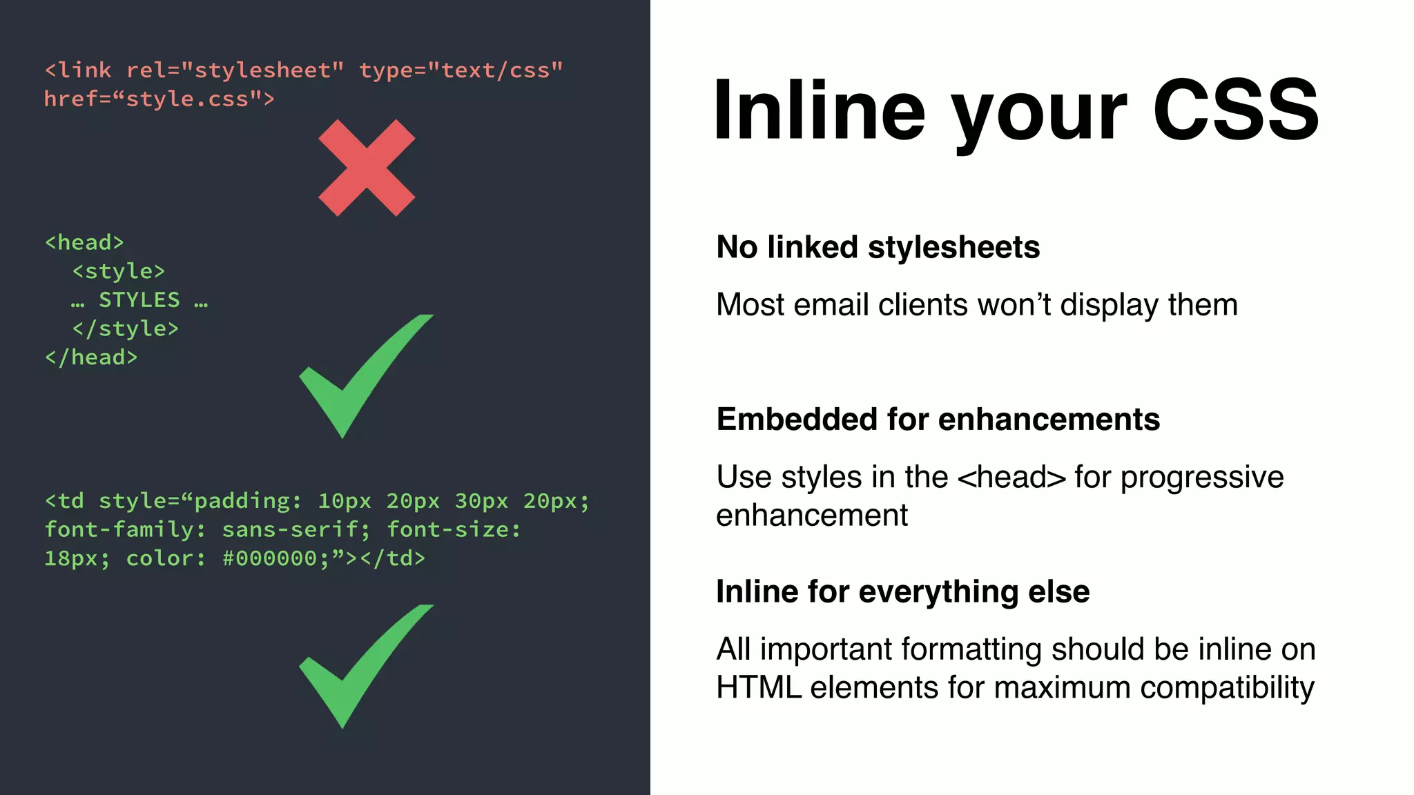
Put this in the <head> of your email:
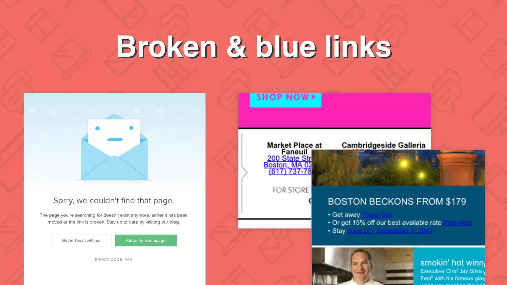
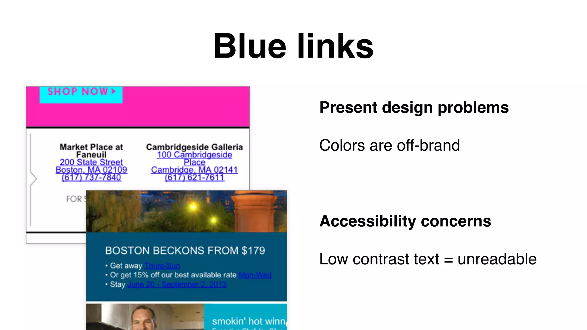
Blue links
a[x-apple-data-detectors] {
color: inherit !important;
text-decoration: none !important;
font-size: inherit !important;
font-family: inherit !important;
font-weight: inherit !important;
line-height: inherit !important;
}](https://image.slidesharecdn.com/wait-what-happened-to-my-email-160203210920/75/Wait-What-just-happened-to-my-email-41-2048.jpg)
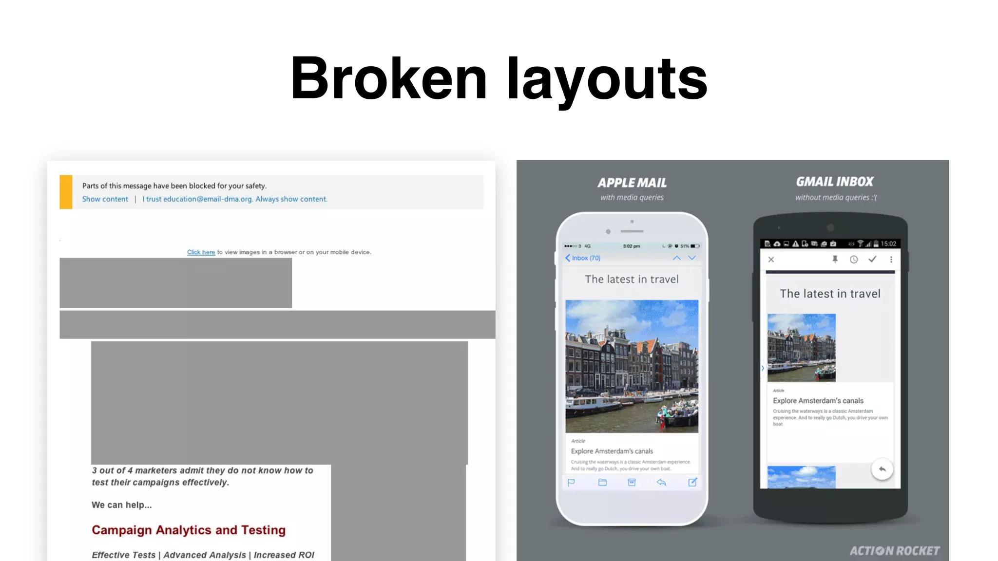

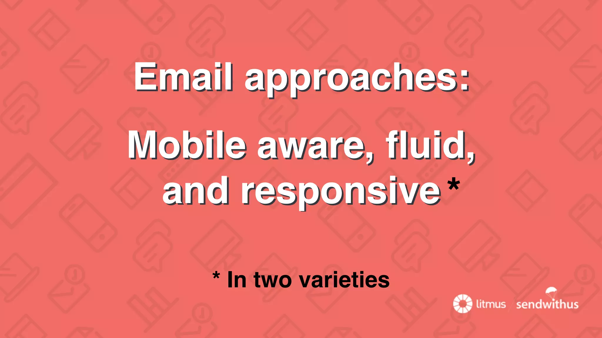

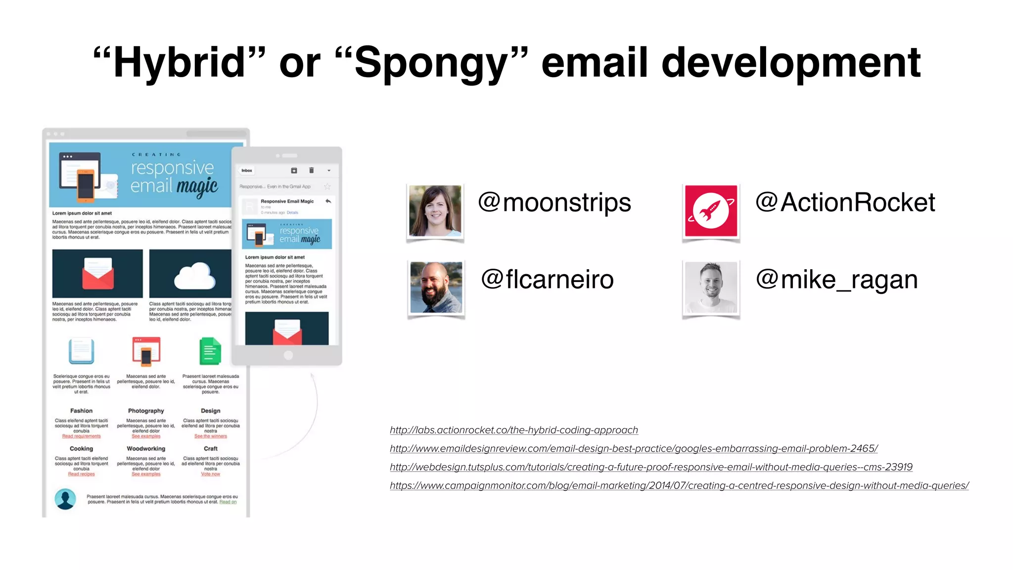
![Spongy (hybrid) approach
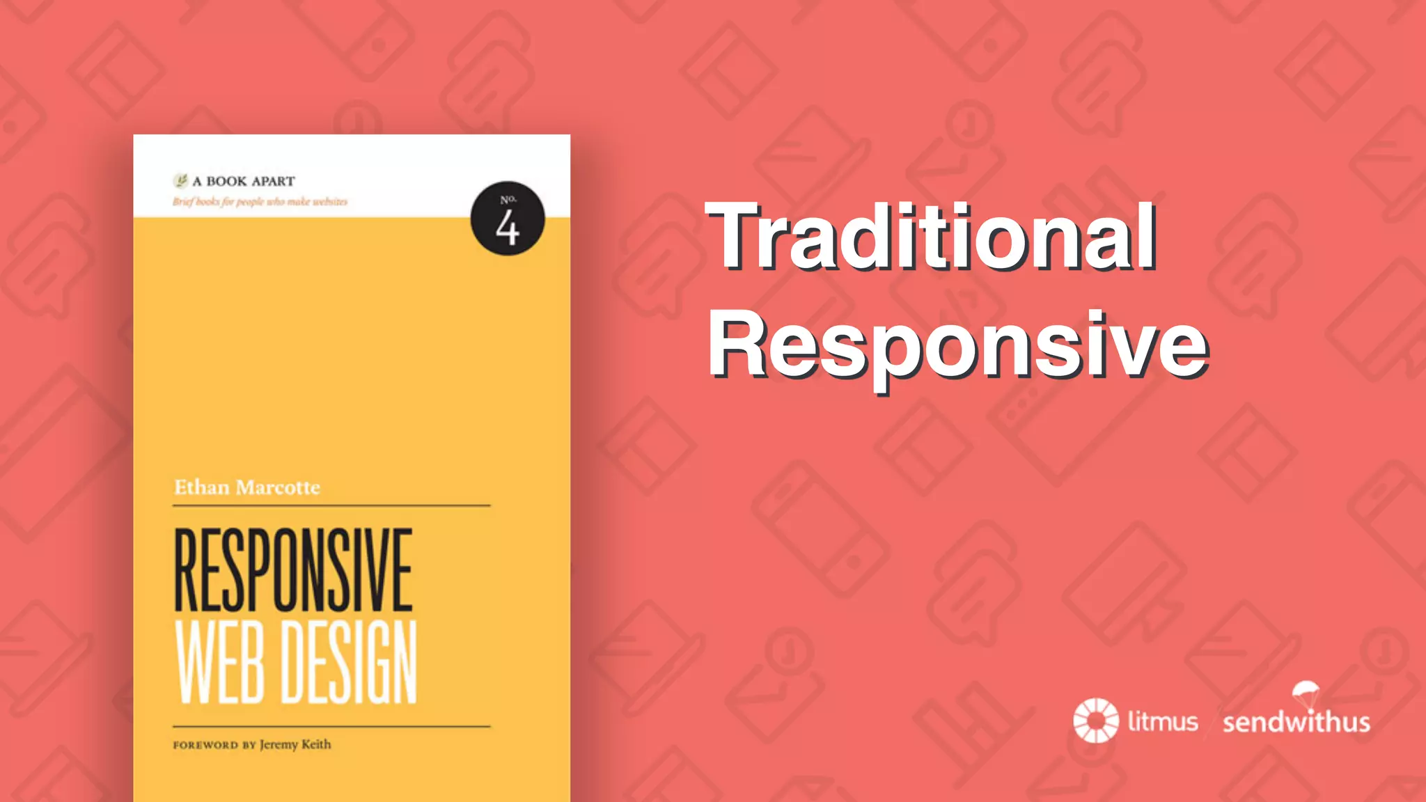
• Fluid-by-default tables
• Constrained tables using CSS
• Conditional tables for Outlook
• Content stacking w/o media queries
• Complicated w/ complex layouts
<!--[if (gte mso 9)|(IE)]>
<table align="center" border="0" cellspacing="0" cellpadding="0"
width="600">
<tr>
<td align="center" valign="top" width="600">
<![endif]-->
<table border="0" cellpadding="0" cellspacing="0" width="100%" style="max-
width: 600px;" >
<tr>
<td align="left" valign="top" style="padding: 10px 10px 20px 10px;">
… CONTENT …
</td>
</tr>
</table>
<!--[if (gte mso 9)|(IE)]>
</td>
</tr>
</table>
<![endif]-->](https://image.slidesharecdn.com/wait-what-happened-to-my-email-160203210920/75/Wait-What-just-happened-to-my-email-60-2048.jpg)


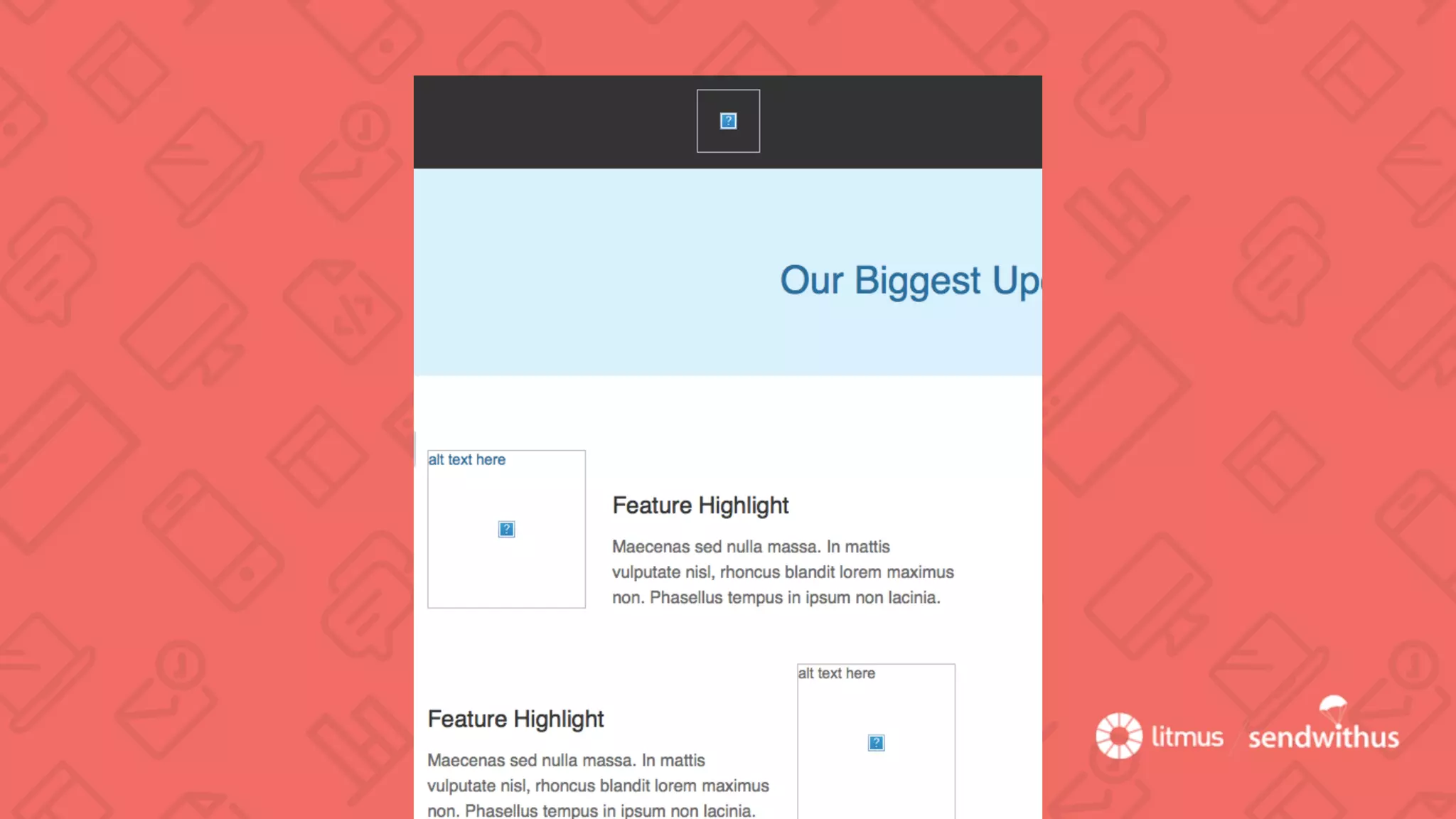
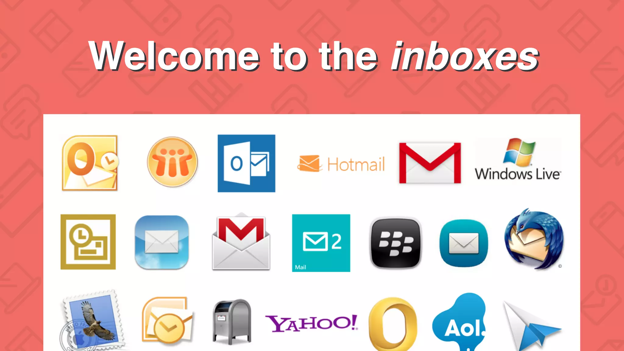
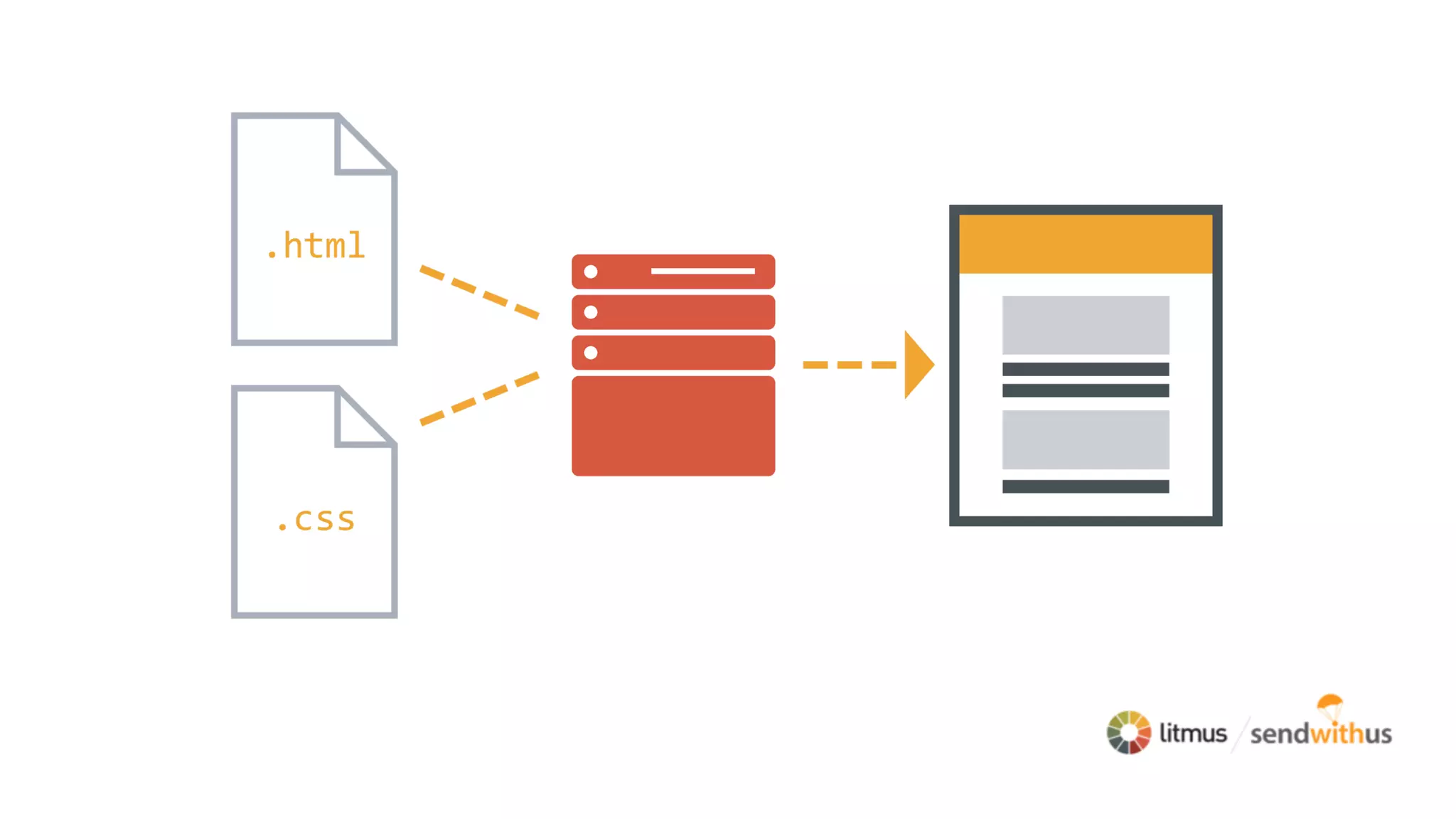
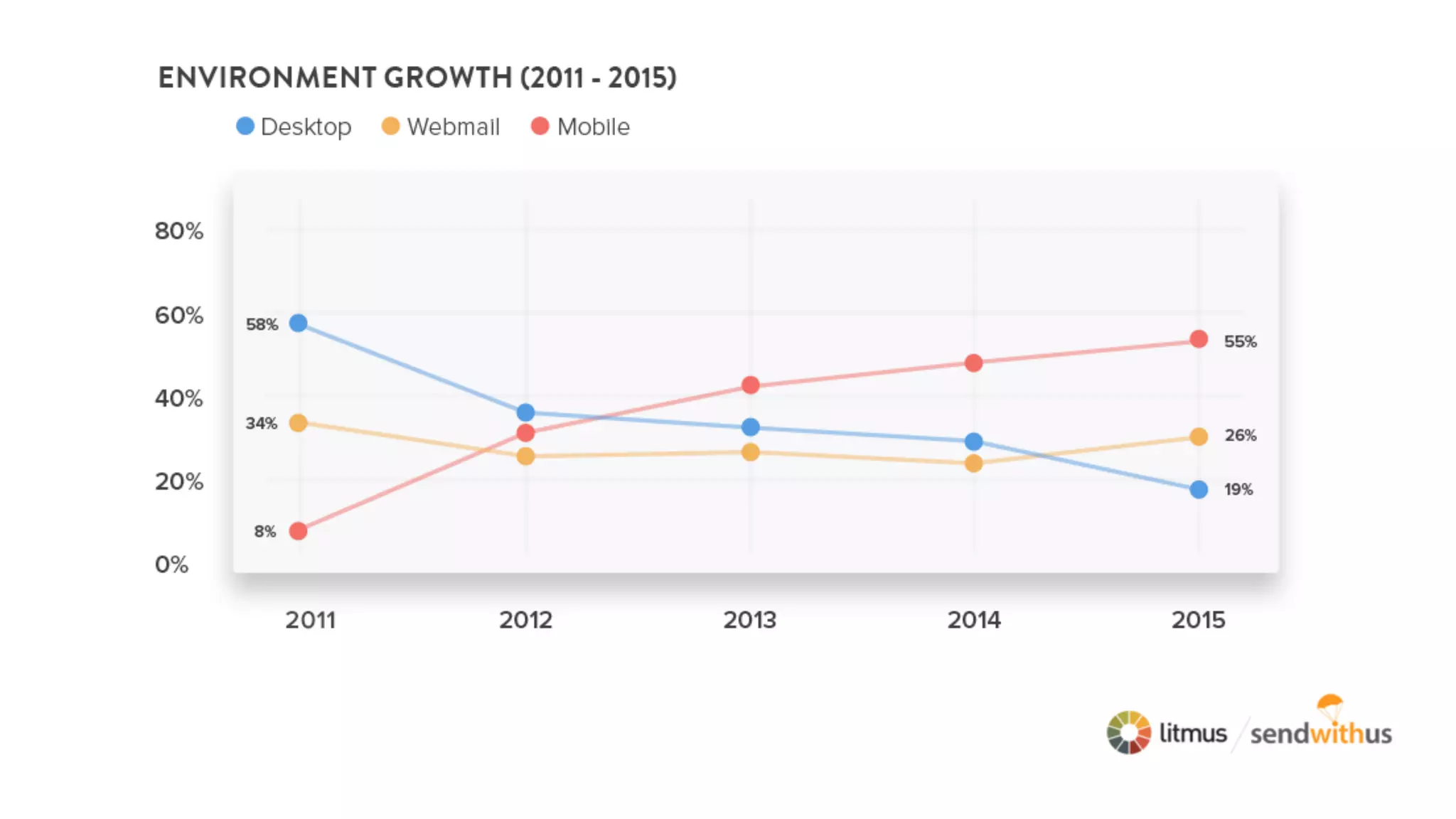
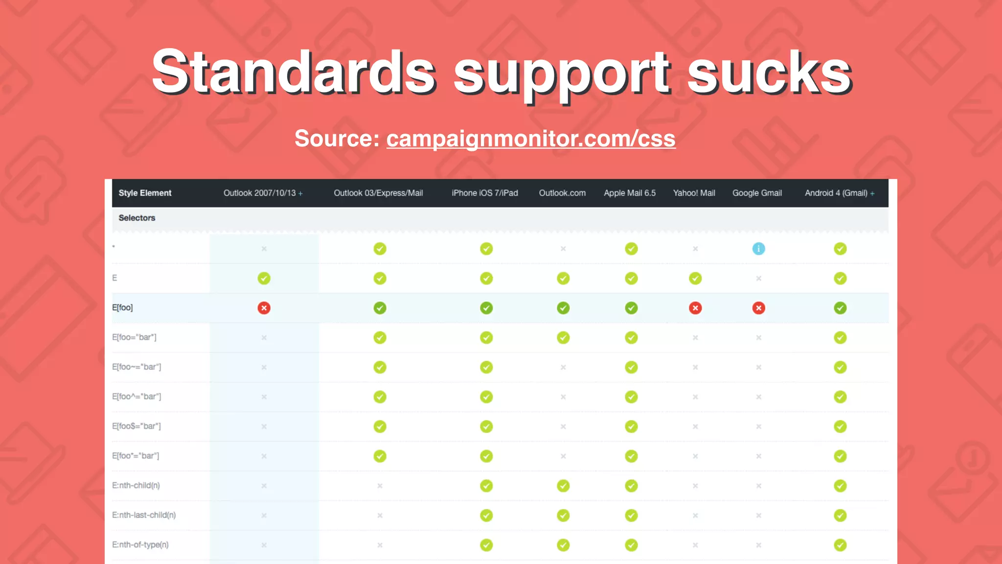
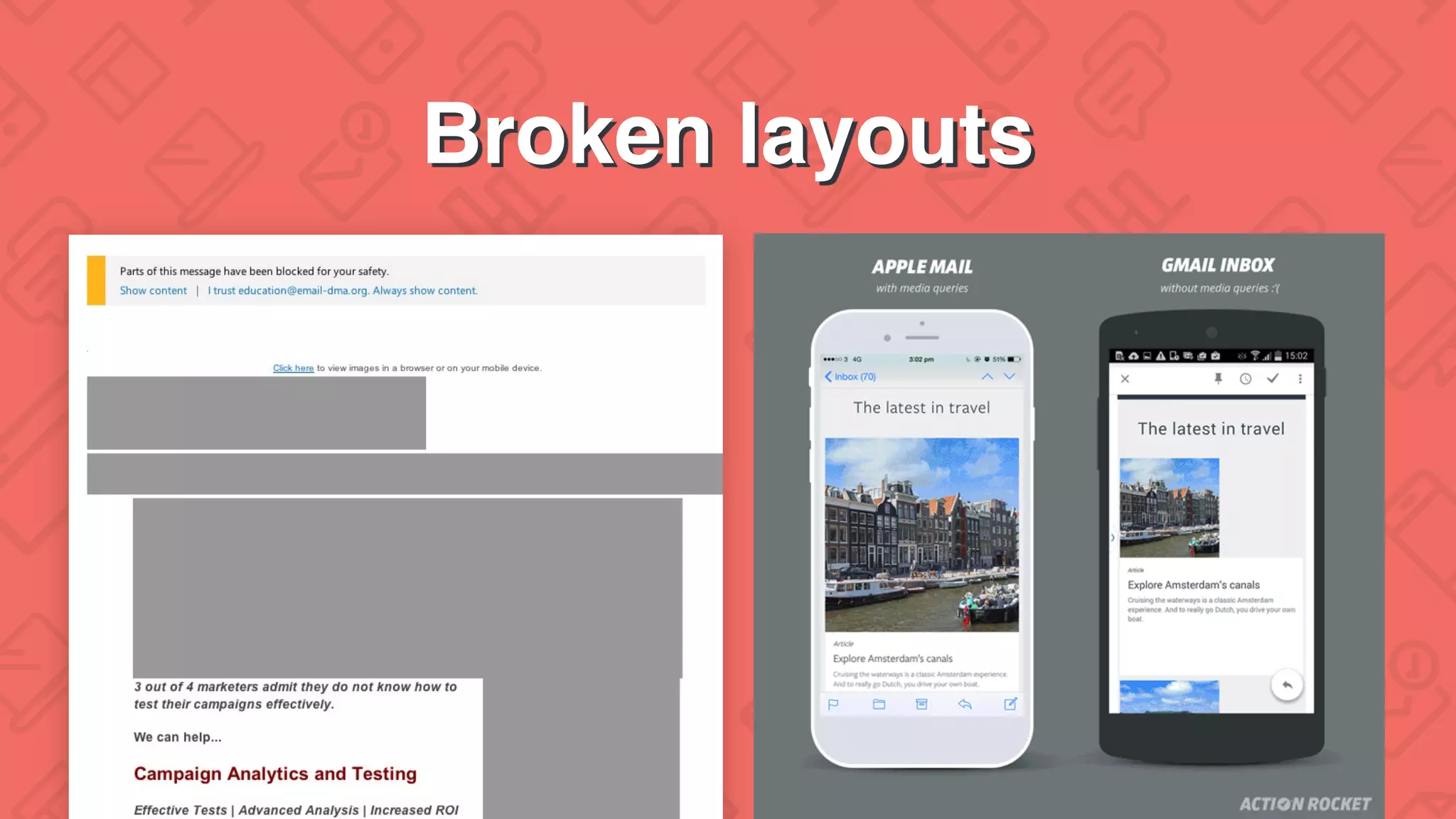
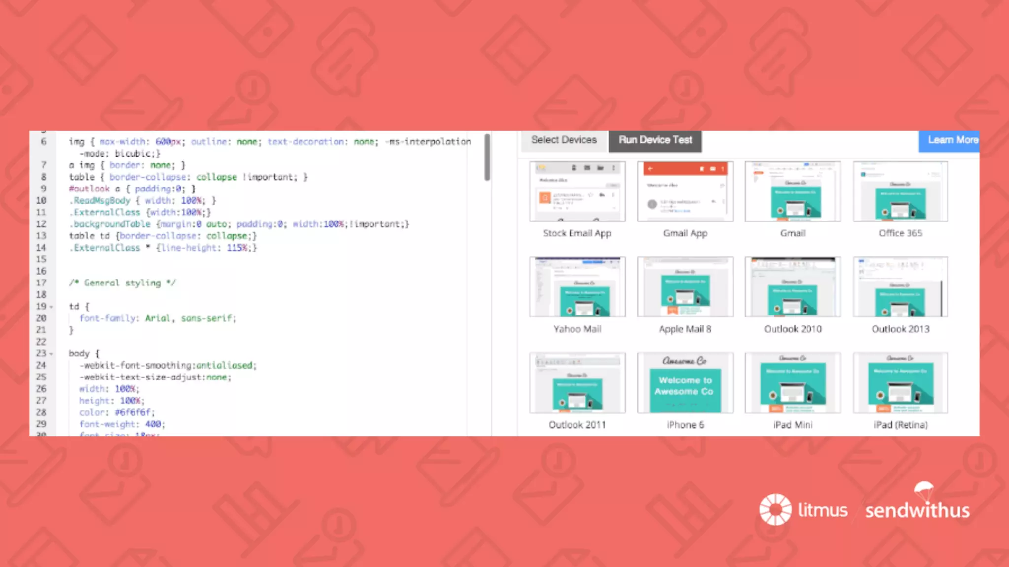
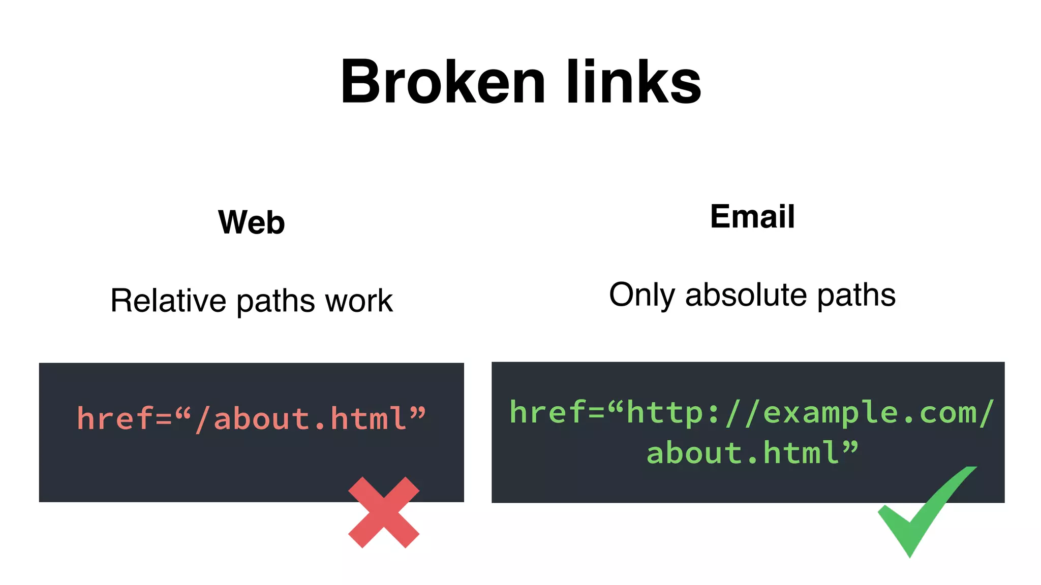
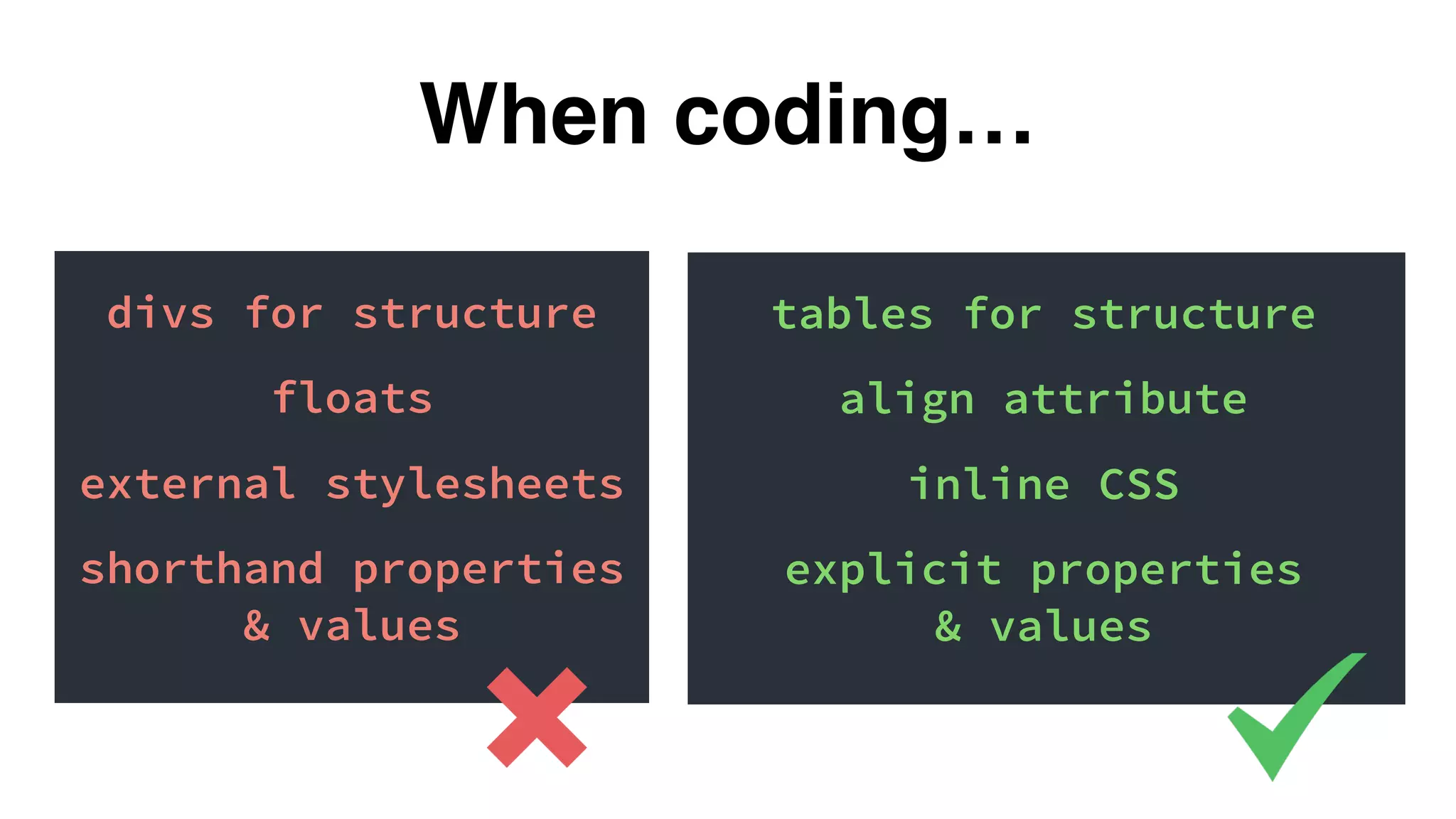
The document discusses best practices for email design, emphasizing the challenges posed by mobile devices and the importance of testing for issues like broken images and links. It advocates for using tables for structure, inlining CSS, and adopting various responsive email approaches to ensure compatibility across different clients. Additionally, it provides resources for further learning and testing tools for effective email marketing.


