Downloaded 13 times


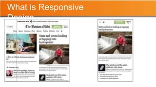


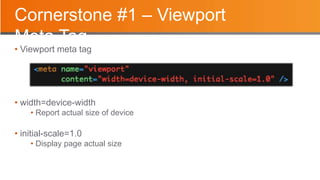


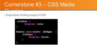

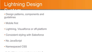
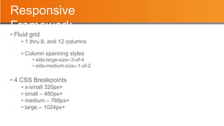

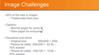


This document discusses responsive app design using the Lightning Design System. It covers: - The key aspects of responsive design including using the viewport meta tag, fluid grids that reflow content, and CSS media queries. - Why responsive design is important, including having a single code base that works across devices and providing a consistent user experience. - How the Lightning Design System supports responsive design with its mobile-first approach, predefined components and styles, and use of fluid grids and breakpoints. - Techniques for responsive images, including using srcset, sizes attributes and the picture element to serve optimized images based on device characteristics.