Download as PDF, PPTX


![<...class="[default]
[x-‐small-‐override]
[small-‐override]
[medium-‐override]
[large-‐override]">](https://image.slidesharecdn.com/slds-and-lightning-components-tdx-160616214107/85/SLDS-and-Lightning-Components-71-320.jpg)


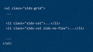
This document discusses Salesforce's Lightning Design System (SLDS) and how it was created to support the development of Lightning Experience and Lightning Components. It describes how SLDS provides standardized UI components, styles, and patterns to help ensure consistency across Salesforce applications. It also discusses how SLDS uses tools like a CSS framework, responsive grid system, and design tokens to make the system flexible and customizable. Finally, it provides examples and guidelines for using SLDS components within Lightning Components.


![Lect 1 Number systems and base conversions. [Autosaved].pptx](https://cdn.slidesharecdn.com/ss_thumbnails/lect1numbersystemsandbaseconversions-260111134109-67c2d865-thumbnail.jpg?width=640&height=640&fit=bounds)


