The Legacy of Breton In A New Age by Master Terrance LindallBBaez1
Brave Destiny 2003 for the Future for Technocratic Surrealmageddon Destiny for Andre Breton Legacy in Agenda 21 Technocratic Great Reset for Prison Planet Earth Galactica! The Prophecy of the Surreal Blasphemous Desires from the Paradise Lost Governments!
Explore the multifaceted world of Muntadher Saleh, an Iraqi polymath renowned for his expertise in visual art, writing, design, and pharmacy. This SlideShare delves into his innovative contributions across various disciplines, showcasing his unique ability to blend traditional themes with modern aesthetics. Learn about his impactful artworks, thought-provoking literary pieces, and his vision as a Neo-Pop artist dedicated to raising awareness about Iraq's cultural heritage. Discover why Muntadher Saleh is celebrated as "The Last Polymath" and how his multidisciplinary talents continue to inspire and influence.
2137ad Merindol Colony Interiors where refugee try to build a seemengly norm...luforfor
This are the interiors of the Merindol Colony in 2137ad after the Climate Change Collapse and the Apocalipse Wars. Merindol is a small Colony in the Italian Alps where there are around 4000 humans. The Colony values mainly around meritocracy and selection by effort.
thGAP - BAbyss in Moderno!! Transgenic Human Germline Alternatives ProjectMarc Dusseiller Dusjagr
thGAP - Transgenic Human Germline Alternatives Project, presents an evening of input lectures, discussions and a performative workshop on artistic interventions for future scenarios of human genetic and inheritable modifications.
To begin our lecturers, Marc Dusseiller aka "dusjagr" and Rodrigo Martin Iglesias, will give an overview of their transdisciplinary practices, including the history of hackteria, a global network for sharing knowledge to involve artists in hands-on and Do-It-With-Others (DIWO) working with the lifesciences, and reflections on future scenarios from the 8-bit computer games of the 80ies to current real-world endeavous of genetically modifiying the human species.
We will then follow up with discussions and hands-on experiments on working with embryos, ovums, gametes, genetic materials from code to slime, in a creative and playful workshop setup, where all paticipant can collaborate on artistic interventions into the germline of a post-human future.
The perfect Sundabet Slot mudah menang Promo new member Animated PDF for your conversation. Discover and Share the best GIFs on Tenor
Admin Ramah Cantik Aktif 24 Jam Nonstop siap melayani pemain member Sundabet login via apk sundabet rtp daftar slot gacor daftar
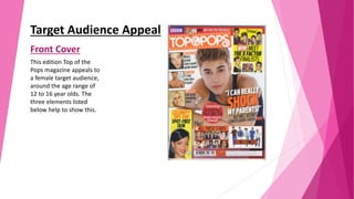
1. Target Audience Appeal
Front Cover
This edition Top of the
Pops magazine appeals to
a female target audience,
around the age range of
12 to 16 year olds. The
three elements listed
below help to show this.
2. Language: The language used appeals to a young
audience of 12 to 16 year olds. This because the
language is very short and sweet, which makes it
very eye-catching to the audience. It also appeals
to a young female target audience, a the words
‘shock’, ‘dating secrets’ and ‘scream’ are used,
which appeals to teenagers, as they will be
interested in the celebrity gossip. The language
also mentions topics that females aged 12-16 year
olds will be intrigued in. For example, ‘Boys Buffs –
11 lads who dare to bare’, ‘Fail-proof friendship
fixes’, ‘celebrity tips for spot-free skin’, ‘All these
stars’, ‘Meet X Factor finalists’ and many more. All
these are topics girl teenagers will relate to be
interested in reading, so it encourages them to
purchase the magazine, through this use of target
audience appeal. This magazine’s language also
appeal to female teenagers, as the cover line asks
the audience a question ‘But will Justin’s
confessions shock you?’ This question engages the
readers, as it’s directed straight at them and the
question is about the personal life of a very famous
male music artist, who is adored by many young
girls, the same target age as Top of the Pop’s, so it
helps to appeal to their target audience.
3. Colours: The colours used on this Top of
the Pop’s front cover appeal to the
target audience. This because very
bright, feminine and fun colours are
present. For example, purples, reds,
oranges and yellows have been used,
which connotes the cover to be very
friendly, bubbly and fun. This will
appeal to the target audience, as they
are young and will prefer to read
magazines that are colourful, as they
are more likely to catch their attention
to read. The use of feminine colours will
also appeal to them more, as they will
know the magazine will be about very
girly topics that they will have a strong
interest in.
4. Images: The images used on this font cover
appeal to Top of the Pop’s target audience.
This is because images of Justin Bieber, Aston
Merrygold, One Direction, Union J, Olly Murs
and many more male artists. All these male
artists are extremely well loved by teenage
girls and are very popular, so Top of the Pop’s
target audience, will appeal to the magazine,
by seeing all these recognisable faces and will
want to buy the magazine. There are also
famous female music artists on the cover. For
example, Rihanna, Ella Henderson, Amelia
Lilly, Rita Ora and Dionne Bromfield. All these
female music artists are icons who young girls
will aspire to, so they will be wanting to
purchase the magazine. All of the celebrity
faces on the magazine connotes Top of the
Pop’s to be a very successful and high-level
celebrity magazine. This will appeal to the
target audience because they will want to buy
the magazine as they will see it as very
popular to have.
5. Contents Page
This edition of We Heart Pop’s contents
page appeals to a female target audience,
around the age range of 12 to 16 year
olds. The three elements listed below
help to show this.
6. Language: We Heart Pop’s language is appealing for
young females around the age of 12-16. This is
because the cover uses words that are very up-lifting,
so young people will find the magazine happy,
friendly and fun to read. For example, it says ‘There’s
not a single frown’, ‘January blues be gone’ and ‘So
enjoy (we guarantee you will)’. The language also
appeals to the target audience because very short
sentences have been used, which catch young
people’s attention. The use of the short and sweet
language like ‘UK girls have dirtier mouths’ and ‘We
buy Tesco’s own brand’ intrigues readers, as they get
a small glimpse of what the article is about the want
to read on. The language is also about articles based
on Justin Bieber, The Saturdays, The Wanted and
many more. These are all music artists the appeal to
young female teenagers, so the target audience will
be interested to read on, to find out the latest gossip.
The language ‘We love this’ appeals to young females,
as the magazine is very popular and represented with
popularity, so if We Heart Pop loves the following
articles, young girls will want to love them as well, so
that they too can be popular.
7. Colours: On the We Heart Pop the colours
used are very appealing to young females, in
the ages of 12-16. This is because girly and
feminine colours are used through-out,
connoting that this magazine is of a girlish
style. The feminine colours also appeal to the
target audience, as it implies to readers that
We Heart Pop has many girly articles inside
that are suited for them to read. The colours
used are also very bright and fun, which
implies the magazine to be bubbly and an
enjoyable read for young teenagers. Many
pinks have been used, which empathises the
girly, friendly and fun tone to the front cover.
These colours are also very eye-catching for
We Heart Pop’s target audience, as they are
colours represented with younger female
generations, who will be interested in reading
a paper that appears very colourful and
intriguing, as these are the types of magazines
that will draw in their attention.
8. Images: We Heart Pop’s target audience will appeal
to the images used on this contents page. This is
because images of very successful and popular
music artists are present on the page. For
example, there are pictures of The Saturdays,
Justin Bieber, The Wanted, One Direction, Taylor
Swift, Rita Ora and many more. Having the images
of all these artists that are extremely popular and
well-known by teenagers, will appeal to We Heart
Pop’s target audience, as they are celebrities that
they like to keep up with and read gossip about.
The recognisable faces will also persuade them to
buy the magazine. The Saturday’s faces on the
magazine are all happy and smiley and Frankie
even has her tongue out. This connotes happiness
and a friendly tone to the contents page, which
will appeal to the target audience.
9. Double Page Spread
This We Heart Pop
double page spread
appeals to a female
target audience, around
the age range of 12 to 16
year olds. The three
elements listed below
help to show this.
10. Language: The language used on this double page spread
appeals to a young female audience of 12 to 16 year olds.
This because the language is very intriguing, for example ‘I
was the girl parents blamed for their kids turning out to be
wrong’ catches young females attention. This is because
Cher Lloyd is someone teenage girls aspire to, so by hearing
she is not perfect, will appeal to young teenage girls, as
they too have pressure to be ‘perfect’ in todays society, so
they will find the language used very relatable. They will
also find the headline shocking, which will appeal to them,
as they will want to know even more about the
controversial article. The language is also appealing for to
We Heart Pop's target audience because very personal
questions are being asked to Cher Lloyd and she is
responding to them all and telling the interviewer things
people never knew about her. This appeal to the target
audience, as teenagers girls are likely to be a fan of Cher
Lloyds, so they will wan to read on to keep up with the
celebrity gossip and news. The cover line ‘Forget everything
you think you know about Cher Lloyd and read this article
now!’ will yet again appeal to the chosen target audience
because young teenagers are associated with keeping up
with celebrity lives and being extremely interested in them.
So by the magazine telling readers that everything they
know about Cher Lloyd is wrong and that there is another
side to her, will definitely appeal to the target audience and
interest them to read on.
11. Colours: The colours used on We Heart Pop’s
double page spread are appealing to young
teenage girls. This is because mainly white,
black and pink has been used. The black and
white connote a sophisticated look to the
magazine and pink is a very popular, feminine,
girly colour. Therefore, the target audience will
be attracted, as the magazine will appeal to
them as a sophisticated girly read for teenagers,
that is appropriate for them and they will enjoy
the read. Parts of Cher's answers have been
highlighted yellow (which will draw more
attention to them) and Cher is wearing a blue
top. The use of the blue and yellow adds more
colours to the plain and simple black, white and
pink colour scheme and connotes the magazine
to be more friendly, fun and bubbly, appealing
to its target audience, as they are likely to have
similar personalities.
12. Images: There are only two images been
used on this double page spread, both
are of Cher Lloyd. The picture of her on
the right hand side is very fun, quirky
and bubbly, as she is in an unusual pose,
wearing original clothes and is holding a
camera. She also appears to me happy.
This will appeal to females aged 12-16
because they will view the spread as
looking up-lifting, cheerful and
enjoyable for them to read. The image
of Cher on the side, shows Cher to be a
very popular, powerful and high-level
celebrity, as she is surrounded by
screaming fans. This will appeal to the
target audience because young girls
aspire to famous woman celebrities,
who are adored by many, as they will
look up to them, therefore will want to
read all about them and their personal
lives.