SlideShare a Scribd company logo
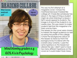
This was my first attempt at a
magazine cover. I Chose the
masthead because it looked like
college art; it looks like somebody has
drawn it, the type of thing a student
might do when listening in a lesson. I
felt it would appeal to students. The
image is of one of the students in my
media class. This was meant to make
students feel that this magazine is for
them and by them.
The teasers on the cover were chosen
to interest the target audience as well
as raising the profile of the college
I chose the background colours of
the teasers to stand out from the
background but to blend with the
overall colour scheme. I used the
same typeface on the teasers but
altered the size. I didn't want o have
too many different typefaces on the
cover as it could make it look messy
My choice of background for the
contents page was chosen as this is a
very well known location within the
college. Most students walk down this
corridor everyday. This would make
students feel part of the magazine. I
used 70% transparency so that the
image is clear but the text can still be
seen. The corridor perspective helps
draw the eye into the image.
The other 2 images were also chosen
for their familiarity to a student; the
canteen and the library. I purposely
chose an image with a student in it as
the corridor background and empty
canteen look a bit deserted.
The choice of colour for the contents
was a mistake as it does not stand out
sufficiently but putting each item at a
different angle, and jumbling them
around makes it more interesting and
less like a list.
Total Guitar Essay
This report is a textual analysis of a magazine cover for “Total Guitar” featuring the image of a leading guitarist.
The black title on a contrasting white background is stark and clear. It would be instantly recognisable to existing
customers but would also catch the eye of someone who has not read the magazine before. The alternating red
and black used for the smaller print on the cover stands out against the white background. It adds to the slightly
gothic feel of the cover which is carried through into the way Matt Bellamy is presented. The red and black motif
is also suggestive of blood and vampires, which is again echoed in the central image of Matt Bellamy.
In direct contrast to the red, white and black theme is the name “Matt Bellamy” in gold, the only place where
this colour is used. Apart from the colour and font size making the name stand out, this could connote that he is
the “golden boy” of guitar playing who would appear golden to his fans. However this colour is often used to
connote jealousy. Possibly the intention is to portray someone we should feel envious of. He is labelled “guitarist of
the decade” which also gives the impression of a superior being.
Another feature that stands out because of colour is the blue tag. It denotes a partially torn, stick on label. This
gives the impression that this amazing offer is so important that the label has been attached to prevent readers
missing this opportunity.
The image of Matt Bellamy is positioned in front of the magazine title showing that the publisher is confident that
readers will still recognise the magazine even if the title is partially obscured. The image is a medium shot, from
the waist up which is an effective way for the magazine to make Matt Bellamy appear to connect with the
audience. Surprisingly, there is no guitar in the image, drawing the audience’s attention to Matt Bellamy as man,
rather than as a musician. There is no background or depth of field, just the stark white cover, suggesting that
Matt Bellamys image is enough by itself to attract the audience’s eye. The lack of anything else to distract the
audience adds importance to the central image. The image is completely symmetrical, even down to the turned
up collar of the guitarist’s black coat. This gives a strongly dominant masculine impression to the image, while the
choice of colour for the clothing matches the overall colour scheme and gives Matt Bellamy a brooding “bad
boy” look. His masculinity is emphasised by his hands on hips posture which appears covertly hostile.
There is an interesting use of lighting in the image (chiaroscuro). Matt Bellamy is lit from above causing shadows
which define his brows and cheekbones and making his face look very pale. This reinforces the gothic vampire
look which fits well with both his clothing and the overall colour scheme of the magazine cover.
In conclusion, the magazine cover is presenting a strong confident image of the musician as an individual. He is
being portrayed as slightly dangerous and very masculine. Overall, the cover is stark and plain with very simple
but effective use of colour. This simplicity of design ensures the audience is drawn to the central image.
The colour scheme is unusual for a
music magazine; they are cool
relaxed colours, not the angry
colours of rap or rock covers. The
image is very posed, and they are
wearing clothes we associate with
previous times, giving a very
traditional feel to the image. This
would not appeal to a young
audience but is more likely to
appeal to an audience of 25+. The
image covers the title, showing that
the editor is confident that readers
will recognise the magazine without
seeing the title. The font is also
classy and likely to appeal to an
older audience. She is wearing
ballet shoes and adopting a dance
pose, giving an arty, creative feel to
the cover.
Bruce Springsteen is represented in a
mid close up which is a very natural
shot. The camera angle is slightly
higher, looking down, and he is looking
directly at the camera which is very
personal. He appears to be on our level
unlike many celebrities. The necklace
softens the “hard man” image that the
leather jacket might give. Because the
background tones with the image the
readers are more able to focus on the
advertisements. The writing is simple
but bold, making it easy to read,
definitely not a classical magazine! The
fonts used are fairly similar which avoids
making the cover look cluttered. 2012
draws the eye as it is the only blue used,
and the audience would then
automatically read the text underneath.
The top bar stands out as it is blocked in
red, again referring to the same article.
The artists names have been picked out
in colour to contrast and stand out from
the mainly white text.
This is a black and white, medium shot,
which is quite dramatic and eye
catching. This effect is increased by the
text not being placed across the image.
This gives the impression that he is
very important, as he is the only person
featured on the contents page. He is
not engaging with the audience which
will make them curious as to why. The
colour scheme is cool apart from the
minimal use of red which leaps out of
the page. This is a simple and
sophisticated look that will appeal to
people in their 20’s, particularly
females, who would be attracted to his
brooding good looks. Even the article
descriptions are of similar size giving an
almost symmetrical appearance. There
is a consistency of fonts and font size
adding to the cool sophisticated appeal.
Contents page
It is a very striking colour scheme
(yellow on red). They are contrasting
colours so it is easy to read. The
subtitles are clear bold, the overall effect
is clean and clear. Most of the pictures
have borders around them to catch the
audience eye and separate them from
each other. The medium long shot on
the left hand side stands out because of
its unique positioning and more posed
structure than the other pictures. It
appears more important to the audience
than the other images. The shape of the
image reflects the shape of the sleeve
tattoo, drawing attention to it. The
sleeve and sleeveless top make him
look hard and dangerous, a stereotype
for rock musicians. I believe this
contents page is targeting 14-20 year
olds because this is the “angry teens”
age who are likely to listen to angry
music and find these images attractive.
Article page
The yellow on black colour
scheme stands out. The
black represents darkness
and the yellow represents
light. They are opposites.
The yellow banner looks
like police tape which
gives a sense of the
forbidden. The image on
the left indicates that he is
the most important
member of the band, and
the one that the audience
is most likely to recognise.
The black and white image
of the band shows the
lead singer with his fist held up aggressively and the word “fuck” on his knuckles. This
suggests that the magazine is not aimed at a young audience. The other images
appear to be snapshots of them on tour. The white border increases this impression.
The photos link with the text and so give a taster of the article to a potential purchaser.

More Related Content

What's hot

Textual analysis
Textual analysis Textual analysis
Textual analysis
Angelika Bober
 
Double page analysis
Double page analysisDouble page analysis
Double page analysisarnellgrace
 
Textual Analysis
Textual AnalysisTextual Analysis
Textual Analysis
Angelika Bober
 
Front cover analysis (2)
Front cover analysis (2)Front cover analysis (2)
Front cover analysis (2)jgamble14
 
Contents Page Analysis
Contents Page Analysis Contents Page Analysis
Contents Page Analysis
Shauna-Mullen
 
Analysis of Kerrang
Analysis of KerrangAnalysis of Kerrang
Analysis of Kerrang
AS Media Column D
 
Magazine Cover Analysis
Magazine Cover AnalysisMagazine Cover Analysis
Magazine Cover Analysis
Anna Salman
 
Detailed analysis of front cover
Detailed analysis of front coverDetailed analysis of front cover
Detailed analysis of front cover
djames127
 
Music magazine analysis covers
Music magazine analysis coversMusic magazine analysis covers
Music magazine analysis coversbethnoble
 
Magazine research jack highfield
Magazine research jack highfield Magazine research jack highfield
Magazine research jack highfield
jrth17
 
Textual Analysis
Textual AnalysisTextual Analysis
Textual Analysis
Naomiclarkexx
 
Signs and Signifiers
Signs and SignifiersSigns and Signifiers
Signs and Signifiers
anniemyatt
 
A2exsw
A2exswA2exsw
A2exsw
Neill Ford
 
Magazine front cover analysis
Magazine front cover analysisMagazine front cover analysis
Magazine front cover analysis
megan_brockwell
 
Research course work
Research course workResearch course work
Research course workmaleneriise
 

What's hot (17)

Textual analysis
Textual analysis Textual analysis
Textual analysis
 
Textual analysis
Textual analysisTextual analysis
Textual analysis
 
Double page analysis
Double page analysisDouble page analysis
Double page analysis
 
Textual Analysis
Textual AnalysisTextual Analysis
Textual Analysis
 
Front cover analysis (2)
Front cover analysis (2)Front cover analysis (2)
Front cover analysis (2)
 
Contents Page Analysis
Contents Page Analysis Contents Page Analysis
Contents Page Analysis
 
Analysis of Kerrang
Analysis of KerrangAnalysis of Kerrang
Analysis of Kerrang
 
Magazine Cover Analysis
Magazine Cover AnalysisMagazine Cover Analysis
Magazine Cover Analysis
 
Detailed analysis of front cover
Detailed analysis of front coverDetailed analysis of front cover
Detailed analysis of front cover
 
Music magazine analysis covers
Music magazine analysis coversMusic magazine analysis covers
Music magazine analysis covers
 
Magazine research jack highfield
Magazine research jack highfield Magazine research jack highfield
Magazine research jack highfield
 
Textual Analysis
Textual AnalysisTextual Analysis
Textual Analysis
 
Signs and Signifiers
Signs and SignifiersSigns and Signifiers
Signs and Signifiers
 
A2exsw
A2exswA2exsw
A2exsw
 
Magazine front cover analysis
Magazine front cover analysisMagazine front cover analysis
Magazine front cover analysis
 
Magazine Research
Magazine ResearchMagazine Research
Magazine Research
 
Research course work
Research course workResearch course work
Research course work
 

Viewers also liked

Dating In The Age Of Facebook
Dating In The Age Of FacebookDating In The Age Of Facebook
Dating In The Age Of Facebook
shelbyjansen
 
Modernisms 2650 brit
Modernisms 2650 britModernisms 2650 brit
Modernisms 2650 britkimbec
 
Cheveres
CheveresCheveres
Cheveresalepani
 
Thomas Merton, La montaña de los siete círculos
Thomas Merton, La montaña de los siete círculosThomas Merton, La montaña de los siete círculos
Thomas Merton, La montaña de los siete círculos
Antonio Jesús Sierra Rivera
 
Presentation/Lecture 2
Presentation/Lecture 2 Presentation/Lecture 2
Presentation/Lecture 2 kimbec
 
Presentation/Lecture 3
Presentation/Lecture 3 Presentation/Lecture 3
Presentation/Lecture 3 kimbec
 
The restoration wk1
The restoration wk1The restoration wk1
The restoration wk1kimbec
 
Plantas y arboles.
Plantas y arboles.Plantas y arboles.
Plantas y arboles.smilefel
 

Viewers also liked (10)

Benjamin franklin
Benjamin franklinBenjamin franklin
Benjamin franklin
 
Dating In The Age Of Facebook
Dating In The Age Of FacebookDating In The Age Of Facebook
Dating In The Age Of Facebook
 
Modernisms 2650 brit
Modernisms 2650 britModernisms 2650 brit
Modernisms 2650 brit
 
Cheveres
CheveresCheveres
Cheveres
 
Thomas Merton, La montaña de los siete círculos
Thomas Merton, La montaña de los siete círculosThomas Merton, La montaña de los siete círculos
Thomas Merton, La montaña de los siete círculos
 
Presentation/Lecture 2
Presentation/Lecture 2 Presentation/Lecture 2
Presentation/Lecture 2
 
Presentation/Lecture 3
Presentation/Lecture 3 Presentation/Lecture 3
Presentation/Lecture 3
 
The restoration wk1
The restoration wk1The restoration wk1
The restoration wk1
 
Plantas y arboles.
Plantas y arboles.Plantas y arboles.
Plantas y arboles.
 
Cuánto cuesta un milagro
Cuánto cuesta un milagroCuánto cuesta un milagro
Cuánto cuesta un milagro
 

Similar to Research part 1

Analysing 3 magazine covers
Analysing 3 magazine coversAnalysing 3 magazine covers
Analysing 3 magazine covers
black-bird
 
Front cover analysis.
Front cover analysis.Front cover analysis.
Front cover analysis.
AmyShields00
 
Analysis of three magazines (3)
Analysis of three magazines (3)Analysis of three magazines (3)
Analysis of three magazines (3)
domingochristal
 
Magazine reserach
Magazine reserachMagazine reserach
Magazine reserachbronnie93
 
Front cover analysis essay and labelled analysis
Front cover analysis essay and labelled analysisFront cover analysis essay and labelled analysis
Front cover analysis essay and labelled analysisLizRose2012
 
FCD 2
FCD 2FCD 2
FCD 2
zoetoase
 
AS media studies magazine research and planning
AS media studies magazine research and planning AS media studies magazine research and planning
AS media studies magazine research and planning
Caitlin Meredith
 
Evaluation Question 1
Evaluation Question 1Evaluation Question 1
Evaluation Question 1
Joe Hird
 
Evaluation q1 22
Evaluation q1 22Evaluation q1 22
Evaluation q1 22
Joe Hird
 
Analysis of cover page
Analysis of cover pageAnalysis of cover page
Analysis of cover page
Klarasa098
 
Market research
Market researchMarket research
Market research
Karis Hays
 
Similar music magazine analysis
Similar music magazine analysisSimilar music magazine analysis
Similar music magazine analysis
Jessica Davies
 
Lewis Merle magazine analysis
Lewis Merle  magazine analysisLewis Merle  magazine analysis
Lewis Merle magazine analysisAnne Horne
 
Magazine Analysis
Magazine AnalysisMagazine Analysis
Magazine Analysis
Caitlin Meredith
 

Similar to Research part 1 (20)

Analysing 3 magazine covers
Analysing 3 magazine coversAnalysing 3 magazine covers
Analysing 3 magazine covers
 
Front cover analysis.
Front cover analysis.Front cover analysis.
Front cover analysis.
 
Analysis of three magazines (3)
Analysis of three magazines (3)Analysis of three magazines (3)
Analysis of three magazines (3)
 
Music mag analysed
Music mag analysedMusic mag analysed
Music mag analysed
 
Music mag analysed
Music mag analysedMusic mag analysed
Music mag analysed
 
Magazine reserach
Magazine reserachMagazine reserach
Magazine reserach
 
Front cover analysis essay and labelled analysis
Front cover analysis essay and labelled analysisFront cover analysis essay and labelled analysis
Front cover analysis essay and labelled analysis
 
Med
MedMed
Med
 
Mt t1-a
Mt t1-aMt t1-a
Mt t1-a
 
FCD 2
FCD 2FCD 2
FCD 2
 
AS media studies magazine research and planning
AS media studies magazine research and planning AS media studies magazine research and planning
AS media studies magazine research and planning
 
Evaluation Question 1
Evaluation Question 1Evaluation Question 1
Evaluation Question 1
 
Evaluation q1 22
Evaluation q1 22Evaluation q1 22
Evaluation q1 22
 
.
..
.
 
Analysis of cover page
Analysis of cover pageAnalysis of cover page
Analysis of cover page
 
Magazine Cover Analysis
Magazine Cover AnalysisMagazine Cover Analysis
Magazine Cover Analysis
 
Market research
Market researchMarket research
Market research
 
Similar music magazine analysis
Similar music magazine analysisSimilar music magazine analysis
Similar music magazine analysis
 
Lewis Merle magazine analysis
Lewis Merle  magazine analysisLewis Merle  magazine analysis
Lewis Merle magazine analysis
 
Magazine Analysis
Magazine AnalysisMagazine Analysis
Magazine Analysis
 

More from jennypennypudding

Photos For Demo Clip
Photos For Demo ClipPhotos For Demo Clip
Photos For Demo Clip
jennypennypudding
 

More from jennypennypudding (6)

Photos For Demo Clip
Photos For Demo ClipPhotos For Demo Clip
Photos For Demo Clip
 
Evaluation part 2
Evaluation part 2Evaluation part 2
Evaluation part 2
 
Evaluation part 1
Evaluation part 1Evaluation part 1
Evaluation part 1
 
Feedback
FeedbackFeedback
Feedback
 
Construction part 2
Construction part 2Construction part 2
Construction part 2
 
Construction part 1
Construction part 1Construction part 1
Construction part 1
 

Recently uploaded

Business Valuation Principles for Entrepreneurs
Business Valuation Principles for EntrepreneursBusiness Valuation Principles for Entrepreneurs
Business Valuation Principles for Entrepreneurs
Ben Wann
 
The Influence of Marketing Strategy and Market Competition on Business Perfor...
The Influence of Marketing Strategy and Market Competition on Business Perfor...The Influence of Marketing Strategy and Market Competition on Business Perfor...
The Influence of Marketing Strategy and Market Competition on Business Perfor...
Adam Smith
 
Evgen Osmak: Methods of key project parameters estimation: from the shaman-in...
Evgen Osmak: Methods of key project parameters estimation: from the shaman-in...Evgen Osmak: Methods of key project parameters estimation: from the shaman-in...
Evgen Osmak: Methods of key project parameters estimation: from the shaman-in...
Lviv Startup Club
 
FINAL PRESENTATION.pptx12143241324134134
FINAL PRESENTATION.pptx12143241324134134FINAL PRESENTATION.pptx12143241324134134
FINAL PRESENTATION.pptx12143241324134134
LR1709MUSIC
 
ikea_woodgreen_petscharity_cat-alogue_digital.pdf
ikea_woodgreen_petscharity_cat-alogue_digital.pdfikea_woodgreen_petscharity_cat-alogue_digital.pdf
ikea_woodgreen_petscharity_cat-alogue_digital.pdf
agatadrynko
 
LA HUG - Video Testimonials with Chynna Morgan - June 2024
LA HUG - Video Testimonials with Chynna Morgan - June 2024LA HUG - Video Testimonials with Chynna Morgan - June 2024
LA HUG - Video Testimonials with Chynna Morgan - June 2024
Lital Barkan
 
20240425_ TJ Communications Credentials_compressed.pdf
20240425_ TJ Communications Credentials_compressed.pdf20240425_ TJ Communications Credentials_compressed.pdf
20240425_ TJ Communications Credentials_compressed.pdf
tjcomstrang
 
CADAVER AS OUR FIRST TEACHER anatomt in your.pptx
CADAVER AS OUR FIRST TEACHER anatomt in your.pptxCADAVER AS OUR FIRST TEACHER anatomt in your.pptx
CADAVER AS OUR FIRST TEACHER anatomt in your.pptx
fakeloginn69
 
Cree_Rey_BrandIdentityKit.PDF_PersonalBd
Cree_Rey_BrandIdentityKit.PDF_PersonalBdCree_Rey_BrandIdentityKit.PDF_PersonalBd
Cree_Rey_BrandIdentityKit.PDF_PersonalBd
creerey
 
3.0 Project 2_ Developing My Brand Identity Kit.pptx
3.0 Project 2_ Developing My Brand Identity Kit.pptx3.0 Project 2_ Developing My Brand Identity Kit.pptx
3.0 Project 2_ Developing My Brand Identity Kit.pptx
tanyjahb
 
Exploring Patterns of Connection with Social Dreaming
Exploring Patterns of Connection with Social DreamingExploring Patterns of Connection with Social Dreaming
Exploring Patterns of Connection with Social Dreaming
Nicola Wreford-Howard
 
一比一原版加拿大渥太华大学毕业证(uottawa毕业证书)如何办理
一比一原版加拿大渥太华大学毕业证(uottawa毕业证书)如何办理一比一原版加拿大渥太华大学毕业证(uottawa毕业证书)如何办理
一比一原版加拿大渥太华大学毕业证(uottawa毕业证书)如何办理
taqyed
 
The key differences between the MDR and IVDR in the EU
The key differences between the MDR and IVDR in the EUThe key differences between the MDR and IVDR in the EU
The key differences between the MDR and IVDR in the EU
Allensmith572606
 
Introduction to Amazon company 111111111111
Introduction to Amazon company 111111111111Introduction to Amazon company 111111111111
Introduction to Amazon company 111111111111
zoyaansari11365
 
RMD24 | Retail media: hoe zet je dit in als je geen AH of Unilever bent? Heid...
RMD24 | Retail media: hoe zet je dit in als je geen AH of Unilever bent? Heid...RMD24 | Retail media: hoe zet je dit in als je geen AH of Unilever bent? Heid...
RMD24 | Retail media: hoe zet je dit in als je geen AH of Unilever bent? Heid...
BBPMedia1
 
Call 7735293663 Satta Matka Dpboss Matka Guessing Satta batta Matka 420 Satta...
Call 7735293663 Satta Matka Dpboss Matka Guessing Satta batta Matka 420 Satta...Call 7735293663 Satta Matka Dpboss Matka Guessing Satta batta Matka 420 Satta...
Call 7735293663 Satta Matka Dpboss Matka Guessing Satta batta Matka 420 Satta...
bosssp10
 
Brand Analysis for an artist named Struan
Brand Analysis for an artist named StruanBrand Analysis for an artist named Struan
Brand Analysis for an artist named Struan
sarahvanessa51503
 
Enterprise Excellence is Inclusive Excellence.pdf
Enterprise Excellence is Inclusive Excellence.pdfEnterprise Excellence is Inclusive Excellence.pdf
Enterprise Excellence is Inclusive Excellence.pdf
KaiNexus
 
amptalk_RecruitingDeck_english_2024.06.05
amptalk_RecruitingDeck_english_2024.06.05amptalk_RecruitingDeck_english_2024.06.05
amptalk_RecruitingDeck_english_2024.06.05
marketing317746
 
Creative Web Design Company in Singapore
Creative Web Design Company in SingaporeCreative Web Design Company in Singapore
Creative Web Design Company in Singapore
techboxsqauremedia
 

Recently uploaded (20)

Business Valuation Principles for Entrepreneurs
Business Valuation Principles for EntrepreneursBusiness Valuation Principles for Entrepreneurs
Business Valuation Principles for Entrepreneurs
 
The Influence of Marketing Strategy and Market Competition on Business Perfor...
The Influence of Marketing Strategy and Market Competition on Business Perfor...The Influence of Marketing Strategy and Market Competition on Business Perfor...
The Influence of Marketing Strategy and Market Competition on Business Perfor...
 
Evgen Osmak: Methods of key project parameters estimation: from the shaman-in...
Evgen Osmak: Methods of key project parameters estimation: from the shaman-in...Evgen Osmak: Methods of key project parameters estimation: from the shaman-in...
Evgen Osmak: Methods of key project parameters estimation: from the shaman-in...
 
FINAL PRESENTATION.pptx12143241324134134
FINAL PRESENTATION.pptx12143241324134134FINAL PRESENTATION.pptx12143241324134134
FINAL PRESENTATION.pptx12143241324134134
 
ikea_woodgreen_petscharity_cat-alogue_digital.pdf
ikea_woodgreen_petscharity_cat-alogue_digital.pdfikea_woodgreen_petscharity_cat-alogue_digital.pdf
ikea_woodgreen_petscharity_cat-alogue_digital.pdf
 
LA HUG - Video Testimonials with Chynna Morgan - June 2024
LA HUG - Video Testimonials with Chynna Morgan - June 2024LA HUG - Video Testimonials with Chynna Morgan - June 2024
LA HUG - Video Testimonials with Chynna Morgan - June 2024
 
20240425_ TJ Communications Credentials_compressed.pdf
20240425_ TJ Communications Credentials_compressed.pdf20240425_ TJ Communications Credentials_compressed.pdf
20240425_ TJ Communications Credentials_compressed.pdf
 
CADAVER AS OUR FIRST TEACHER anatomt in your.pptx
CADAVER AS OUR FIRST TEACHER anatomt in your.pptxCADAVER AS OUR FIRST TEACHER anatomt in your.pptx
CADAVER AS OUR FIRST TEACHER anatomt in your.pptx
 
Cree_Rey_BrandIdentityKit.PDF_PersonalBd
Cree_Rey_BrandIdentityKit.PDF_PersonalBdCree_Rey_BrandIdentityKit.PDF_PersonalBd
Cree_Rey_BrandIdentityKit.PDF_PersonalBd
 
3.0 Project 2_ Developing My Brand Identity Kit.pptx
3.0 Project 2_ Developing My Brand Identity Kit.pptx3.0 Project 2_ Developing My Brand Identity Kit.pptx
3.0 Project 2_ Developing My Brand Identity Kit.pptx
 
Exploring Patterns of Connection with Social Dreaming
Exploring Patterns of Connection with Social DreamingExploring Patterns of Connection with Social Dreaming
Exploring Patterns of Connection with Social Dreaming
 
一比一原版加拿大渥太华大学毕业证(uottawa毕业证书)如何办理
一比一原版加拿大渥太华大学毕业证(uottawa毕业证书)如何办理一比一原版加拿大渥太华大学毕业证(uottawa毕业证书)如何办理
一比一原版加拿大渥太华大学毕业证(uottawa毕业证书)如何办理
 
The key differences between the MDR and IVDR in the EU
The key differences between the MDR and IVDR in the EUThe key differences between the MDR and IVDR in the EU
The key differences between the MDR and IVDR in the EU
 
Introduction to Amazon company 111111111111
Introduction to Amazon company 111111111111Introduction to Amazon company 111111111111
Introduction to Amazon company 111111111111
 
RMD24 | Retail media: hoe zet je dit in als je geen AH of Unilever bent? Heid...
RMD24 | Retail media: hoe zet je dit in als je geen AH of Unilever bent? Heid...RMD24 | Retail media: hoe zet je dit in als je geen AH of Unilever bent? Heid...
RMD24 | Retail media: hoe zet je dit in als je geen AH of Unilever bent? Heid...
 
Call 7735293663 Satta Matka Dpboss Matka Guessing Satta batta Matka 420 Satta...
Call 7735293663 Satta Matka Dpboss Matka Guessing Satta batta Matka 420 Satta...Call 7735293663 Satta Matka Dpboss Matka Guessing Satta batta Matka 420 Satta...
Call 7735293663 Satta Matka Dpboss Matka Guessing Satta batta Matka 420 Satta...
 
Brand Analysis for an artist named Struan
Brand Analysis for an artist named StruanBrand Analysis for an artist named Struan
Brand Analysis for an artist named Struan
 
Enterprise Excellence is Inclusive Excellence.pdf
Enterprise Excellence is Inclusive Excellence.pdfEnterprise Excellence is Inclusive Excellence.pdf
Enterprise Excellence is Inclusive Excellence.pdf
 
amptalk_RecruitingDeck_english_2024.06.05
amptalk_RecruitingDeck_english_2024.06.05amptalk_RecruitingDeck_english_2024.06.05
amptalk_RecruitingDeck_english_2024.06.05
 
Creative Web Design Company in Singapore
Creative Web Design Company in SingaporeCreative Web Design Company in Singapore
Creative Web Design Company in Singapore
 

Research part 1

  • 1. This was my first attempt at a magazine cover. I Chose the masthead because it looked like college art; it looks like somebody has drawn it, the type of thing a student might do when listening in a lesson. I felt it would appeal to students. The image is of one of the students in my media class. This was meant to make students feel that this magazine is for them and by them. The teasers on the cover were chosen to interest the target audience as well as raising the profile of the college I chose the background colours of the teasers to stand out from the background but to blend with the overall colour scheme. I used the same typeface on the teasers but altered the size. I didn't want o have too many different typefaces on the cover as it could make it look messy
  • 2. My choice of background for the contents page was chosen as this is a very well known location within the college. Most students walk down this corridor everyday. This would make students feel part of the magazine. I used 70% transparency so that the image is clear but the text can still be seen. The corridor perspective helps draw the eye into the image. The other 2 images were also chosen for their familiarity to a student; the canteen and the library. I purposely chose an image with a student in it as the corridor background and empty canteen look a bit deserted. The choice of colour for the contents was a mistake as it does not stand out sufficiently but putting each item at a different angle, and jumbling them around makes it more interesting and less like a list.
  • 3.
  • 4. Total Guitar Essay This report is a textual analysis of a magazine cover for “Total Guitar” featuring the image of a leading guitarist. The black title on a contrasting white background is stark and clear. It would be instantly recognisable to existing customers but would also catch the eye of someone who has not read the magazine before. The alternating red and black used for the smaller print on the cover stands out against the white background. It adds to the slightly gothic feel of the cover which is carried through into the way Matt Bellamy is presented. The red and black motif is also suggestive of blood and vampires, which is again echoed in the central image of Matt Bellamy. In direct contrast to the red, white and black theme is the name “Matt Bellamy” in gold, the only place where this colour is used. Apart from the colour and font size making the name stand out, this could connote that he is the “golden boy” of guitar playing who would appear golden to his fans. However this colour is often used to connote jealousy. Possibly the intention is to portray someone we should feel envious of. He is labelled “guitarist of the decade” which also gives the impression of a superior being. Another feature that stands out because of colour is the blue tag. It denotes a partially torn, stick on label. This gives the impression that this amazing offer is so important that the label has been attached to prevent readers missing this opportunity. The image of Matt Bellamy is positioned in front of the magazine title showing that the publisher is confident that readers will still recognise the magazine even if the title is partially obscured. The image is a medium shot, from the waist up which is an effective way for the magazine to make Matt Bellamy appear to connect with the audience. Surprisingly, there is no guitar in the image, drawing the audience’s attention to Matt Bellamy as man, rather than as a musician. There is no background or depth of field, just the stark white cover, suggesting that Matt Bellamys image is enough by itself to attract the audience’s eye. The lack of anything else to distract the audience adds importance to the central image. The image is completely symmetrical, even down to the turned up collar of the guitarist’s black coat. This gives a strongly dominant masculine impression to the image, while the choice of colour for the clothing matches the overall colour scheme and gives Matt Bellamy a brooding “bad boy” look. His masculinity is emphasised by his hands on hips posture which appears covertly hostile. There is an interesting use of lighting in the image (chiaroscuro). Matt Bellamy is lit from above causing shadows which define his brows and cheekbones and making his face look very pale. This reinforces the gothic vampire look which fits well with both his clothing and the overall colour scheme of the magazine cover. In conclusion, the magazine cover is presenting a strong confident image of the musician as an individual. He is being portrayed as slightly dangerous and very masculine. Overall, the cover is stark and plain with very simple but effective use of colour. This simplicity of design ensures the audience is drawn to the central image.
  • 5. The colour scheme is unusual for a music magazine; they are cool relaxed colours, not the angry colours of rap or rock covers. The image is very posed, and they are wearing clothes we associate with previous times, giving a very traditional feel to the image. This would not appeal to a young audience but is more likely to appeal to an audience of 25+. The image covers the title, showing that the editor is confident that readers will recognise the magazine without seeing the title. The font is also classy and likely to appeal to an older audience. She is wearing ballet shoes and adopting a dance pose, giving an arty, creative feel to the cover.
  • 6. Bruce Springsteen is represented in a mid close up which is a very natural shot. The camera angle is slightly higher, looking down, and he is looking directly at the camera which is very personal. He appears to be on our level unlike many celebrities. The necklace softens the “hard man” image that the leather jacket might give. Because the background tones with the image the readers are more able to focus on the advertisements. The writing is simple but bold, making it easy to read, definitely not a classical magazine! The fonts used are fairly similar which avoids making the cover look cluttered. 2012 draws the eye as it is the only blue used, and the audience would then automatically read the text underneath. The top bar stands out as it is blocked in red, again referring to the same article. The artists names have been picked out in colour to contrast and stand out from the mainly white text.
  • 7. This is a black and white, medium shot, which is quite dramatic and eye catching. This effect is increased by the text not being placed across the image. This gives the impression that he is very important, as he is the only person featured on the contents page. He is not engaging with the audience which will make them curious as to why. The colour scheme is cool apart from the minimal use of red which leaps out of the page. This is a simple and sophisticated look that will appeal to people in their 20’s, particularly females, who would be attracted to his brooding good looks. Even the article descriptions are of similar size giving an almost symmetrical appearance. There is a consistency of fonts and font size adding to the cool sophisticated appeal.
  • 8. Contents page It is a very striking colour scheme (yellow on red). They are contrasting colours so it is easy to read. The subtitles are clear bold, the overall effect is clean and clear. Most of the pictures have borders around them to catch the audience eye and separate them from each other. The medium long shot on the left hand side stands out because of its unique positioning and more posed structure than the other pictures. It appears more important to the audience than the other images. The shape of the image reflects the shape of the sleeve tattoo, drawing attention to it. The sleeve and sleeveless top make him look hard and dangerous, a stereotype for rock musicians. I believe this contents page is targeting 14-20 year olds because this is the “angry teens” age who are likely to listen to angry music and find these images attractive.
  • 9. Article page The yellow on black colour scheme stands out. The black represents darkness and the yellow represents light. They are opposites. The yellow banner looks like police tape which gives a sense of the forbidden. The image on the left indicates that he is the most important member of the band, and the one that the audience is most likely to recognise. The black and white image of the band shows the lead singer with his fist held up aggressively and the word “fuck” on his knuckles. This suggests that the magazine is not aimed at a young audience. The other images appear to be snapshots of them on tour. The white border increases this impression. The photos link with the text and so give a taster of the article to a potential purchaser.