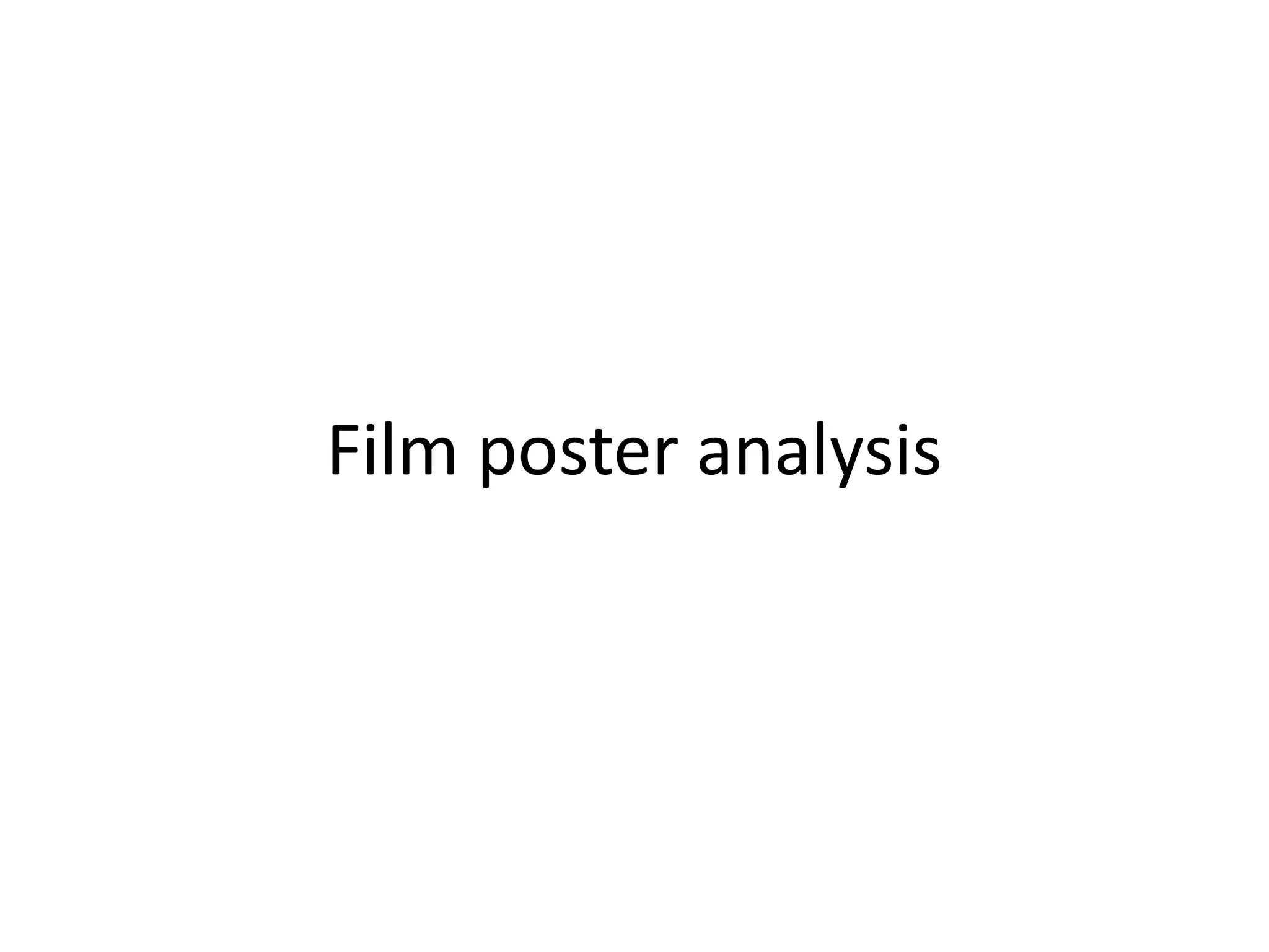
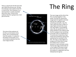
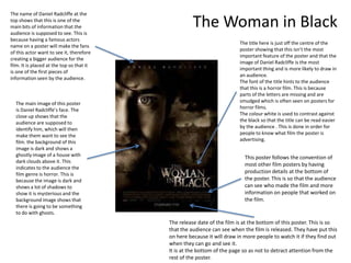
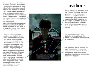
Film poster analysis
There is a tag line for the film here that
says ‘before you die you see’, this tag
line indicates to the audience that this
is a horror film. This is because it is a
warning which is usually associated
                                             The Ring
with horror films. It hints to the
audience that this is going to be a main     The main image and the title of the
plot of the film.                            film are linked together in this
                                             poster. The title the ring and the
                                             image both link together and show
                                             that the film is going to have
                                             something to do with a ring. The
                                             ring in which the title is inside is a
                                             ring of light and looks like an eye.
                                             The ring of light is surrounded by
                                             static, like you would find on a TV,
                                             which indicates to the audience that
  The name of the producers of               the film is going to have something
  the film is at the bottom of the           to do with a film or something on a
  poster. This is conventional for           TV and the fact it looks like an eye
  most film posters. It is placed at         shows that something is going to be
  the bottom of the poster so as             watched by the characters in the
  not to detract attention from the          film. The ring is a ring of light on a
  main image and title.                      background of black which shows
                                             the audience this is a horror
                                             because it is dark and looks sinister.
                                             The fact the image and the title are
                                             in the middle of the poster shows
                                             this is the main focus and is what
                                             the audience is supposed to see first
                                             followed by the tag line.
The name of Daniel Radcliffe at the
top shows that this is one of the
main bits of information that the
audience is supposed to see. This is
                                                     The Woman in Black
because having a famous actors
                                                                         The title here is just off the centre of the
name on a poster will make the fans
                                                                         poster showing that this isn’t the most
of this actor want to see it, therefore
                                                                         important feature of the poster and that the
creating a bigger audience for the
                                                                         image of Daniel Radcliffe is the most
film. It is placed at the top so that it
                                                                         important thing and is more likely to draw in
is one of the first pieces of
                                                                         an audience.
information seen by the audience.
                                                                         The font of the title hints to the audience
                                                                         that this is a horror film. This is because
                                                                         parts of the letters are missing and are
  The main image of this poster                                          smudged which is often seen on posters for
  is Daniel Radcliffe’s face. The                                        horror films.
  close up shows that the                                                The colour white is used to contrast against
  audience are supposed to                                               the black so that the title can be read easier
  identify him, which will then                                          by the audience . This is done in order for
  make them want to see the                                              people to know what film the poster is
  film. the background of this                                           advertising.
  image is dark and shows a
  ghostly image of a house with                                            This poster follows the convention of
  dark clouds above it. This
                                                                           most other film posters by having
  indicates to the audience the
  film genre is horror. This is                                            production details at the bottom of
  because the image is dark and                                            the poster. This is so that the audience
  shows a lot of shadows to                                                can see who made the film and more
  show it is mysterious and the                                            information on people that worked on
  background image shows that                                              the film.
  there is going to be something
  to do with ghosts.
                                           The release date of the film is at the bottom of this poster. This is so
                                           that the audience can see when the film is released. They have put this
                                           on here because it will draw in more people to watch it if they find out
                                           when they can go and see it.
                                           It is at the bottom of the page so as not to detract attention from the
                                           rest of the poster.
The main image here, of the child, takes
up all of the poster. This shows that this
is the most important part of the poster
and is what the audience are supposed
                                                 Insidious
to pay the most attention to. The image
                                              The tag line here says ‘It’s not the house
is dark and uses low key lighting which
                                              that’s haunted’. This shows that this is
hint to the audience that this poster is
                                              going to be a horror film because it
for a horror film. this is because it shows
                                              mentions haunting. Saying that about
mystery. The way the boy is looking also
                                              the house also shows that the child on
hints that this is a horror film because he
                                              the poster is probably going to be the
looks evil and his eyes are made to look
                                              one that gets haunted. This gives away
scary and possessed.
                                              only part of what is going to happen
Having the child on the front shows that
                                              which will then draw a bigger audience
this is the main character that the film
                                              of people that want to know more about
revolves around and the dark clouds in
                                              this film.
the background indicate that in this film
he is considered the villain.


  Listing the other films that the            This poster, like the others, have
  producers have made will draw in            production company details at the
  fans of these films because it means        bottom. This seems to be conventional of
  they could be similar. It also will         all film posters.
  draw in new audiences because it
  shows that the producers are well
  established and have made other
  good films which could mean that
  this film is also going to be good.         The release date is at the bottom of the
                                              page. This shows that the audience are
The title of the film interacts with the      supposed to see it but it isn't the most
main image of the poster. This shows          important part of the poster and it is
that this isn’t as important on the           placed there to not detract attention from
poster as the image and that they             the rest from the poster.
image is what is going to draw bigger
audiences. The fact that it interacts
with it also gives the poster a better
look because it doesn’t detract
attention from the other main
components of the poster.

Film poster analysis

  • 1.
  • 2.
    There is atag line for the film here that says ‘before you die you see’, this tag line indicates to the audience that this is a horror film. This is because it is a warning which is usually associated The Ring with horror films. It hints to the audience that this is going to be a main The main image and the title of the plot of the film. film are linked together in this poster. The title the ring and the image both link together and show that the film is going to have something to do with a ring. The ring in which the title is inside is a ring of light and looks like an eye. The ring of light is surrounded by static, like you would find on a TV, which indicates to the audience that The name of the producers of the film is going to have something the film is at the bottom of the to do with a film or something on a poster. This is conventional for TV and the fact it looks like an eye most film posters. It is placed at shows that something is going to be the bottom of the poster so as watched by the characters in the not to detract attention from the film. The ring is a ring of light on a main image and title. background of black which shows the audience this is a horror because it is dark and looks sinister. The fact the image and the title are in the middle of the poster shows this is the main focus and is what the audience is supposed to see first followed by the tag line.
  • 3.
    The name ofDaniel Radcliffe at the top shows that this is one of the main bits of information that the audience is supposed to see. This is The Woman in Black because having a famous actors The title here is just off the centre of the name on a poster will make the fans poster showing that this isn’t the most of this actor want to see it, therefore important feature of the poster and that the creating a bigger audience for the image of Daniel Radcliffe is the most film. It is placed at the top so that it important thing and is more likely to draw in is one of the first pieces of an audience. information seen by the audience. The font of the title hints to the audience that this is a horror film. This is because parts of the letters are missing and are The main image of this poster smudged which is often seen on posters for is Daniel Radcliffe’s face. The horror films. close up shows that the The colour white is used to contrast against audience are supposed to the black so that the title can be read easier identify him, which will then by the audience . This is done in order for make them want to see the people to know what film the poster is film. the background of this advertising. image is dark and shows a ghostly image of a house with This poster follows the convention of dark clouds above it. This most other film posters by having indicates to the audience the film genre is horror. This is production details at the bottom of because the image is dark and the poster. This is so that the audience shows a lot of shadows to can see who made the film and more show it is mysterious and the information on people that worked on background image shows that the film. there is going to be something to do with ghosts. The release date of the film is at the bottom of this poster. This is so that the audience can see when the film is released. They have put this on here because it will draw in more people to watch it if they find out when they can go and see it. It is at the bottom of the page so as not to detract attention from the rest of the poster.
  • 4.
    The main imagehere, of the child, takes up all of the poster. This shows that this is the most important part of the poster and is what the audience are supposed Insidious to pay the most attention to. The image The tag line here says ‘It’s not the house is dark and uses low key lighting which that’s haunted’. This shows that this is hint to the audience that this poster is going to be a horror film because it for a horror film. this is because it shows mentions haunting. Saying that about mystery. The way the boy is looking also the house also shows that the child on hints that this is a horror film because he the poster is probably going to be the looks evil and his eyes are made to look one that gets haunted. This gives away scary and possessed. only part of what is going to happen Having the child on the front shows that which will then draw a bigger audience this is the main character that the film of people that want to know more about revolves around and the dark clouds in this film. the background indicate that in this film he is considered the villain. Listing the other films that the This poster, like the others, have producers have made will draw in production company details at the fans of these films because it means bottom. This seems to be conventional of they could be similar. It also will all film posters. draw in new audiences because it shows that the producers are well established and have made other good films which could mean that this film is also going to be good. The release date is at the bottom of the page. This shows that the audience are The title of the film interacts with the supposed to see it but it isn't the most main image of the poster. This shows important part of the poster and it is that this isn’t as important on the placed there to not detract attention from poster as the image and that they the rest from the poster. image is what is going to draw bigger audiences. The fact that it interacts with it also gives the poster a better look because it doesn’t detract attention from the other main components of the poster.