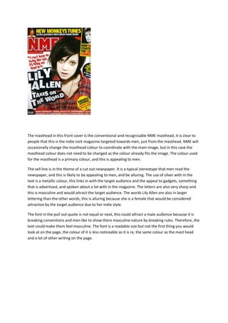
The document summarizes design elements of a magazine cover targeted towards men. The masthead uses a primary color that fits with the main image. The sell line is designed like a cut-out newspaper to appeal to stereotypically male interests. Silver lettering and a large font for a female musician's name are intended to attract the target audience. The pull quote uses an uneven font that could make male readers feel masculine by breaking conventions.