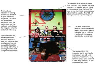
Front Cover Analysis
The banner is all in red as its not the
                            most important thing but its is still quite
                            important, its keeping with red theme
                            to the magazine. Its at the top of the
The masthead                page as you from top to bottom so you
indicates by it being       will se this first, also the “free” CD will
made out of dots that       make you want to buy this magazine
its quite electronic
magazine. The colour
red is used as it
stands out from the
background and that
makes is easier to see                  The main cover photo
the magazine when its                   being in the middle like this
on its rack in the shop                 is very strange as it doesn’t
                                        follow the rule of thirds but
                                        it works well to draw your
The cover line is red                   attention the cover photo.
and white so that it
stand out again and
quite eye catching. Also
usually cover line are
always black capitals
but K mag is breaking is
breaking the rules and
using lower case letters.           The house style of this
                                    magazine is a bit weird as the
                                    main colours are red, white
                                    and green. Green isn’t a very
                                    common colour to be used but
                                    it helps thing stand out as you
                                    don’t see it very often.
RWD or Rewind masthead is a good logo and it has the rewind icon at the start and it
                            helps draw your attention to it even though it is being covered by the cover star


The cover star Wrench                                                                                     The font used is good
32 is taking up most of                                                                                   as it makes you think
the front cover, this                                                                                     of the words “love
draws all your attention                                                                                  and lust”. It is in
to it and makes sure                                                                                      keeping with the
you know the main                                                                                         theme of back and
article is about him. He                                                                                  white.
is all covering up the
masthead. Once again
the photo is in black and
white which is the house
them for the front cover


Cover Story and Sub                                                                                           The cover lines are to
Title are relevant as                                                                                         left and not blocking
the cover them is                                                                                             your view of the
black and white to go                                                                                         cover star. They are
with the cover story.                                                                                         down the to the
                                                                                                              bottom as well by the
                                                                                                              main story.
The Q Magazine logo is           The masthead is in a very
very simple and straight         simple font, it is easy to
up. I like it as you can         read, big and almost
see nearly all of it, a          unobstructed by the cover
small part of it is covered      photo. This make it east to
up by the cover photo.           read but the ‘boring’ font
                                 makes it a bland in my
                                 view.


                              The cover of plan is good as it
The other cover lines         has something to do with the
on the cover are to           cover line. The cover line ‘Plan B
the left side along way       has a few thing to say… you need
out the way of the            to listen’ is complimented by him
main cover photo.             holding microphone and it looks
The still stick the           like he is speaking in to it. The
house theme of red            choice of clothes are good as
and black. They are in        they quite casual and what
good fonts and a nice         people wear now.
size.
                                   The graphic feature is good
                                   as it goes against the house
                                   theme. They so do this a
                                   what is written on it could be
                                   very important or something
                                   the want to tell you.

Front Cover Analysis

  • 1.
  • 2.
    The banner isall in red as its not the most important thing but its is still quite important, its keeping with red theme to the magazine. Its at the top of the The masthead page as you from top to bottom so you indicates by it being will se this first, also the “free” CD will made out of dots that make you want to buy this magazine its quite electronic magazine. The colour red is used as it stands out from the background and that makes is easier to see The main cover photo the magazine when its being in the middle like this on its rack in the shop is very strange as it doesn’t follow the rule of thirds but it works well to draw your The cover line is red attention the cover photo. and white so that it stand out again and quite eye catching. Also usually cover line are always black capitals but K mag is breaking is breaking the rules and using lower case letters. The house style of this magazine is a bit weird as the main colours are red, white and green. Green isn’t a very common colour to be used but it helps thing stand out as you don’t see it very often.
  • 3.
    RWD or Rewindmasthead is a good logo and it has the rewind icon at the start and it helps draw your attention to it even though it is being covered by the cover star The cover star Wrench The font used is good 32 is taking up most of as it makes you think the front cover, this of the words “love draws all your attention and lust”. It is in to it and makes sure keeping with the you know the main theme of back and article is about him. He white. is all covering up the masthead. Once again the photo is in black and white which is the house them for the front cover Cover Story and Sub The cover lines are to Title are relevant as left and not blocking the cover them is your view of the black and white to go cover star. They are with the cover story. down the to the bottom as well by the main story.
  • 4.
    The Q Magazinelogo is The masthead is in a very very simple and straight simple font, it is easy to up. I like it as you can read, big and almost see nearly all of it, a unobstructed by the cover small part of it is covered photo. This make it east to up by the cover photo. read but the ‘boring’ font makes it a bland in my view. The cover of plan is good as it The other cover lines has something to do with the on the cover are to cover line. The cover line ‘Plan B the left side along way has a few thing to say… you need out the way of the to listen’ is complimented by him main cover photo. holding microphone and it looks The still stick the like he is speaking in to it. The house theme of red choice of clothes are good as and black. They are in they quite casual and what good fonts and a nice people wear now. size. The graphic feature is good as it goes against the house theme. They so do this a what is written on it could be very important or something the want to tell you.