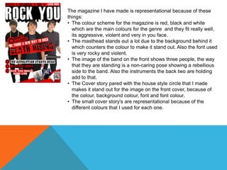
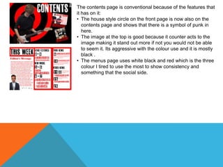
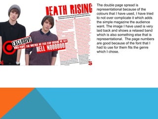
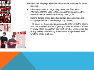
COLOUR
The magazine I have made is representational because of these
things:
• The colour scheme for the magazine is red, black and white
which are the main colours for the genre and they fit really well,
its aggressive, violent and very in you face.
• The masthead stands out a lot due to the background behind it
which counters the colour to make it stand out. Also the font used
is very rocky and violent.
• The image of the band on the front shows three people, the way
that they are standing is a non-caring pose showing a rebellious
side to the band. Also the instruments the back two are holding
add to that.
• The Cover story pared with the house style circle that I made
makes it stand out for the image on the front cover, because of
the colour, background colour, font and font colour.
• The small cover story's are representational because of the
different colours that I used for each one.
The contents page is conventional because of the features that
it has on it:
• The house style circle on the front page is now also on the
contents page and shows that there is a symbol of punk in
here.
• The image at the top is good because it counter acts to the
image making it stand out more if not you would not be able
to seem it. Its aggressive with the colour use and it is mostly
black .
• The menus page uses white black and red which is the three
colour I tired to use the most to show consistency and
something that the social side.
The double page spread is
representational because of the
colours that I have used, I have tried
to not over complicate it which adds
the simple magazine the audience
want. The image I have used is very
laid back and shows a relaxed band
which is also something else that is
representational. The page numbers
are good because of the font that I
had to use for them fits the genre
which I chose.
LAYOUT
The layout of this page representational to the audience for these
reasons:

•

It is a very clustered page, very hectic and filled with
information for the user. After seeing other magazines this
seems to be the trend in which they have go for.

•

Making it more image based on certain pages such as the
front page and the contents page (top banner)

•

The layout for the double page spread it different to the others
as it has a distinct feature of getting a lot of information across
in a way which means they don’t get bored or uninterested this
is why the layout is making it so that the image shows them
what the article is about.
FONTS
In this period I will talk about how the font in my magazine has been
representational to the genre:
• The colour of my masthead represents and aggressive and violent nature
while standing out and drawing people into the magazine.
• The cover line story on the front of the page contrasts to the background
making the text stand out more and therefore making it presentational.
• The contents page masthead is very bold with the colour which it is, white on
black means that it stands out more appealing to the reader more and
showing them what page they are on.
• The text on the double page spread is sans serif, it is clear and very
conventional and is what the reader wants to see as it is easy to read and is
detailed to the genre in which they are reading .

Representations my magzine

  • 2.
  • 3.
    The magazine Ihave made is representational because of these things: • The colour scheme for the magazine is red, black and white which are the main colours for the genre and they fit really well, its aggressive, violent and very in you face. • The masthead stands out a lot due to the background behind it which counters the colour to make it stand out. Also the font used is very rocky and violent. • The image of the band on the front shows three people, the way that they are standing is a non-caring pose showing a rebellious side to the band. Also the instruments the back two are holding add to that. • The Cover story pared with the house style circle that I made makes it stand out for the image on the front cover, because of the colour, background colour, font and font colour. • The small cover story's are representational because of the different colours that I used for each one.
  • 4.
    The contents pageis conventional because of the features that it has on it: • The house style circle on the front page is now also on the contents page and shows that there is a symbol of punk in here. • The image at the top is good because it counter acts to the image making it stand out more if not you would not be able to seem it. Its aggressive with the colour use and it is mostly black . • The menus page uses white black and red which is the three colour I tired to use the most to show consistency and something that the social side.
  • 5.
    The double pagespread is representational because of the colours that I have used, I have tried to not over complicate it which adds the simple magazine the audience want. The image I have used is very laid back and shows a relaxed band which is also something else that is representational. The page numbers are good because of the font that I had to use for them fits the genre which I chose.
  • 6.
  • 7.
    The layout ofthis page representational to the audience for these reasons: • It is a very clustered page, very hectic and filled with information for the user. After seeing other magazines this seems to be the trend in which they have go for. • Making it more image based on certain pages such as the front page and the contents page (top banner) • The layout for the double page spread it different to the others as it has a distinct feature of getting a lot of information across in a way which means they don’t get bored or uninterested this is why the layout is making it so that the image shows them what the article is about.
  • 8.
  • 9.
    In this periodI will talk about how the font in my magazine has been representational to the genre: • The colour of my masthead represents and aggressive and violent nature while standing out and drawing people into the magazine. • The cover line story on the front of the page contrasts to the background making the text stand out more and therefore making it presentational. • The contents page masthead is very bold with the colour which it is, white on black means that it stands out more appealing to the reader more and showing them what page they are on. • The text on the double page spread is sans serif, it is clear and very conventional and is what the reader wants to see as it is easy to read and is detailed to the genre in which they are reading .