
NCSU LIBRARIES 2010 WEB SITE REDESIGN Process & Progress
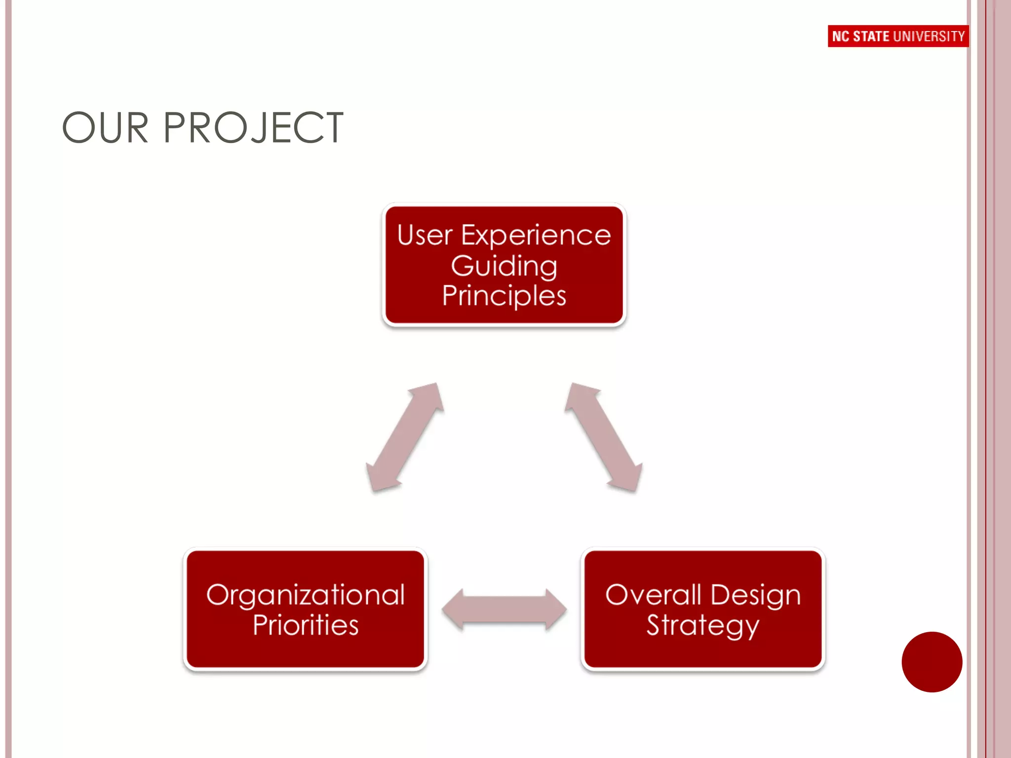
OUR PROJECT
ORGANIZATIONAL PRIORITIES Create a  fresh, modern, and welcoming site , with a clear personality brand for the library;  Streamline homepage access to  search functionality   and core user tasks;  Create a Web site that accommodates a dynamic,  continually updated online presence , with a clear emphasis on innovative library initiatives and offerings; Design a Web site infrastructure that is  flexible and nimble .
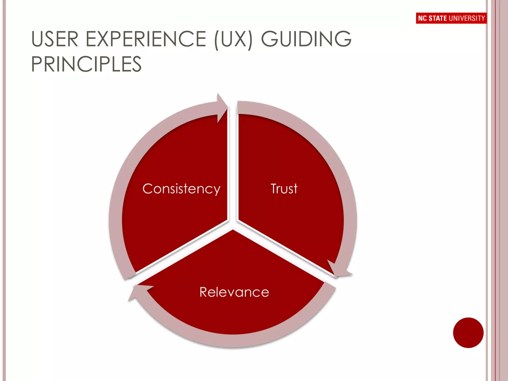
USER EXPERIENCE (UX) GUIDING PRINCIPLES
OVERALL DESIGN STRATEGY Convey  credibility  with design quality and consistency Focus on  core user needs Use clear and  consistent language  in labeling to increase user confidence Promote intangibles through  visual design and messaging
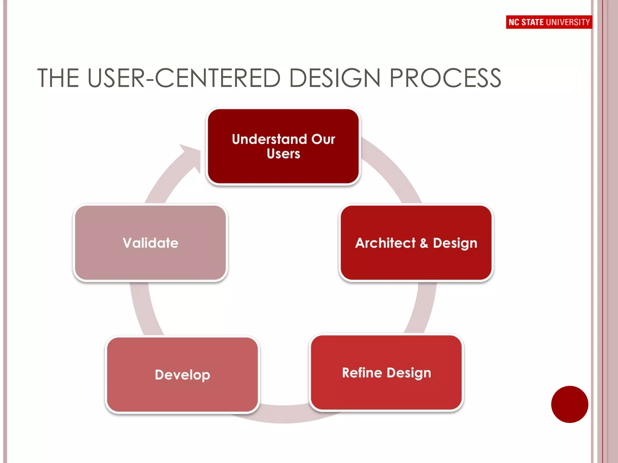
THE USER-CENTERED DESIGN PROCESS
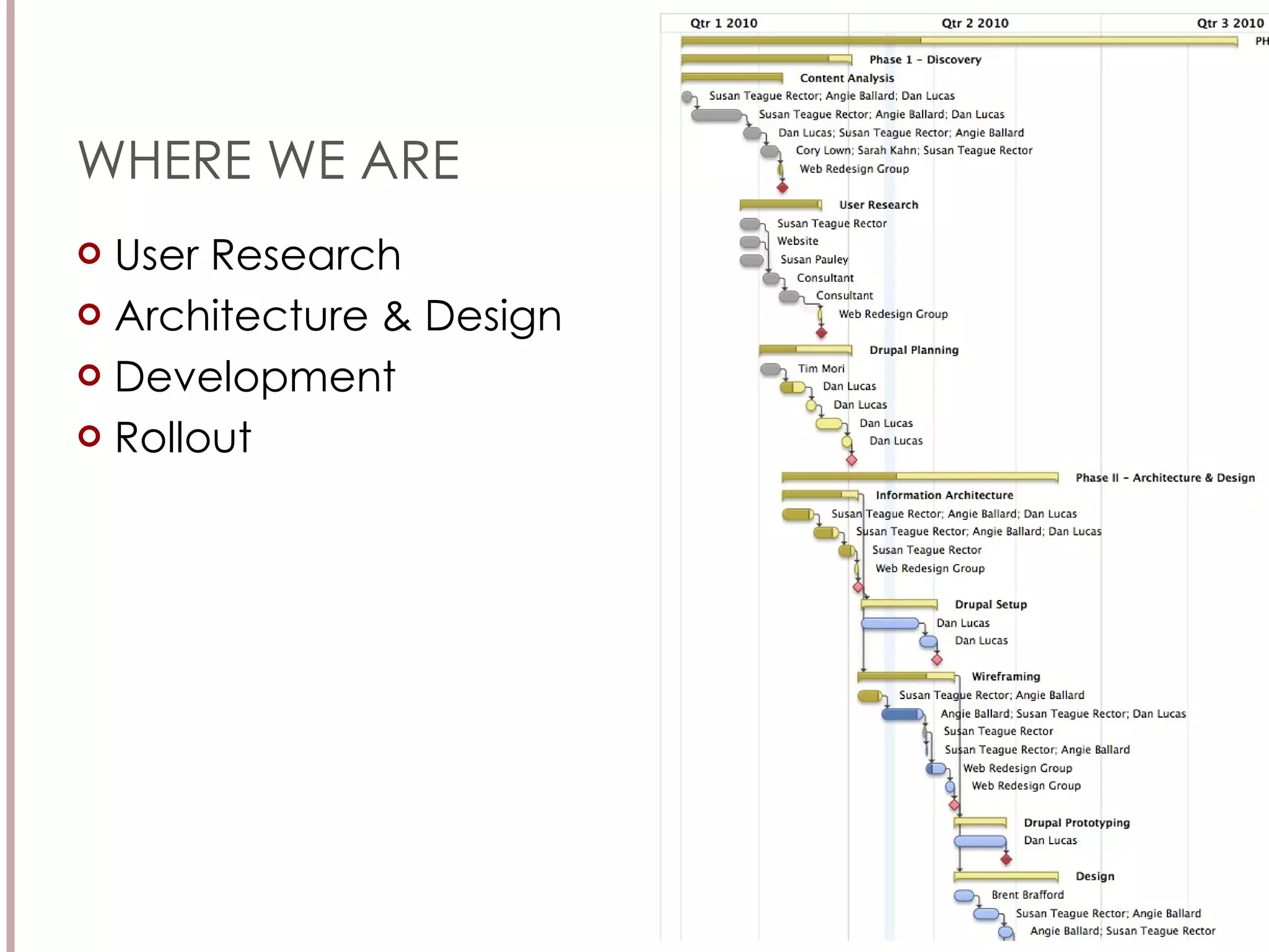
WHERE WE ARE User Research Architecture & Design Development Rollout
USER RESEARCH
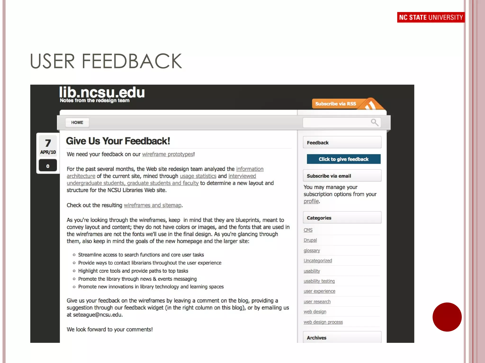
USER RESEARCH Web site Usage Analysis Search Term Analysis Interviews with user groups Usability testing Navigation Search Box Blog posts asking for user feedback
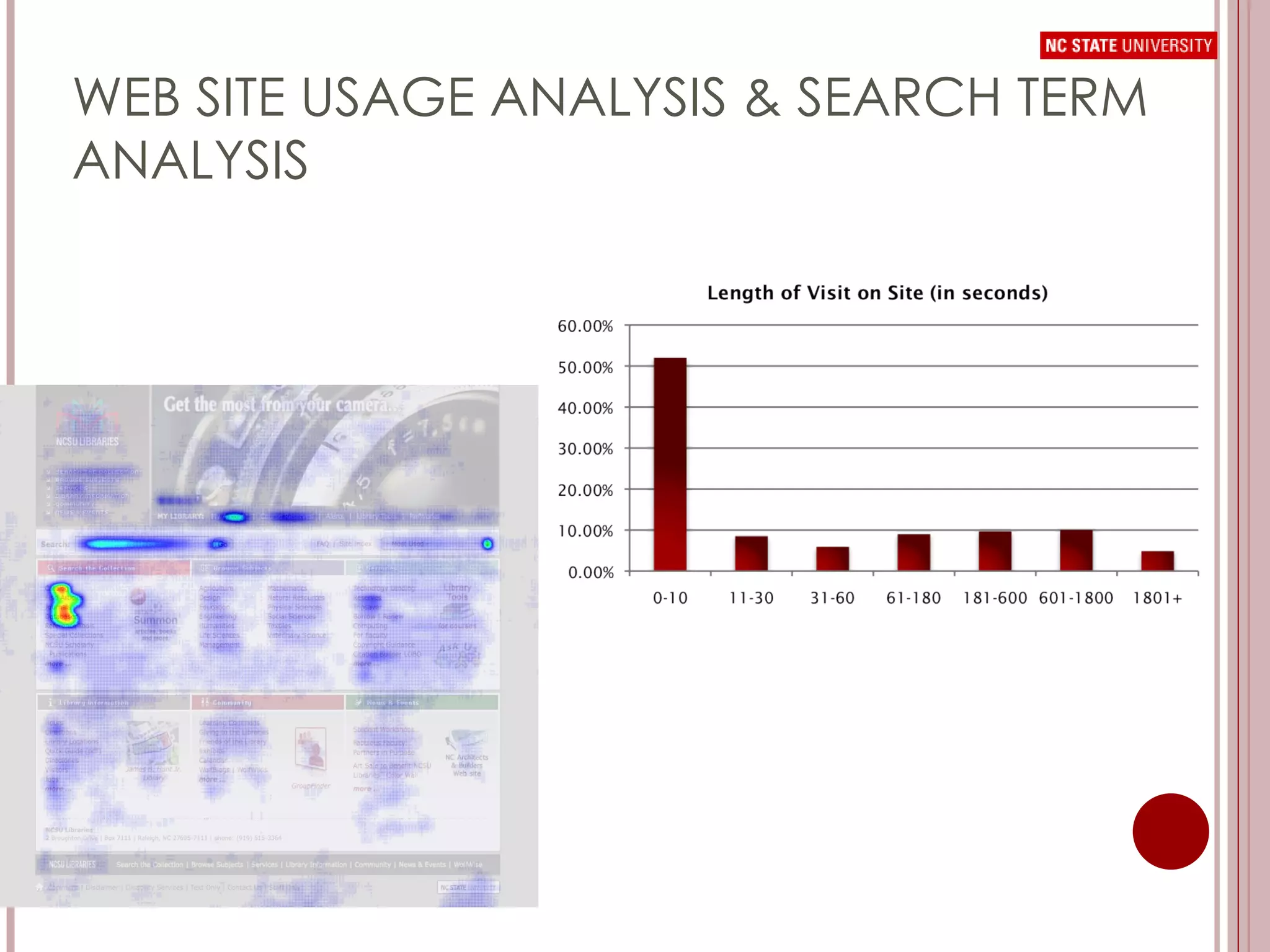
WEB SITE USAGE ANALYSIS & SEARCH TERM ANALYSIS
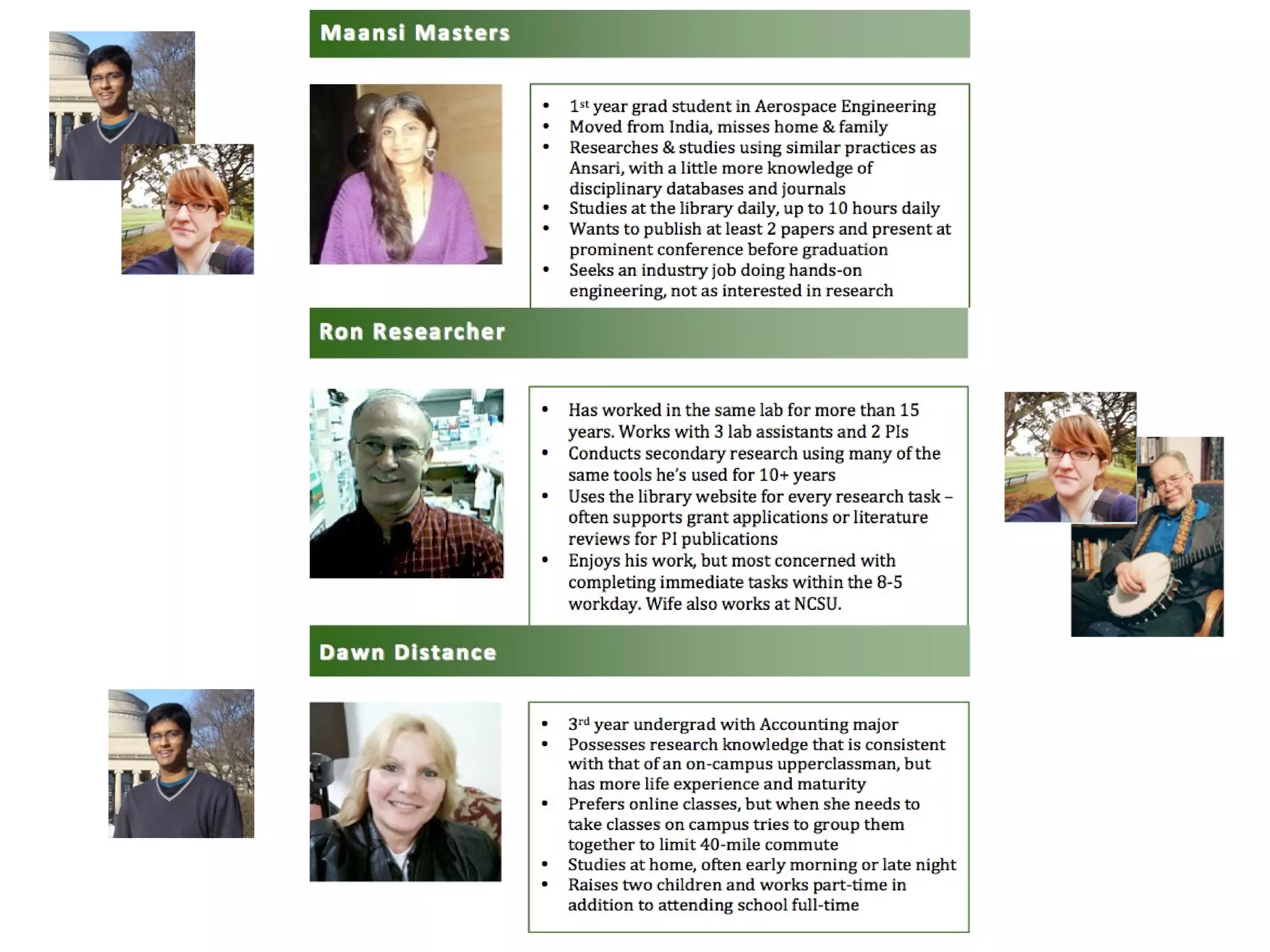
INTERVIEWS & PERSONAS Persona:  n. A thumbnail summary of the characteristics, needs, motivations, and environment of targeted types of web site users. Why  Personas? You are not your user. You’re different in significant ways that change your web experience: Priorities, interests and needs Skill levels & knowledge bases Motivations Daily experiences
WHO WE INTERVIEWED Beginning Undergraduates Upperclass Undergraduates Distance Students Industry Graduate Students Academic Graduate Students Research Staff Faculty 33 participants 8 in-depth interviews 25 shorter interviews
MAJOR FINDINGS D. H. Hill Library serves as a central hub of undergraduate student life Despite encouragement from faculty, students very rarely interacted with library staff for research needs
MAJOR FINDINGS Several library Web site services were “invisible” to users, even though they used them on a regular basis There is currently little interest in smart phones and apps among the on-campus population Students’ general impressions of the library were remarkably consistent “ big” – “has everything I could ever need” “ confusing or “intimidating” “ friendly” & “laid-back” “ organized” and “convenient”
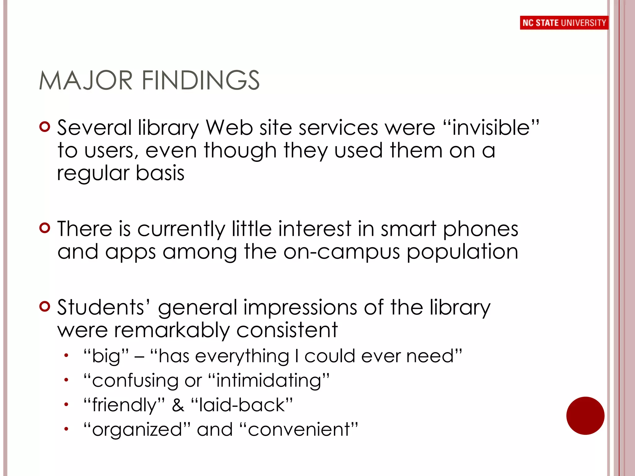
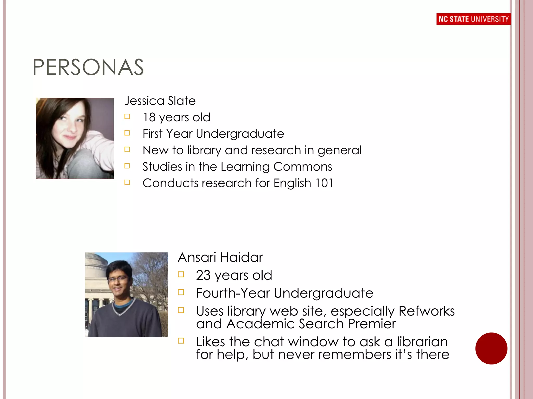
PERSONAS Jessica Slate 18 years old First Year Undergraduate New to library and research in general Studies in the Learning Commons Conducts research for English 101 Ansari Haidar 23 years old Fourth-Year Undergraduate Uses library web site, especially Refworks and Academic Search Premier Likes the chat window to ask a librarian for help, but never remembers it’s there
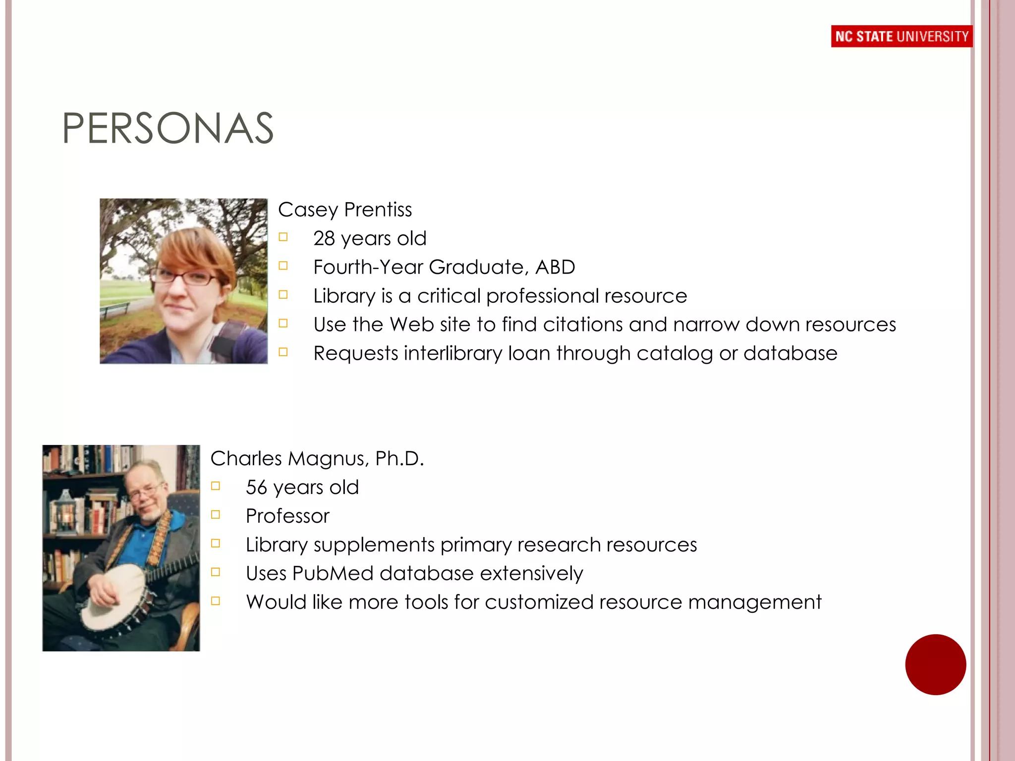
PERSONAS Casey Prentiss 28 years old Fourth-Year Graduate, ABD Library is a critical professional resource Use the Web site to find citations and narrow down resources Requests interlibrary loan through catalog or database Charles Magnus, Ph.D. 56 years old Professor Library supplements primary research resources Uses PubMed database extensively Would like more tools for customized resource management
 
NAVIGATION TESTING 32 undergraduates, graduates, and library staff at NCSU in navigation testing Each task required the user to open a navigation menu and indicate which menu item they would select to look for the specified information Facilitators recorded up to 4 of each user’s menu selections, in order of selection A facilitator assessment of task difficulty was also recorded
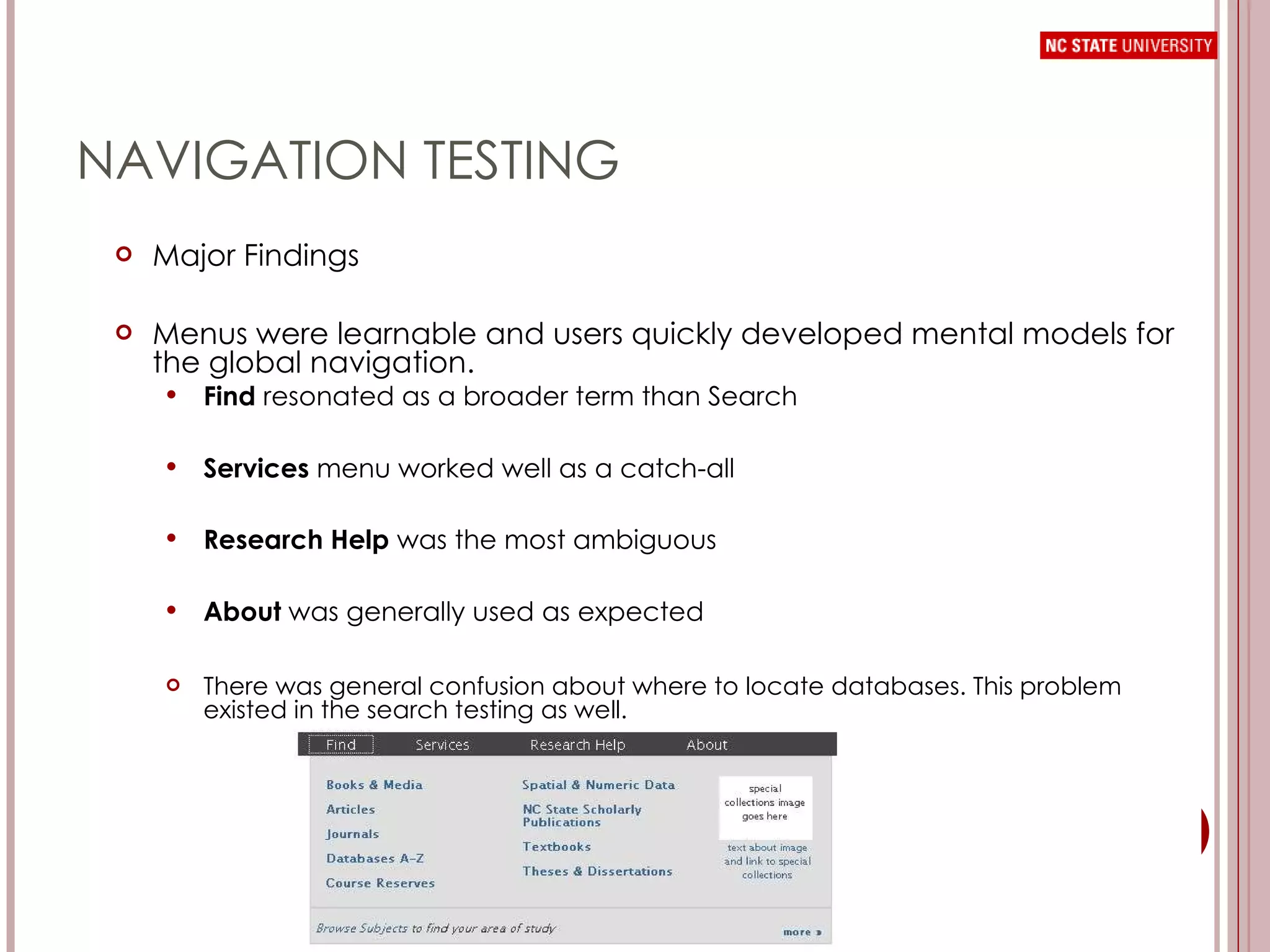
NAVIGATION TESTING Major Findings Menus were learnable and users quickly developed mental models for the global navigation. Find  resonated as a broader term than Search Services  menu worked well as a catch-all Research Help  was the most ambiguous About  was generally used as expected There was general confusion about where to locate databases. This problem existed in the search testing as well.
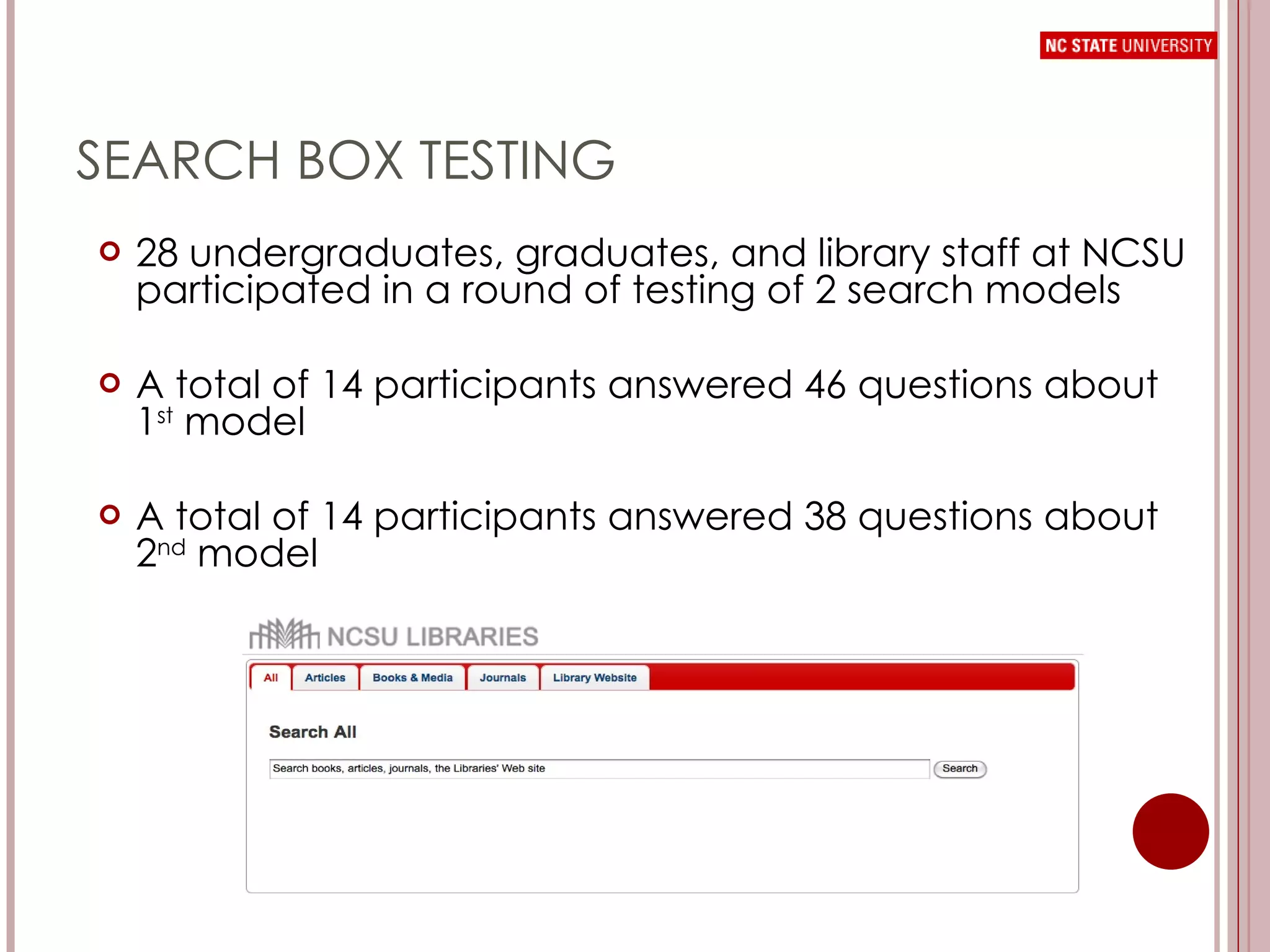
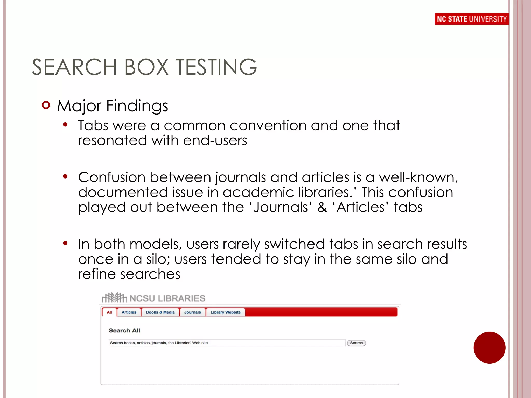
SEARCH BOX TESTING 28 undergraduates, graduates, and library staff at NCSU participated in a round of testing of 2 search models A total of 14 participants answered 46 questions about 1 st  model A total of 14 participants answered 38 questions about 2 nd  model
SEARCH BOX TESTING Major Findings Tabs were a common convention and one that resonated with end-users Confusion between journals and articles is a well-known, documented issue in academic libraries.’ This confusion played out between the ‘Journals’ & ‘Articles’ tabs In both models, users rarely switched tabs in search results once in a silo; users tended to stay in the same silo and refine searches
USER FEEDBACK
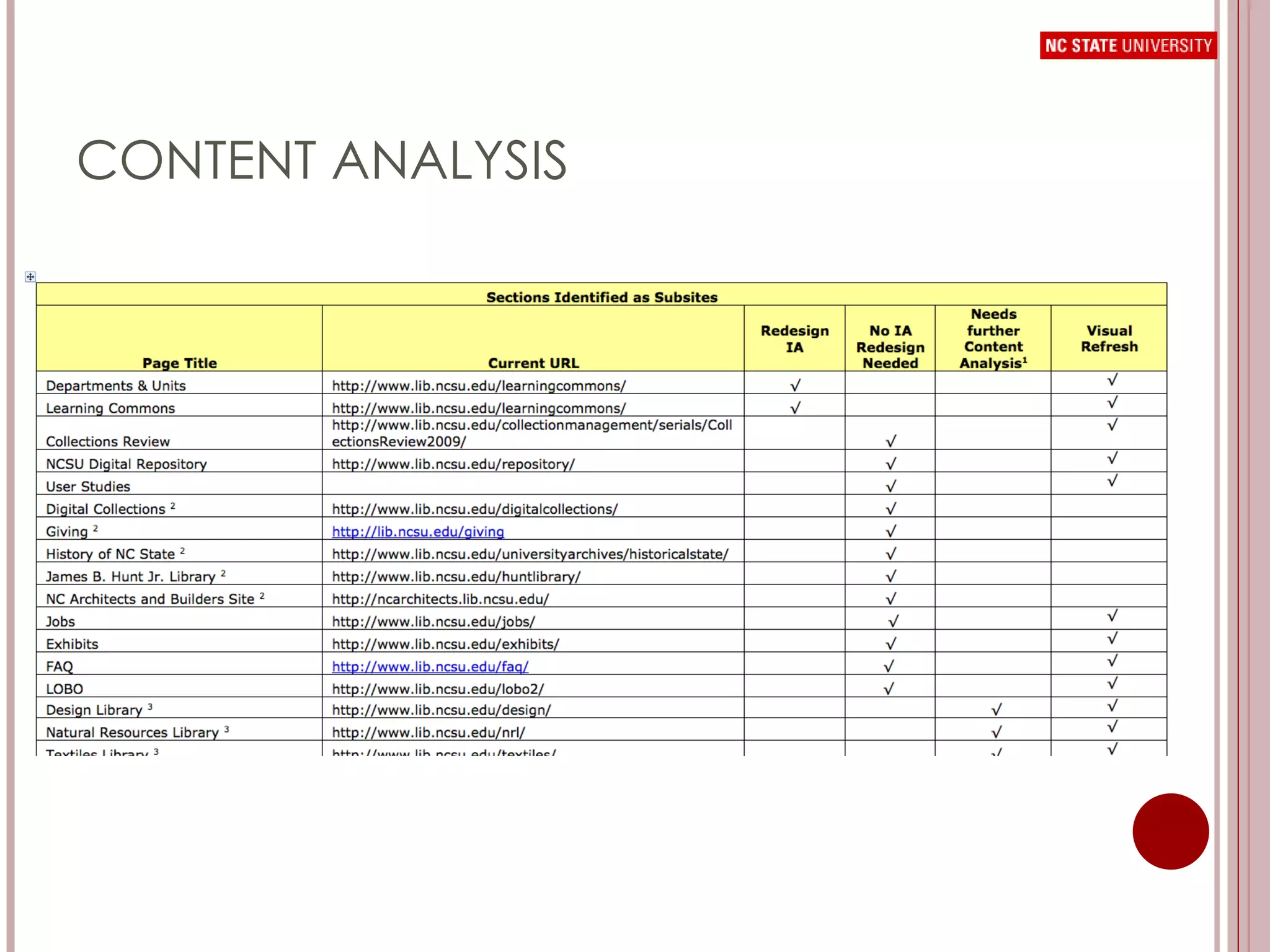
CONTENT ANALYSIS
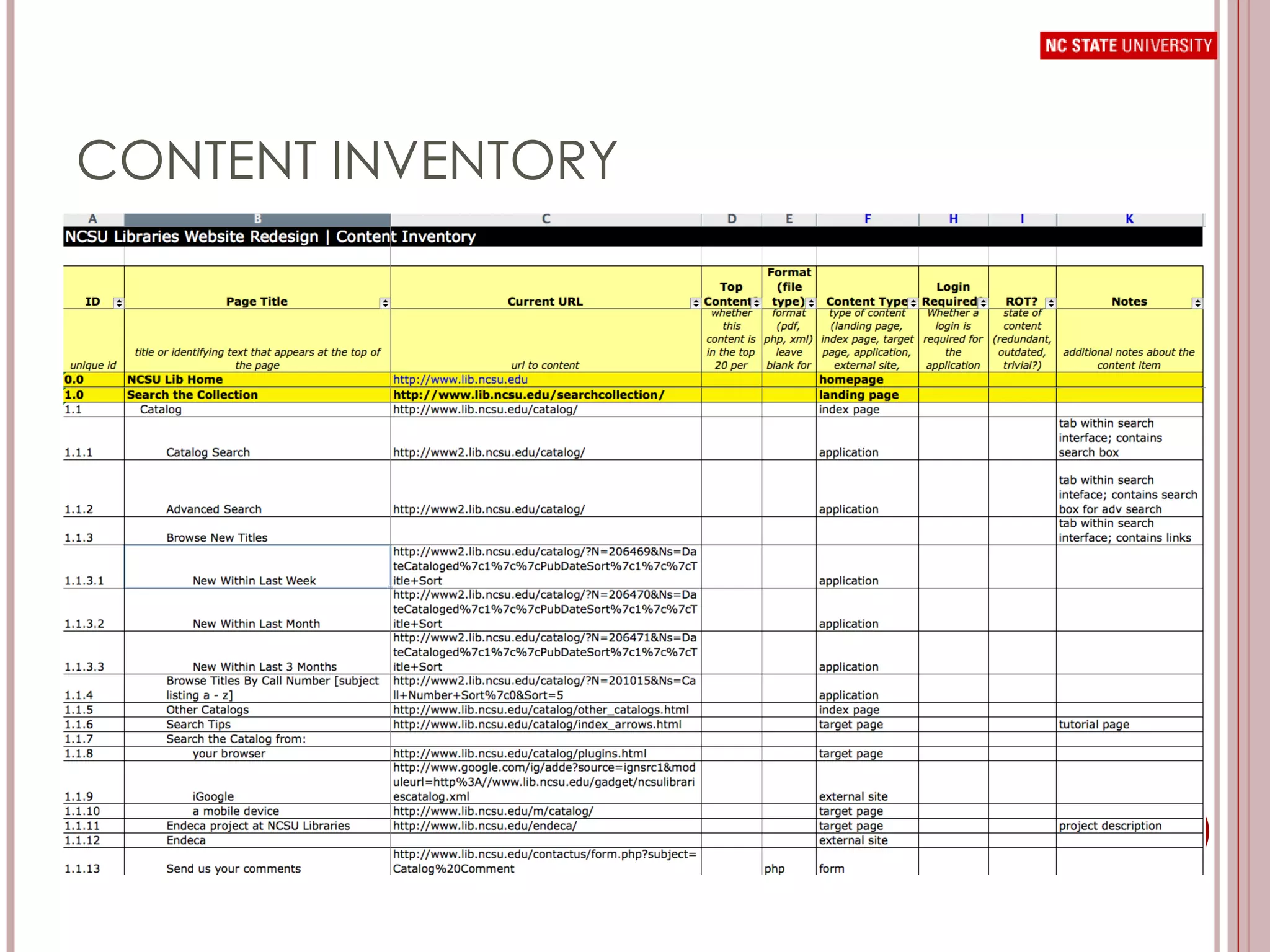
CONTENT INVENTORY
CONTENT ANALYSIS
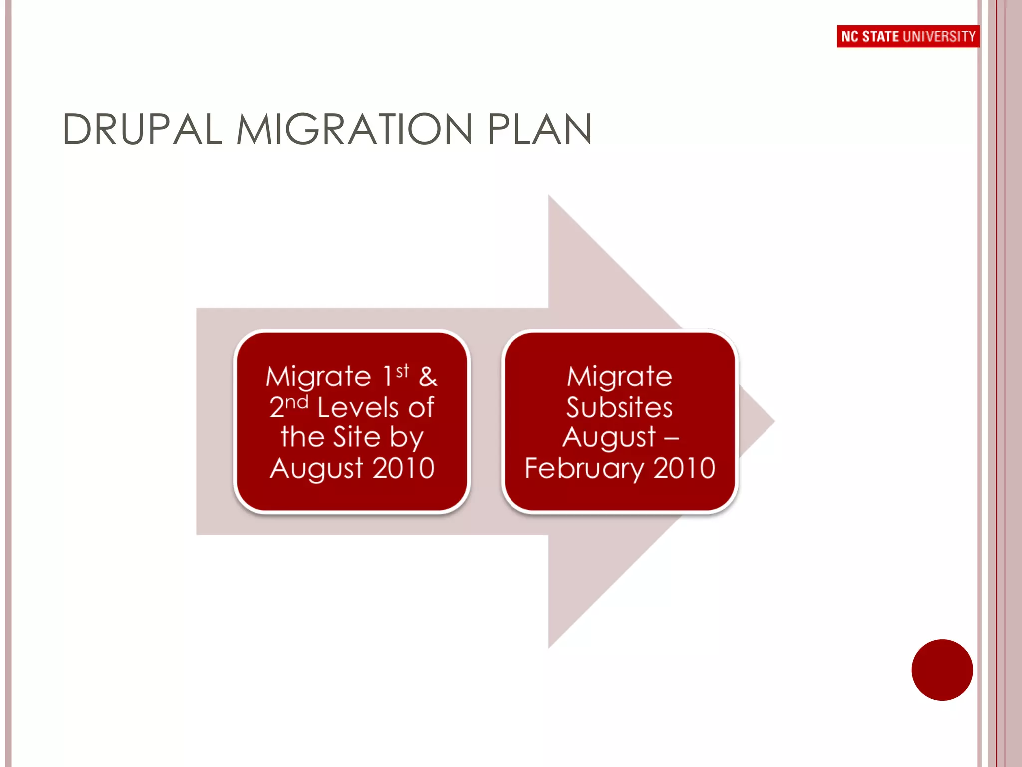
DRUPAL MIGRATION PLAN
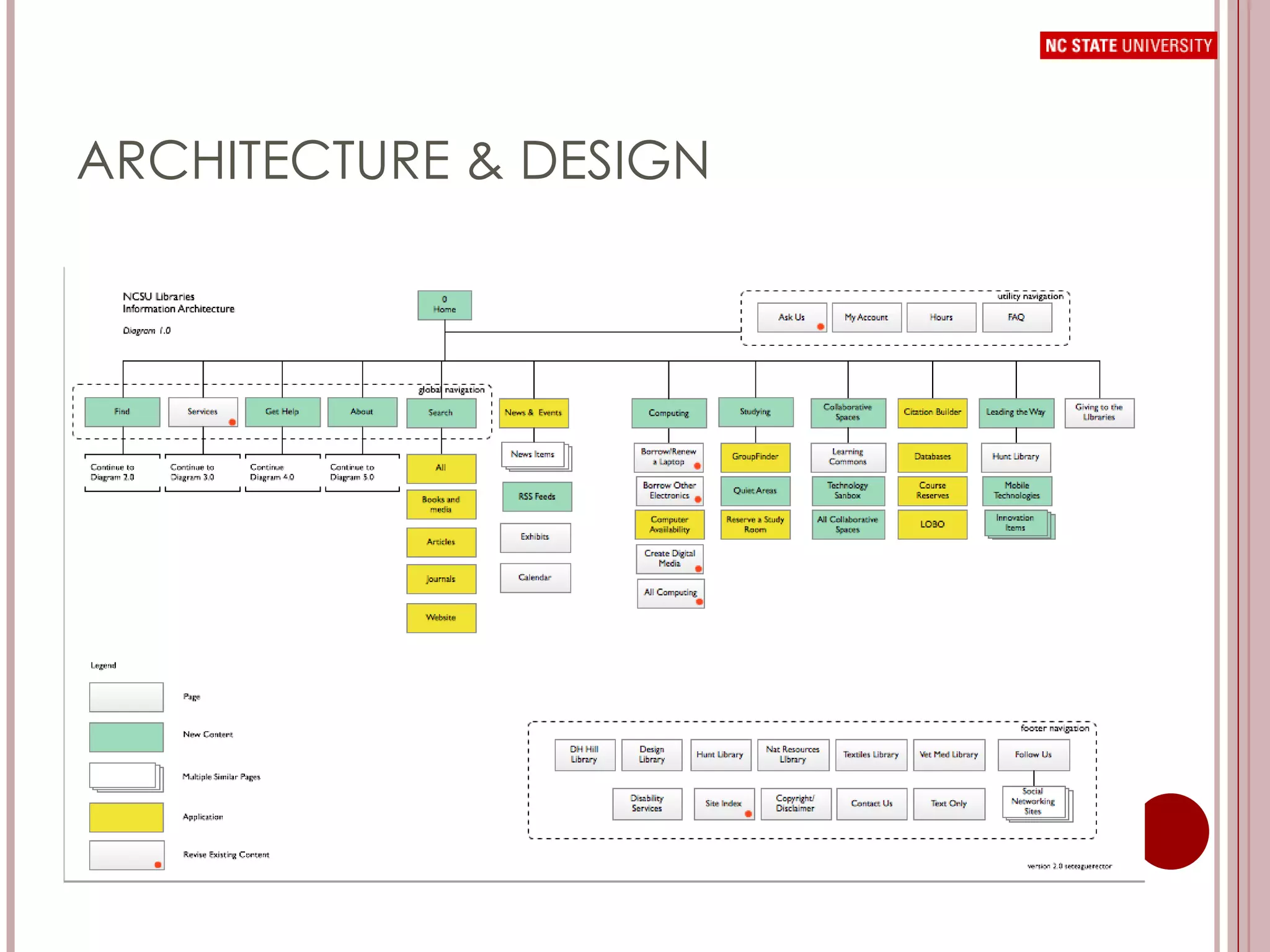
ARCHITECTURE &  DESIGN
ARCHITECTURE & DESIGN
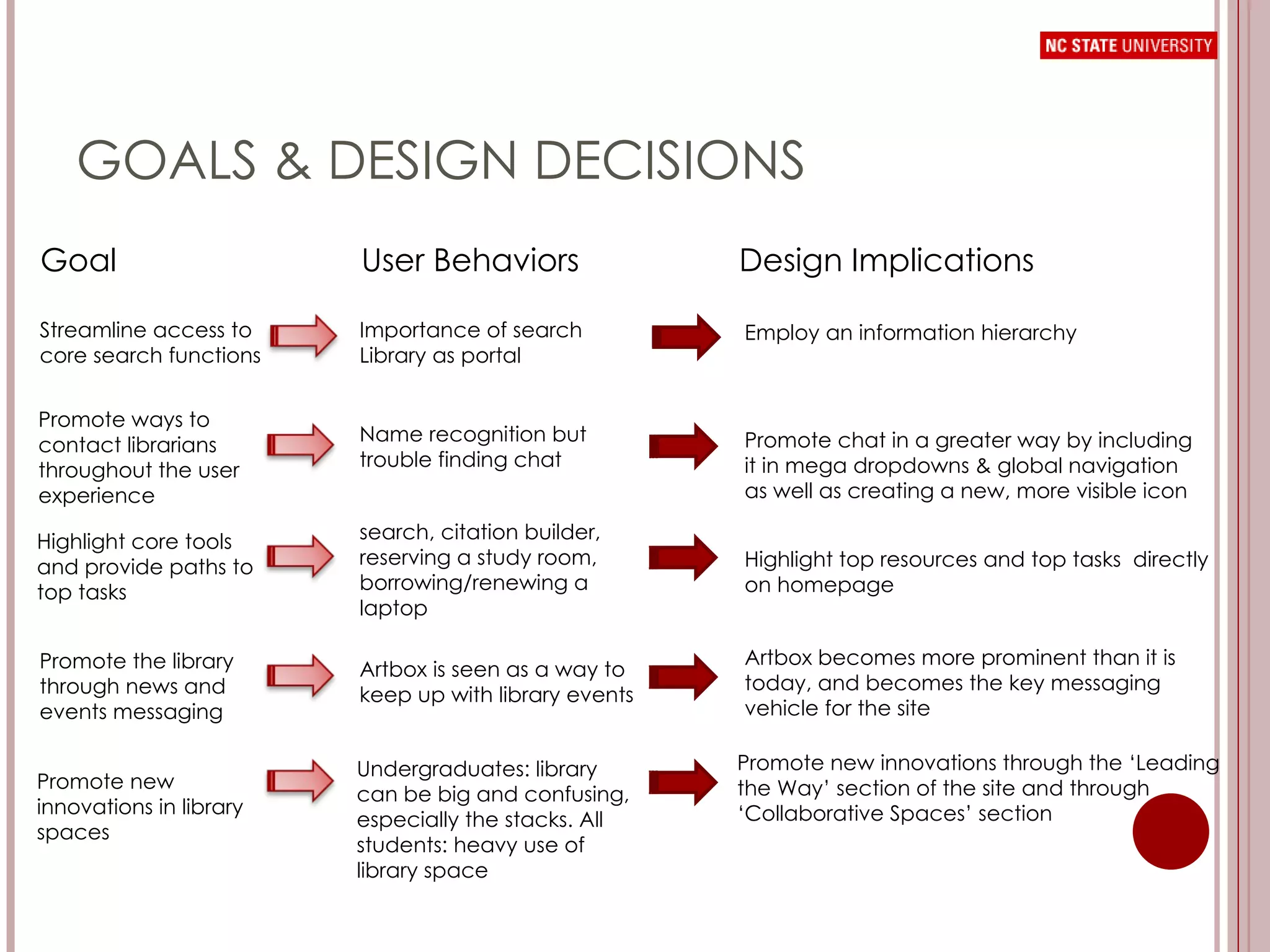
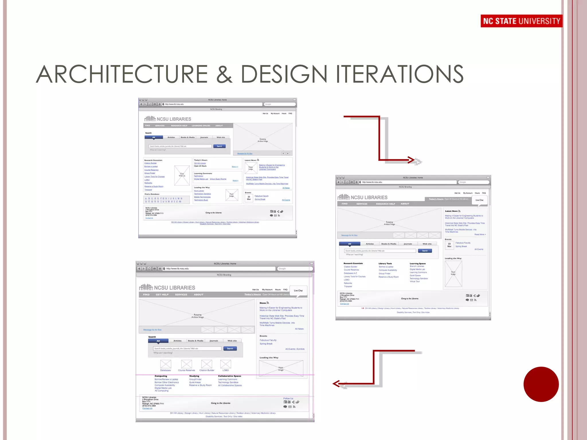
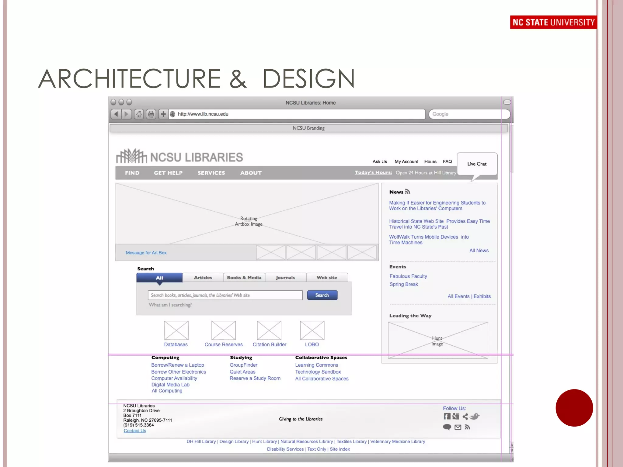
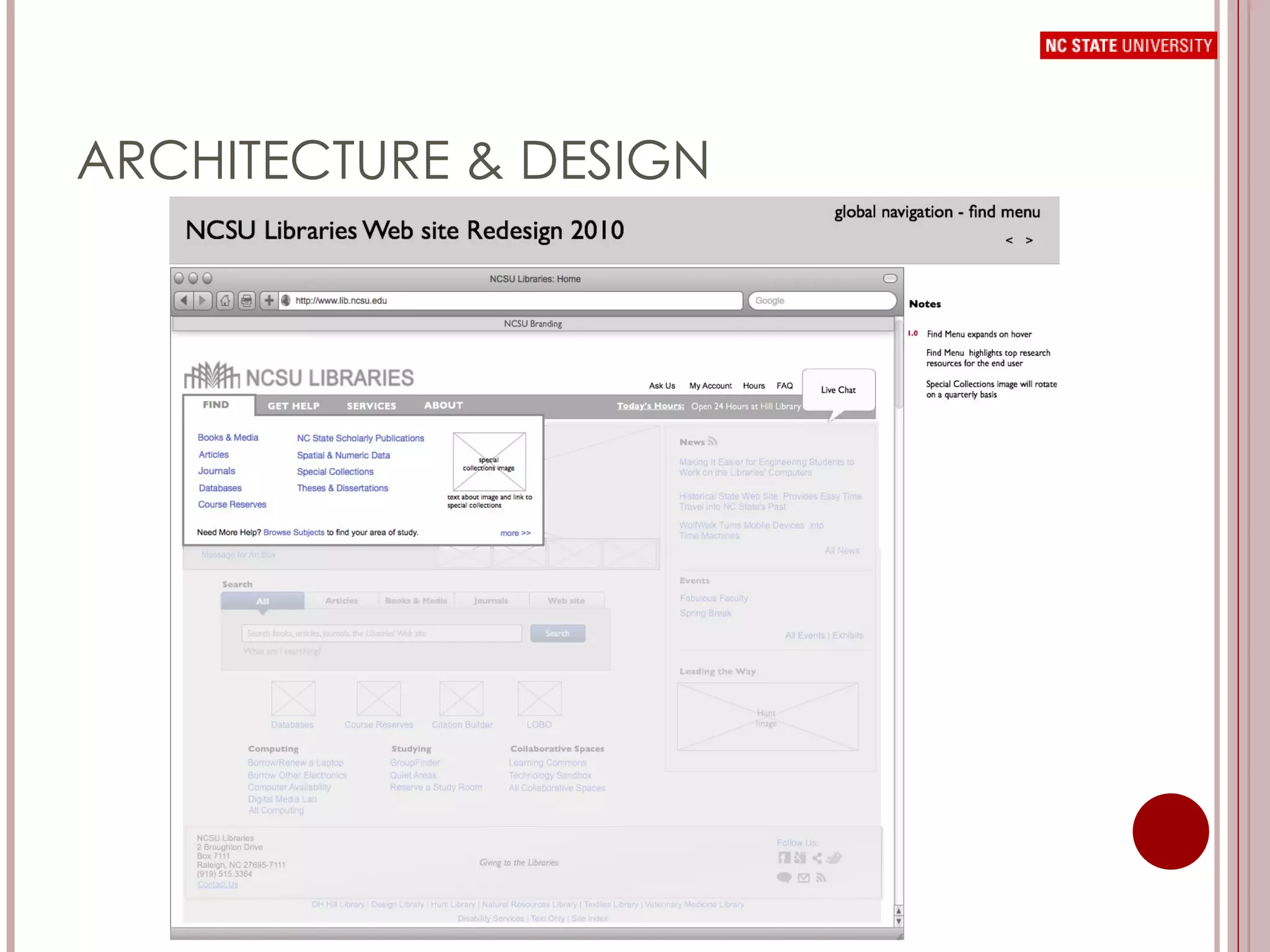
GOALS & DESIGN DECISIONS Goal User Behaviors Design Implications Streamline access to core search functions Promote ways to contact librarians throughout the user experience  Highlight core tools and provide paths to top tasks  Promote the library through news and events messaging Promote new innovations in library spaces  Importance of search Library as portal Name recognition but trouble finding chat search, citation builder, reserving a study room, borrowing/renewing a laptop Artbox is seen as a way to keep up with library events Undergraduates: library can be big and confusing, especially the stacks. All students: heavy use of library space Employ an information hierarchy Promote chat in a greater way by including it in mega dropdowns & global navigation as well as creating a new, more visible icon Highlight top resources and top tasks  directly on homepage Artbox becomes more prominent than it is today, and becomes the key messaging vehicle for the site Promote new innovations through the ‘Leading the Way’ section of the site and through ‘Collaborative Spaces’ section
ARCHITECTURE & DESIGN ITERATIONS
ARCHITECTURE &  DESIGN
ARCHITECTURE & DESIGN
NEXT STEPS Design Comps User Testing Presentations to various stakeholders and library user groups Feedback on Blog Drupal Migration
QUESTIONS? [email_address] [email_address]