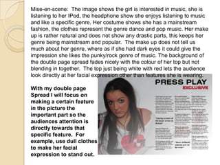
The document discusses using images and layouts in magazines to attract audiences. It analyzes a magazine double page spread and provides suggestions for improvement. Specifically:
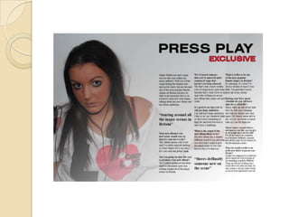
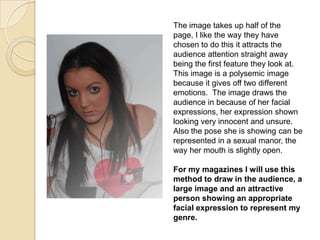
- The first page discusses using a large, attractive image of a person with an appropriate expression to represent the genre.
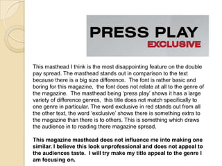
- The second page criticizes the masthead for being too basic and not matching the magazine's genre. It notes the word "exclusive" draws attention.
- The third page likes how quotes are enlarged to stand out but thinks the interview format could be more conversational.
- The last page analyzes the subject's appearance and suggests focusing a specific feature, like facial expression, to direct the audience's attention.