This document summarizes how the student's R&B magazine product uses and develops conventions of real media magazines.
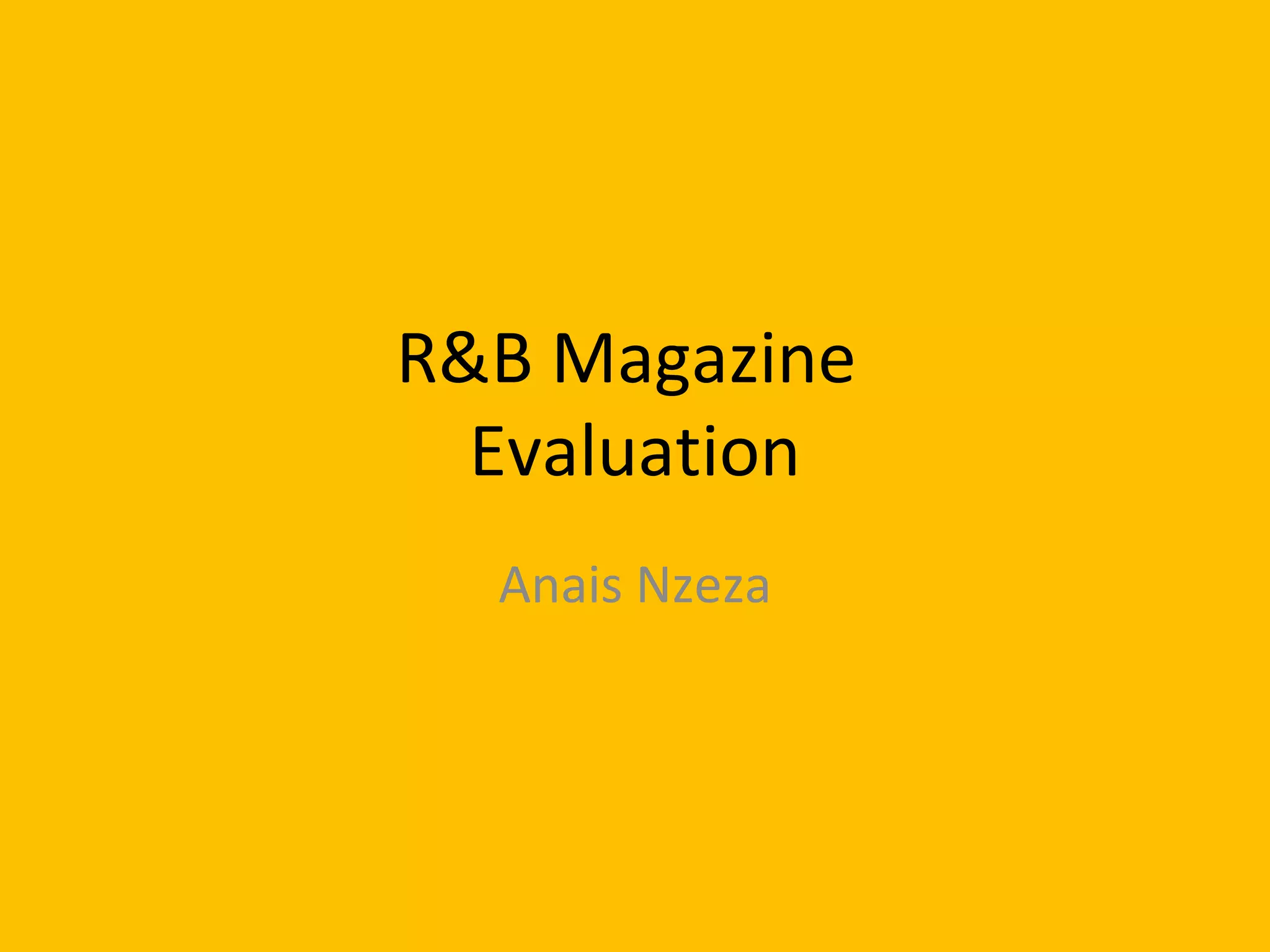
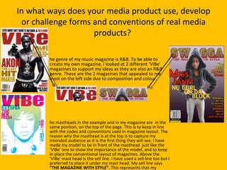
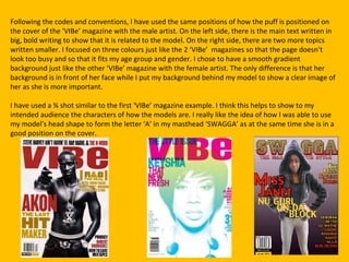
The student looked at two "Vibe" magazines as examples for their magazine layout and design. Key elements copied from the examples include placing the masthead at the top, including a sell line below the masthead, using diagonal text for the main story puff, and including a barcode with issue number and price.
Additional conventions developed include choosing three focal colors, using a 3/4 shot of the model, and incorporating the model's head shape into the masthead lettering. Overall, the student followed magazine design codes and positioned elements similarly to the example magazines.