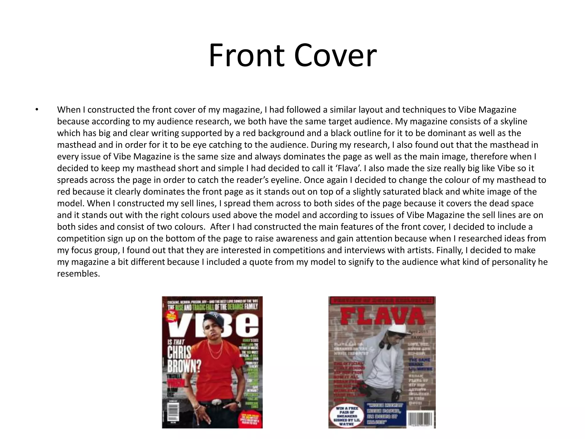
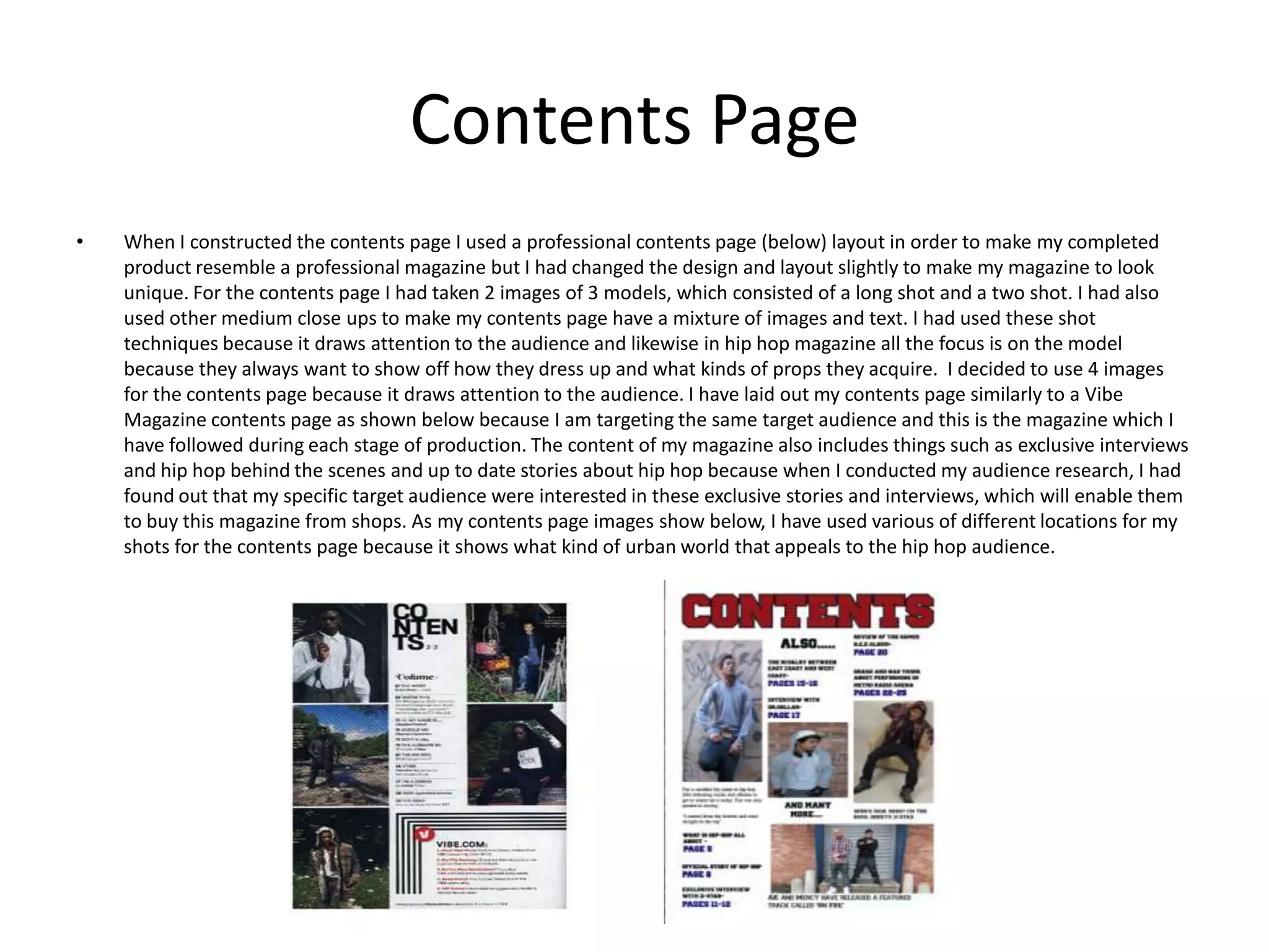
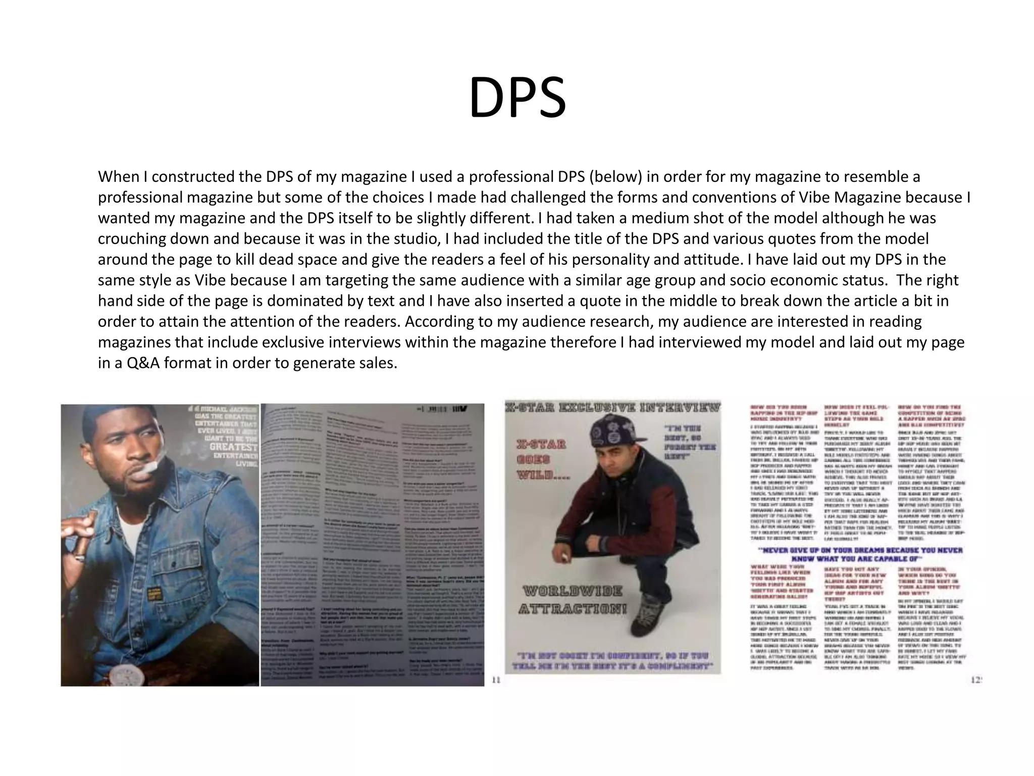
Evaluation Question 1By Shahriyar Choudhury
IntroductionIn what ways does your media product use, develop and challenge forms and conventions of real media products?Whilst I was researching photography from other hip hop magazines such as Vibe and XXL, I had found out how the models dress up and what kinds of props they wear in order to signify their specific genre of music. Another aspect that I had taken into account when I had taken the photo shoots was the location because the mise en scene connotes the genre of music. For my front cover, I had taken the shoot against brick walls which included graffiti because according to my research from UK Tribes I have found out that my target audience are urban therefore I tried to target my audience as closely as possible.  I had used 5 of my friends to model for me, with one medium shot for the front cover, 2 long shots for the contents page and the DPS and I had also taken a wide shot for the contents page to include a variety of camera techniques because this shows that my magazine is following a professional magazine such as Vibe or XXL.I am also going to explain how I followed Vibe Magazine through each stage of production and how I challenged the forms and conventions. Finally, I am also going to explain my opinions on the decisions I made for photography and other parts of the magazine itself.
Front Cover When I constructed the front cover of my magazine, I had followed a similar layout and techniques to Vibe Magazine because according to my audience research, we both have the same target audience. My magazine consists of a skyline which has big and clear writing supported by a red background and a black outline for it to be dominant as well as the masthead and in order for it to be eye catching to the audience. During my research, I also found out that the masthead in every issue of Vibe Magazine is the same size and always dominates the page as well as the main image, therefore when I decided to keep my masthead short and simple I had decided to call it ‘Flava’. I also made the size really big like Vibe so it spreads across the page in order to catch the reader’s eyeline. Once again I decided to change the colour of my masthead to red because it clearly dominates the front page as it stands out on top of a slightly saturated black and white image of the model. When I constructed my sell lines, I spread them across to both sides of the page because it covers the dead space and it stands out with the right colours used above the model and according to issues of Vibe Magazine the sell lines are on both sides and consist of two colours.  After I had constructed the main features of the front cover, I decided to include a competition sign up on the bottom of the page to raise awareness and gain attention because when I researched ideas from my focus group, I found out that they are interested in competitions and interviews with artists. Finally, I decided to make my magazine a bit different because I included a quote from my model to signify to the audience what kind of personality he resembles.
Contents PageWhen I constructed the contents page I used a professional contents page (below) layout in order to make my completed product resemble a professional magazine but I had changed the design and layout slightly to make my magazine to look unique. For the contents page I had taken 2 images of 3 models, which consisted of a long shot and a two shot. I had also used other medium close ups to make my contents page have a mixture of images and text. I had used these shot techniques because it draws attention to the audience and likewise in hip hop magazine all the focus is on the model because they always want to show off how they dress up and what kinds of props they acquire.  I decided to use 4 images for the contents page because it draws attention to the audience. I have laid out my contents page similarly to a Vibe Magazine contents page as shown below because I am targeting the same target audience and this is the magazine which I have followed during each stage of production. The content of my magazine also includes things such as exclusive interviews and hip hop behind the scenes and up to date stories about hip hop because when I conducted my audience research, I had found out that my specific target audience were interested in these exclusive stories and interviews, which will enable them to buy this magazine from shops. As my contents page images show below, I have used various of different locations for my shots for the contents page because it shows what kind of urban world that appeals to the hip hop audience.
DPSWhen I constructed the DPS of my magazine I used a professional DPS (below) in order for my magazine to resemble a professional magazine but some of the choices I made had challenged the forms and conventions of Vibe Magazine because I wanted my magazine and the DPS itself to be slightly different. I had taken a medium shot of the model although he was crouching down and because it was in the studio, I had included the title of the DPS and various quotes from the model around the page to kill dead space and give the readers a feel of his personality and attitude. I have laid out my DPS in the same style as Vibe because I am targeting the same audience with a similar age group and socio economic status.  The right hand side of the page is dominated by text and I have also inserted a quote in the middle to break down the article a bit in order to attain the attention of the readers. According to my audience research, my audience are interested in reading magazines that include exclusive interviews within the magazine therefore I had interviewed my model and laid out my page in a Q&A format in order to generate sales.

Evaluation question 1

  • 1.
    Evaluation Question 1ByShahriyar Choudhury
  • 2.
    IntroductionIn what waysdoes your media product use, develop and challenge forms and conventions of real media products?Whilst I was researching photography from other hip hop magazines such as Vibe and XXL, I had found out how the models dress up and what kinds of props they wear in order to signify their specific genre of music. Another aspect that I had taken into account when I had taken the photo shoots was the location because the mise en scene connotes the genre of music. For my front cover, I had taken the shoot against brick walls which included graffiti because according to my research from UK Tribes I have found out that my target audience are urban therefore I tried to target my audience as closely as possible. I had used 5 of my friends to model for me, with one medium shot for the front cover, 2 long shots for the contents page and the DPS and I had also taken a wide shot for the contents page to include a variety of camera techniques because this shows that my magazine is following a professional magazine such as Vibe or XXL.I am also going to explain how I followed Vibe Magazine through each stage of production and how I challenged the forms and conventions. Finally, I am also going to explain my opinions on the decisions I made for photography and other parts of the magazine itself.
  • 3.
    Front Cover When Iconstructed the front cover of my magazine, I had followed a similar layout and techniques to Vibe Magazine because according to my audience research, we both have the same target audience. My magazine consists of a skyline which has big and clear writing supported by a red background and a black outline for it to be dominant as well as the masthead and in order for it to be eye catching to the audience. During my research, I also found out that the masthead in every issue of Vibe Magazine is the same size and always dominates the page as well as the main image, therefore when I decided to keep my masthead short and simple I had decided to call it ‘Flava’. I also made the size really big like Vibe so it spreads across the page in order to catch the reader’s eyeline. Once again I decided to change the colour of my masthead to red because it clearly dominates the front page as it stands out on top of a slightly saturated black and white image of the model. When I constructed my sell lines, I spread them across to both sides of the page because it covers the dead space and it stands out with the right colours used above the model and according to issues of Vibe Magazine the sell lines are on both sides and consist of two colours. After I had constructed the main features of the front cover, I decided to include a competition sign up on the bottom of the page to raise awareness and gain attention because when I researched ideas from my focus group, I found out that they are interested in competitions and interviews with artists. Finally, I decided to make my magazine a bit different because I included a quote from my model to signify to the audience what kind of personality he resembles.
  • 4.
    Contents PageWhen Iconstructed the contents page I used a professional contents page (below) layout in order to make my completed product resemble a professional magazine but I had changed the design and layout slightly to make my magazine to look unique. For the contents page I had taken 2 images of 3 models, which consisted of a long shot and a two shot. I had also used other medium close ups to make my contents page have a mixture of images and text. I had used these shot techniques because it draws attention to the audience and likewise in hip hop magazine all the focus is on the model because they always want to show off how they dress up and what kinds of props they acquire. I decided to use 4 images for the contents page because it draws attention to the audience. I have laid out my contents page similarly to a Vibe Magazine contents page as shown below because I am targeting the same target audience and this is the magazine which I have followed during each stage of production. The content of my magazine also includes things such as exclusive interviews and hip hop behind the scenes and up to date stories about hip hop because when I conducted my audience research, I had found out that my specific target audience were interested in these exclusive stories and interviews, which will enable them to buy this magazine from shops. As my contents page images show below, I have used various of different locations for my shots for the contents page because it shows what kind of urban world that appeals to the hip hop audience.
  • 5.
    DPSWhen I constructedthe DPS of my magazine I used a professional DPS (below) in order for my magazine to resemble a professional magazine but some of the choices I made had challenged the forms and conventions of Vibe Magazine because I wanted my magazine and the DPS itself to be slightly different. I had taken a medium shot of the model although he was crouching down and because it was in the studio, I had included the title of the DPS and various quotes from the model around the page to kill dead space and give the readers a feel of his personality and attitude. I have laid out my DPS in the same style as Vibe because I am targeting the same audience with a similar age group and socio economic status. The right hand side of the page is dominated by text and I have also inserted a quote in the middle to break down the article a bit in order to attain the attention of the readers. According to my audience research, my audience are interested in reading magazines that include exclusive interviews within the magazine therefore I had interviewed my model and laid out my page in a Q&A format in order to generate sales.