- The respondent conducted a questionnaire to gather feedback on a music magazine concept.
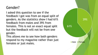
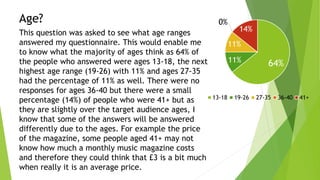
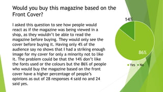
- Results showed the feedback was mostly from males aged 13-18, and most respondents said they would buy the magazine based on the appealing front cover.
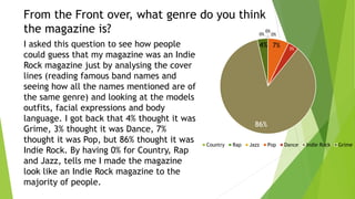
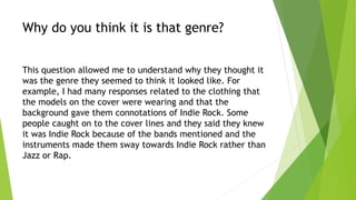
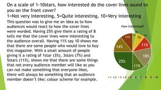
- The majority guessed the genre as indie rock based on the cover details, and rated the cover lines as interesting with a average score of 8 out of 10.
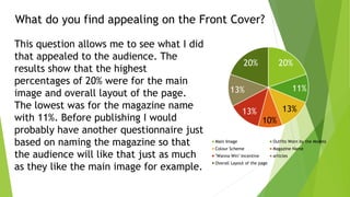
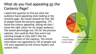
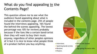
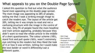
- Respondents found the main image, layout, interviews and behind the scenes articles most appealing aspects of the magazine concept.
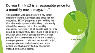
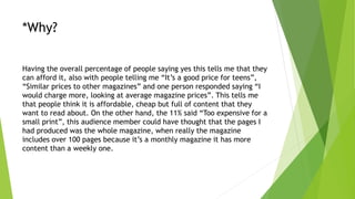
- 89% thought £3 was a reasonable monthly price, seeing it as affordable and comparable to other magazines.