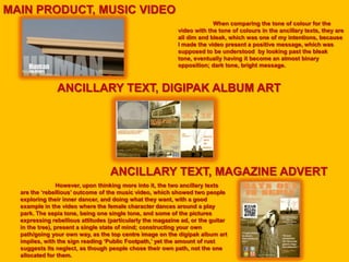
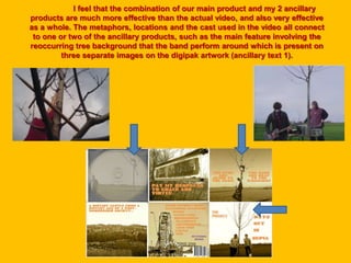
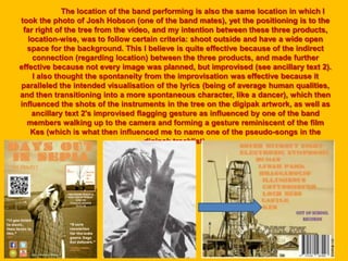
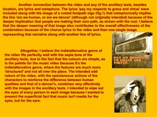
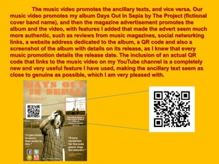
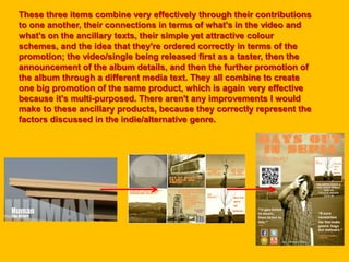
OUT OF SCHOOL
PRODUCTIONS
HOW EFFECTIVE IS THE COMBINATION OF
YOUR MAIN PRODUCT & ANCILLARY
TEXTS
MAIN PRODUCT, MUSIC VIDEO
ANCILLARY TEXT, DIGIPAK ALBUM ART
ANCILLARY TEXT, MAGAZINE ADVERT
However, upon thinking more into it, the two ancillary texts
are the ‘rebellious’ outcome of the music video, which showed two people
exploring their inner dancer, and doing what they want, with a good
example in the video where the female character dances around a play
park. The sepia tone, being one single tone, and some of the pictures
expressing rebellious attitudes (particularly the magazine ad, or the guitar
in the tree), present a single state of mind; constructing your own
path/going your own way, as the top centre image on the digipak album art
implies, with the sign reading ‘Public Footpath,’ yet the amount of rust
suggests its neglect, as though people chose their own path, not the one
allocated for them.
When comparing the tone of colour for the
video with the tone of colours in the ancillary texts, they are
all dim and bleak, which was one of my intentions, because
I made the video present a positive message, which was
supposed to be understood by looking past the bleak
tone, eventually having it become an almost binary
opposition; dark tone, bright message.
I feel that the combination of our main product and my 2 ancillary
products are much more effective than the actual video, and also very effective
as a whole. The metaphors, locations and the cast used in the video all connect
to one or two of the ancillary products, such as the main feature involving the
reoccurring tree background that the band perform around which is present on
three separate images on the digipak artwork (ancillary text 1).
The location of the band performing is also the same location in which I
took the photo of Josh Hobson (one of the band mates), yet the positioning is to the
far right of the tree from the video, and my intention between these three products,
location-wise, was to follow certain criteria: shoot outside and have a wide open
space for the background. This I believe is quite effective because of the indirect
connection (regarding location) between the three products, and made further
effective because not every image was planned, but improvised (see ancillary text 2).
I also thought the spontaneity from the improvisation was effective because it
paralleled the intended visualisation of the lyrics (being of average human qualities,
and then transitioning into a more spontaneous character, like a dancer), which then
influenced the shots of the instruments in the tree on the digipak artwork, as well as
ancillary text 2's improvised flagging gesture as influenced by one of the band
members walking up to the camera and forming a gesture reminiscent of the film
Kes (which is what then influenced me to name one of the pseudo-songs in the
digipak tracklist).
Another connection between the video and any of the ancillary texts, besides
location, are lyrics and metaphors. The lyrics 'pay my respects to grace and virtue' were
included along with the image of a rusted footpath sign (fig.1) that metaphorically implies
the line 'are we human, or are we dancer' (although not originally intended) because of the
deeper implication that people are making their own path, as shown with the rust. I believe
that the deeper meaning of that image also contributes to the overall effectiveness of the
combination because of the chorus lyrics in the video and then one single image
representing that narrative along with another line of lyrics.
Altogether, I believe the indie/alternative genre of
the video fits perfectly well with the sepia tone of the
ancillary texts, due to the fact that the colours are simple, as
is the palette for the music video because it's the
indie/alternative genre, where the features are much more
'structured' and not all over the place. The intended odd
nature of the video, with the spontaneous actions of the
characters to reinforce the difference between human
qualities and that of a dancer's, combines very effectively
with the images in the ancillary texts. I intended to wipe out
the eyes of every person in each image because I wanted to
present the superficial fact that music isn't media for the
eyes, but for the ears.
The music video promotes the ancillary texts, and vice versa. Our
music video promotes my album Days Out In Sepia by The Project (fictional
cover band name), and then the magazine advertisement promotes the
album and the video, with features I added that made the advert seem much
more authentic, such as reviews from music magazines, social networking
links, a website address dedicated to the album, a QR code and also a
screenshot of the album with details on its release, as I knew that every
music promotion details the release date. The inclusion of an actual QR
code that links to the music video on my YouTube channel is a completely
new and very useful feature I have used, making the ancillary text seem as
close to genuine as possible, which I am very pleased with.
These three items combine very effectively through their contributions
to one another, their connections in terms of what's in the video and
what's on the ancillary texts, their simple yet attractive colour
schemes, and the idea that they're ordered correctly in terms of the
promotion; the video/single being released first as a taster, then the
announcement of the album details, and then the further promotion of
the album through a different media text. They all combine to create
one big promotion of the same product, which is again very effective
because it's multi-purposed. There aren't any improvements I would
make to these ancillary products, because they correctly represent the
factors discussed in the indie/alternative genre.

QUESTION 2 MEDIA ANALYSIS

  • 1.
    OUT OF SCHOOL PRODUCTIONS HOWEFFECTIVE IS THE COMBINATION OF YOUR MAIN PRODUCT & ANCILLARY TEXTS
  • 2.
    MAIN PRODUCT, MUSICVIDEO ANCILLARY TEXT, DIGIPAK ALBUM ART ANCILLARY TEXT, MAGAZINE ADVERT However, upon thinking more into it, the two ancillary texts are the ‘rebellious’ outcome of the music video, which showed two people exploring their inner dancer, and doing what they want, with a good example in the video where the female character dances around a play park. The sepia tone, being one single tone, and some of the pictures expressing rebellious attitudes (particularly the magazine ad, or the guitar in the tree), present a single state of mind; constructing your own path/going your own way, as the top centre image on the digipak album art implies, with the sign reading ‘Public Footpath,’ yet the amount of rust suggests its neglect, as though people chose their own path, not the one allocated for them. When comparing the tone of colour for the video with the tone of colours in the ancillary texts, they are all dim and bleak, which was one of my intentions, because I made the video present a positive message, which was supposed to be understood by looking past the bleak tone, eventually having it become an almost binary opposition; dark tone, bright message.
  • 3.
    I feel thatthe combination of our main product and my 2 ancillary products are much more effective than the actual video, and also very effective as a whole. The metaphors, locations and the cast used in the video all connect to one or two of the ancillary products, such as the main feature involving the reoccurring tree background that the band perform around which is present on three separate images on the digipak artwork (ancillary text 1).
  • 4.
    The location ofthe band performing is also the same location in which I took the photo of Josh Hobson (one of the band mates), yet the positioning is to the far right of the tree from the video, and my intention between these three products, location-wise, was to follow certain criteria: shoot outside and have a wide open space for the background. This I believe is quite effective because of the indirect connection (regarding location) between the three products, and made further effective because not every image was planned, but improvised (see ancillary text 2). I also thought the spontaneity from the improvisation was effective because it paralleled the intended visualisation of the lyrics (being of average human qualities, and then transitioning into a more spontaneous character, like a dancer), which then influenced the shots of the instruments in the tree on the digipak artwork, as well as ancillary text 2's improvised flagging gesture as influenced by one of the band members walking up to the camera and forming a gesture reminiscent of the film Kes (which is what then influenced me to name one of the pseudo-songs in the digipak tracklist).
  • 5.
    Another connection betweenthe video and any of the ancillary texts, besides location, are lyrics and metaphors. The lyrics 'pay my respects to grace and virtue' were included along with the image of a rusted footpath sign (fig.1) that metaphorically implies the line 'are we human, or are we dancer' (although not originally intended) because of the deeper implication that people are making their own path, as shown with the rust. I believe that the deeper meaning of that image also contributes to the overall effectiveness of the combination because of the chorus lyrics in the video and then one single image representing that narrative along with another line of lyrics. Altogether, I believe the indie/alternative genre of the video fits perfectly well with the sepia tone of the ancillary texts, due to the fact that the colours are simple, as is the palette for the music video because it's the indie/alternative genre, where the features are much more 'structured' and not all over the place. The intended odd nature of the video, with the spontaneous actions of the characters to reinforce the difference between human qualities and that of a dancer's, combines very effectively with the images in the ancillary texts. I intended to wipe out the eyes of every person in each image because I wanted to present the superficial fact that music isn't media for the eyes, but for the ears.
  • 6.
    The music videopromotes the ancillary texts, and vice versa. Our music video promotes my album Days Out In Sepia by The Project (fictional cover band name), and then the magazine advertisement promotes the album and the video, with features I added that made the advert seem much more authentic, such as reviews from music magazines, social networking links, a website address dedicated to the album, a QR code and also a screenshot of the album with details on its release, as I knew that every music promotion details the release date. The inclusion of an actual QR code that links to the music video on my YouTube channel is a completely new and very useful feature I have used, making the ancillary text seem as close to genuine as possible, which I am very pleased with.
  • 7.
    These three itemscombine very effectively through their contributions to one another, their connections in terms of what's in the video and what's on the ancillary texts, their simple yet attractive colour schemes, and the idea that they're ordered correctly in terms of the promotion; the video/single being released first as a taster, then the announcement of the album details, and then the further promotion of the album through a different media text. They all combine to create one big promotion of the same product, which is again very effective because it's multi-purposed. There aren't any improvements I would make to these ancillary products, because they correctly represent the factors discussed in the indie/alternative genre.