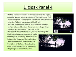
The digipak design choices conform to the notion of a coherent promotional package. Images from the music video are used visually to portray themes of fantasy and coming of age. Each panel corresponds to a scene in the music video to create a narrative link.
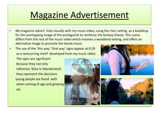
The magazine advertisement uses the river setting from the music video as a backdrop for an overlapping image of the protagonist. Signs referencing "Alice in Wonderland" represent decisions young people face.
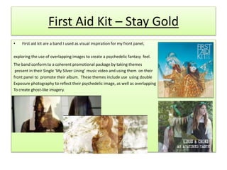
First Aid Kit's album cover inspired the use of overlapping images to create a psychedelic fantasy feel, taking themes from their "My Silver Lining" music video to promote their album coherently.