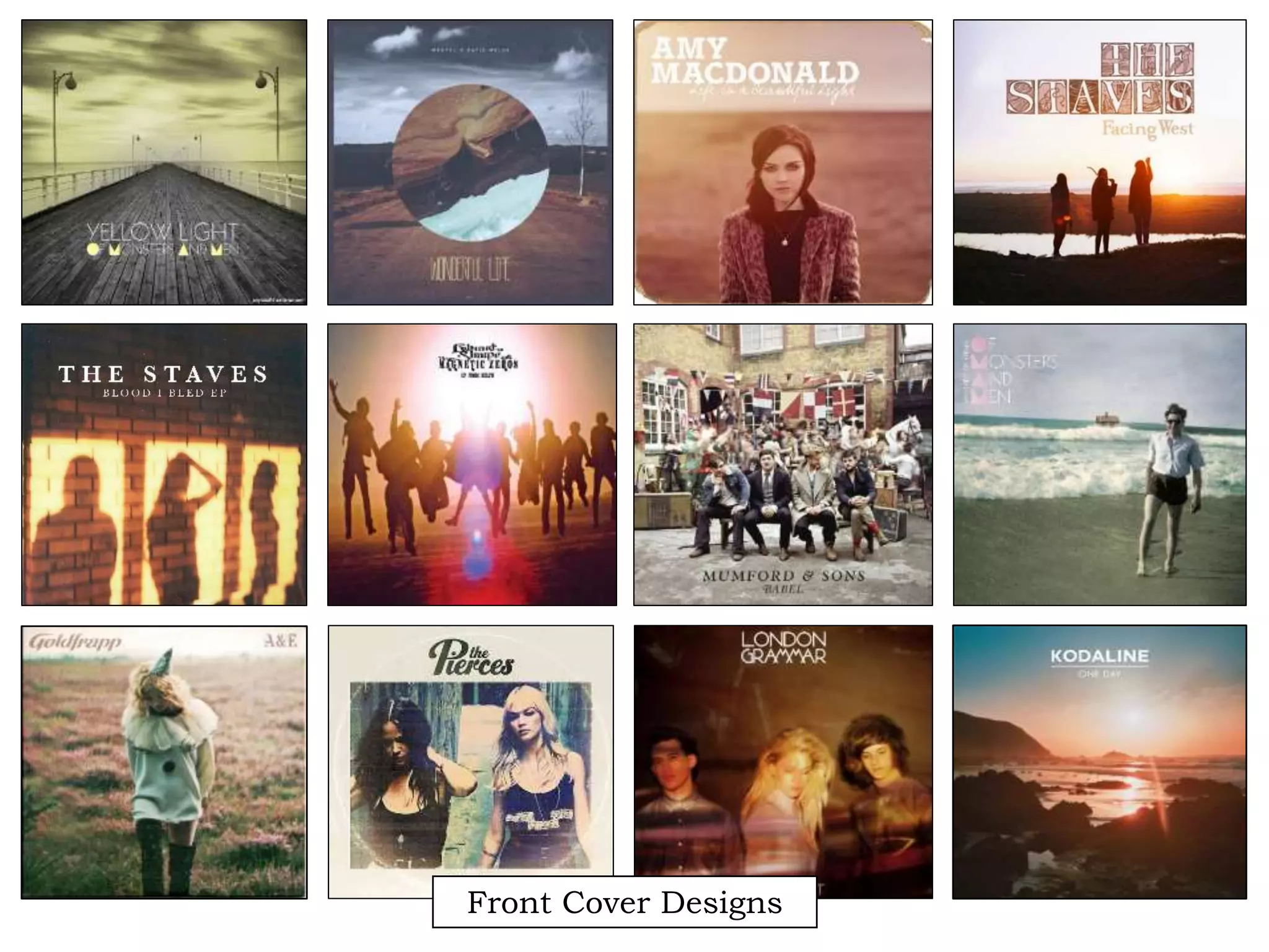
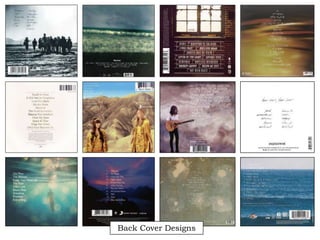
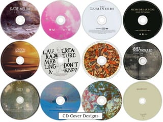
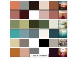
Front Cover Designs
Back Cover Designs
CD Cover Designs
- What have I learned from these designs? -
I researched album covers from artists whose genre is similar to that of the artist I used, Natasha
North: contemporary folk/indie/alternative. The first thing, evident in most designs, are the
slightly faded images, creating an old-soul/vintage look; this could be seen as a convention of the
genre, as folk music is passed through generations, becoming almost timeless, so the images pay
homage to their vintage roots. This also allows the images to feel warm and familiar to the
audience, thus encouraging them to pick up the album and admire the tracks.
A second thing I noticed were the warm, earthy tones frequently used in the covers. I took some
of my favourite covers and created a colour scheme, where a noticed a pattern of warm, autumnal
shades, such as deep browns, reds and greens. Again, this seems to be a convention of the genre
as folk/indie music often feature lyrics traditionally focused on nature and the outdoors; this links
to its stripped back, “natural” roots, where nature helped to shape folk music into what it is today.
Similarly to when I researched music videos of the genre, contemporary folk/indie musicians often
used silhouettes and shadows on their album artwork, highlighted through use of back lighting
and lens flares; again, this creates connotations of nature and warmth, as the sun often acts as the
predominant form of lighting. By using backlighting, the silhouette of the musician stands out
more; the image becomes more dynamic and memorable, catching the eye of any record browser.
Finally, the designs are very stripped down. The back covers are often textured backgrounds or
simple landscapes so not to distract from the track listings. The text is often centred, and the font
is very small and delicate so not to remove from the beautiful simplicity of the designs. On the
covers, the artists name is the centre of attention, written in the largest font; a convention seems to
be having the title written underneath the artist’s name is a far smaller text, in a contrasting font.
Indeed, the name of the artist is often in a more decorated, elaborate font, while the title of the
album/single is in a simple sans serif font face. The stripped down design also transcends onto the
CD covers themselves, often only featuring the name of the artists against a textured background.

Ideas/Moodboard

  • 1.
  • 2.
  • 3.
  • 5.
    - What haveI learned from these designs? - I researched album covers from artists whose genre is similar to that of the artist I used, Natasha North: contemporary folk/indie/alternative. The first thing, evident in most designs, are the slightly faded images, creating an old-soul/vintage look; this could be seen as a convention of the genre, as folk music is passed through generations, becoming almost timeless, so the images pay homage to their vintage roots. This also allows the images to feel warm and familiar to the audience, thus encouraging them to pick up the album and admire the tracks. A second thing I noticed were the warm, earthy tones frequently used in the covers. I took some of my favourite covers and created a colour scheme, where a noticed a pattern of warm, autumnal shades, such as deep browns, reds and greens. Again, this seems to be a convention of the genre as folk/indie music often feature lyrics traditionally focused on nature and the outdoors; this links to its stripped back, “natural” roots, where nature helped to shape folk music into what it is today. Similarly to when I researched music videos of the genre, contemporary folk/indie musicians often used silhouettes and shadows on their album artwork, highlighted through use of back lighting and lens flares; again, this creates connotations of nature and warmth, as the sun often acts as the predominant form of lighting. By using backlighting, the silhouette of the musician stands out more; the image becomes more dynamic and memorable, catching the eye of any record browser. Finally, the designs are very stripped down. The back covers are often textured backgrounds or simple landscapes so not to distract from the track listings. The text is often centred, and the font is very small and delicate so not to remove from the beautiful simplicity of the designs. On the covers, the artists name is the centre of attention, written in the largest font; a convention seems to be having the title written underneath the artist’s name is a far smaller text, in a contrasting font. Indeed, the name of the artist is often in a more decorated, elaborate font, while the title of the album/single is in a simple sans serif font face. The stripped down design also transcends onto the CD covers themselves, often only featuring the name of the artists against a textured background.