Arlind Malat
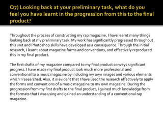
Throughout the process of constructing my rap magazine, I have learnt many things
looking back at my preliminary task. My work has significantly progressed throughout
this unit and Photoshop skills have developed as a consequence.Through the initial
research, I learnt about magazine forms and conventions, and effectively reproduced
this in my final product.
The first drafts of my magazine compared to my final product conveys significant
progress. I have made my final product look much more professional and
conventional to a music magazine by including my own images and various elements
which I researched. Also, it is evident that I have used the research effectively to apply
the forms and conventions of a music magazine to my own magazine. During the
progression from my first drafts to the final product, I gained much knowledge from
the formats that I was using and gained an understanding of a conventional rap
magazine.
Hand-drawn design:
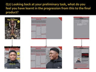
Looking back at my preliminary task, it is clear that I have progressed highly from my
initial hand-drawn design. I have used the same layout that I intended to, and the
codes and conventions that are presented in the hand-drawn design. For example,
the masthead at the top of the front cover is evident in my final magazine.
It is evident that my initial understanding of the codes and conventions required for my magazine cover,
highly progressed towards the final product.The main image of the magazine artist is located at the centre of
the magazine, and takes up most of the front cover.This appeals to my target audience, as it is the first
convention that they will notice which will encourage them to buy the magazine. Looking back at my
preliminary task, I did not conceive for the main image to take up most of the front cover. Furthermore, I
deployed the barcode, date, and price in the same area which I initially used, in my final magazine. Also, the
main cover line and the artist’s name was inspired by my hand-drawn design.Overall, I think that my hand-
drawn design was a key task for the progression of my final product.
Looking back at my hand-drawn design for my contents page, it is clear that I have progressed from my initial
ideas. I have used the structure in more or less the same way, which is conventional to a rap magazine.The
main cover line informing the audience of the contents page is the biggest text in my final product. In my
hand-drawn design, the main cover line was not the same size as the final product, which shows how I
deployed my understanding of conventions in my final magazine. I used borders in my contents page to grant
it a more professional look, and the image that I used was well fitted. As well as this, my ideas of including the
magazine logo as a sticker on my contents page progressed to the final product.This was effective in widening
the magazine’s promotion, as it is made to look more stylistic.
The hand-drawn design for my double page spread was fairly simple, but aided me in the way I structured my
final product. For example, I made clear that I intended to use three columns in my interview, which appealed
to my target audience as it looked professional and tidy.The image was situated on the right hand side of the
page and the pull quote was at the top of the image, which allowed the audience to associate the image with
the pull quote. In general, my double page spread was highly influenced by my hand-drawn design and I learnt
of the different conventions that I can utilize in order for the magazine to appeal to my target audience. For
example, in my final product I included drop caps, which is a conventional way of presenting an interview in an
elegant matter.This shows how I have developed and progressed from my final product.
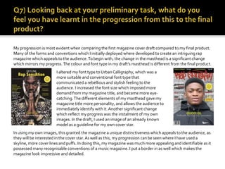
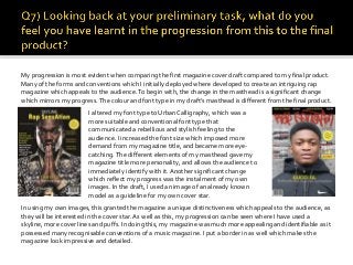
My progression is most evident when comparing the first magazine cover draft compared to my final product.
Many of the forms and conventions which I initially deployed where developed to create an intriguing rap
magazine which appeals to the audience.To begin with, the change in the masthead is a significant change
which mirrors my progress.The colour and font type in my draft’s masthead is different from the final product.
I altered my font type to UrbanCalligraphy, which was a
more suitable and conventional font type that
communicated a rebellious and stylish feeling to the
audience. I increased the font size which imposed more
demand from my magazine title, and became more eye-
catching.The different elements of my masthead gave my
magazine title more personality, and allows the audience to
immediately identify with it. Another significant change
which reflect my progress was the instalment of my own
images. In the draft, I used an image of an already known
model as a guideline for my own cover star.
In using my own images, this granted the magazine a unique distinctiveness which appeals to the audience, as
they will be interested in the cover star. As well as this, my progression can be seen where I have used a
skyline, more cover lines and puffs. In doing this, my magazine was much more appealing and identifiable as it
possessed many recognisable conventions of a music magazine. I put a border in as well which makes the
magazine look impressive and detailed.
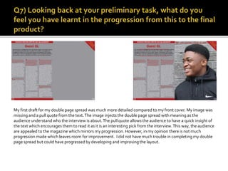
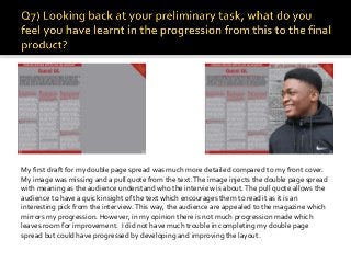
My first draft for my double page spread was much more detailed compared to my front cover.
My image was missing and a pull quote from the text.The image injects the double page spread
with meaning as the audience understand who the interview is about.The pull quote allows the
audience to have a quick insight of the text which encourages them to read it as it is an
interesting pick from the interview. This way, the audience are appealed to the magazine which
mirrors my progression. However, in my opinion there is not much progression made which
leaves room for improvement. I did not have much trouble in completing my double page
spread but could have progressed by developing and improving the layout.
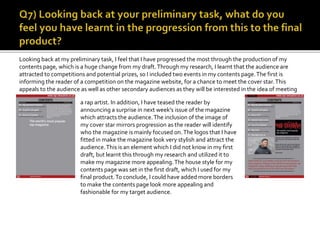
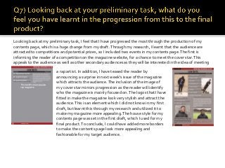
Looking back at my preliminary task, I feel that I have progressed the most through the production of my
contents page, which is a huge change from my draft.Through my research, I learnt that the audience are
attracted to competitions and potential prizes, so I included two events in my contents page.The first is
informing the reader of a competition on the magazine website, for a chance to meet the cover star.This
appeals to the audience as well as other secondary audiences as they will be interested in the idea of meeting
a rap artist. In addition, I have teased the reader by
announcing a surprise in next week’s issue of the magazine
which attracts the audience.The inclusion of the image of
my cover star mirrors progression as the reader will identify
who the magazine is mainly focused on.The logos that I have
fitted in make the magazine look very stylish and attract the
audience.This is an element which I did not know in my first
draft, but learnt this through my research and utilized it to
make my magazine more appealing.The house style for my
contents page was set in the first draft, which I used for my
final product.To conclude, I could have added more borders
to make the contents page look more appealing and
fashionable for my target audience.
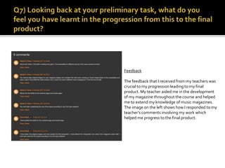
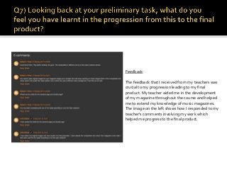
Feedback
The feedback that I received from my teachers was
crucial to my progression leading to my final
product. My teacher aided me in the development
of my magazine throughout the course and helped
me to extend my knowledge of music magazines.
The image on the left shows how I responded to my
teacher’s comments involving my work which
helped me progress to the final product.
Reflection
In conclusion, after look back at my task, I feel I have developed my understanding of the codes and
conventions of a music magazine.This is because I researched the codes and conventions of similar magazines
and deployed my findings in my own work. I have also grown confident with the whole nature of media
production as I had to use different formats and stay open to new findings. I have become more skilled on
formats such as Blogger or Photoshop through the production of my magazine. I can now use different tools
in Photoshop to good effect. I have learnt that forms and conventions can be challenged and developed based
on the sub-genre of a music magazine. For example, a rap magazine compared to a pop magazine will have
different elements and will be identifiable for the audience.A pop magazine will be more colourful and will
have calmer font types compared to a rap magazine. Most importantly, I have learnt that the composition of a
magazines house style is pivotal in giving the magazine its own distinctiveness, which appeals to the audience.
Also, my time management and organisation skills have highly developed as I had to complete a lot of work
within a set time.

AS Media Studies: Evaluation Question 7

  • 1.
  • 2.
    Throughout the processof constructing my rap magazine, I have learnt many things looking back at my preliminary task. My work has significantly progressed throughout this unit and Photoshop skills have developed as a consequence.Through the initial research, I learnt about magazine forms and conventions, and effectively reproduced this in my final product. The first drafts of my magazine compared to my final product conveys significant progress. I have made my final product look much more professional and conventional to a music magazine by including my own images and various elements which I researched. Also, it is evident that I have used the research effectively to apply the forms and conventions of a music magazine to my own magazine. During the progression from my first drafts to the final product, I gained much knowledge from the formats that I was using and gained an understanding of a conventional rap magazine.
  • 4.
    Hand-drawn design: Looking backat my preliminary task, it is clear that I have progressed highly from my initial hand-drawn design. I have used the same layout that I intended to, and the codes and conventions that are presented in the hand-drawn design. For example, the masthead at the top of the front cover is evident in my final magazine.
  • 5.
    It is evidentthat my initial understanding of the codes and conventions required for my magazine cover, highly progressed towards the final product.The main image of the magazine artist is located at the centre of the magazine, and takes up most of the front cover.This appeals to my target audience, as it is the first convention that they will notice which will encourage them to buy the magazine. Looking back at my preliminary task, I did not conceive for the main image to take up most of the front cover. Furthermore, I deployed the barcode, date, and price in the same area which I initially used, in my final magazine. Also, the main cover line and the artist’s name was inspired by my hand-drawn design.Overall, I think that my hand- drawn design was a key task for the progression of my final product.
  • 6.
    Looking back atmy hand-drawn design for my contents page, it is clear that I have progressed from my initial ideas. I have used the structure in more or less the same way, which is conventional to a rap magazine.The main cover line informing the audience of the contents page is the biggest text in my final product. In my hand-drawn design, the main cover line was not the same size as the final product, which shows how I deployed my understanding of conventions in my final magazine. I used borders in my contents page to grant it a more professional look, and the image that I used was well fitted. As well as this, my ideas of including the magazine logo as a sticker on my contents page progressed to the final product.This was effective in widening the magazine’s promotion, as it is made to look more stylistic.
  • 7.
    The hand-drawn designfor my double page spread was fairly simple, but aided me in the way I structured my final product. For example, I made clear that I intended to use three columns in my interview, which appealed to my target audience as it looked professional and tidy.The image was situated on the right hand side of the page and the pull quote was at the top of the image, which allowed the audience to associate the image with the pull quote. In general, my double page spread was highly influenced by my hand-drawn design and I learnt of the different conventions that I can utilize in order for the magazine to appeal to my target audience. For example, in my final product I included drop caps, which is a conventional way of presenting an interview in an elegant matter.This shows how I have developed and progressed from my final product.
  • 9.
    My progression ismost evident when comparing the first magazine cover draft compared to my final product. Many of the forms and conventions which I initially deployed where developed to create an intriguing rap magazine which appeals to the audience.To begin with, the change in the masthead is a significant change which mirrors my progress.The colour and font type in my draft’s masthead is different from the final product. I altered my font type to UrbanCalligraphy, which was a more suitable and conventional font type that communicated a rebellious and stylish feeling to the audience. I increased the font size which imposed more demand from my magazine title, and became more eye- catching.The different elements of my masthead gave my magazine title more personality, and allows the audience to immediately identify with it. Another significant change which reflect my progress was the instalment of my own images. In the draft, I used an image of an already known model as a guideline for my own cover star. In using my own images, this granted the magazine a unique distinctiveness which appeals to the audience, as they will be interested in the cover star. As well as this, my progression can be seen where I have used a skyline, more cover lines and puffs. In doing this, my magazine was much more appealing and identifiable as it possessed many recognisable conventions of a music magazine. I put a border in as well which makes the magazine look impressive and detailed.
  • 10.
    My first draftfor my double page spread was much more detailed compared to my front cover. My image was missing and a pull quote from the text.The image injects the double page spread with meaning as the audience understand who the interview is about.The pull quote allows the audience to have a quick insight of the text which encourages them to read it as it is an interesting pick from the interview. This way, the audience are appealed to the magazine which mirrors my progression. However, in my opinion there is not much progression made which leaves room for improvement. I did not have much trouble in completing my double page spread but could have progressed by developing and improving the layout.
  • 11.
    Looking back atmy preliminary task, I feel that I have progressed the most through the production of my contents page, which is a huge change from my draft.Through my research, I learnt that the audience are attracted to competitions and potential prizes, so I included two events in my contents page.The first is informing the reader of a competition on the magazine website, for a chance to meet the cover star.This appeals to the audience as well as other secondary audiences as they will be interested in the idea of meeting a rap artist. In addition, I have teased the reader by announcing a surprise in next week’s issue of the magazine which attracts the audience.The inclusion of the image of my cover star mirrors progression as the reader will identify who the magazine is mainly focused on.The logos that I have fitted in make the magazine look very stylish and attract the audience.This is an element which I did not know in my first draft, but learnt this through my research and utilized it to make my magazine more appealing.The house style for my contents page was set in the first draft, which I used for my final product.To conclude, I could have added more borders to make the contents page look more appealing and fashionable for my target audience.
  • 12.
    Feedback The feedback thatI received from my teachers was crucial to my progression leading to my final product. My teacher aided me in the development of my magazine throughout the course and helped me to extend my knowledge of music magazines. The image on the left shows how I responded to my teacher’s comments involving my work which helped me progress to the final product.
  • 13.
    Reflection In conclusion, afterlook back at my task, I feel I have developed my understanding of the codes and conventions of a music magazine.This is because I researched the codes and conventions of similar magazines and deployed my findings in my own work. I have also grown confident with the whole nature of media production as I had to use different formats and stay open to new findings. I have become more skilled on formats such as Blogger or Photoshop through the production of my magazine. I can now use different tools in Photoshop to good effect. I have learnt that forms and conventions can be challenged and developed based on the sub-genre of a music magazine. For example, a rap magazine compared to a pop magazine will have different elements and will be identifiable for the audience.A pop magazine will be more colourful and will have calmer font types compared to a rap magazine. Most importantly, I have learnt that the composition of a magazines house style is pivotal in giving the magazine its own distinctiveness, which appeals to the audience. Also, my time management and organisation skills have highly developed as I had to complete a lot of work within a set time.