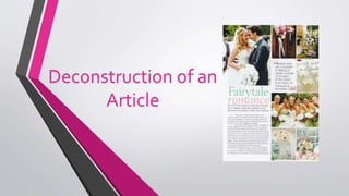
2. Dominant Image
• The Dominant Image on this article is situated in the upper left hand corner of the page, directly above the
article.
• The image is a seemingly candid photo of a newly married couple, gazing into each others eyes.
• The mise-en-scene includes a wedding carriage and some trees/flowers.
• The bride is wearing a wedding dress, veil and has her hair and makeup done. As well as this, she is carrying
a bouquet of flowers.The groom is wearing a (which you cannot see much of due to the angle of the
picture).
• The use of natural lighting gives an authentic look to the image, makes it seem more like a real wedding.
• The image is a mid shot – allowing the audience to see more of their costumes.
• The fact that the image is in full colour adds an exciting, bubbly look to the article.
3. Heading
• The title of this article is ‘Fairytale romance’, which has connotations of happiness and love
– drawing the audience in and making them want to read the article more.
• Pastel colours have been used for the typography.Green and pink are on opposite ends of
the colour wheel and therefore look aesthetically pleasing together.This will draw the
readers eye, making them more likely to want to read on.
• The use of two different fonts will attract the attention of the audience.The font is very
simple, therefore being easy to read.The simplicity of the fonts do not take away from the
rest of the page.The size of the heading is the biggest text on the page and thus standing
out against the rest of the text.
• The Heading is situated directly beneath the dominant image.
4. Strapline
• The strapline is situated directly underneath the heading.
• It is written in a simple ‘arial’ type font, in dark grey.This makes it stand out
against the background and the actual article as it is slightly bigger than the
article font.
• The strapline gives a more personal touch and gives the couple in the
dominant image an identity, making the audience connect to them more
and want to read on.
5. Pull Quote
• On the right hand side of the page, amongst the sub images, is a pull quote from
the article.
• A pull quote will attract the attention of the audience as they will be drawn in by
the quote and want to read the article to provide context for the quote.
• The pull quote is written in the same font as the strapline and is the only writing on
the right side of the page. It is also bigger writing than that of the strapline.
• You can clearly tell that this is a pull quote from the article by the pastel pink
quotation marks that the quote is on top of.
6. Article
• The article on this page is situated on the bottom left side, underneath the heading and
strapline.
• There are subheadings within the article that are written in pastel pink and are bolder than
the rest of the article.This breaks the article up a bit and allows the audience to skip
straight to the bit they are interested in, should they want to do so.
• The rest of the article is written in a dark grey, ‘arial’ type font.This stands out easily against
the background and the subheadings.
• Unlike other magazine articles, there is no intro to this article and there are no columns.
This is possibly because there is not enough room on the page.
7. Sub Images
• All of the sub images are placed on the right side of the page.This adds a clear
structure to the page, making it appear organised and thought-out rather than
cluttered.
• The slight spacing between the pictures give a professional look to the page –
making it look more attractive.
• There is only one image of people, which is the biggest sub image, whilst the rest
are of things/objects you would find at weddings.
• All of these images match the theme well and all tie in with the article.
8. Colour Scheme
• The colour scheme of this article page is clearly pastel green, pastel pink and white.
• There is not an overload of these colours, but instead there are accents of the colours which add
a fresh look to the page.
• The pink can be found in the heading, subheadings, quotation marks and the flowers in the sub
images.
• The green can be found in the headings, bridesmaid dresses and the flowers/greenery in the
images.
• There is a lot of white on the page but not a lot of white space as the images cover that.
• Green and pink are on opposite ends of the colour wheel and therefore look aesthetically
pleasing together.
9. Layout
• There is a clear layout to this article page, which gives a professional look.
• It is very structured and not cluttered, which matches the codes and
conventions of a bridal magazine very well.