AS MEDIA PRODUCTION PORTFOLIO
          EVALUATION

          By Timothy Ogden
My Portfolio Magazine
Focus Group Feedback

  A broadband connection is required
Target User Group
                                     Feedback.
1. Do you think the colours
                                         2. Do you think the layout
  are conventional of the
                                           is conventional of the                  3. Do you think the
           genre?
                                                   genre?                        imagery is correct for
                                                                                        the genre?
                              Yes                                Yes
                              No                                 No                                       Yes
                                                                                                          No


      4. Do you think the                  5.Do you think the fonts
                                                                                        6. Do you think the
   syntax is correct for the                  are correct for the
                                                                                       magazine conveys the
             genre?                                  genre?
                                                                                       correct emotions and
                                                                                     attitudes of the genre?
                               Yes                                    Yes

                               No                                     No                                        Yes
                                                                                                                No
                                           8. Do you think the house
  7. Do you think the it has                style is correct of the
     the correct amount of                           genre?
  information for the genre?

                                                                           Yes
                                   Yes
                                                                           No
                                   No
1. IN WHAT WAYS DOES YOUR MEDIA PRODUCT USE, DEVELOP OR
CHALLENGE FORMS AND CONVENTIONS OF REAL MEDIA PRODUCTS?

                              My product uses several conventions of a real media
                              product of the same genre. For example, the fonts used are
                              san-serif which is typical of the hip hop genre. It also
                              employs the three most popular colours for hip hop
                              magazines: Red, White and Black. The layout could be
                              considered similar to the conventional layout for hip hop
                              magazines, where there is the names of the artists featured
                              in the magazine, rather than their name and a cover line to
                              go with it, which isn't as space efficient. I also developed a
                              logo for my product, utilizing a san-serif and bold text with
                              a square box, which is conventional of the hip hop genre
                              which favours bold and straight edged designs. The
                              imagery I developed and used was digitally modified to
                              show the person in a more dominating stance. This is
                              typical of the hip hop genre, where artists are always shown
                              as dominating and powerful either by their stance or the
                              camera angle. Lighting can also be used to influence the
                              shot to make the artist look more dominant. In the
                              instance of my imagery, I used manipulation to lighten the
                              shot to surreal ranges which gave the impression that the
                              person was dominant and powerful.
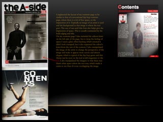
I engineered the layout of my contents page to be
similar to that of conventional hip hop contents
page, where there is a lot of free space, or the
impression of it. Typically an image of an artist is used
and the background in that image is where the text
goes. The use of san-serif thin font also helps give the
impression of space. This is usually contrasted by the
bold edging and title.
On my contents page I also included the editors letter
on the left side of the page, but to keep the feeling of
space I used a glass effect backing which ensured it
didn’t look cramped, but it also separated the editor’s
letter from the rest of the content. I also manipulated
the image of the artist to change the perspective of the
image and make it appear more serene and almost
elegant, which is typical of the hip hop genre and this
theme can be seen on the real world magazines to the
left. I also manipulated the imagery so that there was
blank white space where the text was, which made it
easier to see than if it was overlapping the image.
With my double page spread I used up one page with a large image of an artist, which is conventional of the hip hop genre as
it allows for an image of an artist to be in proportion and allows for a full body shot. On the right hand page I put a large
title, which was more of a sentence than a title but it introduced the article. My article was an interview asking questions, and
the questions were highlighted in red to easier discern them. On the full page image I put a quote from the article which the
artist had said, which is a much used convention. I manipulated the image to suit the tone of the article and interview, which
was a bit darker and less happy. I stuck to the conventions by using bold hard edged styling. I would argue I challenged some
of the conventions by using an image that didn’t necessarily show the artist in a dominant stance, yet it didn’t make the person
appear vulnerable.
2. HOW DOES YOUR PRODUCT REPRESENT PARTICULAR
SOCIAL GROUPS?

My magazine represents the hip hop social group. This is done by using imagery of an
artist of the stereotypical style, such as wearing a branded hooded sweatshirt and
sweatpants. I would argue that my product represents the British hip hop social group
rather than the typical American hip hop group as the persons in my magazine aren’t
black, which is an associated factor with the hip hop social group. The magazine is
intended for the hip hop social group who want an interesting, informative and partially
informal magazine.
3. WHAT KIND OF MEDIA INSTITUTION MIGHT
DISTRIBUTE YOUR MEDIA PRODUCT AND WHY?

I think the only institutions that would distribute my product would
either be a institution that specifically distributed music magazines
or an institution that distributed a broad range of magazines. A
example of such a publisher would be Harris Publications.

Harris Publications already publishes similar hip hop magazines
such as Source and XXL and over 75 other non music
publications. This would allow my magazine to get the correct
media attention it would require to sell properly as a large company
such as Harris Publications will be able to provide sufficient
advertising and distribution.
4. WHO WOULD BE THE AUDIENCE FOR YOUR
MEDIA PRODUCT?
The audience for my media product would be 16 year old teenage boys and girls who
have an interest in the hip hop genre and want an interesting, different, informative and
informal magazine to read that gives them information about the latest events in the hip
hop genre of music. My audience would be predominantly male, which is typical of the
chosen genre but not exclusive to males.
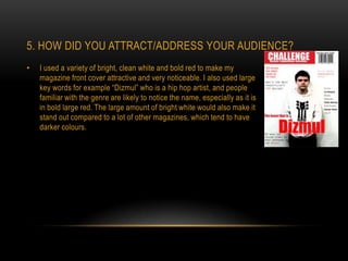
5. HOW DID YOU ATTRACT/ADDRESS YOUR AUDIENCE?
•   I used a variety of bright, clean white and bold red to make my
    magazine front cover attractive and very noticeable. I also used large
    key words for example “Dizmul” who is a hip hop artist, and people
    familiar with the genre are likely to notice the name, especially as it is
    in bold large red. The large amount of bright white would also make it
    stand out compared to a lot of other magazines, which tend to have
    darker colours.
6. WHAT HAVE YOU LEARNT ABOUT
TECHNOLOGIES FROM THE PROCESS OF
CONSTRUCTING THIS PRODUCT?
•   During the process of constructing my media product I learnt how to use several image
    manipulation programs such as Photoshop CS5.5. I also learnt how to use a digital
    camera in a more advanced manner to further enhance the image. I also learnt how to
    use an Apple Mac, which I had no previous experiences with.
7. LOOKING BACK AT YOUR PRELIMINARY
TASK, WHAT DO YOU FEEL YOU HAVE LEARNT
IN THE PROGRESSION FROM IT TO THE FULL
PRODUCT?
During the time in which I constructed my preliminary task and finished constructing my full
    product, I feel I have learnt how to use computer manipulation technologies such as
    Photoshop, and I feel I have also learnt how to effectively use a digital camera. I also
    think I have learnt how to effectively lay out a music magazine and how to set the
    atmosphere with clever manipulation.

Media evaluation final

  • 1.
    AS MEDIA PRODUCTIONPORTFOLIO EVALUATION By Timothy Ogden
  • 2.
  • 3.
    Focus Group Feedback A broadband connection is required
  • 4.
    Target User Group Feedback. 1. Do you think the colours 2. Do you think the layout are conventional of the is conventional of the 3. Do you think the genre? genre? imagery is correct for the genre? Yes Yes No No Yes No 4. Do you think the 5.Do you think the fonts 6. Do you think the syntax is correct for the are correct for the magazine conveys the genre? genre? correct emotions and attitudes of the genre? Yes Yes No No Yes No 8. Do you think the house 7. Do you think the it has style is correct of the the correct amount of genre? information for the genre? Yes Yes No No
  • 5.
    1. IN WHATWAYS DOES YOUR MEDIA PRODUCT USE, DEVELOP OR CHALLENGE FORMS AND CONVENTIONS OF REAL MEDIA PRODUCTS? My product uses several conventions of a real media product of the same genre. For example, the fonts used are san-serif which is typical of the hip hop genre. It also employs the three most popular colours for hip hop magazines: Red, White and Black. The layout could be considered similar to the conventional layout for hip hop magazines, where there is the names of the artists featured in the magazine, rather than their name and a cover line to go with it, which isn't as space efficient. I also developed a logo for my product, utilizing a san-serif and bold text with a square box, which is conventional of the hip hop genre which favours bold and straight edged designs. The imagery I developed and used was digitally modified to show the person in a more dominating stance. This is typical of the hip hop genre, where artists are always shown as dominating and powerful either by their stance or the camera angle. Lighting can also be used to influence the shot to make the artist look more dominant. In the instance of my imagery, I used manipulation to lighten the shot to surreal ranges which gave the impression that the person was dominant and powerful.
  • 6.
    I engineered thelayout of my contents page to be similar to that of conventional hip hop contents page, where there is a lot of free space, or the impression of it. Typically an image of an artist is used and the background in that image is where the text goes. The use of san-serif thin font also helps give the impression of space. This is usually contrasted by the bold edging and title. On my contents page I also included the editors letter on the left side of the page, but to keep the feeling of space I used a glass effect backing which ensured it didn’t look cramped, but it also separated the editor’s letter from the rest of the content. I also manipulated the image of the artist to change the perspective of the image and make it appear more serene and almost elegant, which is typical of the hip hop genre and this theme can be seen on the real world magazines to the left. I also manipulated the imagery so that there was blank white space where the text was, which made it easier to see than if it was overlapping the image.
  • 7.
    With my doublepage spread I used up one page with a large image of an artist, which is conventional of the hip hop genre as it allows for an image of an artist to be in proportion and allows for a full body shot. On the right hand page I put a large title, which was more of a sentence than a title but it introduced the article. My article was an interview asking questions, and the questions were highlighted in red to easier discern them. On the full page image I put a quote from the article which the artist had said, which is a much used convention. I manipulated the image to suit the tone of the article and interview, which was a bit darker and less happy. I stuck to the conventions by using bold hard edged styling. I would argue I challenged some of the conventions by using an image that didn’t necessarily show the artist in a dominant stance, yet it didn’t make the person appear vulnerable.
  • 8.
    2. HOW DOESYOUR PRODUCT REPRESENT PARTICULAR SOCIAL GROUPS? My magazine represents the hip hop social group. This is done by using imagery of an artist of the stereotypical style, such as wearing a branded hooded sweatshirt and sweatpants. I would argue that my product represents the British hip hop social group rather than the typical American hip hop group as the persons in my magazine aren’t black, which is an associated factor with the hip hop social group. The magazine is intended for the hip hop social group who want an interesting, informative and partially informal magazine.
  • 9.
    3. WHAT KINDOF MEDIA INSTITUTION MIGHT DISTRIBUTE YOUR MEDIA PRODUCT AND WHY? I think the only institutions that would distribute my product would either be a institution that specifically distributed music magazines or an institution that distributed a broad range of magazines. A example of such a publisher would be Harris Publications. Harris Publications already publishes similar hip hop magazines such as Source and XXL and over 75 other non music publications. This would allow my magazine to get the correct media attention it would require to sell properly as a large company such as Harris Publications will be able to provide sufficient advertising and distribution.
  • 10.
    4. WHO WOULDBE THE AUDIENCE FOR YOUR MEDIA PRODUCT? The audience for my media product would be 16 year old teenage boys and girls who have an interest in the hip hop genre and want an interesting, different, informative and informal magazine to read that gives them information about the latest events in the hip hop genre of music. My audience would be predominantly male, which is typical of the chosen genre but not exclusive to males.
  • 11.
    5. HOW DIDYOU ATTRACT/ADDRESS YOUR AUDIENCE? • I used a variety of bright, clean white and bold red to make my magazine front cover attractive and very noticeable. I also used large key words for example “Dizmul” who is a hip hop artist, and people familiar with the genre are likely to notice the name, especially as it is in bold large red. The large amount of bright white would also make it stand out compared to a lot of other magazines, which tend to have darker colours.
  • 12.
    6. WHAT HAVEYOU LEARNT ABOUT TECHNOLOGIES FROM THE PROCESS OF CONSTRUCTING THIS PRODUCT? • During the process of constructing my media product I learnt how to use several image manipulation programs such as Photoshop CS5.5. I also learnt how to use a digital camera in a more advanced manner to further enhance the image. I also learnt how to use an Apple Mac, which I had no previous experiences with.
  • 13.
    7. LOOKING BACKAT YOUR PRELIMINARY TASK, WHAT DO YOU FEEL YOU HAVE LEARNT IN THE PROGRESSION FROM IT TO THE FULL PRODUCT? During the time in which I constructed my preliminary task and finished constructing my full product, I feel I have learnt how to use computer manipulation technologies such as Photoshop, and I feel I have also learnt how to effectively use a digital camera. I also think I have learnt how to effectively lay out a music magazine and how to set the atmosphere with clever manipulation.