Q magazine analysis
•Download as PPTX, PDF•
1 like•146 views
This document analyzes the front cover of a music magazine called Q Magazine. It summarizes the different elements of the cover design including the masthead, main image and caption, cover lines, language and pull quote, and overall layout and design. The analysis notes that the masthead grabs attention, the main image and caption are clear and appropriate for the featured artist, and the cover lines intrigue the reader without revealing too much. It also comments that the layout follows a conventional music magazine formula and the design and colors used make the cover visually appealing and organized.
Report
Share
Report
Share

Recommended
Analysis of contents page
The document summarizes the contents page of Analyse Music Magazine. It notes that various text sizes and colors are used to highlight important articles. The main colors used - green, black, and blue - are balanced and don't clash. A chart listing contents is a unique design choice. Images are clear and not overcrowded. Consistency is shown across page numbers and articles. The colors and inclusion of a boy band are aimed at the target audience of teenage girls. Highlighting draws readers to important text. Overall, the design pulls the reader in and makes them want to read more.
Presentatieon23
The document discusses the target audience and design approach for a magazine. It aims the magazine at young teenagers through colorful, stylish design. On the cover, it features a happy artist image and headings for free music to attract musically-interested youth. Inside, it uses bright colors, chunky fonts, and quotes to engage younger readers in an upbeat way through the contents, articles, and overall design. The goal is to appeal to teenagers through an easy to navigate, inspiring look.
Analysis of contents pages magazines
The document analyzes the contents page of a Billboard Magazine. It notes the use of different fonts, sizes, and colors to draw attention to important articles and sections. Blue, black, and grey are used consistently to keep the style neutral without being too basic. Images and page numbers are used clearly and sparingly to avoid overcrowding. The layout and design helps showcase articles and is tailored to the target teenage girl audience.
Presentatieon23
The document discusses the design choices made for a magazine aimed at attracting a young teenage audience. Bright colors, bold fonts, and playful headings are used throughout the cover, masthead, headlines, and contents page to appeal visually to younger readers. The contents page also advertises free music downloads, recognizing that teenagers may not have money to purchase music. Within articles, large quotes stand out among colorful, simple text. The overall magazine style is crafted to provide an upbeat, inspirational look that allows teenage readers to escape from homework.
Music magazine
This document analyzes and summarizes the key elements of various magazine covers, including:
1) It discusses the use of colors, photos, and captions on magazine covers to attract readers and convey the type of content inside. Red, in particular, is often used to make the cover stand out.
2) Short captions and headlines are used to entice readers and give them a sense of what articles and celebrities will be featured without revealing too much.
3) Design choices like fonts, layouts, and color schemes help communicate the intended audience for different magazines. Masculine versus feminine styles, and genres like music and fashion, have distinguishing visual traits.
Attracting and Addressing Audience - Imogen
The document discusses the design choices made for a magazine aimed at young female readers. Pastel colors and images of female celebrities are used to attract the target audience. The cover promises exclusive celebrity content like learning Katy Perry's daily routine. Inside, contests and advice columns provide interactive elements. Images and layouts aim to seem fun and appeal to the typical interests of the audience.
Presentatieon23
The document discusses the design choices made for a magazine aimed at attracting a young teenage audience. Bright colors, bold fonts, and colorful headlines were used on the cover to appeal to younger readers. The contents page and articles also use simple, colorful layouts and large quotes to maintain interest. Free music downloads and an affordable £2.50 price point were included to make the magazine accessible to teenagers who may have limited budgets. The overall design emphasizes an upbeat, engaging style appropriate for teens.
Double page spread ppt
The document discusses the layout and design elements of magazine spreads featuring Lady Gaga and the band The Teenagers. Specifically:
1) Large or differently sized text is used to draw the reader's eye to key information like article topics, interview sections, and website addresses.
2) Images take up full pages to make their subjects the clear focus, and casual, informal photos appeal to younger audiences.
3) Varied fonts, colors, and visual effects like torn edges make the spreads more interesting and keep readers engaged.
Powerpoint question 5
The document discusses design elements used for a magazine, including using bold colors like red, yellow, and blue to catch readers' attention, including striking images of pop stars and festivals, and using short memorable phrases. Layout is designed to be easy to read with a consistent masthead, well-displayed grid formation, and columned text with pull-quotes. The target audience and design aims to appear fun, entertaining and engage the reader.
LIIAR
This magazine targets teenage girls aged 12-17. It uses bright colors, fun fonts, and images of popular celebrities like One Direction on the cover to attract its young audience. The masthead, features, and other elements are designed to pop out and grab readers' attention quickly. The double page spread profiles One Direction's career journey since their X Factor appearance in 2010. Images and a timeline are used to summarize their success over the past four years. The overall design aims to promote positivity and happiness to please fans and build loyalty to the artists featured.
Music magazine research
The document summarizes the key design elements of a music magazine cover. It uses a large medium shot of Justin Bieber as the main image to attract customers since he is a popular pop star. Color is used throughout the cover to make it more eye-catching and associate different colors with images and text. The masthead uses colorful and bold fonts to make it stand out from other magazines and be easily identifiable from a distance. Shapes are also used to attract the target teenage and younger audience through fun designs that relate to the attitudes of pop stars.
Magazine homepage analysis
The document discusses the design choices of the homepage for the magazine Seventeen. It aims its content at young teenage girls, as evidenced by its use of the colors pink and purple, informal language, focus on beauty and fashion tips, and framing of women as objects that must be beautiful. These design elements are meant to appeal to and engage the target demographic. The masthead uses a serif font to seem formal and credible, while also incorporating san serif fonts to seem casual. Overall the document analyzes how the visual design, language, and framing of content are strategically crafted to appeal to and attract teenage female readers.
Contents page analysis
The document summarizes the contents page of a pop music magazine. It describes several large images of pop artists dressed in colorful costumes and hairstyles. The images are accompanied by dramatic quotes to entice readers to specific pages. Page numbers are in bold pink colors for easy navigation. Borders and colors create an elaborate and vibrant style representing the magazine's brand. Images of major pop stars like Katy Perry and Justin Bieber are intended to draw in older teenage readers by having the artists look directly at the camera to make readers feel targeted.
Draft analysis
The document discusses the layout and design choices for a Christmas edition of a teen pop magazine called "Scenes". It describes designing the front cover with a large bold title, snowflakes, and popular artists to attract a young audience. It also summarizes planning the contents page with colors and images consistent with the front cover. Finally, it outlines a double page spread with a large celebrity image on the left and full interview text on the right for simplicity and impact. The goal is to emulate typical magazine styles while appropriately representing artists for a young demographic.
Spin magazine text analysis
The masthead is positioned on the left side to draw the reader's eyes to it first. It is short and blue to be memorable and convey mystery. The main image on the cover is a close-up in black and white to make facial features prominent and text stand out against an indie theme. Sell lines are in blue and harder to read, with clarifying text in white, encouraging readers to learn more and buy the magazine. The contents page uses simple colors and font to clearly list pieces to engage readers and drive sales.
Question 5
The document describes how the magazine attracts and addresses its target audience of young teenage girls through its design elements. The contents page uses bold colors and a large picture to draw attention. Social media links make the magazine feel current. The double page spread contrasts pink and gray text for emphasis. The cover photo gives a sense of intimacy while various articles cater to different interests within the target demographic. Bright colors and a relaxed aesthetic create a girly feel suitable for teenage girls.
Evaluation Question 5
The document summarizes how the author attracted their audience for a magazine through various design techniques in Photoshop. Some key techniques included using eye-catching fonts, colors, and images that would appeal to the target audience. For example, images of popular artists like Harry Styles were included to draw interest from the audience. The first three main pages were kept simple with limited text to attract readers to want to buy the magazine.
Drawn draft analysis
This document provides details on the design of the cover of a fictional teen music magazine called "Sound Burst". It discusses elements like the masthead, main image, cover lines, skyline, pugs, and main cover line. The masthead uses a sans serif font in shades of pink to appeal to older teenage girls. The main image will be a medium close-up photo of a model representing the featured artist, using props to emphasize the music genre. Cover lines and pugs aim to attract teenage readers through references to popular artists, reviews, and a free iTunes voucher.
Analysis of 'blues matters'
The magazine cover uses blue and gold colors that connect it to blues music and make it look sophisticated. A photo of a black man represents the origins of blues in black culture. Large text advertising an interview draws readers in. Inside, pages use white space and contrasting colors well. Photos feature blues musicians to reinforce the genre. Formal but inclusive language and detailed content sections aim to engage and inform readers. Overall the design successfully brands the magazine about blues in a stylish way.
Contnets page analysis
This magazine targets younger children who regularly listen to pop music. The layout uses bright pink and white colors with easy to read fonts. Pictures and varied page numbers break up the text and make the articles easier to find. The informal colors, fonts, and images connote fun and appeal to the target audience. The language is informal with slang to seem relaxed. The brand identity is instantly recognizable through the consistent use of girly pink and yellow colors, informal fonts, and child-friendly language throughout the magazine.
Question 5
The document discusses a magazine and interviews conducted about its design. The interviews found that changing the title color from blue to red improved how well it linked to the magazine's color scheme. Interviewees also said the title on the front cover was the most attractive part because it's the first thing seen when browsing magazines on a shelf. The interviews provided feedback on good and bad aspects to help improve the magazine.
Task3 smash hits analysis
This magazine cover targets 10-15 year olds. It uses bright, fun colors like pink and features many male artists to attract its primarily female audience. The cover is cluttered with images and text scattered across the page rather than following traditional layout rules, mirroring how busy a teenager's life may feel. The main cover line anchors with an image of singer Shayne Ward, drawing the most attention to promote his story inside.
All 3 deconstructions
This document contains analyses of magazine covers and contents pages from music magazines such as NME, The Fly, Clash, and Spin. The analyses note design elements that attract audiences such as large eye-catching images, bold colorful fonts for titles, and organized layouts with clear navigation. Photographs are described as captivating due to facial expressions or production elements. Text is generally organized into columns for readability. Overall the document evaluates how magazine covers and contents pages use visual design and text elements to engage and inform audiences.
Genre research
The document discusses key components of the pop music genre that the author will focus on for their genre research project, including colors, font, lighting, and costume. Specifically:
Colors in pop magazines typically include bright pinks, blues, reds, and yellows to convey feelings of happiness and energy. Fonts aim to be fun, exciting, and stand out using effects like bubbles or slants. Lighting is usually bright with a white background to make covers pop visually. Costumes are generally simple and in bright colors so as not to distract from the main photo on the cover.
My average reader
My Average Reader is a 16-24 year old student studying creative subjects like art, music, or design who enjoys spending time with friends and views music as a large part of their life. They own an iPod/iPhone, wear casual clothes like skinny jeans and band t-shirts, shop at stores like Urban Outfitters and H&M, likely play an instrument, blog on Tumblr, and enjoy indie films.
O ingenuo
O documento apresenta um resumo do livro "O Ingênuo" de Voltaire, descrevendo como o prior de Nossa Senhora da Montanha e sua irmã encontram um jovem hurão enquanto passeavam à beira-mar e ficam intrigados com seu comportamento educado e curiosidade sobre a França, apesar de sua aparência selvagem.
Magazine front cover 3
The front cover of Total Film magazine features the title in large, bold font across the top in white against a blue background. The cover image shows Sherlock Holmes standing in a foggy setting in period costume, with a subtle smile that intrigues the viewer about the character and film. The caption below in blue and white calls the film a "World Exclusive" and promises that "All the elements are coming together" to build mystery and intrigue around the narrative. Overall the cover uses striking visual design and teasing text to attract audiences interested in films like Sherlock Holmes.
Fambond insights
A social networking application for Android and iOS users to make and share better experiences with their families on a daily basis. The App intends to fill the gap of transactions missed by Whatsapp.
“Families and friends share a bond, which should be well understood. This natural experiences releases a need to increase relationship based experience on smartphones.”
More Related Content
What's hot
Powerpoint question 5
The document discusses design elements used for a magazine, including using bold colors like red, yellow, and blue to catch readers' attention, including striking images of pop stars and festivals, and using short memorable phrases. Layout is designed to be easy to read with a consistent masthead, well-displayed grid formation, and columned text with pull-quotes. The target audience and design aims to appear fun, entertaining and engage the reader.
LIIAR
This magazine targets teenage girls aged 12-17. It uses bright colors, fun fonts, and images of popular celebrities like One Direction on the cover to attract its young audience. The masthead, features, and other elements are designed to pop out and grab readers' attention quickly. The double page spread profiles One Direction's career journey since their X Factor appearance in 2010. Images and a timeline are used to summarize their success over the past four years. The overall design aims to promote positivity and happiness to please fans and build loyalty to the artists featured.
Music magazine research
The document summarizes the key design elements of a music magazine cover. It uses a large medium shot of Justin Bieber as the main image to attract customers since he is a popular pop star. Color is used throughout the cover to make it more eye-catching and associate different colors with images and text. The masthead uses colorful and bold fonts to make it stand out from other magazines and be easily identifiable from a distance. Shapes are also used to attract the target teenage and younger audience through fun designs that relate to the attitudes of pop stars.
Magazine homepage analysis
The document discusses the design choices of the homepage for the magazine Seventeen. It aims its content at young teenage girls, as evidenced by its use of the colors pink and purple, informal language, focus on beauty and fashion tips, and framing of women as objects that must be beautiful. These design elements are meant to appeal to and engage the target demographic. The masthead uses a serif font to seem formal and credible, while also incorporating san serif fonts to seem casual. Overall the document analyzes how the visual design, language, and framing of content are strategically crafted to appeal to and attract teenage female readers.
Contents page analysis
The document summarizes the contents page of a pop music magazine. It describes several large images of pop artists dressed in colorful costumes and hairstyles. The images are accompanied by dramatic quotes to entice readers to specific pages. Page numbers are in bold pink colors for easy navigation. Borders and colors create an elaborate and vibrant style representing the magazine's brand. Images of major pop stars like Katy Perry and Justin Bieber are intended to draw in older teenage readers by having the artists look directly at the camera to make readers feel targeted.
Draft analysis
The document discusses the layout and design choices for a Christmas edition of a teen pop magazine called "Scenes". It describes designing the front cover with a large bold title, snowflakes, and popular artists to attract a young audience. It also summarizes planning the contents page with colors and images consistent with the front cover. Finally, it outlines a double page spread with a large celebrity image on the left and full interview text on the right for simplicity and impact. The goal is to emulate typical magazine styles while appropriately representing artists for a young demographic.
Spin magazine text analysis
The masthead is positioned on the left side to draw the reader's eyes to it first. It is short and blue to be memorable and convey mystery. The main image on the cover is a close-up in black and white to make facial features prominent and text stand out against an indie theme. Sell lines are in blue and harder to read, with clarifying text in white, encouraging readers to learn more and buy the magazine. The contents page uses simple colors and font to clearly list pieces to engage readers and drive sales.
Question 5
The document describes how the magazine attracts and addresses its target audience of young teenage girls through its design elements. The contents page uses bold colors and a large picture to draw attention. Social media links make the magazine feel current. The double page spread contrasts pink and gray text for emphasis. The cover photo gives a sense of intimacy while various articles cater to different interests within the target demographic. Bright colors and a relaxed aesthetic create a girly feel suitable for teenage girls.
Evaluation Question 5
The document summarizes how the author attracted their audience for a magazine through various design techniques in Photoshop. Some key techniques included using eye-catching fonts, colors, and images that would appeal to the target audience. For example, images of popular artists like Harry Styles were included to draw interest from the audience. The first three main pages were kept simple with limited text to attract readers to want to buy the magazine.
Drawn draft analysis
This document provides details on the design of the cover of a fictional teen music magazine called "Sound Burst". It discusses elements like the masthead, main image, cover lines, skyline, pugs, and main cover line. The masthead uses a sans serif font in shades of pink to appeal to older teenage girls. The main image will be a medium close-up photo of a model representing the featured artist, using props to emphasize the music genre. Cover lines and pugs aim to attract teenage readers through references to popular artists, reviews, and a free iTunes voucher.
Analysis of 'blues matters'
The magazine cover uses blue and gold colors that connect it to blues music and make it look sophisticated. A photo of a black man represents the origins of blues in black culture. Large text advertising an interview draws readers in. Inside, pages use white space and contrasting colors well. Photos feature blues musicians to reinforce the genre. Formal but inclusive language and detailed content sections aim to engage and inform readers. Overall the design successfully brands the magazine about blues in a stylish way.
Contnets page analysis
This magazine targets younger children who regularly listen to pop music. The layout uses bright pink and white colors with easy to read fonts. Pictures and varied page numbers break up the text and make the articles easier to find. The informal colors, fonts, and images connote fun and appeal to the target audience. The language is informal with slang to seem relaxed. The brand identity is instantly recognizable through the consistent use of girly pink and yellow colors, informal fonts, and child-friendly language throughout the magazine.
Question 5
The document discusses a magazine and interviews conducted about its design. The interviews found that changing the title color from blue to red improved how well it linked to the magazine's color scheme. Interviewees also said the title on the front cover was the most attractive part because it's the first thing seen when browsing magazines on a shelf. The interviews provided feedback on good and bad aspects to help improve the magazine.
Task3 smash hits analysis
This magazine cover targets 10-15 year olds. It uses bright, fun colors like pink and features many male artists to attract its primarily female audience. The cover is cluttered with images and text scattered across the page rather than following traditional layout rules, mirroring how busy a teenager's life may feel. The main cover line anchors with an image of singer Shayne Ward, drawing the most attention to promote his story inside.
All 3 deconstructions
This document contains analyses of magazine covers and contents pages from music magazines such as NME, The Fly, Clash, and Spin. The analyses note design elements that attract audiences such as large eye-catching images, bold colorful fonts for titles, and organized layouts with clear navigation. Photographs are described as captivating due to facial expressions or production elements. Text is generally organized into columns for readability. Overall the document evaluates how magazine covers and contents pages use visual design and text elements to engage and inform audiences.
Genre research
The document discusses key components of the pop music genre that the author will focus on for their genre research project, including colors, font, lighting, and costume. Specifically:
Colors in pop magazines typically include bright pinks, blues, reds, and yellows to convey feelings of happiness and energy. Fonts aim to be fun, exciting, and stand out using effects like bubbles or slants. Lighting is usually bright with a white background to make covers pop visually. Costumes are generally simple and in bright colors so as not to distract from the main photo on the cover.
What's hot (16)
Viewers also liked
My average reader
My Average Reader is a 16-24 year old student studying creative subjects like art, music, or design who enjoys spending time with friends and views music as a large part of their life. They own an iPod/iPhone, wear casual clothes like skinny jeans and band t-shirts, shop at stores like Urban Outfitters and H&M, likely play an instrument, blog on Tumblr, and enjoy indie films.
O ingenuo
O documento apresenta um resumo do livro "O Ingênuo" de Voltaire, descrevendo como o prior de Nossa Senhora da Montanha e sua irmã encontram um jovem hurão enquanto passeavam à beira-mar e ficam intrigados com seu comportamento educado e curiosidade sobre a França, apesar de sua aparência selvagem.
Magazine front cover 3
The front cover of Total Film magazine features the title in large, bold font across the top in white against a blue background. The cover image shows Sherlock Holmes standing in a foggy setting in period costume, with a subtle smile that intrigues the viewer about the character and film. The caption below in blue and white calls the film a "World Exclusive" and promises that "All the elements are coming together" to build mystery and intrigue around the narrative. Overall the cover uses striking visual design and teasing text to attract audiences interested in films like Sherlock Holmes.
Fambond insights
A social networking application for Android and iOS users to make and share better experiences with their families on a daily basis. The App intends to fill the gap of transactions missed by Whatsapp.
“Families and friends share a bond, which should be well understood. This natural experiences releases a need to increase relationship based experience on smartphones.”
3.14+ +revised biomass+energy
This document outlines a lesson plan on biomass energy. It begins with an introduction defining biomass as plant or animal matter that can be burned for energy. It then provides quick facts on biomass, including that over 1 billion people rely on wood as an energy source. The major sources of biomass are identified as wood, manure, crops, and crop residues/wastes. Biofuels such as ethanol, biodiesel, and biogas are introduced. The pros and cons of biomass energy are then discussed, with pros including being renewable and reducing greenhouse gases, and cons such as potential health hazards, deforestation, impacts on biodiversity from monoculture agriculture, and inefficient energy inputs.
Edt 620 app project draft (3)
The document reviews 12 different educational apps for various grade levels and subject areas. It provides brief descriptions of each app, including the grades and subjects it covers, whether it provides student feedback or aligns with standards, and how it can be used specifically (e.g. for learning to read, assessment, or remediation). Many of the apps aim to develop higher-order thinking skills and allow for differentiation. Privacy levels and ease of use are also noted for each app.
Presentation1
This is a document titled "Final Copy Of Front Cover." It appears to be the final draft of a front cover or title page for a publication, but no other details are provided in the single line of text.
SRK
Michael Jordan has been an inspiration to many for over 20 years through his incredible basketball career and accomplishments. As one of the greatest players of all time, Jordan dominated the NBA and led the Chicago Bulls to 6 championships throughout the 1990s with his unmatched talent, competitive drive, and will to win. His iconic status and success on the court has motivated fans and athletes worldwide for over two decades.
Career Portfolio
This career portfolio contains sections showcasing Krysta Kramer's resume, letters of recommendation, samples of work in Microsoft programs, volunteer history, award letters, references, and a conclusion slide. The introduction explains that the portfolio displays the skills and abilities Krysta has gained as a student focusing on advertising and marketing, with goals of obtaining a top marketing/advertising position and applying skills and knowledge to help others.
Viewers also liked (15)
Similar to Q magazine analysis
Mt t1-a
This document analyzes the cover design of various music magazines. It discusses elements like the use of prominent images of iconic artists to attract readers, colorful mastheads and headers that stand out, teaser text and graphics to promote articles and competitions, and consistent color schemes and layouts that make information easily scannable. Overall it examines how magazine covers use visual design features to attract audiences and promote the content within.
Front page analysis
The front cover of 'RWD' magazine features two popular artists to attract readers' attention. A major music label, Def Jam, is prominently displayed as a sponsor. The artists appear to be facing off against each other to engage consumers. Dark colors and serious expressions convey the magazine's focus on intense music topics. Microphones in the artists' hands further indicate the emphasis on music. The layout differs from most magazines by using a city background and focusing on the artists rather than listing contents. This projects confidence and individuality.
Med
The document analyzes magazine covers and contents pages. It summarizes the key design elements used in different magazines, including photographs, color schemes, placement of images and text, and how these elements appeal to audiences and convey information. Elements like the rule of thirds, prominent images, and high contrast are discussed.
Researching and analysing magazines
The document analyzes and compares the front covers, contents pages, and double page spreads of three music magazines: Kerrang!, NME, and Rock Sound. It examines the layout, house style, use of images, writing and other design elements for each magazine. Overall, Kerrang! uses bold colors and designs that represent rock music. NME has a simpler, newspaper-inspired style. Rock Sound has a basic design that establishes itself through consistent fonts and colors associated with rock.
Analysing 3 magazine covers
The document analyzes 3 magazine covers. It summarizes each cover's key elements including the header, masthead, main image, main sell line, barcode/price, and additional details. For each cover, it describes design elements like fonts, colors, images and their purpose in attracting the intended audience for each magazine's genre of music.
Analyising music magazines
The document discusses the design elements of various magazine covers and contents pages. Key points analyzed include mastheads, color schemes, foreground images, callouts, and layouts. Across the examples, effective design is shown to attract readers through bold fonts, prominent icons, and visually appealing compositions that highlight important information. Younger audiences are particularly drawn to edgier, contrasting designs that portray subjects in a raw or unconventional light. Overall organization and consistency of branding is important to guide readers through content in a simple yet engaging manner.
AS Level Music Magazine Analysis
The document provides details about the layout, design elements, and intended messaging of various magazine covers and pages. It analyzes aspects like mastheads, fonts, color schemes, images, pull quotes, and section headings to understand how they are used to target specific audiences and convey information. For example, a Q magazine cover uses a bold masthead, white font, and primary colors to seem recognizable and appeal to both genders. The layout focuses attention on the central image of the band Foals to highlight them as the main feature.
Textanalysis
The document provides information about the target audience and design elements of Q Magazine. It describes Chris, a fictional 29-year-old man from Leeds who represents Q Magazine's target reader. It also provides demographic information, stating that 71.8% of readers are ABC1, mostly 34 years old and employed. The document then analyzes various design elements of Q Magazine covers and interior pages, including the masthead, images, headlines, fonts, and layouts. It examines how these elements are designed to attract Q Magazine's target audience.
Front cover analysis.
The front cover of the magazine features a close-up photo of Florence Welch with vibrant makeup drawing attention to her eyes. The simple layout and structured typography aim to appear mature. Secondary images and sell lines about artists like Skrillex are used to entice buyers. The main photo of Welch has been heavily airbrushed to look flawless and portray purity, in line with the magazine's image.
Magazine front cover analysis
The document analyzes the conventions and design elements used across the front covers of several professional music magazines. Key elements included are the masthead at the top identifying the magazine title, skylines with advertisements, main cover lines introducing the cover star or theme, quotes and incentives to engage readers, and issue information in small text at the bottom. Across the magazines analyzed, common techniques are using bold colors and fonts that stand out, informal language to appeal to younger audiences, and glamorous cover stars often in minimal clothing to attract readers.
Research on existing music magazines
The document discusses the layout and design elements of several music magazines' front covers and contents pages. It describes how they use images, colors, fonts and other graphical elements to attract readers and convey information about the artists and articles featured. The magazines aim to highlight important information and create brand identities while appealing to their target audiences.
Magazine research On Existing Music Magazines
The document discusses the layout and design elements of several music magazines' front covers and contents pages. It describes how they use images, colors, fonts and other graphical elements to attract readers and convey information about the artists and articles featured. The magazines aim to highlight important information and create brand identities while appealing to their target audiences.
Front cover analysis
The document describes the layout of a magazine cover focusing on Katy Perry. It notes that the masthead is stretched across the side of the page rather than at the top, making it larger than the rest of the text. The main coverline focuses on Katy Perry as the subject of the issue. The cover includes one large image of Katy Perry as well as two smaller coverlines.
Textual analysis covers
The document analyzes the design elements of magazine covers, including:
1) The skyline uses matching fonts and colors as the magazine and varies text color to make headlines stand out.
2) Main images are usually close-up shots of artists to create a positive vibe and attract fans.
3) Mastheads clearly identify magazines as titles appear in bold, distinctive fonts and colors that match the brand.
Mastheads analysis
The document analyzes and summarizes the mastheads of several music magazines:
- Q Magazine's masthead uses the letter "Q" which references music cues and implies careful curation. The consistent red and white color scheme makes the masthead iconic.
- NME's initials sound like "enemy" giving it a mysterious feel. The vibrant red color conveys strength and independence.
- Billboard uses colorful primary colors to imply entertainment and appeal to all generations. The basic font and colors allow it to advertise music widely.
- Top of the Pops' bright pink logo targets young female pop fans. The cartoony font and speech bubble shape aim to be personal and entertaining.
-
Analyising music magazines
- The document analyzes several magazine covers.
- Key elements discussed include mastheads, color schemes, layouts, foreground images, and how elements are used to attract audiences.
- Analyses find that elements like bold colors, prominent images, and headlines about popular artists/bands help draw in readers. Placement of elements and rule of thirds are also used compositionally.
Mise en-scene research
The document summarizes the mise-en-scene elements of various parts of a magazine featuring Ariana Grande:
- The front cover uses bright, high key lighting to highlight Ariana Grande's smiling facial expression and present a happy feel. Her image in the center suggests she is the main story.
- The contents page is laid out clearly with bold headings to divide articles. Gold and blue colors are used to attract different audiences.
- A double page spread on Justin Bieber uses a question and answer format from fans. Red text and his casual black and red costume suggest a darker persona compared to typical pop stars.
My magazine analysis
The document analyzes magazine covers and contents pages. It finds that covers typically feature prominent images of artists and use bold red text for the magazine name. Contents pages inform readers about articles and use red text and images to highlight features. Double page spreads include both images and text about artists. Common conventions across magazines are identified, such as capitalized mastheads and inclusion of artist pictures.
Existing Magazine Radial Analysis
The document analyzes magazine covers and pages. It discusses conventions like using bold red text for mastheads and key features. Specific magazines analyzed include NME, Q, and Dazed & Confused. Key points made include using artists to attract readers, bright colors catching the eye, and layouts tailored to male or female audiences. Descriptions focus on how visual elements construct meanings and target demographics.
Magazine analysis
This magazine cover features an image of artist Jake Bugg in black and white to draw focus to him. Smaller colored images advertise inside articles. The color scheme of red, yellow, and black is bold and eye-catching. It presents the magazine as stereotypically indie through its visual style and focus on the indie artist.
Similar to Q magazine analysis (20)
More from mmmillie13
Final trailer analysis
The trailer establishes a post-apocalyptic setting in a derelict New York city. It focuses on the female lead, Tris, who is portrayed as a strong, fearless character that female viewers can identify with. It also shows her developing relationship with the main male character. The trailer establishes different factions represented by distinct clothing and explores the relationships between characters of different factions. It uses shots like mid-shots and establishing shots to provide context and allow viewers to relate to the characters emotionally. Action shots build tension towards the end and leave viewers with many unanswered questions about the story.
Advanced portfolio evaluation question 2
The document discusses the effectiveness of continuity across promotional materials for a film called "Defiance." It summarizes feedback from someone who was not involved in the project and had no prior knowledge of it. They said the promotional package as a whole was very gripping and intriguing, making the audience want to know more. There was a sense of anticipation and curiosity created by the different products that tied together through consistent branding and left viewers wanting to see the film. The use of continuity across the board in promoting the film was deemed extremely effective.
Media questionnaire results
This document summarizes the results of a media questionnaire completed by Millie-May Rich and Jessica Jones. It shows the responses to 8 questions about respondents' gender, age, favorite film genres, films they have watched, and their interpretations of the titles The Hunger Games, The Maze Runner, Divergent, and Defiance. The majority of respondents had seen the Hunger Games, Maze Runner and Divergent film series and understood the titles to reference themes of survival, mazes, and divergence from social norms.
Animatic critical analysis five shots
The document summarizes feedback from test audiences on 5 key shots from an animatic for a film trailer. Shot 1, which depicted a fight scene, was the most memorable and tense. Shot 2 confused viewers about the character in a lab coat. Shot 3 raised questions but felt out of place without dialogue. Shot 4 helped viewers relate to a character. Shot 5 left the strongest impression and unease, as intended, and will be impactful in the final trailer.
Half term filming
The filming during half term went well and captured an important scene effectively. The makeup application that had been previously practiced translated well on set. Costumes were aged to indicate that time had passed within the story and that the scene took place later than previous ones.
Apeq3 trailer focus group results
This document summarizes the results from a questionnaire given to a 7-person focus group about a film trailer created by the document's authors. Most of the focus group felt the trailer successfully targeted both males and females aged 14-25 and represented the post-apocalyptic genre. While the soundtrack was seen as adding tension, it was also identified as an area that could be improved with more "dramatic flare." Feedback indicated the trailer successfully promoted curiosity about the film's plot and ending without revealing too much, and that all members of the focus group wanted to see the full movie. Suggested improvements centered on providing more character context and adjusting the soundtrack.
Creating the title
The document discusses the process of creating the title for a film. They looked to existing titles in their genre for inspiration and wanted a sterile, futuristic feel to represent the film. They decided on a simple blue title with the first letter larger than the rest, similar to the title for "Divergent." They experimented with different effects and colors on a sample "D" letter to see which fit best with the themes. In the end, they chose a blue title with the word "Die" to create mystery and help the title stand out on posters and trailers, taking the line away from the "A" like in "Maze Runner" for a sci-fi aesthetic.
Poster drafts for blog
The document discusses revisions made to a poster design. The original draft used exterior shots as a background but they did not layer well. Feedback from a focus group noted issues with the stance being wrong and too much empty space on the left, making it look "pretty" rather than informative. The document also notes the billing block looked too sharp and blunt, so revisions were needed.
Magazine drafts
The creator wanted the best image for their magazine. They removed backgrounds from other photos to compare to just a photo of Chloe. This helped them realistically see how the image would work with layout and color against the main photo.
Advanced portfolio evaluation 1-magazine
This document describes the design choices made for a fictional film magazine called "Debut". Some of the key points summarized:
1) The magazine title "Debut" was chosen to reflect new films in one word. The logo includes text saying "The Latest Film" to indicate it provides up-to-date news.
2) The cover features a stern actress in costume to represent the film without cluttering the cover with background details. Conventions are challenged by using the same title from the trailer for continuity.
3) Cover lines are in bold black fonts and draw attention to actor names to capitalize on their popularity. Lines also promote film-related topics and awards to position the magazine as established
Advanced portfolio evaluation 1
Our media product develops and challenges conventions by developing strong female and male leads. Our main character Olivia is developed from Tris in Divergent and progresses from vulnerable to strong, mirroring Tris. We also introduce masculine but soft male characters Nate and Connor, developed from Peeta and Four, to be relatable. The control room setting, developed from The Hunger Games, establishes that the characters are being watched and monitored in the rural setting, moving between locations as the plot requires for a post-apocalyptic survival narrative.
Animatic analysis
1. The animatic allows filmmakers to see how their storyboard shots will look in sequence, including timing and basic sounds. This helps evaluate if ideas are practical and reflect the intended narrative.
2. After reviewing their storyboard, the filmmakers replaced an unachievable shot and added flashbacks and character development scenes. Costumes and props were included to establish the futuristic setting and importance of technology.
3. Locations and characters were used to group storyboard shots for the animatic filming. Communication during the process was crucial to ensure all shots were captured. Some shots required refilming for improved emotion or narrative clarity.
Poster research
The document discusses different movie posters and their key elements. It analyzes posters for films like The Hunger Games, Journey 2, Red Dawn, Spiderman 2, Dorian Grey, The Vow, Total Recall, Dark Shadows, This Means War, and The Dark Knight. Some common elements identified across most posters include pictures, film titles, and inclusion of recognizable actors. Some posters also contain taglines, release dates, or locations to generate intrigue and excitement. Website links and social media promotion are highlighted as important marketing tools. Actors' names are noted as a good way to boost publicity through their fan bases.
Question 1 double page spread
The document discusses how the media product follows conventions of real music magazines. It uses a column layout, masthead, title, and consistent color scheme similar to other music magazines. It also includes up-to-date technology links, a Q&A interview format with the artist, a large main image, and page numbers - all conventions of real music magazines. The images and content are tailored to the genre of music to attract the intended younger audience.
More from mmmillie13 (20)
Q magazine analysis
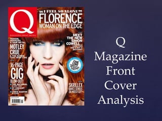
- 1. { Q Magazine Front Cover Analysis
- 2. The masthead is simply the letter ‘Q’. It’s very recognisable as it is a well established brand. The size is fairly big on the page. The placing in the top left hand corner automatically grabs your attention and the colour is very bold, grabbing your attention. ‘DISCOVER GREAT MUSIC’ lets us know that it’s a music magazine and that their aim is to help us discover great music. The Masthead
- 3. The main image is of the artist featured in the magazine. It links in with the caption and it is very clear that the caption links in with the picture and is very appropriate. The image size is also appropriate. The pose the artist is in entices you in. With the cover line being ‘Women On The Edge’ the use of make up and hair colour makes the meanings of the words a lot stronger. Image and Caption
- 4. The cover lines are all appropriate. They say just enough to draw you in with out telling you too much. The white letter against the artists ginger hair really stand out and are clear to see. The pug is clear and pull quote on it makes you a little confused and you want to know more. The blue is a strong and inviting colour. ‘New Column’ makes you intrigued and the use of capital letters make the words more in ‘your face’ and bolder. All spelling and punctuation is accurate. The themes are all consistent. The sell and strap lines give a clear indication that it is a music magazine as they mention bands and artists. The use of the rhetorical question makes you feel important as it feels like the magazine is talking to you directly. The word ‘bastard’ being used shows us that the target audience is more mature. Language and Pug
- 5. The over all layout and design is conventional for a music magazine. The colours are all strong and nothing is lost on the page. Its stuck to the formula of one artist per page and the main image works really well and represents music. Its all very clear and organised. To me, the magazine is very appealing and ascetically very pleasing. Overall the colour scheme works well. The blue has been pulled from the artist and used in the pug and break up lines so it all links together nicely. The white and red also work well and the use of white makes it all more clear. Layout and Design