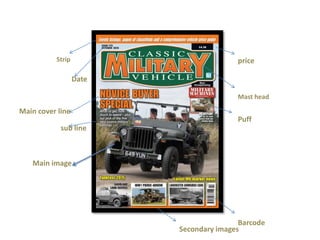
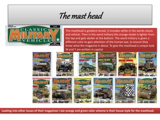
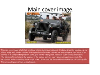
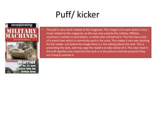
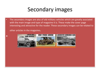
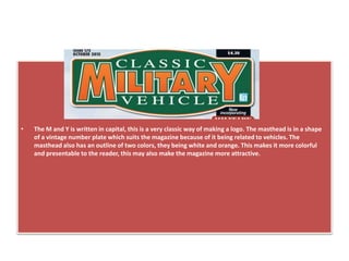
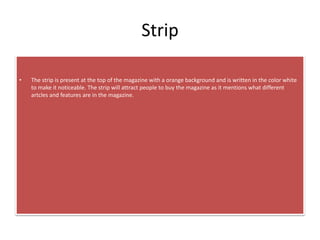
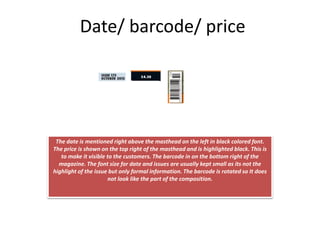
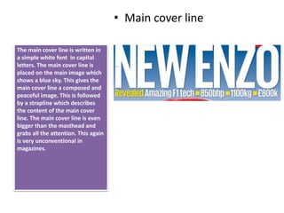
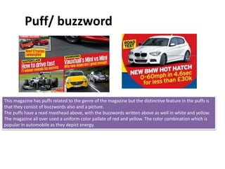
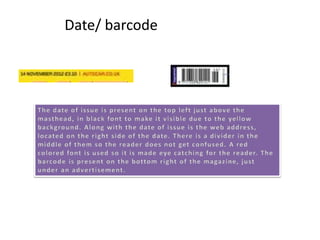
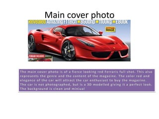
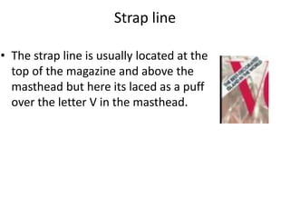
• For my media studies class I have chosen to analyze a UK based
magazine
• The magazines name is “classic military vehicle”
• As the name suggests its about classic military vehicles
• It is the UK’S best selling historic military vehicle magazine
Mast head
Strip
Barcode
Date
Main image
Main cover line
Puff
Secondary images
sub line
price
Themasthead
The masthead is gradient toned, it includes white in the words classic
and vehicle. Then in the word military the orange shade is lighter from
the top and gets darker at the bottom. The word military is given a
different color to gain attention of the human eye, to ensure they
know what the magazine is about. To give the masthead a unique look
M and Y are written in capital.
Looking into other issues of their magazines I see orange and green color scheme is their house style for the masthead.
Main cover image
The main cover image is full shot a military vehicle, looking very elegant. It is being driven by possibly a army
officer, along with his two children. The expressions of the two children are portraying that they seem to be
worried or in some kind of problem. Same goes for the elderly man, he makes a very serious expression.
The lighting of the shot and the weather in the picture portrays a very gloomy image in our minds. The
background and surroundings show crops, so we can say that the shots taken somewhere in the country side.
The surroundings are shown to be pleasant.
Puff/ kicker
• The puff is very much related to the magazine. This image is of a tank which is very
much related to the magazine, as this was also used by the military. Military
machines is written in bold letters, in white with red behind it. The font has a look
of a stencil text which is commonly used in the army. This makes it very eye catching
for the reader. Just below the image there is a line talking about the tank. This is
promoting the tank, and may urge the readers to take notice of it. The color read in
the puff signifies how important the tank is in the picture and how powerful they
are trying to portray it.
Secondary images
• The secondary images are also of old military vehicles which are greatly asociated
with the main image and type of magazine it is. These make the cover page
interesting and attractive for the reader. These secondary images can be related to
other articles in the magazine.
•
• The M and Y is written in capital, this is a very classic way of making a logo. The masthead is in a shape
of a vintage number plate which suits the magazine because of it being related to vehicles. The
masthead also has an outline of two colors, they being white and orange. This makes it more colorful
and presentable to the reader, this may also make the magazine more attractive.
Strip
• The strip is present at the top of the magazine with a orange background and is written in the color white
to make it noticeable. The strip will attract people to buy the magazine as it mentions what different
artcles and features are in the magazine.
Date/ barcode/ price
The date is mentioned right above the masthead on the left in black colored font.
The price is shown on the top right of the masthead and is highlighted black. This is
to make it visible to the customers. The barcode in on the bottom right of the
magazine. The font size for date and issues are usually kept small as its not the
highlight of the issue but only formal information. The barcode is rotated so It does
not look like the part of the composition.
Autocar
Autocar is one of the oldest magazines that is still
being published. This magazine’s publishing
started in 1895 in the UK. This magazine keeps
the readers updated on the latest cars and new
releases. In other words it is one of the best
magazines available for readers who love the
Genre of car magazines.
Date
masthead
Main cover line
Cover line
Main cover
photo
Barcode
Puff
advertisement
Tagline
Selling line
Highlights/ anchoring images
Website
address
Masthead
The masthead of the magazine is written in Bold red font, in capital letters on a
yellow background. This is in order to make the magazine title be noticeable. The
masthead in all the magazine issues are the same, and is the identity of the Autocar
magazine.
There is a tagline below the masthead in black and red. The tagline represents genre
of the magazine. The masthead is not spread from one end to another. It takes 70%
of the total width which is not a usual convention. The text has a 3D effect which
enchances the masthead and gives it a sporty feel.
• Main cover line
The main cover line is written in
a simple white font in capital
letters. The main cover line is
placed on the main image which
shows a blue sky. This gives the
main cover line a composed and
peaceful image. This is followed
by a strapline which describes
the content of the main cover
line. The main cover line is even
bigger than the masthead and
grabs all the attention. This again
is very unconventional in
magazines.
Puff/ buzzword
This magazine has puffs related to the genre of the magazine but the distinctive feature in the puffs is
that they consist of buzzwords also and a picture.
The puffs have a read masthead above, with the buzzwords written above as well in white and yellow.
The magazine all over used a uniform color pallate of red and yellow. The color combination which is
popular in automobile as they depict energy.
Date/ barcode
Main cover photo
Strap line
Cover lines
Cover lines
Main image
Masthead
Bar code
Masthead
• The name of the magazine is large and bold on the page,
written in bright red color. This attracts the eye of the
customer. This also is the logo of the magazine, which
allows the reader to recognize it. The typography is Serif,
as its very formal and the color pink makes the target
audience females.
Cover lines
• The cover lines relate to the main image which is of Emma
Watson, famous for the Harry potter Series. The first cover
line reads ‘Life after Harry Potter’ . The other cover lines
relate to other famous celebrities, such as Rihanna,
Beyonce and JLO. The names of these celebrities are
written in larger text than the over text. Other cover lines
are there to attract the reader so they buy the magazine
to read the articles present inside.
Main Image
• The main image which is a picture of Emma
Watson, takes up most of the space on the cover.
Emma is a very famous actress, famous for her
role in the Harry Potter series. Bright colors have
been used to attract the reader and make the
magazine stand out on the shelf. Emma’s eyes are
looking directly towards the audience. Her lip
color is very similar to title, which is the models
name. Her lips can be identified as the main
attraction as they attract male target audiences.
Strap line
• The strap line is usually located at the
top of the magazine and above the
masthead but here its laced as a puff
over the letter V in the masthead.
Bar code
• There is a bar code present at the bottom
left of the magazines cover page.

Magazine Cover Page Analysis

  • 1.
    • For mymedia studies class I have chosen to analyze a UK based magazine • The magazines name is “classic military vehicle” • As the name suggests its about classic military vehicles • It is the UK’S best selling historic military vehicle magazine
  • 2.
    Mast head Strip Barcode Date Main image Maincover line Puff Secondary images sub line price
  • 3.
    Themasthead The masthead isgradient toned, it includes white in the words classic and vehicle. Then in the word military the orange shade is lighter from the top and gets darker at the bottom. The word military is given a different color to gain attention of the human eye, to ensure they know what the magazine is about. To give the masthead a unique look M and Y are written in capital. Looking into other issues of their magazines I see orange and green color scheme is their house style for the masthead.
  • 4.
    Main cover image Themain cover image is full shot a military vehicle, looking very elegant. It is being driven by possibly a army officer, along with his two children. The expressions of the two children are portraying that they seem to be worried or in some kind of problem. Same goes for the elderly man, he makes a very serious expression. The lighting of the shot and the weather in the picture portrays a very gloomy image in our minds. The background and surroundings show crops, so we can say that the shots taken somewhere in the country side. The surroundings are shown to be pleasant.
  • 5.
    Puff/ kicker • Thepuff is very much related to the magazine. This image is of a tank which is very much related to the magazine, as this was also used by the military. Military machines is written in bold letters, in white with red behind it. The font has a look of a stencil text which is commonly used in the army. This makes it very eye catching for the reader. Just below the image there is a line talking about the tank. This is promoting the tank, and may urge the readers to take notice of it. The color read in the puff signifies how important the tank is in the picture and how powerful they are trying to portray it.
  • 6.
    Secondary images • Thesecondary images are also of old military vehicles which are greatly asociated with the main image and type of magazine it is. These make the cover page interesting and attractive for the reader. These secondary images can be related to other articles in the magazine. •
  • 7.
    • The Mand Y is written in capital, this is a very classic way of making a logo. The masthead is in a shape of a vintage number plate which suits the magazine because of it being related to vehicles. The masthead also has an outline of two colors, they being white and orange. This makes it more colorful and presentable to the reader, this may also make the magazine more attractive.
  • 8.
    Strip • The stripis present at the top of the magazine with a orange background and is written in the color white to make it noticeable. The strip will attract people to buy the magazine as it mentions what different artcles and features are in the magazine.
  • 9.
    Date/ barcode/ price Thedate is mentioned right above the masthead on the left in black colored font. The price is shown on the top right of the masthead and is highlighted black. This is to make it visible to the customers. The barcode in on the bottom right of the magazine. The font size for date and issues are usually kept small as its not the highlight of the issue but only formal information. The barcode is rotated so It does not look like the part of the composition.
  • 10.
    Autocar Autocar is oneof the oldest magazines that is still being published. This magazine’s publishing started in 1895 in the UK. This magazine keeps the readers updated on the latest cars and new releases. In other words it is one of the best magazines available for readers who love the Genre of car magazines.
  • 11.
    Date masthead Main cover line Coverline Main cover photo Barcode Puff advertisement Tagline Selling line Highlights/ anchoring images Website address
  • 12.
    Masthead The masthead ofthe magazine is written in Bold red font, in capital letters on a yellow background. This is in order to make the magazine title be noticeable. The masthead in all the magazine issues are the same, and is the identity of the Autocar magazine. There is a tagline below the masthead in black and red. The tagline represents genre of the magazine. The masthead is not spread from one end to another. It takes 70% of the total width which is not a usual convention. The text has a 3D effect which enchances the masthead and gives it a sporty feel.
  • 13.
    • Main coverline The main cover line is written in a simple white font in capital letters. The main cover line is placed on the main image which shows a blue sky. This gives the main cover line a composed and peaceful image. This is followed by a strapline which describes the content of the main cover line. The main cover line is even bigger than the masthead and grabs all the attention. This again is very unconventional in magazines.
  • 14.
    Puff/ buzzword This magazinehas puffs related to the genre of the magazine but the distinctive feature in the puffs is that they consist of buzzwords also and a picture. The puffs have a read masthead above, with the buzzwords written above as well in white and yellow. The magazine all over used a uniform color pallate of red and yellow. The color combination which is popular in automobile as they depict energy.
  • 15.
  • 16.
  • 17.
    Strap line Cover lines Coverlines Main image Masthead Bar code
  • 18.
    Masthead • The nameof the magazine is large and bold on the page, written in bright red color. This attracts the eye of the customer. This also is the logo of the magazine, which allows the reader to recognize it. The typography is Serif, as its very formal and the color pink makes the target audience females.
  • 19.
    Cover lines • Thecover lines relate to the main image which is of Emma Watson, famous for the Harry potter Series. The first cover line reads ‘Life after Harry Potter’ . The other cover lines relate to other famous celebrities, such as Rihanna, Beyonce and JLO. The names of these celebrities are written in larger text than the over text. Other cover lines are there to attract the reader so they buy the magazine to read the articles present inside.
  • 20.
    Main Image • Themain image which is a picture of Emma Watson, takes up most of the space on the cover. Emma is a very famous actress, famous for her role in the Harry Potter series. Bright colors have been used to attract the reader and make the magazine stand out on the shelf. Emma’s eyes are looking directly towards the audience. Her lip color is very similar to title, which is the models name. Her lips can be identified as the main attraction as they attract male target audiences.
  • 21.
    Strap line • Thestrap line is usually located at the top of the magazine and above the masthead but here its laced as a puff over the letter V in the masthead.
  • 22.
    Bar code • Thereis a bar code present at the bottom left of the magazines cover page.

Editor's Notes

  • #3 Masthead Puff Main image