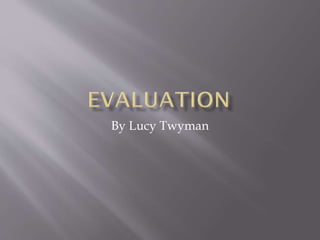
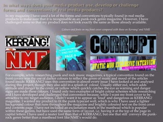
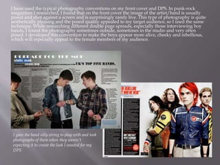
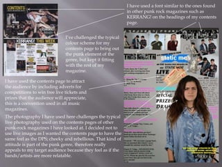
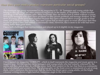
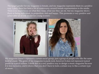
Krótki przewodnik po serwisie Opinnet.com, gromadzącym opinie konsumentów na temat produktów. Przedstawiamy najważniejsze funkcjonalności serwisu i wyjaśniamy czym różni się on od innych stron z opiniami klientów. Dołącz do społeczności Opinnet.com!
The Challenges of Good Governance and Project Implementation in Nigeria: A Re...AJHSSR Journal
ABSTRACT : This study reveals that systemic corruption and other factors including poor leadership,
leadership recruitment processes, ethnic and regional politics, tribalism and mediocrity, poor planning, and
variation of project design have been the causative factors that undermine projects implementation in postindependence African states, particularly in Nigeria. The study, thus, argued that successive governments of
African states, using Nigeria as a case study, have been deeply engrossed in this obnoxious practice that has
undermined infrastructure sector development as well as enthroned impoverishment and mass poverty in these
African countries. This study, therefore, is posed to examine the similarities in causative factors, effects and
consequences of corruption and how it affects governance, projects implementation and national growth. To
achieve this, the study adopted historical research design which is qualitative and explorative in nature. The
study among others suggests that the governments of developing countries should shun corruption and other
forms of obnoxious practices in order to operate effective and efficient systems that promote good governance
and ensure there is adequate projects implementation which are the attributes of a responsible government and
good leadership. Policy makers should also prioritize policy objectives and competence to ensure that policies
are fully implemented within stipulated time frame.
KEYWORDS: Developing Countries, Nigeria, Government, Project Implementation, Project Failure
Non-Financial Information and Firm Risk Non-Financial Information and Firm RiskAJHSSR Journal
ABSTRACT: This research aims to examine how ESG disclosure and risk disclosure affect the total risk of
companies. Using cross section data from 355 companies listed in Indonesia Stock Exchange, data regarding
ESG disclosure and risk was collected. In this research, ESG and risk disclosures are measured based on content
analysis using GRI 4 guidelines for ESG disclosures and COSO ERM for risk disclosures. Using multiple
regression, it is concluded that only risk disclosure can reduce the company's total risk, while ESG disclosure
cannot affect the company's total risk. This shows that only risk disclosure is relevant in determining a
company's total risk.
KEYWORDS: ESG disclosure, risk disclosure, firm risk
Social media refers to online platforms and tools that enable users to create, share, and exchange information, ideas, and content in virtual communities and networks. These platforms have revolutionized the way people communicate, interact, and consume information. Here are some key aspects and descriptions of social media:
Unlock TikTok Success with Sociocosmos..SocioCosmos
Discover how Sociocosmos can boost your TikTok presence with real followers and engagement. Achieve your social media goals today!
https://www.sociocosmos.com/product-category/tiktok/
How social media marketing helps businesses in 2024.pdfpramodkumar2310
Social media marketing refers to the process of utilizing social media platforms to promote products, services, or brands. It involves creating and sharing valuable content, engaging with followers, analyzing data, and running targeted advertising campaigns.
www.nidmindia.com
Grow Your Reddit Community Fast.........SocioCosmos
Sociocosmos helps you gain Reddit followers quickly and easily. Build your community and expand your influence.
https://www.sociocosmos.com/product-category/reddit/
Enhance your social media strategy with the best digital marketing agency in Kolkata. This PPT covers 7 essential tips for effective social media marketing, offering practical advice and actionable insights to help you boost engagement, reach your target audience, and grow your online presence.
“To be integrated is to feel secure, to feel connected.” The views and experi...AJHSSR Journal
ABSTRACT: Although a significant amount of literature exists on Morocco's migration policies and their
successes and failures since their implementation in 2014, there is limited research on the integration of subSaharan African children into schools. This paperis part of a Ph.D. research project that aims to fill this gap. It
reports the main findings of a study conducted with migrant children enrolled in two public schools in Rabat,
Morocco, exploring how integration is defined by the children themselves and identifying the obstacles that they
have encountered thus far. The following paper uses an inductive approach and primarily focuses on the
relationships of children with their teachers and peers as a key aspect of integration for students with a migration
background. The study has led to several crucial findings. It emphasizes the significance of speaking Colloquial
Moroccan Arabic (Darija) and being part of a community for effective integration. Moreover, it reveals that the
use of Modern Standard Arabic as the language of instruction in schools is a source of frustration for students,
indicating the need for language policy reform. The study underlines the importanceof considering the
children‟s agency when being integrated into mainstream public schools.
.
KEYWORDS: migration, education, integration, sub-Saharan African children, public school
Get Ahead with YouTube Growth Services....SocioCosmos
Get noticed on YouTube by buying authentic engagement. Sociocosmos helps you grow your channel quickly and effectively.
https://www.sociocosmos.com/product-category/youtube/
Your Path to YouTube Stardom Starts HereSocioCosmos
Skyrocket your YouTube presence with Sociocosmos' proven methods. Gain real engagement and build a loyal audience. Join us now.
https://www.sociocosmos.com/product-category/youtube/
Exploring Factors Affecting the Success of TVET-Industry Partnership: A Case ...AJHSSR Journal
ABSTRACT: The purpose of this study was to explore factors affecting the success of TVET-industry
partnerships. A case study design of the qualitative research method was used to achieve this objective. For the
study, one polytechnic college of Oromia regional state, and two industries were purposively selected. From the
sample polytechnic college and industries, a total of 17 sample respondents were selected. Out of 17
respondents, 10 respondents were selected using the snowball sampling method, and the rest 7 respondents were
selected using the purposive sampling technique. The qualitative data were collected through an in-depth
interview and document analysis. The data were analyzed using thematic approaches. The findings revealed that
TVET-industry partnerships were found weak. Lack of key stakeholder‟s awareness shortage of improved
training equipment and machines in polytechnic colleges, absence of trainee health insurance policy, lack of
incentive mechanisms for private industries, lack of employer industries involvement in designing and
developing occupational standards, and preparation of curriculum were some of the impediments of TVETindustry partnership. Based on the findings it was recommended that the Oromia TVET bureau in collaboration
with other relevant concerned regional authorities and TVET colleges, set new strategies for creating strong
awareness for industries, companies, and other relevant stakeholders on the purpose and advantages of
implementing successful TVET-industry partnership. Finally, the Oromia regional government in collaboration
with the TVET bureau needs to create policy-supported incentive strategies such as giving occasional privileges
of duty-free import, tax reduction, and regional government recognition awards based on the level of partnership
contribution to TVET institutions in promoting TVET-industry partnership.
KEY WORDS: employability skills, industries, and partnership
Multilingual SEO Services | Multilingual Keyword Research | Filosemadisonsmith478075
Multilingual SEO services are essential for businesses aiming to expand their global presence. They involve optimizing a website for search engines in multiple languages, enhancing visibility, and reaching diverse audiences. Filose offers comprehensive multilingual SEO services designed to help businesses optimize their websites for search engines in various languages, enhancing their global reach and market presence. These services ensure that your content is not only translated but also culturally and contextually adapted to resonate with local audiences.
Visit us at -https://www.filose.com/
2. In my magazine I have used a lot of the forms and conventions typically found in real media
products to make sure that it is recognisable as an punk-rock genre magazine. However, I have
challenged some so that my product does not look exactly the same as those already available.
For example, while researching punk and rock music magazines, a typical convention found on the
front covers was the use of darker colours to reflect the genre of music and mood of the articles
found inside. KERRANG! uses this convention in almost every issue I have looked at and analysed
during this project, though they also add in a splash of colour. Usually either red, which adds
attitude and danger to the cover, or yellow which quickly catches the eye as warning and danger
signs are made these colours. I found only two examples of bright colour schemes while researching
and I have developed and challenged that convention because, while I want my front cover to be
attractive to my target audience, I didn’t want it to appear as ‘loud’ and dangerous as KERRANG!
magazine. I wanted my product to fit the punk typecast well, which is why I have used a lighter
background colour that runs throughout the magazine and brightly coloured text on the front cover
and contents page. I have not included an exclamation mark in the masthead which is popular
within these genres, but have used the same form of layout, i.e. having it at the top of the page in
capital letters. I have used a neater font than that of KERRANG!, but one that still conveys the punk-
rock genre better than a masthead font like NME’s would do.
Colours and fonts on my front cover compared with those on Kerrang! and NME
3. I have used the typical photography conventions on my front cover and DPS. In punk-rock
magazines I researched, I found that on the front cover the image of the artist/band is usually
posed and shot against a screen and is surprisingly rarely live. This type of photography is quite
aesthetically pleasing and the posed quality appealed to my target audience, so I used the same
technique. While researching different double page spreads, especially those interviewing boy
bands, I found the photography sometimes outside, sometimes in the studio and very often
posed. I developed this convention to make the boys appear more alive, cheeky and rebellious,
which will especially appeal to the female members of my audience.
I gave the band silly string to play with and took
photographs of them when they weren’t
expecting it to create the look I wanted for my
DPS
4. I have used a font similar to the ones found
in other punk rock magazines such as
KERRANG! on the headings of my contents
page.
The photography I have used here challenges the typical
live photography used on the contents pages of other
punk-rock magazines I have looked at. I decided not to
use live images as I wanted the contents page to have the
same feel as the DPS; cheeky and rebellious. That kind of
attitude is part of the punk genre, therefore really
appeals to my target audience because they feel as if the
bands/artists are more relatable.
I have used the contents page to attract
the audience by including adverts for
competitions to win free live tickets and
prizes that the audience will appreciate,
this is a convention used in all music
magazines.
I’ve challenged the typical
colour scheme for my
contents page to bring out
the punk element of the
genre, but kept it fitting
with the rest of my
magazine.
5. The dominant age group represented in my magazine is 15 – 18. Teenagers and young adults that
belong to this age range are often portrayed negatively in the media, as shoplifters, violent hoodies
and thugs in the most extreme cases. More frequently they are shown just as rebels without a course,
first world teenagers who don’t have problems so they invent problems and teenage drinkers. In the
news, if young adults have been reported because they have achieved above average grade or done
some sort of brilliant charity work, they aren’t given half as much space or word allowance than they
would be given if they had robbed a convenience store. However, this is more to do with bad news
selling better than good news.
I have both challenged that representation and played up to it slightly in my magazine.
I have named my magazine ‘CORRUPT’, which in itself represents the magazine and music genre in a
negative way. Yet this reaches out to teenagers and young adults who feel unfairly criticized by the
media and they, just as they do with the music itself, find comfort in the fact that there is a community
who understands and accepts them. The photography on the front cover is reminiscent of a set of mug
shots, which reinforces the stereotype that the media has thrust upon young adults, yet the bright
coloured writing shows a light-hearted, humorous angle to the front cover.
6. The target gender for my magazine is female, and my magazine represents them in a positive
way. Lately there has been a lot of controversy around female representation in the media.
There is so much focus on what they wear, what size they are etc. but my magazine shows
them as being individual, in proportion, real and happy. This promotes a very positive and
achievable set of role model for young women.
My magazine doesn’t represent a certain social group, just a group of people who like the same
kind of music. The genre of my magazine is punk-rock, however it does not represent typical
punks or typical rockers. I think this is a very positive way to design a music magazine because
it is less exclusive, and it shows that you don’t have to look a certain way to like a certain type
of music.
7. I researched magazines with a similar target audience and pitch to my own
product, and looked at their various media packs to come up with a list of
institutions. I chose Bauer Media to distribute my product. They distribute
two other music magazines, KERRANG! and Q which both have similar
audiences to my product, but there is still a gap that my magazine can fill. Q
magazine represents classic rock and roll and KERRANG! appeals to
everyone ‘From the younger teenage readers who are more open to different
genres of rock music – from EMO to Thrash etc, to the readers who respect
Kerrang! as an authority when it comes to our scene’s heritage bands.’
according to they’re site. My magazine wishes to represent the smaller sub-
genres like punk-rock and indie.
8. I found that the target audience for my
magazine will be a female, aged 15-18
who loves to music. She prefers
alternative music, mostly punk rock and
all of it’s sub-genres. She enjoys
listening to music, playing music and
reading about music. She finds
interviews about her favourite bands
and artists interesting, she can’t wait to
share the information she reads with
her friends. She reads about music
every week, and spends the rest of her
time at gigs, with friends or playing her
own instrument. She either is, or knows
someone who is in a band because she
loves to hear live music, and is
fascinated by new music being created
and hopes it makes an impact in the
world. Her style and ethics are
influenced by her favourite punk-rock
stars who have good, strong morals and
show this to their fans through their
lyrics.
9. One of the ways I attracted my audience was the font I used for the masthead. I
chose this font because it is bold and easy to read, yet it’s more interesting a font
such as Arial or Berlin Sans. I wanted to attract both genders, but mainly females.
This font works for that particular target audience because the colour and the fact
it’s in capitals appeals to the masculine side of my target audience, but the font has
a certain vintage look which is very attractive to a female audience.
The colour palette I chose because it was a little different from the colours usually
used to represent heavier music. The colours catch the eye and I can choose to bring
attention to certain headings and offers which will attract the audience further. The
use of bright turquoise and pink is attractive to the female audience of my product.
On the front cover I have used words like ‘EXCLUSIVE INTERVIEW’ in bright
yellow capital letters to attract attention, the word exclusive makes the audience
feel as if they’re getting something extra. ‘Free Posters’ makes the audience think
they’ll be getting free merchandise, which is one of the most attractive things to an
audience who is paying for a product. I have also added turquoise splash with a
article heading and ‘find out on page 4!’ to invite the audience inside.
10. I have used words such as gig and
festival to address the audience
with words that they are familiar
with, this gives a feeling of
acceptance. Words like ‘live’ and
‘tour dates’ work in the same way.
‘I enjoy laughing at people who think
they’re better than me’ - Addressing
the audience with situations that have
happened to them in real life.
Live music –
addresses the
audience by
relating with
their interests
‘We were just
a garage band’
– famous
bands talking
about how
they made it, a
lot of the
audience will
look up to the
artist and feel
as if they have
things in
common.
11. Technology played an important role in
every stage of creating my product, and
every stage was recorded on Blogger.
For the research stage, I began by using
Survey Monkey to ask my audience
what they would like to see in my
magazine. Here is an example of one of
my questions, and how I learned to turn
the responses into bar charts and
percentage tables. I also posted my
survey questions on Facebook and
Twitter to get more results.
12. For the planning of my product I
used Microsoft Word and Microsoft
PowerPoint to present my work.
To create my magazine front cover
and contents page I use Adobe
Photoshop CS3 to edit pictures by
changing the brightness and
contrast, I also used it to layer texts
and images which made the two
pages look more professional. On
my contents page, the most helpful
thing it allowed me to do was cut
out pictures from they’re own
background and paste them onto
the page. For my double page
spread I used InDesign.
13. I used Youtube to upload my video
interview of my target audience for
my research of my magazine. I think
that watching a video of an interview
instead of just reading a script or
listening to a voice recording is
important because as well as hearing
the interviewers opinion you can see
who they are in how the dress and
how they act and how that shows
who my target audience are.
To upload this power point to my
blog I have also used SlideShare. I
found this convenient because it
makes it easy for my PowerPoint to
be viewed online and gives the
readers of my blog a better way of
interacting with technologies.
14. It is clear from these images that my College magazine is very basic compared to my
finished product. I had not used Photoshop before so the only technique on my first
front cover was elementary layering of text on an imported image. My contents page
is also very simple, with only two images and no real layout. My final product has
improved dramatically from these practises as I have included a bigger range of more
appropriate photography, a planned layout based on real music magazines and a lot
more text. The colour scheme on my College magazine works well for the product,
but I needed something more sophisticated for my final piece. I used more colours
and because there was more text I could easily put the colours together in an
attractive way. The college magazine was useful because it allowed me to experiment
with different techniques that have improved the look of my final product.