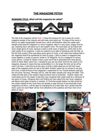
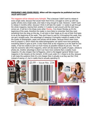
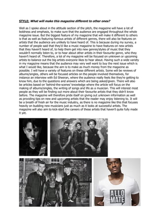
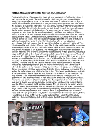
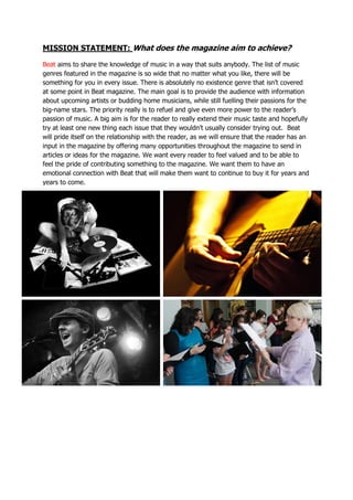
The magazine will be called "Beat" to represent music genres through a single recognizable musical term. It will focus on a variety of music genres to appeal to different audiences rather than focusing on one genre. The magazine will be published every other Monday to allow sufficient time for quality articles and photos while still providing a regular release schedule. It will cost £2.99 to seem affordable while still earning a profit over its two week shelf life. The magazine will use emphasis, color, images, and other design elements to draw readers' attention to important information and showcase a range of styles.
The document discusses the development of a magazine title and concept. It considers various titles before settling on "Pandemonium" as a word that captures the genre of rock music in an innovative way. The magazine will focus on rock, alternative and indie music genres and be published fortnightly at a price of £2.99. It aims to have a bold and dramatic attitude shown through its visual design with bright colors, different fonts and layouts for each article. The style is intended to be distinctive from other magazines through its varied content and presentation.
The document discusses how the media product uses, develops, and challenges conventions of real music magazines. It summarizes that the front cover and double page spread use typical conventions like the masthead, color scheme, standfirst, drop cap, and pull quote to look realistic. However, the contents page challenges conventions by having an atypical layout with a large main image and non-column listings to portray a fresh, distinctive magazine for its target indie music audience. In conclusion, most elements follow conventions for realism while the contents page challenges norms to suit the magazine's genre and prevent boredom for its target readers.
This magazine cover uses bright colors and many images to represent a hybrid "Japop" genre that blends jazz and pop music. The target audience is clearly young females, as seen from the colors, artists featured, and busy layout. Distribution partners like RCA Records would be interested since the magazine prominently features pop artists. While colorful and eye-catching like pop magazines, elements like the sophisticated masthead and fonts also represent jazz through simplicity and elegance. Overall the cover successfully blends representations of both jazz and pop to profile its new music genre for its intended female youth audience.
The document summarizes audience feedback from a survey about a music magazine called "Addiction". The feedback was overall positive, with respondents saying:
1) The magazine was well-structured and could compete with other magazines like NME. However, some said the cover lines were too cluttered.
2) The magazine successfully conveyed an indie/rock genre through elements like color scheme, fonts, and bands featured.
3) The magazine effectively targeted and linked to its intended indie audience by representing their styles and interests.
The document analyzes each question in detail to identify ways to improve the magazine based on the feedback.
The document is a reflection on how the student's magazine cover adheres to and challenges conventions of real music magazines like NME. The student followed conventions like placement of titles, quotes, and band listings. However, they broke some conventions like not including the magazine name on the contents page or a band index. The student learned photography and editing skills using Photoshop to enhance their magazine's professional look.
Music Magazine Survey: Analysis of resultstashaay27
- The majority of respondents to the music magazine survey were teenagers aged 13-18, showing this is the target audience.
- Most respondents listened to rock, alternative, and heavy metal music and did not prefer classical or jazz.
- Females responded to the survey more than males, indicating the magazine should focus more on genres and artists appealing to females.
- Respondents listened to music frequently, for 3+ hours per day, showing they are passionate about music and will be interested in a music magazine.
The document provides details on the proposed "POP" music magazine, including:
- The name "POP" was chosen as it represents the genre instantly and is short like other popular music magazines.
- The mission is to give readers first-hand information on their favorite artists with no gimmicks, allowing readers to feel connected to pop stars.
- Interviews were found to be the most wanted feature. The magazine will focus on the pop/chart music genre and target older teenagers.
- It will be published monthly at £3.99 generally or £2.99 for students, released on the 1st of each month.
- The magazine aims to have a sophisticated style while still
The document discusses how the author created a music magazine to target a specific audience based on research. Through surveys on Survey Monkey, the author found that most respondents were ages 17-25 and enjoyed a variety of music genres. This informed the content and design of the magazine to attract this demographic. Inspired by Billboard and NME magazines, the author chose a simple title and masthead design without bright colors that would distract from the content. The front cover features an attractive female model to attract both male and female readers through techniques like the male gaze. Overall, the magazine aims to attract its target audience through clean, easy-to-read design and content tailored to music-loving youth.
The document discusses the development process of creating a music magazine media product. It describes conducting market research through a questionnaire to understand the target audience. Drafts of the magazine's cover, contents page, and double-page spread are analyzed and how they drew inspiration and conventions from real magazines like NME and Q. The document also reflects on learning Photoshop skills and how testing ideas with market research helped create a more polished final product.
- The document is an evaluation of a student's media magazine project about jazz music.
- The student challenged conventions by targeting a younger audience than typical jazz magazines and featuring a young cover star.
- Conventions like banners, advertisements, and section names were used but also developed, like a horizontal banner and "Editor's Note" instead of "Editor's Letter."
- Photos, language, and layout were designed to represent and attract the target audience of 16-18 year old jazz fans.
The document discusses the planning and research that went into creating a music magazine targeted at 15-28 year olds interested in rock and alternative music. It covers choosing the target audience and genre, researching similar magazines to determine style and content elements, selecting a color palette to represent the genre, and using flat plans to layout the front cover, contents page, and articles. Key elements like the masthead, images, and features are discussed in relation to attracting the target readership.
Harry Laflin Pre production and researchmarcusmilburn
The document discusses a student's plans for their first AS media coursework project, which will be creating a school magazine using PowerPoint and Publisher. The student explains that creating the magazine will help them learn the necessary software skills and techniques to apply to their second project, a music magazine cover. They have done research on magazine formats and contents to help plan their school magazine.
Harry Laflin Pre production and researchmarcusmilburn
This document discusses the planning and research process for a student's AS media coursework project creating a school magazine in PowerPoint and Publisher. It describes collecting research on magazine formats and contents by looking at other magazines and asking a target audience. It also details sketching a draft cover, editing images, learning software skills, and researching cover and content page designs from real magazines to inform the project. The goal is to gain experience with the software and techniques to apply to a subsequent music magazine project.
The document discusses the creation of the front cover, contents page, and double page spread for a music magazine. It summarizes the research and elements emulated from other magazines, as well as the unique design aspects. Key tools like Photoshop filters and color replacement were used to enhance images and give the magazine a professional look. Overall, the document reflects on the skills developed in creating a high quality music magazine and how it has improved from an initial preliminary task.
The document discusses magazines in the UK music industry. It provides examples of some major music magazine publishers in the UK like Bauer Media Group which publishes Q Magazine and Kerrang, Immediate Media Company which publishes Top of the Pops, and DMC Publishing which publishes Mixmag. It also gives details about the type of music each magazine covers, their prices, circulations, and frequencies.
This document provides an overview and analysis of the Kerrang and Q magazines. It discusses the genres, content, target audiences, and design elements of both magazines. For Kerrang, it analyzes the front page, double page spread, and contents page. It also provides an annotation of the Kerrang website. Similarly, it analyzes design elements and provides an overview of Q magazine. The document concludes with sections on the production processes for magazines.
The document summarizes the author's process in designing and developing their own music magazine. Some key points:
1) The magazine takes influence from other music magazines like NME and Mojo and focuses on indie/alternative music.
2) The magazine has a clean and simplistic layout with one main image and small sections of spread out text.
3) Distribution would likely be through major publishers like Bauer who distribute similar niche magazines.
4) The target demographic is indie, alternative, and rock music fans from teens to mid-30s, especially students.
This document contains information about a student's process of designing a school magazine as practice for designing their music magazine. It describes the research and drafting process, including looking at other magazines for inspiration on layout, cover design, and contents page design. The student summarizes what they have learned about using software and understanding magazine design through creating the school magazine. They then discuss plans and research for their music magazine cover and contents page design.
1. The document evaluates a music magazine created by the author.
2. Key aspects of the magazine discussed include using fonts and branding from real bands, incorporating photos taken at live performances, and including content relevant to the target teenage/young adult audience.
3. The author believes the magazine effectively represents the rock music genre through its dark color scheme, broken glass backgrounds, and topics covered. Distribution through Bauer Media is proposed due to their success and audience match.
The document is a reflection by Liam Evans on their final evaluation of a music magazine they created. The summary includes:
1) Liam modeled conventions from real music magazines like Mixmag in their magazine cover and contents page layout.
2) Feedback was incorporated such as filling empty space on the cover, which Liam addressed by taking new photos.
3) The magazine was aimed at drum and bass fans aged 16-21 and featured an interview with an up-and-coming DJ to appeal to this target audience.
The document discusses how the author addressed and attracted their target audience for a rock music magazine. They used intriguing band names, terms like "punk rock" and "merchandise" on the cover. Inside, they discussed download arenas, album reviews and used terms that rock fans would understand. They chose edgy fonts like "kill em all" to give a rock feel. Photos included a gothic woman on the cover and nondescript band members to generate mystery. The color scheme of black, red, white and a splash of yellow was intentionally simple. Page layouts were complex with many images and text styles to engage younger readers interested in creativity.
This document provides an evaluation of a music magazine created by Kiranjit Jandu. The summary discusses several key elements of the magazine's design and how it represents certain conventions or challenges them:
- The bold masthead on the front cover challenges conventions by its placement and bold style. It is influenced by Vibe magazine.
- The main image of singer Bella challenges conventions by using a female figure rather than typical male figures.
- Other elements like the barcode placement, spread title, and single cover image challenge conventions while keeping the overall style cohesive.
- The magazine represents younger generations interested in R&B music and portrays the group OVOXO as strong and rebellious
The document describes a media product (a magazine) and how it uses and challenges conventions of real magazines. It discusses the magazine's masthead, images, color scheme, text, and layouts. The magazine aims to represent a young, urban audience that listens to pop music. It follows conventions like masthead placement and font but challenges some with edgier fonts. The target audience would be teens to late 20s, primarily male students and music fans. Feedback from a focus group was positive overall.
The document outlines a magazine pitch that includes details about the proposed magazine's title, genres, sales information, contents, style, and mission statement. The magazine title, "Demo," is meant to suggest that the magazine features new and current music. The magazine will cover various genres like rock, indie, alternative, and pop, based on survey responses. It will be published monthly for £3.50 and sold at stores and online. Each issue will include interviews, reviews, event information, and posters. The magazine will have a clean layout with consistent fonts. The mission is to share new music news and connect fans across genres.
The document provides details for a proposed new music magazine called "Feedback". It discusses the name and meaning behind it, the genres of music it will focus on (rock/alternative rock), its weekly publication frequency and decision to be free, its rebellious attitude aimed at teenagers, its darker color stylistic approach, and the various sections and contents that will be included such as artist features, new musician spotlights, and reader emails. The goal is to create an engaging and fun magazine for teenage music fans to discover new artists and music.
The document outlines plans for a new rock music magazine. It will target an audience aged 13-20 and feature information on rock bands, albums, tours, and reviews. The magazine will be published monthly with a retail price of £3. It will have a casual, informal style with red as the main color. The content will include articles, posters, and free CDs or digital codes with issues.
The document outlines plans for a new rock music magazine. It will target an audience aged 13-20 and feature information on rock bands, albums, tours, and reviews. The magazine will be published monthly with a retail price of £3. It will have a casual, informal style and use red, black, and white as its main colors. Sample images and plans are provided for the front cover, contents page, and double page spreads.
The document is a draft proposal for a new music magazine focused on indie and punk genres. It will entertain and inform readers about upcoming albums, concerts, and artists through reviews, interviews, and competitions. The target audience is teens and people in their early twenties who enjoy these music styles on a limited budget. Key aspects of the magazine include monthly issues, social media engagement, free ticket giveaways, and an affordable price of £1.50-2 to attract readers.
The document is a proposal for a new music magazine focused on indie and punk genres. It will entertain and inform readers about new music and concerts while also trying to persuade them. The target audience is teens and people in their early 20s who like indie/punk music. Each monthly issue will feature an in-depth interview with an artist and have reviews, contests and giveaways to engage readers and encourage subscriptions. The magazine will have a minimalist design with one bright accent color and feature social media posts from readers.
The document proposes a music magazine focused on indie and rock bands. It will feature both established and upcoming artists. The magazine will be released monthly to allow for higher quality, more detailed articles that can include more bands. The target audience will be teenagers aged 13-18, as music has a big influence during those years. Content will include profiles of individual band members and information about their music and influences.
The document proposes a music magazine focused on indie and rock bands. It will feature both established and upcoming artists. The magazine will be released monthly to allow for higher quality, more detailed articles that can include more bands. The target audience is teenagers aged 13-18 who are heavily influenced by music. The magazine will provide biographies and profiles of bands to educate readers. It will aim to stand out from similar magazines by adding unique elements and exclusive content.
The document outlines initial ideas for a pop music magazine targeting 16-18 year olds. It discusses choosing the name "Fusion" to represent the blending of different music styles. The target audience of 16-18 year old males and females is chosen to be exposed to the magazine through sales in colleges. Initial cover ideas include featuring a female artist to appeal to both male and female readers, following the rule of thirds for layout. The contents page would list articles, section them, and continue the style of the front cover. A double page spread is planned to have a main artist image on one side and a smaller one with an exclusive interview in a question and answer format using different text colors.
1) The document discusses the student's evaluation of a magazine design project, including a preliminary task to design a student magazine contents page and a main task to design a music magazine cover, double page spread, and contents page.
2) For the preliminary task, the student designed a student magazine cover with colors that would appeal to both sexes. For the main task, the student researched music magazines and designed a cover for an indie music magazine targeted at 15-25 year olds.
3) Key elements of the music magazine design included photos of a singer taken on location at the student's school, templates created for the cover, double page spread, and contents page, and use of software to edit photos
This document provides an evaluation of a student's project to create a magazine. The student produced a contents page and student magazine as a preliminary task. For the main task, the student created a music magazine with a front cover, double page spread, and contents page. The student researched conventions of magazines and surveyed their target audience of 15-25 year olds. They planned and took photos to feature an indie artist. The student edited photos and laid out the magazine pages using software to construct the final music magazine.
1) The document discusses the student's process of creating a magazine for a school project, including preliminary tasks, research, planning, and construction.
2) For the preliminary task, the student created a student magazine cover and contents page. For the main task, the student produced a music magazine cover, double-page spread, and contents page aimed at ages 15-25.
3) Key aspects of planning included researching conventions of music magazines, surveying music preferences of the target age group, and taking photos to feature an indie artist. Templates were created and the magazine was constructed using photo editing and layout software.
1) The document discusses the student's evaluation of a magazine design project where they created a student magazine and then a music magazine targeted at 15-25 year olds.
2) For the preliminary task, the student created a student magazine contents page to practice layout elements. They then applied what they learned to design their music magazine.
3) For the music magazine, the student conducted research on magazine conventions and target demographics to inform the design of the front cover, double page spread, and contents page. Photographs were taken and edited to feature an indie musician interview for the magazine.
The document discusses the technologies used to construct a media product. The creator used Microsoft PowerPoint to plan presentations, SlideShare to upload presentations online, and Blogger to present work. Photoshop was used to create the final magazine pages. The creator learned how to use themes, shapes, and transparent images in PowerPoint. Blogger allowed work to be organized and accessible online. SlideShare easily embedded presentations. OneDrive provided online storage. The creator's first time using Photoshop helped them learn how to create magazine pages. Overall, the creator gained experience with online presentation, storage, and design software through constructing this media product.
The document discusses conventions used in alternative music magazine covers and contents. It describes using bold red and black titles to follow conventions while using full body shots of bands on the cover instead of headshots to seem less serious. Splashes are included to grab attention and drive sales. The contents page is kept simple with minimal text as younger readers prefer less text. A letter from the editor and band photos create involvement. Overall, the magazine follows conventions like darker colors but breaks up long blocks of text preferred by younger audiences.
The document proposes a new music magazine called "RIFF" focused on alternative/indie rock music. Some key details include:
- The name "RIFF" is derived from a musical term and emphasizes the repetitive publishing of the weekly magazine.
- The magazine will focus on the alternative/indie rock genre, which allows for creative design and appeals to the target demographic of 16-21 year olds.
- It will be published weekly for £1.50 to be affordable for its young audience. Each issue will feature a band as its main story and on the cover.
- The style will be bold with many images and music-focused content like articles, interviews, and event listings
The magazine will be called RockDesire and will focus on rock, alternative, and indie music genres. It will be released monthly and cost £4.99 per issue. The magazine will have a bold and colorful style using black, white, and red colors to draw attention. The mission statement says the magazine will provide a variety of music content including popular artists, discoveries, tour information, interviews, and insider access. The target reader is described as Marcus, a 17-year-old passionate about rock music living in York.
The proposed magazine will be called "Unleash The Underground" and will focus on the genre of rap music. It will be published monthly for £2.99 per issue. Each issue will feature an interview with a rap artist as the top story, along with the top music charts for that month. The magazine aims to provide unique rap content and expose new artists through interviews. The target readership is teenagers and young adults who enjoy keeping up with new rap music.
1) The document proposes a music magazine that combines aspects of VIBE and Q magazines, focusing on honesty and telling the truth about artists and music.
2) The target audience is males aged 15-28 who are interested in music, concerts, and social media.
3) The magazine will be published monthly and include features on popular artists, reviews of concerts from readers' perspectives, and sections voted on by readers.
The document discusses plans for an indie music magazine. The author has chosen to focus on the indie genre because they enjoy that type of music and are familiar with many indie artists. They also feel indie is a broad genre that will allow them to write about different types of artists. The author looks to magazines like Rolling Stone and Q as models because of their success and layout styles. They want their magazine to be credible and provide honest reviews, even if that means criticizing albums. The target audience is identified as predominantly white males aged 18-40 who are interested in arts and entertainment. The magazine will aim to provide information, advice, and a sense of belonging for readers while also being entertaining. Ultimately, the author aspires for their
The document provides style and branding guidelines for a digipak and advert including specifying logos, fonts, colors, and their usages. The digipak features the band's logo in red, yellow, and black along with track listings and disc titles. The record label logo appears in black on red. Main colors include red, yellow, black, and white. Fonts are specified for websites, legal text, and logos. The advert also details font usage for titles, dates, and quotes along with specifying various colors for text, backgrounds, and social media logos.
Tom received feedback on his music video and promotional products from Facebook, YouTube, interviews, and surveys. The feedback was mostly positive and helped him recognize what aspects worked well, such as the video's storyline and linking of the different products. He also learned some ways to improve, like minimizing effects on the digipak and making the font more readable. The feedback showed that his goals of creating a brand identity were successful. Overall, Tom found the audience feedback very helpful for evaluating his work and identifying areas of strength and growth for future projects.
Tom received feedback on his music video and ancillary texts from Facebook, YouTube comments, and interviews. He learned that the storyline and mixing of live performance and storyline in the video worked well. Some suggestions included adding a new note at the end of the video. The digipak and advert effectively created a brand identity that linked the products together. Constructive feedback included minimizing effects on the digipak and improving font readability. The feedback helped Tom evaluate his work and identify areas for potential improvement in future projects.
The combination of the band's main product (music video) and ancillary texts (digipak and magazine advert) was effective in creating a brand identity. Live performance was featured prominently in the ancillary texts through images to link them, while the music video included both live performance and a storyline to appeal to more types of audiences. Other connections between the ancillary texts included shared fonts, cover image, and color scheme. While consistency helped make the brand more memorable and professional, variety in the music video opened it up to a wider range of potential fans. Overall, the combination of products successfully created a brand and synergistic entry points to the band.
Throughout his project, Tom used various media technologies in the research and planning stages. He used Blogger to compile all of his work and findings in one place. He also used Slideshare to embed documents like PowerPoints into his blog posts. During research, he created surveys using Survey Monkey and conducted research online using Google. He shared his survey on social media to reach more participants. He presented his findings using Microsoft Word and PowerPoint. He analyzed existing music videos on YouTube and created reaction videos using iMovie. All of these technologies helped with research, planning, and presenting his work.
The document discusses the music video the author created for an indie rock band. It analyzes how the video uses and develops conventions of the genre based on research. Key conventions included depicting a live performance, synchronizing music and visuals, focusing on the artist, and including narrative elements. The video aimed to clearly represent the genre through a live concert scene and storyline that amplified rather than literally illustrated the song's lyrics. Character development and progression were achieved through costume changes and following typical narrative structures. Overall, the video followed theorized conventions of music videos to create an entertaining representation of the indie rock genre.
The digipak cover for a Libertines album features a medium shot of two band members, one making direct eye contact with the camera. This creates intimacy between the artist and viewer. The band's name appears in a consistent font used across their albums. The CD disc keeps things simple with the band name and copyright information in white text on black. It lacks additional design elements found on most discs. The back cover contrasts with brighter colors and a group photo of all four band members, reinforcing the band as a unit. It includes the track list again and a barcode in an uncommon top-right position. Overall, the covers emphasize the relationship between the artists and consumers through consistent imagery and fonts.
The document provides a shooting schedule for filming shots of a protagonist over three days - Friday, Saturday, and Sunday. On Friday, shots will be filmed at a college, including of the protagonist walking around campus and receiving exam results. Saturday's shots will be filmed in town, including by a river, in a museum garden, browsing in shops, and getting new clothes. Sunday's shots will be at the protagonist's house, including waking up, making coffee, finding an old guitar, and giving a present to his mother. The schedule lists over 50 shots planned to tell the story.
This document analyzes the music video for "Not So Sad" by the indie rock band Faux Pas based on six conventions of music videos identified by Andrew Goodwin. The video takes place entirely in one location, appearing to be a band member's living room, with no storyline, due to the band's lack of budget and being unsigned. While fitting the convention of a live performance, it lacks professional elements and other conventions like reference to voyeurism, due to the band's inexperience. Rotations of the band members changing clothes are unexplained. The video concludes with thanks and a "blooper" scene. Overall, though amateurish, it is a valid attempt at a music video for an unsigned band.
1) Magazine advertisements are a popular way for artists to promote their albums using conventional portrait images and information like the album title and release date placed at the bottom.
2) Ads typically use the album cover image to associate the advertisement with the album. Additional details like song names can entice audiences.
3) Visual elements in ads often relate to the album title or theme through imagery and colors to represent the style of music.
The document outlines the risks identified for an upcoming film shoot and proposes actions to mitigate those risks. It identifies 29 hazards and assigns each a risk factor based on severity and likelihood. For hazards rated 3 or higher, it proposes actions such as using tripods to avoid dropped cameras, staying away from derelict buildings and machinery, ensuring good rest to prevent fatigue, and having a non-smoking filming area. Most risks can be removed through communication and following the agreed safety precautions. However, the risk from public weapons cannot be fully removed. Overall the document shows thorough risk assessment and planning to improve safety for the film shoot.
The document discusses potential filming locations for a student video project in York, England. The group decided to choose locations within York to save on transportation costs. They went on a location tour and scouted six potential spots, including a restaurant, shopping streets, a city center roundabout, gardens, and the library. The locations would provide different settings and moods to advance the film's narrative and characters.
Unsigned artists have many options to share their music online and gain exposure. Social media platforms like Facebook, Instagram, and Twitter allow artists to share their music with hundreds or thousands of people. SoundCloud and YouTube are also popular platforms for unsigned artists, where they can upload audio tracks and videos. Bandcamp allows artists to sell their music directly to fans. Websites help artists promote their music, social media, Bandcamp, and other online activities in one place. Local radio can also help get an unsigned artist's name known in their community.
Music video analysis don't look back into the sunTom Ibbott
The document provides an in-depth analysis of the music video for "Don't Look Back Into the Sun" by The Libertines. It examines how the video uses techniques like live performances, references to lyrics, costumes, and mystery to tell the story of two characters. Most of the six common music video conventions outlined by Andrew Goodwin are present, with the exception of focusing on female bodies. The analysis identifies how elements like sunglasses, locations, and cuts between live and prerecorded footage advance the narrative and meaning of the song.
The document provides details for three promotional items for a musician: a music video for the song "Anywhere" by Passenger, a website homepage, and a digipak for a greatest hits album. The music video storyline follows a long-distance couple who miss each other greatly when apart and enjoy their time together. Short, fast-cut shots will be used to match the upbeat song. The website homepage template will prominently feature the artist's name and allow users to listen to song snippets. It will include images and navigation tabs. The digipak will include 14 popular songs across one disc and a second "Best of" DVD disc compiling favorite moments from tours.
The document provides details for promoting a new album release, including creating a music video for the song "Anywhere" by Passenger, designing a website homepage, and producing a digipak. The music video storyline would focus on a long-distance relationship, with fast-paced editing to match the upbeat song. For the website, Wix or Jimdo would be used to feature the artist and song snippets. The digipak would include a "Greatest Hits" album and bonus DVD capturing tour highlights to promote Passenger's work.
Tom Ibbott evaluated his magazine project. He analyzed how his magazine used and developed conventions from real magazines in its content, layouts, and formats. He represented various social groups like teenagers, EDM fans, and the middle class. He challenged some stereotypes about these groups. Finally, he discussed that Bauer Media, BBC/Immediate Media, or Time Inc. UK would be suitable media institutions to distribute his magazine because of their experience producing similar magazines.
The document is an evaluation of a magazine created by the author. It discusses various conventions used in real magazines and how the author employed or challenged these conventions in their own magazine. Specifically, it covers conventions around mastheads, fonts, color schemes, photography, date lines, pull quotes, and watermarks. The author analyzes how they applied each convention and why to best suit their target audience and make their magazine appealing and readable.
Company Valuation webinar series - Tuesday, 4 June 2024FelixPerez547899
This session provided an update as to the latest valuation data in the UK and then delved into a discussion on the upcoming election and the impacts on valuation. We finished, as always with a Q&A
SATTA MATKA SATTA FAST RESULT KALYAN TOP MATKA RESULT KALYAN SATTA MATKA FAST RESULT MILAN RATAN RAJDHANI MAIN BAZAR MATKA FAST TIPS RESULT MATKA CHART JODI CHART PANEL CHART FREE FIX GAME SATTAMATKA ! MATKA MOBI SATTA 143 spboss.in TOP NO1 RESULT FULL RATE MATKA ONLINE GAME PLAY BY APP SPBOSS
Structural Design Process: Step-by-Step Guide for BuildingsChandresh Chudasama
The structural design process is explained: Follow our step-by-step guide to understand building design intricacies and ensure structural integrity. Learn how to build wonderful buildings with the help of our detailed information. Learn how to create structures with durability and reliability and also gain insights on ways of managing structures.
At Techbox Square, in Singapore, we're not just creative web designers and developers, we're the driving force behind your brand identity. Contact us today.
Implicitly or explicitly all competing businesses employ a strategy to select a mix
of marketing resources. Formulating such competitive strategies fundamentally
involves recognizing relationships between elements of the marketing mix (e.g.,
price and product quality), as well as assessing competitive and market conditions
(i.e., industry structure in the language of economics).
Anny Serafina Love - Letter of Recommendation by Kellen Harkins, MS.AnnySerafinaLove
This letter, written by Kellen Harkins, Course Director at Full Sail University, commends Anny Love's exemplary performance in the Video Sharing Platforms class. It highlights her dedication, willingness to challenge herself, and exceptional skills in production, editing, and marketing across various video platforms like YouTube, TikTok, and Instagram.
Top mailing list providers in the USA.pptxJeremyPeirce1
Discover the top mailing list providers in the USA, offering targeted lists, segmentation, and analytics to optimize your marketing campaigns and drive engagement.
IMPACT Silver is a pure silver zinc producer with over $260 million in revenue since 2008 and a large 100% owned 210km Mexico land package - 2024 catalysts includes new 14% grade zinc Plomosas mine and 20,000m of fully funded exploration drilling.
Taurus Zodiac Sign: Unveiling the Traits, Dates, and Horoscope Insights of th...my Pandit
Dive into the steadfast world of the Taurus Zodiac Sign. Discover the grounded, stable, and logical nature of Taurus individuals, and explore their key personality traits, important dates, and horoscope insights. Learn how the determination and patience of the Taurus sign make them the rock-steady achievers and anchors of the zodiac.
B2B payments are rapidly changing. Find out the 5 key questions you need to be asking yourself to be sure you are mastering B2B payments today. Learn more at www.BlueSnap.com.
The Evolution and Impact of OTT Platforms: A Deep Dive into the Future of Ent...ABHILASH DUTTA
This presentation provides a thorough examination of Over-the-Top (OTT) platforms, focusing on their development and substantial influence on the entertainment industry, with a particular emphasis on the Indian market.We begin with an introduction to OTT platforms, defining them as streaming services that deliver content directly over the internet, bypassing traditional broadcast channels. These platforms offer a variety of content, including movies, TV shows, and original productions, allowing users to access content on-demand across multiple devices.The historical context covers the early days of streaming, starting with Netflix's inception in 1997 as a DVD rental service and its transition to streaming in 2007. The presentation also highlights India's television journey, from the launch of Doordarshan in 1959 to the introduction of Direct-to-Home (DTH) satellite television in 2000, which expanded viewing choices and set the stage for the rise of OTT platforms like Big Flix, Ditto TV, Sony LIV, Hotstar, and Netflix. The business models of OTT platforms are explored in detail. Subscription Video on Demand (SVOD) models, exemplified by Netflix and Amazon Prime Video, offer unlimited content access for a monthly fee. Transactional Video on Demand (TVOD) models, like iTunes and Sky Box Office, allow users to pay for individual pieces of content. Advertising-Based Video on Demand (AVOD) models, such as YouTube and Facebook Watch, provide free content supported by advertisements. Hybrid models combine elements of SVOD and AVOD, offering flexibility to cater to diverse audience preferences.
Content acquisition strategies are also discussed, highlighting the dual approach of purchasing broadcasting rights for existing films and TV shows and investing in original content production. This section underscores the importance of a robust content library in attracting and retaining subscribers.The presentation addresses the challenges faced by OTT platforms, including the unpredictability of content acquisition and audience preferences. It emphasizes the difficulty of balancing content investment with returns in a competitive market, the high costs associated with marketing, and the need for continuous innovation and adaptation to stay relevant.
The impact of OTT platforms on the Bollywood film industry is significant. The competition for viewers has led to a decrease in cinema ticket sales, affecting the revenue of Bollywood films that traditionally rely on theatrical releases. Additionally, OTT platforms now pay less for film rights due to the uncertain success of films in cinemas.
Looking ahead, the future of OTT in India appears promising. The market is expected to grow by 20% annually, reaching a value of ₹1200 billion by the end of the decade. The increasing availability of affordable smartphones and internet access will drive this growth, making OTT platforms a primary source of entertainment for many viewers.
The Evolution and Impact of OTT Platforms: A Deep Dive into the Future of Ent...
5. the pitch pdf
1. THE MAGAZINE PITCH
WORKING TITLE: What will the magazine be called?
The title of the magazine will be ‘Beat’. I chose this because it’s not a name of a music
magazine already in the industry and will make mine stand out. The idea of this name is
that it’s an easily recognisable musical term, which will therefore make the reader spot
straight away that the magazine is a music magazine. Beat is a very quick, snappy word to
say, meaning that it will stand out in the reader’s mind. The word beat can be linked with
every single genre of music, because a beat is what music is based on, which links to the
wide variety of my magazine. I want my audience to be able to familiarise with the title, so
the fact that a beat is from just about every genre of music, it will make them believe that in
the magazine there’ll be something for them to enjoy. I plan to make it a magazine that
mixes together a variety of genres, similar to ‘Q’ Magazine. As it’s a magazine of various
music genres, I aimed to choose a short, quick word that is associated with most genres,
which is where ‘Beat’ came from. I decided to just use one short word for the name of my
magazine, because it means the less words/letters in it, the larger the font can be of the
word I do have. I want this to be the case, so that it really stand out on the front cover
page of the magazine when it’s sat on the shelf. Another reason for my choice to use just
one word, is that all three of the magazines I researched for my Textual Analysis used just
the one word, ‘Kerrang’, ‘Mixmag’ and ‘Q’, with the latter actually only using one letter. This
makes the title stick in the reader’s head as there’s less to remember. Another reason this
could stand out for the reader is that they may recognise that a beat could be a reference to
any genre of music, intriguing them into finding out more about this new music magazine
and about what types of genres it includes. If I find that people believe my title should be
two words instead of one, since there are already a large amount of one-word title music
magazines out there, I will be open to changing this at a later date. But I predict that this
short, quick one word ‘Beat’ will be more attractive to the audience and have more of an
effect on them.
2. MAGAZINE GENRE: What music genre will the magazine focus on?
Instead of focusing on one specific genre, I’ve decided that I will focus on a wide
range of musical genres to suit different audiences. During my research, I found that
Q was the most successful of the three magazines that I looked at and I think the
main reason for this is that it doesn’t have a specific genre. I will do this similarly
and include a variety of different music tastes so that there’s something for
everybody. During my survey, when I asked my audience which genres were their
favourite from a certain list, they came back very close together. Therefore, I will
target all these different people by pulling in a wide variety of music. By choosing to
focus on a variety of music, it means I can help my readers to experiment and try
something new when it comes to their music taste, as there will be things in the
magazine that they wouldn’t usually try. The audience can then appreciate the music
which they like, as well as challenging themselves by exploring new genres/styles.
The readers of my magazine will then have to be open to trying new things. They
will have to want to get something from the magazine that they haven’t heard
before, instead of just looking for the one genre they like the best. The choice to
use varied genres also links well with the working title of the magazine. A ‘beat’ can
be from any genre of music, which links with the fact that you don’t know what will
be in the magazine each issue, it could be from any genre of music, just like a beat.
Focusing on different genres also gives me the opportunity to make every page
different. Instead of every page being focused on different aspects of pop or
different aspects of rock, etc. they could be focused on absolutely any type of music,
giving my articles a very wide variation. The only downside of focusing on a wide
range of genres is that it wouldn’t appeal to someone with a limited music taste, for
example the 16 year old boy that I interviewed for my audience research, as he said
the only type of music he was into was rock. This is because, although my magazine
will feature aspects of rock as well as other genres, the fact that it’s a broad range
means that there will only be a maximum of a few pages dedicated to each genre,
unlike magazines like Kerrang! which are fully dedicated to their one specialist
genre. My readers will need to have a wide music taste and be willing to try new
things, more like the 32 year old female that I also interviewed.
3. FREQUENCY AND COVER PRICE: When will the magazine be published and how
much will it cost?
The magazine will be released every fortnight. This is because I didn’t want to release it
every single week, because that would mean that it’d be a struggle to come up with top
quality articles every single week, and make it long enough to read. However, I didn’t want
to release it monthly either, because I think it will take the reader 1-2 weeks to get through
the whole magazine, leaving them another 2-3 weeks to wait around until the next issue
comes out. It will be in the shops every other Monday. I’ve chosen Monday as it’s the
beginning of the week, therefore the reader is more likely to remember that they need
something from the shop on this day. It will stick in their heads as it’s one of their first tasks
to do at the beginning of the week. They don’t have to wait for it throughout the week, they
can get it straight away. One advantage of releasing it fortnightly instead of weekly is that
the quality of photographs, paper and articles will be better, because there’s been more
time to prepare it, which means the editor/photographer can spend more time perfecting
everything before it goes to print. It also means that as the magazine is on the shelf for two
weeks, it has two weeks to earn as much money as possible instead of just one. This will
help the economic side of the magazine, which will also boost the quality of paper, articles &
photos etc. Another advantage is that it can have more contents than a weekly music
magazine. It’s also cheaper than Q Magazine, which is the biggest ‘general’ British music
magazine in the industry at the moment. £2.99 is just under £3. I chose to do this, because
it will make the audience think it’s a lot cheaper than it actually is as they see the 2 first
instead of seeing a 3, but in reality they’re actually spending £3.
4. ATTITUDE: How will the magazine be presented to the audience?
In the magazine, I will use a variety of boldness, emphasis and regular text. There will
be certain aspects of the magazine which I will want the audience to read first before
anything else. This could be because I think it might appeal to them or it could be because
they need to read it to understand the rest of the text. To do this I will put emphasis on
these aspects. I will use a variety of ways to do this. One example is that they will be big
and bold. It will be large and fill a lot of space and will be in a very bold font. Another way
of doing this is by using the colour scheme. Because my magazine is focused on a range of
music genres, my colour scheme will also be quite varied. I will use black, whites and greys
for darker, louder music articles, such as dubstep, rock, metal, however ‘hot’ colours like
red, orange and yellow will be used in other easy-listening music, such as acoustic, classical
and novelty. Therefore, bearing in mind what music genre is on the page, the colour scheme
will be reflected in this and I will use the colour which is used least on the rest of the page
for the text that I want to stand out. As it’s the colour used least on the rest of the page, it
will draw the audience’s eyes to it. If the part I want the audience to see is an image, this
will be different however. I will play with the image’s brightness, opacity etc. to make it
really stand out. This could be making it brighter when the page is dark or lighter when the
page is dark. This immediately will draw the eyes of the reader to it. Another way to make
an image stand out could be by using photo frames. This will draw attention to the photo,
because a frame is like the equivalent of making a text bold. It makes it larger and makes it
stand out. I will also be sure to use a lot of pull quotes, taglines and anchorage. I
discovered in my research that these are effective when trying to draw in a reader. Pull
quotes make the reader wonder what context they were said, prompting them to read the
article and find out this information. Taglines and anchorage can often provide more
information about something than just the headline or title, informing the reader of what
they’re letting themselves in for if they read the article. They can also provide a bit of
mystery when they don’t tell the whole story, as the reader wonders what is meant by a
certain phrase. Either way, they are effective techniques and definitely something that I will
be looking to use in my magazine. The fact that I’m using so many different techniques to
emphasize certain parts of it shows contrasts throughout the magazine, which will interest
the audience into why each page is different. This may lead them to reading other articles
that they wouldn’t normally read if it’s laid out differently, which is what I was aiming for
with my magazine. With my layouts, I will try and please everybody as well, because some
pages will have nearly no images and just all text, however some will be dominated by
images, with a bit of text to go with it, meaning there’s different choices for people who
enjoy reading long articles and those who don’t. And these images will be varied too. Some
will be live concert images and some will be photoshoot images, to also appeal to wide
ranges of people. All of these different aspects help to represent the variety and diversity of
my magazine.
5. STYLE: What will make this magazine different to other ones?
Well as I spoke about in the attitude section of the pitch, the magazine will have a lot of
boldness and emphasis, to make sure that the audience are engaged throughout the whole
magazine issue. But the biggest feature of my magazine that will make it different to others
is that as well as featuring famous artists of different genres, there will also be features on
artists that the audience are unlikely to have heard of. This is because during my survey, a
number of people said that they’d like a music magazine to have features on new artists
that they haven’t heard of, to help them get into new genres/styles of music that they
wouldn’t normally listen to, or to hear about other artists in their favourite genre, who they
haven’t heard of. Therefore, a lot of my magazine will be focused on unknown or upcoming
artists to balance out the big artists everyone likes to hear about. Having such a wide variety
in my magazine means that the audience may very well want to buy the next issue which is
what I would like, because the aim is to make as much money from the magazine as
possible. I will have a variety of features on these different artists. Some will be reviews of
albums/singles, others will be focused articles on the people involved themselves, for
instance an interview with Ed Sheeran, where the audience really feels like they’re getting to
know him, due to the questions and answers which are being asked/given. There will also
be articles based on ‘behind-the-scenes’ knowledge where the article will focus on the
making of albums/singles, the writing of songs and life as a musician. This will interest most
people as they will be finding out more about their favourite artists that they didn’t know
before. The magazine will therefore pride itself on giving out unknown information as well
as providing tips on new and upcoming artists that the reader may enjoy listening to. It will
be a breath of fresh air for the music industry, as there is no magazine like this that focuses
heavily on budding new musicians just as much as it looks at successful artists. The
magazine will also aim to kick-start the careers of these artists that haven’t quite fully made
it yet.
6. TYPICAL MAGAZINE CONTENTS: What will be in each issue?
To fit with the theme of the magazine, there will be a huge variety of different contents in
each issue of the magazine. The main reason for this is to again provide something for
everybody in my magazine. Some people prefer interviews to find out more about specific
people, however others prefer reviews to analyse existing music products. This also makes
the magazine a much more interesting read than simply having 20 interviews with different
people. Hopefully, this will make the reader see that it really is worth the money, because
they’re getting a magazine full of contents. So some examples of contents from the
magazine are interviews. As I’ve already mentioned, I will focus on a variety of different
artists, so some of the interviews will be with established musicians and others will be with
lesser/unknown artists. On these interviews, some will have a 3:1 ratio of images to text;
however others will be 1:1. This is because some people prefer to have a lot of pictures to
look at, whereas others prefer it when the interview has a lot to read about the
person/group featured, because they did come there to find out information after all. The
interviews will be split into two different types. The first type of interview will be one created
by the magazine itself. I will write the questions which will be asked to the artist, based on
what I think will appeal to the audience. The other type of interview will be a question &
answers interview. This is where I will ask the readers to send in their questions, via various
ways, and the best 5 or 6 of these will be chosen to be asked to the interviewee. There will
be about a 4:1 ratio of regular interviews to Q & A’s in the magazine. This is not set in stone
however and could easily change. Another type of article will be the featured news articles.
Here, any big stories going on in the news to do with the music genre will be analysed. For
instance, TV Shows such as The X Factor and The Voice nearing their climax would be
analysed so that the magazine can give our verdict on who should win. A third type of
article to be featured in my magazine will be reviews. There will be reviews of all sorts of
things, for example individual songs, artists, festivals, albums and award ceremonies. This is
so that the audience can hear what something is like, if they were considering purchasing it.
At the base of each review, there will be a small section saying ‘If you like this artists you
may also like…’ and three other lesser known artists will be listed. Many people in my
questionnaire said that they wanted to hear about other artists they might not know about.
This is one very good way of communicating this. My magazine will conclude with a quiz
page over a double page spread, including things such as wordsearches, crosswords and
spot the differences as well as 10-question quizzes. This will appeal to the slightly younger
audience, as well as the audience who just like quizzes. This page will be very colourful and
bright. Unlike other magazines, I have decided against giving away freebies every issue,
because it came to my attention that I costs an awful lot to get hold of them in the first
place, and although giving them away for free would definitely draw in more people, I think
I would make a larger profit from the regular audience than I would from the regular
audience + the ones that come just for the freebies, due to the cost of these in the first
place.
7. READER PROFILE: Who would be my ideal reader?
Ewan is 25 and lives in Salford, Greater Manchester. He’s been listening to all sorts of
different music all his life, after growing up in a packed house of six, where everyone was a
mad fan of a different genre of music. He’s grown up, being fed with music from classical to
dubstep. Ewan ALWAYS remains completely on point with the newest music to be released
and can always be trusted to tell his friends about what’s new in the industry. He uses
YouTube on a daily basis, always has his iTunes account stocked up with cash and has a full
premium Spotify membership. Ewan has a variety of hobbies, from attending regular music
festivals to playing guitar in the worship band at his local church; he really is the pinnacle of
what music is all about. He spent three years studying music at the University of
Manchester, whilst balancing his studies with a part-time job at HMV. Ewan has now earnt
himself a full-time management job there, having worked there for a total of six years,
saying:
“There’s no better job than when you
work somewhere you love!”
Ewan lets absolutely nothing get ahead of his passion for music, no matter what that may
be and is always insistent on finding more artists to really get his teeth into. His music really
reflects in the way he lives his life, as he tries to live it out to the full, making the most of
every single moment. He likes to think of the music as another limb as he is always nearby
to a speaker, playing music himself or attached to a pair of headphones, even in his sleep.
It’s his source of breath and is absolutely not afraid to let people know about it.
KEY STATISTICS:
MALE: 57.9%
FEMALE: 42.1%
AGE: 18 – 29: 68%
SOCIAL GRADE ABC1: 71%
READERS WITH A ‘WIDE’ MUSIC TASTE: 82%
8. MISSION STATEMENT: What does the magazine aim to achieve?
Beat aims to share the knowledge of music in a way that suits anybody. The list of music
genres featured in the magazine is so wide that no matter what you like, there will be
something for you in every issue. There is absolutely no existence genre that isn’t covered
at some point in Beat magazine. The main goal is to provide the audience with information
about upcoming artists or budding home musicians, while still fuelling their passions for the
big-name stars. The priority really is to refuel and give even more power to the reader’s
passion of music. A big aim is for the reader to really extend their music taste and hopefully
try at least one new thing each issue that they wouldn’t usually consider trying out. Beat
will pride itself on the relationship with the reader, as we will ensure that the reader has an
input in the magazine by offering many opportunities throughout the magazine to send in
articles or ideas for the magazine. We want every reader to feel valued and to be able to
feel the pride of contributing something to the magazine. We want them to have an
emotional connection with Beat that will make them want to continue to buy it for years and
years to come.
9. STYLE SHEET
FONTS:
Masthead
Font: BonJovi
Size: 98pt
STRAPLINE/SLOGAN:
Font: Aharoni
Size: 26pt
THE MUSIC FOR EVERYONE
HEADLINES
Font: Brittanic Bold
Size: 48pt
INTERVIEWSCOVERLINES
Font: LateNoise
Size: 36pt
DISCOVERING THE UNDISCOVERED
MAIN TEXT:
Font: Tahoma
Size: 8-12pt
DROP CAPS TEXT:
Font: Comic Sans MS
Size: 24-36pt
PULL QUOTES TEXT:
Font: Century Gothic
Size: 36pt
‘THE BEST EXPERIENCE’
COLOUR SCHEMES:
As my magazine is all about music
variety, it will not have a constant
colour scheme running through the
whole magazine. However, there
will be a constant colour scheme of
blacks-whites and greys for the
front cover. Many people in my
survey said this colour scheme
would appeal to them. This is why
my logo is the colour that it is. It
will give my magazine identity as it
will be the same every issue. The
blacks also create a sense of
mystery, because you don’t know
what’s going to be inside each
issue.