
Recommended
More Related Content
What's hot
What's hot (20)
Viewers also liked
Similar to Question 7
Similar to Question 7 (20)
Recently uploaded
Recently uploaded (20)
Question 7
- 1. PRELIMINARY TASK FINAL PRODUCT
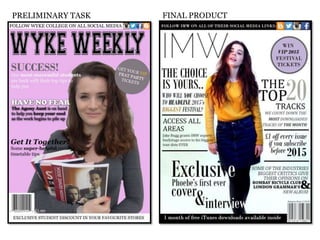
- 2. When it came to creating my final media product, I realised just how useful the preliminary task had been. The skills I had learnt and developed during the preliminary task all came in very useful when creating my final product and I feel that having the chance to ‘practise’ a front cover before doing the real thing enabled me to gain knowledge in magazine front cover conventions because of the conventions analysis we did at the very start of the Media Studies course, the layout of a magazine front cover after doing digital drafts of our first front covers and how to experiment with the colour scheme of the cover as result of making mood boards in the planning and research stage of the preliminary task. When I was in the process of constructing my final product, I carried over the feedback I had been given from my teacher in the preliminary task and made sure that I applied it to my final product. This was advice such as keeping the text on my front cover short and catchy because it takes up a lot of room on the front cover and also because the audience don’t want as lot of text to read on the front cover of a magazine. I was told to use a range of font styles and experiment with the size of the text on my front cover. A large, bold text is good to highlight any key words that you want to catch the audiences eye and draw attention to because perhaps it might be the main feature story of the magazine and may be the reason a lot of people buy that particular issue of the magazine.
- 3. Although it is clear that my skills have definitely developed and improved between the preliminary task and the final product, this comes as a result of doing the preliminary task. During the making of my final front cover I was able to transfer skills and elements of the cover I created in the preliminary task and incorporate them in my final front cover. I chose to use the skyline, advertising the social media links on which the magazine can be found as I thought it was relevant to my magazine because of the social group my magazine is targeting and their hobbies and interests as social media is big part of millions of people’s lives nowadays. I also chose to put the plug in the same place on my final product as I did on my preliminary task front cover because I thought it filled the space well and also because it seemed quite conventional to have the plug in that position on a magazine cover. Another thing I used from preliminary task was the banner at the bottom of the page which, on both front covers, is advertising something extra that would be of interest to the target market and is something extra that may encourage or give people another reason to buy the magazine. Finally, because of feedback I received about my preliminary task cover, I decided to to use a different range of fonts and font sizes to make the cover of my magazine look much more creative and aesthetically pleasing. BY using bolder fonts in a bigger size, it is a way of attracting the audiences eye straight to a certain area of the front cover of the magazine.
- 4. Having done digital drafts of possible layouts for my preliminary task front cover, when it came to doing mock-ups for our final front cover, I found that my existing knowledge of a layout of a magazine front cover made this task much easier as I was able to use the templates I had created and use them to create successful mock ups of a magazine for the genre of music I chose by using artists well-known within that genre for my main cover image. Although I have not positioned some of the conventions in exactly the place on the mock up as they were on the template, I have still included them all on the google mock up in some way. It was hard to layout the google mock up in exactly the same way as the digital draft because sometimes one thing would take up more room than I had anticipated and sometimes things just looked better in one place compared to another. Preliminary Task Digital Draft Google Mock Up
- 5. Preliminary Task Conventions Analysis Final Product Conventions Analysis Another thing I found much easier to do as a result of having done the preliminary task prior to creating the final product was my research. When I came to the planning and research stage of the project, I found that doing conventions analysis became much easier as I had an idea of what conventions to pick up on and how links can be made between the magazine front cover and the target audience or feature stories within the magazine, for example. I feel that having previous knowledge of conventions analysis by the time it came to creating the final product allowed me to re-do it, for my final product, in much more depth and detail. I think this is because I was much more interested and had more knowledge of the genre of magazine for my final product than I did for genre of the preliminary task magazine and I also think that it is because my knowledge of magazine conventions and media terminology had expanded so much in the gap between the preliminary task and the planning and research for my final product.
- 6. Overall, from doing the preliminary task to completing my final product I would say that a number of things have improved. My magazine overall looks much more professional and this comes as a result of being much more experienced in Photoshop and having more knowledge on the genre of the magazine and a better understanding on my target audience by the time it came to creating my final product because of the amount of planning and research we had done in comparison to when I created the front cover of a college magazine for the preliminary task. As a result of my improved skills in Photoshop my main cover image looks much better as I have inserted the coloured background much better and the image in general has been edited to a much better standard which I think has a big impact on the appearance of the cover. My planning and research is also much more detailed and accurate which allowed me to create a much better final product because I had a much better understanding of the audience I was targeting and the market that would consume my magazine, as well as a bigger interest in the genre of magazine we were asked to create for the final product as I am likely to buy a magazine however it would never cross my mind to buy a college magazine. By combining my own personal interests and what I would like to find in a music magazine with my thorough research and planning of my target market I feel that I was able to create a successful product that appeals to the market it was intended for and also one that looks professional and it is work that I am very proud of.