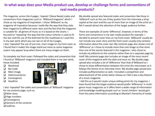
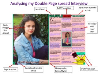
This document provides an evaluation of a student's media studies foundation portfolio project on magazine design. The student chose "Billboard magazine" as their inspiration and replicated some of its codes and conventions across their 4-page magazine, including color scheme, bold masthead, and single cover image. They included industry-standard elements like masthead, barcode, date/price on the cover. The contents page featured main stories, page numbers, and sections. Their double-page spread included interview quotes, a drop cap, and multiple images of the artist. The student provided some differences from Billboard as well, like cover lines and additional images on the contents page. Through this process, the student learned about applying codes and conventions from other media to
The document provides an evaluation of Chloe Bonner's media magazine product. Chloe used conventions from the real media magazine "Q Magazine" in constructing her magazine, including using a black and white front cover image, replicating headline styles, and setting out the contents page similarly. However, her magazine also challenges some conventions through using subtle colors instead of bright ones and including an editor's letter. Chloe further discusses how she employed techniques like desaturating images and using shape tools in Adobe Photoshop to construct the magazine. She also explains shooting decisions for photos used on the cover and contents page.
- The document discusses the production process for a magazine called "Clubland" including planning photoshoots, analyzing the front cover, contents page, and interview spread, and getting audience feedback.
- Feedback indicated the photos were the main strengths but the contents page layout could be more professional at the bottom.
- Completing the preliminary tasks helped the student structure the main tasks and better understand the production process and demands.
This document contains feedback from an evaluation of Abbie Fowler's media magazine product. The evaluator provides feedback on several aspects of the magazine, including the use of conventions from real media products, representation of social groups, intended audience, and technologies used. The evaluator provides positive feedback on the strengths of the images used on the front cover, contents page, and interview spread. One suggestion is to improve the layout of the bottom portion of the contents page to maintain a professional look consistently. Overall, the feedback indicates the magazine successfully uses real-world conventions and represents its target audience.
The document is a product evaluation for a magazine created by Amelia Springthorpe. It summarizes the key conventions and techniques used in the magazine design, including masthead, strap line, headlines, images, and sections on the front cover and contents page. It also discusses conventions used on a double page spread layout, such as columns, quotes, images, and introduction of the interview subject. Feedback was received on using different images to improve the design.
The document is a product evaluation of a student-created magazine. It describes the various conventions and techniques used to design the magazine to appeal to its target audience of music fans aged 14-20. Key points include:
- The magazine takes inspiration from established music magazines like NME and uses conventions like mastheads, headlines, and interviews.
- Pages include a front cover with promotions, a contents page with sections and editorials, and a double-page interview spread.
- Photography was planned to present the rock music genre through clothing styles. Different images were used on different pages for variety.
- Feedback was received and changes were made, like using a more "fun" photo for the double-
The document provides an evaluation of Chloe Bonner's media magazine product. Chloe used conventions from the real media magazine "Q Magazine" in constructing her magazine "ZONE", such as using a black and white front cover image and similar headline styles. However, her magazine also challenges some conventions by using more subtle colors. In layout and design, she replicated elements like the contents page banner and double page interview format. Through this process, Chloe learned how to use tools in Photoshop like hue/saturation, shapes, pen tool, and layers duplication to construct the magazine pages professionally.
Here are 4 annotations of my contents page with red arrows and appropriate media language:
1. Contents Listing: This lists the articles and features contained within the magazine issue. It allows readers to navigate to sections that interest them.
2. Page Numbers: The page numbers help readers locate each article or feature easily.
3. Feature Image: A large eye-catching image promotes and entices readers to turn to the double page interview feature.
4. Magazine Name/Issue: The masthead and issue details identify the magazine and lets readers know they have the correct publication.
The document is a student's evaluation of their media studies project creating a music magazine. It summarizes the key elements of the magazine, including replicating conventions from real magazines like codes, fonts, and features on the cover. It represents rock music fans and aims to appeal to workers and teenagers. The student argues their magazine could be published by Bauer Media due to its synergies across media platforms. The evaluation covers the technical skills learned and gaining audience feedback.
This document contains an evaluation of a student's media production project. It provides feedback on how the student's magazine used and developed conventions of real magazines. It notes that the student followed conventions from music magazines like NME in layout, design elements, and use of convergence. The evaluation praises how the student modeled aspects of their magazine after NME to effectively target their audience of 16-27 year olds. It also comments on technologies the student learned in constructing the magazine project.
The document provides hand-drawn drafts and context for the creation of a music magazine as part of a media studies coursework. It details feedback received from the target audience on key features of a successful magazine, such as consistent color scheme, bold headlines, appealing star appeal on the cover, attractive puff content, and inclusion of social media convergence. This feedback informed the layout and design decisions for the student's final magazine to best appeal to their target demographic.
Nikita Da Silva created hand-drawn drafts of a music magazine to help plan their media production project. Through discussions with the target audience of 16-26 year old females, Nikita identified several key elements of a successful media product. These included using a consistent pink or purple color scheme, having a bold headline, featuring a star the audience admires, including an enticing "puff" piece, and adding social media convergence. The drafts and feedback helped Nikita understand how to design the magazine to appeal to the target audience.
The document discusses how a media product called "Simply Pop Magazine" uses conventions of real pop magazines. It includes conventions like a masthead to establish the genre, cover lines indicating articles, and advertisements to highlight features. Pull quotes, slogans, dates and editors' articles are also included. Images are used prominently on the cover and inside pages to appeal to the target audience of 14-19 year old females interested in pop music and artists. The intended publisher, IPC, is seen as the best media institution to distribute the magazine due to their experience with similar magazines.
The document discusses how a media product called "Simply Pop Magazine" uses conventions of real pop magazines to attract its target audience of 14-19 year old females. Key conventions included bright colors, cover lines advertising articles, pull quotes to intrigue readers, and many images with little text based on audience research. The magazine would be best distributed by IPC, which has experience with iconic magazines like NME and does not currently have a pop magazine.
The document provides research on magazines NME and Q as inspiration for a new music magazine focusing on indie/alternative genres. Key details include:
- NME and Q are cited as inspiration due to focusing on indie/alternative music. Conventions like large mastheads and cover stars will be replicated.
- Target audiences for both magazines are described as mainly male, aged 20-30 with interest in indie/alternative music. Exclusive content draws readers.
- Evidence is given for replicating cover stars and layouts from magazines to attract target audiences through recognition and personal identification.
The document is an evaluation of a student's media studies project creating a music magazine. It summarizes the key aspects of designing the magazine to follow real conventions, including using similar colors, fonts, and layouts as magazines like Rolling Stone. It discusses targeting the magazine's content and advertisements towards social groups that enjoy rock music like emos, punks, and goths. The student also explains how they would distribute the magazine through a company like Bauer Media due to the synergies with their other music magazines. The intended audience is identified as 15-25 year olds interested in learning about the rock industry.
This document contains an evaluation by Forrest Smyth of their music magazine media product for their OCR Media Studies AS Level course. It includes sections analyzing how the magazine uses conventions of real media, how it represents social groups, what type of publisher might distribute it, who the target audience is and how they were addressed. Forrest discusses what they learned about using Adobe Photoshop to construct the magazine and analyzes the layout and elements of the front cover and a double page interview spread.
- The document discusses a music magazine product the author created, evaluating how it uses and develops conventions from real music magazines.
- The author researched magazines like NME, Q, VIBE and Rolling Stone to inspire design elements like the masthead, layout, and photo styles.
- Feedback from a focus group of the target audience, ages 15-25, was positive and provided suggestions for improvement.
- The author learned skills with technologies like Photoshop, Microsoft Word, and Blogger through the process of researching, designing, and presenting their magazine product.
The document provides a design brief to create a new music magazine for a specified audience. It discusses researching conventions of music magazine mastheads and covers to develop the design of the new magazine's masthead, cover lines, plugs, and feature article photograph. Elements were incorporated from magazines like Q and IDJ while also making creative choices to challenge conventions and develop the magazine's distinct style.
The document summarizes the student's magazine project. The magazine uses conventions from established magazines like NME and Q. It represents fans of progressive deep house and electro music. The target audience is males and females aged 16-25 who are interested in those music genres. Distribution could be through a magazine like NME due to similarities in conventions. The student learned skills in using Photoshop and the pen tool to design pages professionally.
As part of my AS Media coursework, I have created a slide share of my evaluation of the music magazine I created. This evaluates the choices I made and whether they were effective or not.
This document analyzes a student's print media product evaluation. It discusses how the student's product uses and develops conventions of real magazines. It describes how magazines typically feature mastheads partially covered by images, give away free items to attract buyers, use sell lines to grab attention, include exclusive interviews, and more. The student aims to challenge gender stereotypes on the cover. The document also discusses the contents page layout, double page spreads, representation of social groups, potential distributors like Bauer Media, the target audience, and technologies learned through the process.
The document presents the results of a survey conducted to gather information to help plan a music magazine. The survey was distributed both online via Survey Monkey and in paper format. The results showed that the target audience should be males and females aged 18+. Most respondents were interested in interviews, album reviews, and upcoming music events. The majority preferred pop music and were willing to pay up to £2-£3 for the magazine. This information will help determine the genres, content, and pricing of the new magazine.
Katie Denn evaluates her media magazine project. She summarizes how she used conventions from real music magazines in her design, such as including a masthead, cover lines, and color scheme. She researched magazines like NME for inspiration on layouts. Her magazine represents indie music fans in their late teens to mid-twenties. She chose a casual yet intriguing cover star photo to attract this audience and showcase new indie artists. Her goal was to authentically portray indie style and culture for readers.
The document discusses how the media product uses and develops conventions of real music magazines. It summarizes the design choices made for the cover, contents page, and double page spread, including color themes, images, fonts, and layouts. Key conventions that were followed include mastheads, prices, barcodes, and competitions. Some conventions that were challenged include using a single main image on the cover rather than multiple images. The target audience is identified as 16-24 year olds interested in indie/alternative music. Learning from Photoshop tools like layers, magic wand, and spot healing helped in designing and maintaining consistency across pages.
The document summarizes Hannah Sweeney's media evaluation project creating a pop music magazine. It discusses how the magazine uses and develops conventions of real music magazines through elements like the cover design, contents page, double-page spread, and interviews. It also addresses how the magazine represents young women and how the target audience of 16-25 year olds was identified and addressed. The document reflects on the software tools used and what was learned through the process about constructing a media product from preliminary ideas to the final magazine.
The document discusses various conventions used in music magazines and whether the media product follows, develops, or challenges these conventions. It analyzes conventions for the masthead, main image, features, tags, anchorage text, house style, sell lines, contents page layout and design elements, double page spreads, pull quotes, and page numbers. Overall, the media product follows most conventions to be recognizable to audiences but makes some unconventional choices for the contents title, logo addition, and large page number to draw more attention.
The document describes a student's media coursework project to create a new British music magazine focused on the genre of electro-pop. The student conducted research and found no existing electro-pop magazines, seeing an opportunity. The student believes the magazine will be popular given the growing popularity of electro-pop music and artists. The document includes questions about representing audiences, distribution partners, the target audience, and attracting readers.
The document provides details on the production of a music magazine front cover created by Isaac Halle. It includes explanations of design elements added to the cover such as the masthead, background, date, price, and bar code. Images of featured bands inside are also included. Evidence is given for replicating the "star" or featured artist on the cover through choosing a model and coordinating their appearance, pose, and hand gesture to match the original star. The contents page is similarly designed to replicate the layout and poses of the band Alt-J. Evidence is provided to show how individual band members are replicated through the model's clothing, pose, and appearance. Research is included on magazines of inspiration NME and Q, analyzing their conventions
Candidate Toni Hopkins completed a media studies portfolio over the course of several months. They created preliminary designs for a school magazine including hand drawn drafts of the front cover and contents pages. Hopkins then designed digital versions of these pages in Photoshop, applying codes and conventions from their inspiration magazine Billboard. They took photos and designed a double page spread interview, obtaining feedback and making revisions. Finally, Hopkins evaluated their work through a survey and added the results to a PowerPoint presentation concluding their portfolio.
This document is a log book for a student's music magazine production preliminary task. It provides details of the student's progress on creating the front cover and contents page for the magazine. For the front cover, the student describes adding elements like the masthead, tagline, barcode, cover stories, images, and price. For the contents page, the student outlines structuring the page, including the main story image, contents heading, story titles, editorial image and story images. Research is also included on established music magazine Billboard and its target audience and unique selling point.
The document represents several groups through stereotypes. Older women are portrayed as gossiping in the town. Young men are depicted as rowdy through their loud music. The police are seen as upholding social order but also as a means for young people to rebel against authority.
The document discusses how four film techniques - soundtrack, editing, mise-en-scene, and camerawork - are used to create effects. For soundtrack, it notes how music can set the mood. Editing involves choosing shots and transitions to guide the audience. Mise-en-scene includes elements like lighting, costumes, and setting to immerse viewers. Camerawork utilizes angles, distance, and movement to direct attention and develop meaning. Examples of each technique could be taken from the provided extract.
This document appears to be an analysis of a practice test or assignment that contains 4 sections - 3 multiple choice questions and a narrative. The analysis examines characteristics of the characters in the narrative such as gender, nationality, age, ethnicity and presence of stereotypes or anti-stereotypes.
The document provides a schedule with key details. It outlines when certain events will take place and the order that they will occur in. The schedule gives an overview of the plan and timeline for upcoming activities.
The prop list is for a student media production called "No Escape" created by a group consisting of Eleanor Mason, Niall Moriarty, and Alex Tate. Niall will gather fake blood and weapons like an axe or knife. All group members will provide plain paper, backpacks, handbags, and school books. All group members and actors will provide their own clothes. Alex may provide sports equipment like a basketball or football.
This document summarizes the key points from a student's evaluation of their media magazine project. The student believes their magazine challenges conventions by incorporating both music and art genres. They were inspired by Rolling Stone magazine's multi-genre approach. The student aimed to give their magazine a sophisticated, fashion magazine-like aesthetic inspired by Vogue. They used various typographic and design choices to achieve this. The student represents artists and musicians in their magazine and chose Lady Gaga as their cover story due to her influence across genres and inclusive attitude. They believe their magazine would appeal most to 18-27 year olds interested in individuality, identity, and artistic expression.
A group of A-Level students from St Paul's Catholic College are requesting permission to film locations around Sunbury in November 2015 for their soap opera trailer coursework. They will be filming every Thursday that month and only using the footage for their A-Levels. The students want to film scenes at their school and ensure no harm will come to the environment, area, or people during filming. Their teacher, Mr. M Vinnicombe, can be contacted if needed.
The document summarizes research on magazines, including codes and conventions of magazine covers, target audiences, unique selling propositions (USPs), genre research, and publisher research. Specifically:
- It identifies codes that should be on a magazine cover like a masthead, images, cover lines, barcode, and convergence links. An analysis finds that a Rolling Stone cover is missing some of these elements.
- The target audience for the author's proposed magazine is identified as people aged 13-25 interested in rock and pop music.
- The magazine's USP would be featuring emerging artists in the art world beyond just music.
- Research on the genre identifies Rolling Stone as inspiration for including both music and art
This document provides an analysis of codes and conventions of the soap opera genre based on a study of EastEnders. It identifies common elements like multi-stranded narratives, romance subplots, family conflict, and a focus on working class communities. The intended audience is identified as primarily female and British based on an analysis using Hartley's seven subjectivities. Two trailers are deconstructed looking at how they incorporate various codes and conventions and their potential impact on audiences based on theories by Katz, Maslow, and Hartley. BBC Two is identified as an appropriate institution to partner with given its target demographics and history of airing similar programming.
The document provides a textual analysis of two trailers for the soap opera EastEnders and evaluates the strengths of each. For the first trailer focusing on Kat and Alfie, the analysis notes the use of dialogue and costumes to reference a Western film genre. Character reactions and locations are used to set up an upcoming conflict. The second "Week of Revelations" trailer uses ominous music and lighting to create a horror element, focusing on Lucy Beale's ghost to tease the revelation of her killer. Both trailers effectively use stereotypes and close-ups of characters to engage audiences. The analysis also summarizes the American Horror Story: Hotel trailer, praising its use of a dolly shot to introduce characters in a creep
The document is a collection of random symbols and characters that do not form coherent words or sentences. It discusses nonsensical topics through an incomprehensible grouping of letters, numbers, and punctuation marks. The document does not have a clear point and is impossible to understand or summarize in a concise manner.
The document provides an evaluation of Chloe Bonner's media magazine project. Chloe used conventions from the real magazine "Q Magazine" in constructing her own magazine titled "ZONE". On the front cover, she repeated conventions like using a black and white main image and setting out headlines in a similar style. She also repeated conventions on the contents page like including a screenshot of the front cover. Chloe challenged some conventions by adding an editor's letter. Feedback from peers praised the clear layouts and professional appearance but suggested improvements like higher quality images and more color. The magazine effectively replicates the style of "Q Magazine".
The document discusses how the student's media product, a magazine, uses and develops conventions from the real-world magazine "XXL Magazine". The student repeats colors, logo style, lack of thumbnails, and other design elements from XXL. The student also challenges conventions by changing the layout of the contents page and separating the editorial onto its own page. The intended audience is described as black/urban followers ages 14-20 who enjoy hip-hop music. Images and headlines feature popular artist Usher to appeal to this target demographic.
This document contains an evaluation of a student's media studies project creating a music magazine called "Virtuoso". The student discusses how their magazine uses and develops conventions from real music magazines like "Billboard". They also discuss representing social groups, their target audience, and how they addressed that audience. The student reflects on what they learned about using Adobe Photoshop to construct the magazine pages and planning the photography used.
This document provides an evaluation of Abbie Fowler's media product. It discusses how the product uses and develops conventions from real media products like Mixmag magazine. Specifically, it repeats conventions like masthead positioning and main image, puff promotion, and strapline placement from Mixmag. It also challenges conventions by making some elements like stories and sections clearer. Photoshop was used to help create effects and maintain a consistent color scheme. The document discusses how the product represents particular social groups that would be interested in club music. Overall, it reflects on the learning process of constructing the media product and meeting the demands of the production process.
This document contains an evaluation of a student's media studies coursework project to create a music magazine. The student summarizes their use of conventions from their magazine of inspiration ("Q" magazine) in designing the layout, structure, and content of their magazine. This includes replicating elements like the location of the masthead, adding artist listings on the cover, and using consistent colors. The student also discusses some ways their magazine differs, such as through more casual clothing of their model and personal responses in the interview feature. The evaluation reflects on how the magazine represents social groups like young R&B fans and troubled young men through the images and language used.
1. The student created a 4-page music magazine called "Dynamic" to replicate conventions from real magazines like Billboard and Clash.
2. Technologies like Adobe Photoshop were used to manipulate images and lay out the magazine, learning tools like the shape, line, and pen tools.
3. Four photos were taken of the front cover star, Katy Perry, and the fourth photo was chosen to clearly show her whole face and fill the cover in a mid-shot size.
The document provides an evaluation of a student's media studies project to create a music magazine called "Sound Army".
The student discusses how their magazine uses conventions from real media products like Vibe magazine. They also analyze how their magazine represents different social groups and the types of audiences it might attract.
The student explains that large media company Bauer Media might be interested in distributing their magazine due to its focus on building relationships with readers across different platforms.
Overall, the student reflects on what they have learned about technologies like Photoshop and the progression of their skills from their preliminary task to completing the full magazine product.
Katherine created a music magazine called "Dropout" to fulfill a media studies assessment. She drew inspiration from the layout and conventions of "Clash Magazine." Katherine represented the target demographic of 16-25 year olds and those in socioeconomic category E through affordable pricing and content. She incorporated codes like colored text and images to attract her intended audience. Producing preliminary tasks helped Katherine improve her Photoshop skills and create a professional final product that demonstrated her creative abilities.
The document discusses how the author attracted and addressed their target audience for their music magazine. To attract readers, the front cover uses a bold masthead, colorful imagery, and prominently displays the price. The contents page features the author's own concert photos to seem more relatable. To address readers, the magazine provides information like tour dates and reviews. It helps build readers' personal identities by emulating styles of music icons. Entertainment elements like boxed extras break up longer articles. Social media integration and a genre-related magazine title foster community among fans.
The document is an evaluation of the student's media magazine project. It discusses how the magazine uses and develops conventions from inspiration magazines Kerrang! and Classic Rock. It analyzes the codes and conventions used on the front cover, contents page, and double page interview spread. The student explains the photography planning and choices made. Audience feedback is discussed, suggesting improvements like adding borders, focusing on music stories, and making the website link more noticeable. Overall the summary analyzes and discusses the codes, conventions, and design choices used in the student's magazine project.
The document summarizes a student's magazine project evaluation. The student created a music magazine called "SOUND" targeted towards a unisex audience aged 16-24. Key elements of the magazine included a bold masthead, a lead image featuring a band member on a throne for the cover story, and columns on the double page spread layout. Feedback from surveys indicated a need for different cover color choices and less clutter. The student learned important skills in magazine design using Photoshop and conducting research.
This document provides an evaluation of a student's media studies project to create a music magazine. The student discusses how they used conventions from real magazines like Rolling Stone in their design. They explain the features included on the front cover and contents page to follow industry standards. For a double page spread interview, the student arranged images and text conventionally and credited contributors as required. They believe Bauer Media could potentially publish their magazine due to its relationship-building content and cross-platform convergence. The student reflects on learning Photoshop skills like layers and editing images to make their magazine look professional.
This document contains an evaluation of a student's media studies project creating a music magazine. The student summarizes how they used conventions from real magazines in their design. They explain the layout choices made for the front cover, contents page, and double page spread. The student also responds to questions addressing how the magazine represents social groups, what publisher might distribute it, who the target audience is, and how they attracted this audience. The student reflects on what they learned about technologies like Photoshop through constructing the magazine.
This document provides an evaluation of a student's media studies project to create a music magazine. The student summarizes how they used conventions from real magazines in their design. They explain the layout and content of the front cover, contents page, and double page spread. The student also reflects on what they learned about technologies like Photoshop and fonts in constructing the magazine. Overall, the document evaluates how the student's media product represented target audiences and could be distributed by a publisher based on research.
1. The document discusses the design elements and conventions used in creating a music magazine called "SOUND" for a target audience of 16-25 year olds interested in indie and hip hop music.
2. Key elements discussed include the masthead, cover image, pull quotes, and layout which were designed to attract readers and represent the magazine's genre and social group.
3. Feedback from a survey of the target audience indicated they liked the magazine overall but suggested changes to the front cover color and layout. The creator learned new skills in magazine design using Photoshop.
The document is a student's evaluation of their work on a music magazine production project. It begins by outlining the criteria that must be addressed in the evaluation, including answering 7 questions about the pre-production and production tasks completed. It emphasizes utilizing a variety of technologies to evaluate the work.
The bulk of the document consists of the student's responses to the 7 required questions. They discuss how their magazine uses conventions from real music magazines as inspiration. They analyze how it represents particular social groups through imagery and content. They argue that Bauer Media might distribute it due to similarities with Bauer's magazine Kerrang. The intended audience is identified as teenagers and young adults, especially males, based on theories of audience and uses and gratifications
The student learned a lot from completing the preliminary task to the full product. They gained experience with the demands of the production process. There is evidence of progression, such as applying feedback to better meet the target audience's needs and preferences. The student incorporated appropriate codes, conventions, and technical skills to create a polished media product.
The document summarizes the key aspects of the student's media product, which is an indie music magazine called OFFBEAT. The student used conventions from existing magazines like Q Magazine but added their own style. They focused on representing women and younger audiences positively. The magazine would likely be distributed by media companies like Bauer Media Group that publish similar music magazines. The student learned important skills in photography, Photoshop, and using different media platforms to construct and showcase their product. The target audience is people interested in indie music and alternative genres.
The document discusses the student's media magazine project. It summarizes how the magazine uses conventions of real media products in its design and layout. While it adheres to conventions like mastheads and editorial layouts, it also challenges some conventions by listing artists on the cover rather than stories and reusing cover images on the contents page. The document also discusses how the magazine represents its target 20-25 year old audience that enjoys electronic dance music. It was produced using tools in Adobe Photoshop to achieve a professional look and replicate magazine conventions. The student learned efficient techniques for layout and how to speed up the production process for meeting deadlines.
This presentation includes basic of PCOS their pathology and treatment and also Ayurveda correlation of PCOS and Ayurvedic line of treatment mentioned in classics.
ISO/IEC 27001, ISO/IEC 42001, and GDPR: Best Practices for Implementation and...PECB
Denis is a dynamic and results-driven Chief Information Officer (CIO) with a distinguished career spanning information systems analysis and technical project management. With a proven track record of spearheading the design and delivery of cutting-edge Information Management solutions, he has consistently elevated business operations, streamlined reporting functions, and maximized process efficiency.
Certified as an ISO/IEC 27001: Information Security Management Systems (ISMS) Lead Implementer, Data Protection Officer, and Cyber Risks Analyst, Denis brings a heightened focus on data security, privacy, and cyber resilience to every endeavor.
His expertise extends across a diverse spectrum of reporting, database, and web development applications, underpinned by an exceptional grasp of data storage and virtualization technologies. His proficiency in application testing, database administration, and data cleansing ensures seamless execution of complex projects.
What sets Denis apart is his comprehensive understanding of Business and Systems Analysis technologies, honed through involvement in all phases of the Software Development Lifecycle (SDLC). From meticulous requirements gathering to precise analysis, innovative design, rigorous development, thorough testing, and successful implementation, he has consistently delivered exceptional results.
Throughout his career, he has taken on multifaceted roles, from leading technical project management teams to owning solutions that drive operational excellence. His conscientious and proactive approach is unwavering, whether he is working independently or collaboratively within a team. His ability to connect with colleagues on a personal level underscores his commitment to fostering a harmonious and productive workplace environment.
Date: May 29, 2024
Tags: Information Security, ISO/IEC 27001, ISO/IEC 42001, Artificial Intelligence, GDPR
-------------------------------------------------------------------------------
Find out more about ISO training and certification services
Training: ISO/IEC 27001 Information Security Management System - EN | PECB
ISO/IEC 42001 Artificial Intelligence Management System - EN | PECB
General Data Protection Regulation (GDPR) - Training Courses - EN | PECB
Webinars: https://pecb.com/webinars
Article: https://pecb.com/article
-------------------------------------------------------------------------------
For more information about PECB:
Website: https://pecb.com/
LinkedIn: https://www.linkedin.com/company/pecb/
Facebook: https://www.facebook.com/PECBInternational/
Slideshare: http://www.slideshare.net/PECBCERTIFICATION
Reimagining Your Library Space: How to Increase the Vibes in Your Library No ...Diana Rendina
Librarians are leading the way in creating future-ready citizens – now we need to update our spaces to match. In this session, attendees will get inspiration for transforming their library spaces. You’ll learn how to survey students and patrons, create a focus group, and use design thinking to brainstorm ideas for your space. We’ll discuss budget friendly ways to change your space as well as how to find funding. No matter where you’re at, you’ll find ideas for reimagining your space in this session.
हिंदी वर्णमाला पीपीटी, hindi alphabet PPT presentation, hindi varnamala PPT, Hindi Varnamala pdf, हिंदी स्वर, हिंदी व्यंजन, sikhiye hindi varnmala, dr. mulla adam ali, hindi language and literature, hindi alphabet with drawing, hindi alphabet pdf, hindi varnamala for childrens, hindi language, hindi varnamala practice for kids, https://www.drmullaadamali.com
How to Manage Your Lost Opportunities in Odoo 17 CRMCeline George
Odoo 17 CRM allows us to track why we lose sales opportunities with "Lost Reasons." This helps analyze our sales process and identify areas for improvement. Here's how to configure lost reasons in Odoo 17 CRM
Leveraging Generative AI to Drive Nonprofit InnovationTechSoup
In this webinar, participants learned how to utilize Generative AI to streamline operations and elevate member engagement. Amazon Web Service experts provided a customer specific use cases and dived into low/no-code tools that are quick and easy to deploy through Amazon Web Service (AWS.)
A review of the growth of the Israel Genealogy Research Association Database Collection for the last 12 months. Our collection is now passed the 3 million mark and still growing. See which archives have contributed the most. See the different types of records we have, and which years have had records added. You can also see what we have for the future.
This slide is special for master students (MIBS & MIFB) in UUM. Also useful for readers who are interested in the topic of contemporary Islamic banking.
This presentation was provided by Steph Pollock of The American Psychological Association’s Journals Program, and Damita Snow, of The American Society of Civil Engineers (ASCE), for the initial session of NISO's 2024 Training Series "DEIA in the Scholarly Landscape." Session One: 'Setting Expectations: a DEIA Primer,' was held June 6, 2024.
How to Build a Module in Odoo 17 Using the Scaffold MethodCeline George
Odoo provides an option for creating a module by using a single line command. By using this command the user can make a whole structure of a module. It is very easy for a beginner to make a module. There is no need to make each file manually. This slide will show how to create a module using the scaffold method.
1. OCR Media Studies – AS Level
Unit G321: Foundation Portfolio in Media
Evaluation
Name: Toni Hopkins
Candidate Number: 6660
Center Name: St. Paul’s Catholic College
Center Number: 64770
2. The magazine, across the 4-pages, ‘repeats’ (Steve Neale) codes and
conventions from magazines such as ‘Billboard magazine’ which I
chose as my magazine of inspiration. I chose ‘Billboard’ as my
magazine of inspiration because I really like the way that they style
their magazine to different cover stars and the fact that the magazine
is suitable for all genres of music as it is based on the charts. I
focused on ‘repeating’ the way that the colour scheme is used to fit
the star and the use of the bold text for the masthead so I used this
in my own work which you can see on all of my 4 pages.
I also ‘repeated’ the use of just one, main image on my front cover as
I found that it makes the image stand out more as some magazine
covers may appear busy when there are many images on them.
To complete my front cover I followed the codes and convention that
I found on ‘Billboard’ magazine and included them in my own work,
these included:
Masthead
Bar Code
Main Image
Date/issue/price
Convergence
Headline
I also ‘repeated’ the codes and conventions of ‘Billboard’ magazine
for my contents page, such as:
Main story
Page numbers
Convergence
Sections of the contents
Sublines
My double spread also featured codes and convention like those in
‘billboard’ such as the use of key quotes from the interview, a drop
capital at the start and the use of more than on image of the artist as I
felt it would attract the attention of the target audience further.
There are examples of some ‘difference’, however, in terms of the
forms and conventions in my own media product for example I
decided to present cover lines on my front cover, ‘Billboard’ usually do
not include any cover story and the front cover usually only contains
information about the cover star. My contents page also shows a lot of
‘difference’ as I chose to include more than one image so that more
than one of the stories featured in the magazine. I also chose to
include my editorial on the contents rather than on a separate page by
itself. My contents page also includes an image of the most recent
cover of the magazine with the date and issue no. My double page
spread also includes a lot of ‘difference’ than that of Billboard as I
chose to show differentiation between the artist the interviewer so it
follows the theme of an interview more. My double page spread also
includes puff/promotion as well, I included a competition and
advertisement of the artists latest release as I felt it was a key feature
of a music magazine.
I did this as it would create unique selling points for my magazine, I
have found that the target audience would prefer ‘difference’ in multi-
genre music magazines as it offers them a wider range of information
and knowledge enabling people such as ‘social climbers’ would gain
from this extra information according to Maslow’s hierarchy of needs.
3. How does your media product represent particular
social groups?
The denotation of representation is the action of speaking or acting on behalf of someone or the state of
being so represented. The magazine, across the 4-pages, helps to represent both female and male stars in
a positive way, mainly the female gender. Especially on my front cover I have chosen to portray my cover
star as confident and powerful. I think the way that the image has been captured gives the reader the
impression that I wanted them to. I have used Photoshop to edit the front cover image so that she
appears to be wearing bright and colourful clothing making her come across as a cheerful person. I also
made the lighting look brighter and more like a star would look on a warm summers day, once again
making the star look like a positive role model for the audience. I think that my magazine could be a form
of ‘diversion’ (Katz) for audience members that are workers as reading my magazine will act as a way to
escape the reality of their lives. The inclusion of male stars on the cover and on the contents also
represents them as a good role model as the brief descriptions tell the audience of their success. The use
of these cover stars will attract a particular audience due to ‘Star Appeal’ (dyer) as many people would
buy a magazine for the stars they see on the cover. My intentions for my magazine was to attract a wide
audience with the use of multi-genres just like my magazine of inspiration Billboard, which is why I
included cover stories involving stars from genres other than pop. However my magazine does not
represent all audiences/social groups; such as ‘goths’ ‘hippies’ ‘punks’ and those into classical music. In
order to attract these audiences I would have to change the appearance of my magazine and make the
colour scheme darker and change the types of stars I include on the cover and in my contents page so that
it will meet the expectations of a wider audience including the previously mentioned social groups.
4. What kind of media institution (Publisher) might
distribute your media product and why?
From the research that was completed pre-production, I would think that Billboard
publications would publish my magazine ‘Shuffle’ because I found that they ‘inform’ and
‘educate’ (Katz’) their audience with the latest music news and gossip and provide the
audience with the breakdown of the charts containing all of the viewers favourite music stars.
The similarities of my magazine to ‘Shuffle’ also ‘sgnifies’ (De Saussure) that Billboard
Productions may decide to distribute my magazine due to the fact that my magazine follows
similar codes and conventions that I ‘repeated’ (Steve Neal) from my magazine of
inspirational magazine Billboard, as they fit best with the genre I have chosen to base my
magazine on, this will create interest for Billboard Publications causing them to distribute my
magazine.
During my planning I also looked at other magazines such as ‘Q’ and ‘NME’ for inspiration.
The publisher for ‘Q’ is Bauer. There’s also a possibility for my magazine to be distributed by
Bauer because as some of the codes and conventions featured on ‘Q’ are featured on my
magazine and as y magazine contains multiple genres, this publishing company would be
appropriate for my magazine ‘Shuffle’.
5. Who would be the audience for your media product
and why?
According to Hartley’s seven subjectivities the target audience if my magazine ‘Shuffle’ would be for both
genders but mainly female aged between 15-25 years old. It would appeal to thus audience due the
bright colour scheme followed throughout and a very modern appearance, the stars that I have
chosen for the cover will also attract this audience because the stars will act as role models for the
audience as they may aspire to be as successful and powerful as the mainly female stars of my
magazine.
According to Katz’ Uses & Gratifications theory, my audience would be able to build a ‘personal
relationship’ with the stars of the magazine and also in some ways be able to ‘personally identify’
with the stories told by their role models on the interview pages. This is a key aspect of attracting an
audience as it encourages the audience to read my magazine and will encourage them to build
anticipation for future issues. In future issues male over stars will be included which will build
elements of ‘female gaze’ (Laura Mulvey) whilst in the issue I just produced ‘male gaze’ is clear as the
star Selena Gomez is objectified by the male audience.
According to Maslow’s hierarchy of needs, my magazine would be aimed at ‘social climbers’ as they will
seek as much information as possible to gain their status in society. The information that they gain
from my magazine will give them this information, as the double page interview includes a lot of
information about the audiences role model meaning they can find out the latest from their favourite
stars.
6. How did you attract/address your audience?
In order to attract the intended target audience of mainly females aged between 16-24, I decided to use
the appropriate language. The language I have chosen to use will fit my target audience as they will be
able to understand everything clearly. By using words such as ‘win’ or ‘exclusive’ will attract my target
audience because they will be able to gain something from ‘Shuffle’ and these words will entice them so
that they can build ‘esteem’ according to Maslow’s Hierarchy of needs. ‘Star Appeal’ will also help my
attracting my audience because the first thing you see on a magazine is the main image and if the image
is of a star that interests the target audience they will buy the magazine. The inclusion of codes &
conventions such as my editorial will help to appeal to the target audience because it allowed my target
audience to ‘Identify’ (Katz’) with as I included the use of words such as ‘I’ and ‘You’ this is effective in
attracting the audience as the audience of ‘Shuffle’ will feel as if I am communicating directly with them.
7. What have you learnt about technologies from the
process of constructing this product?
The denotation of the software used to construct the media product entitled ‘Shuffle’ was Adobe
Photoshop CS4. I chose to use this product because I had previous knowledge of the software from
various other projects and it allowed me to successfully create my magazine. This software enabled me
to edit my images appropriately so that they fit to the genre if my product, it also allowed me to change
the backgrounds and arrange all of the appropriate codes and conventions neatly on each page. My
ability to complete actions like this was due to the wide variety of tools available on the software. From
this project I learnt how to manipulate colours on images allowing me to brighten up all images across
all four pages, including my main cover image which will attract the audiences attention. I also learnt
how to use the pen tool, this tool allowed me to write around images and shapes across my pages, I
mainly used this tool to create the columns of text on my double page spread. For originality, I used all
of my own images which I took on my camera and also found an appropriate font to fit my genre on a
website called, dafont.com. I then changed the colour of the text to meet the colour scheme of my
magazine, this created some ‘difference’ (Steve Neele) from my inspirational magazine ‘Billboard’ to my
original magazine ‘Shuffle’.
8. I took a variety of different images for my Main front cover image. I got the
idea for my image from my magazine of inspiration ‘Billboard’ as I found that
they typically use a medium close up of the cover star which is then presented
in the centre of the front cover. I chose the mage where my cover star as I felt
that it was appropriate for my magazine and I like the way that the female is
seen as quite powerful, this will give a good impression on my audience as
they will aspire to be powerful like the star on the cover, this will also allow
my target audience to be able to build a ‘personal relationship’ (Katz) with the
star Selena Gomez as she appears like a positive female role model and quite
an approachable person. After choosing the top left image as my final image I
decided to edit it to make it more colourful and aesthetically pleasing for my
audience. I cropped out the white background making the image background
transparent so I was able to place it onto my front cover, I also changed the
colours of her clothing to match the pale pink background I chose for my
magazine. I also made my cover star look like she
was wearing lipstick, I did this because I felt the
image was quite plain and she didn’t really look
like a cover star. As I chose to appeal to both
genders, however mainly female, this image will
also bring in a male audience due to ‘male gaze’
(Mulvey), providing me with a wider audience
for the whole of my magazine.
Final image After Photoshop
9. For my contents page I decided to include a few images of the stars from the
front cover. I chose to add images of Taylor Swift and Passenger. During the
process of producing my magazine I went to see passenger in concert so I
decided to use an image from the concert, I chose to use an image from the
concert as it would be beneficial to the audience to see one of their favourite
stars on stage. However, this image is very low quality so if I was to take this
shoot again I will find a model and set it up on backdrop in a higher quality.
For the Taylor Swift shoot I decided to dress her in stereotypical clothes so
that my audience will instantly be able to recognise her. I also included an
image of my cover star, Selena Gomez, I did this a little preview for the main
article featured in ‘Shuffle’. I think that these images will allow my target
audience to ‘personally identify’ (Katz) with my magazine and it will increase
their anticipation for further issues. When placing these images onto my
content page I decided to shape them and place them like thumbnails, I did
this because it gave the page more of a professional look. By including more
than one image on my contents page I am ‘repeating’ (Neale) the codes and
conventions featured on ‘Billboard’ magazine.
10. Final image
Final image
After Photoshop
After Photoshop
I took the most images for my double page spread. I experimented with different
environments, angles and lighting for these images. After my research of billboard
magazine I decided to do my own layout for the DPS as I felt that it would produce
some difference (Neale). I chose my final image as I it seemed to fit well with the
image I was trying to create for my magazine and I decided to use it s that it would
take up a whole side of my DPS. By having my cover star in a natural environment
made my star more relatable for the audience. After choosing this image as my final
one I decided to edit it to make it more colourful and aesthetically pleasing for my
audience. I decided to keep the background, so I was able to place it onto the page
and fit it on appropriately. I also changed vibrancy of the colours of her clothing to
match the bright colours seen on the front cover. I also made my star look like she
was wearing lipstick so that I have ‘repeated’ (Neale) her look from the cover. I also
decided that I wanted to make the natural background a bit more vibrant to math
the feeling the star is giving the audience, I did this by enhancing the green of the
grass and changing the colour of the dead brown flowers in the background to pink
to making them look more pretty like flowers should be. Once again this image will
also bring in a male audience due to ‘male gaze’ (Mulvey), providing me with a wider
audience.
14. Audience Feedback -
As well as completing a series of face to face interviews
to gather audience feedback, I also produced a feedback
group using social media, I did this because a key part of
my magazine is the availability of online interviews and
exclusives online on social networking sites such as
Facebook and Twitter. I created a feedback group on
WhatsApp and asked the participants the following
questions; ‘Please could you tell me your most and least
favourite aspects and why?’ and ‘Would you buy my
magazine and why?’. From my results I gathered I found
that everyone really like my use of the shadow effect in
my main image on the front cover as it made the image
stand out, they also like the colour scheme I used as it fit
with my target audience. Most females I asked said that
they would purchase my magazine as they was intrigued
by the stories featured on my front cover and the use of
‘Star Appeal’ (Dyer), however with the male audience,
only a few of them said that they would purchase the
magazine. To improve they suggested that I find some
clearer images for my contents page as the quality of
those images did not meet the standard of some of my
other images featured in the magazine. They also
suggested making the title of my double page spread
more clear as there is no evidence that it is on Selena
Gomez for those who will not recognise her image.
15. Looking back at your Preliminary task, what do you
feel you have learnt in the progression from it to the
full product?
I feel that, having completed the preliminary task and learning about the demands of this
production process I was able to complete my main task to the best of my ability. I have learnt that
by doing a preliminary task it allows you to improve on your skills and make your media product
look more professional. Doing my preliminary task allowed me to brush up on my Photoshop skills
that I learnt during my GCSE media coursework and a chance learn some new ones. During this
process I learnt how to use the pen tool, this tool has helped throughout the whole of my
magazine. There is evidence of progression that I feel particularly demonstrates how I met the
demands of the production process, for example the quality of my main image on my preliminary
front cover is a lot lower than the image on my main production work. I also feel like all of my work
is of a more professional standard after my preliminary task. This will be beneficial in attracting my
target audience as they will aim toward a magazine that looks professional and also meets their
needs.