EVALUATION
Natalie Holt
The 7 Questions
• In what ways does your media product use, develop or challenge
forms and conventions of real media products?
• How does your media product representation particular social
groups?
• What kind of media institution might distribute your media product and
why?
• Who would be the audience for your media product?
• How did you attract/address your audience?
• What have you learnt about technologies from the process of
constructing this product?
• Looking back at your preliminary task, what do you feel you have
learnt in the progression from it to the full product?
Developing and Challenging Conventions
• Concerning my front cover, the basic conventions of the rock genre are followed by use of an
inconsistent colour scheme. The basic black and white are usually followed, but each issue a third
colour is used which is different each time to represent an artist, while black and grey are used to
connote violence and aggression.
• The masthead is located in the first third of the magazine and is bold to catch the readers attention. I
chose to use the font „Chiller‟ because the rmessy lettering I felt represented the rock genre by
looking less tidy, which emulates the cluttered layout of other rock magazines but still remained
easily readable as it is large and bold. Throughout the front cover, contents page, and double page
spread 3 different fonts were used; Chiller, Aharoni, and Lucinda Sans, as all together they still
represented the right image, but having the „straight‟ fonts Aharoni and Lucinda Sans the smaller
text is still easily readable.
• My main image includes dark clothing, but rather than a miserable facial expression, I had the model
do a side pout as it best represents the attitude of the artist I am trying to create. I pulled quotes
from my articles to interest the reader and included free poster give away‟s to make the reader want
to buy the magazine, as the audience are young and free things appeal to them. I featured famous
rock bands and artists in the magazine to attract the audience, if they see a band they know they
are more likely to buy the magazine.
Representation
As my magazine is of a rock genre, I used the following features to represent this;
• Concerning my front cover, the usual feature of an inconsistent colour scheme us used. I chose to
have the basic black and white but as my artist is a young teenage girl I also used a dark purple. As
she is an young rock star, I stayed away from bright colours to represent the darker tone of the
music genre, whilst still using a stereotypically female colour, purple.
• I chose to use the font „Chiller‟ for the masthead because the messy lettering I felt represented the
rock genre by looking less tidy, but still remained easily readable as it is large and bold. Throughout
the front cover, contents page, and double page spread 3 different fonts were used;
Chiller, Aharoni, and Lucinda Sans, as all today they still represented the right image whilst being
bold and easily readable.
• For my images, the model used was dressed in dark but young clothing and make-up, this allowed
me to represent the young age of the artist and her typically rock attitude also. The lighting used in
the images was used to create a dark background but to aluminate the subject so she would stand
out. The use of shadows and the bare backgrounds which allow her to be the sole focus of the
image imply that she is in the spotlight, which is an underlying representation of her current status
within the industry.
Institutions
I think a the media institution Freeway Press Inc. may distribute my magazine as it is the
publisher for the British magazine Rocksound which is similar to the magazine as it is
aimed at a more underground audience, being less commercial whilst also giving
coverage to well-known acts.
Another institution that might also distribute my product is Future Publishing, which also
publish rock magazines Metal Hammer and Revolver. Although aimed at a more
underground audience, these titles are heavy metal publications, which would put my
product at an advantage to the company as it is of a different genre and will attract a new
and possibly larger audience.
Another possible media institution is Emap/Bauer who as responsible for distributing the
popular titles Q, Mojo, and Kerrang!. However, the more „underground‟ titles that the
company have previously published have been closed, so the prospects for my magazine
doing well with this company and poor.
Target Audience
• My target audience is a younger demographic aged between 16 and 25. This
age group are often looking for the newest trends in music and
fashion, therefore my magazine, that focuses on new and upcoming artists
will be suitable for them. Also I have priced my magazine at £2.30 to appeal
to this particular age group as they often have low paying jobs to support
themselves whilst still in education. Despite this they would still be able to
afford my magazine each issue. My survey results have also helped me
establish what people of this age range would like to see in the
magazine, therefore I can meet their expectations.
• Magazines aimed at 16-25 year olds are more likely to get extra publicity
because of the readers. As this age of people are more willing to look at new
magazines and are more likely to spread the news of the magazine quickly
through social media and word of mouth, increasing the chances of the
magazines popularity rising quickly.
Attracting an Audience
As my magazine is aimed at bother male and female young adults I had to be careful not to alienate
the male members of the audience as this issue is about young female artist and may appeal more to
women.
• To attract the audience I used the classic features of bold fonts and contrasting colours to initially
grab their attention. The colours were used more to represent the artist rather than attract an
audience, but the colour scheme I believe is indicative of a rock magazine and would still attract
potential readers. To appeal further to the readers I used plugs such as „6 AMAZING POSTERS‟ to
advertise the magazine in addition to the feature articles to essentially „hook‟ them into buying it.
• The artists used in my feature articles; Muse, Noel Gallagher, David Bowie, Bastille, The Rolling
Stones, Hayley Williams, Def Leppard, and Lacey are old and new bands/artists that I hoped would
appeal to different types of fans, whether they prefer old rock or new. In terms of my cover articles, I
attempted to create ones that would appeal to the fans of that particular artist, for example “Noel
Opens Up” causing interest for the Oasis fans. But additionally the majority of readers I think would
be interested in confessions for Noel Gallagher. I also made up a conflicting quote from David
Bowie, a respected artist in the rock community, throwing blame on the most well known pop band
in the world right now “THE 1D‟S OF THIS WORLD ARE TO BLAME”. As 1D have an immense
following, a comment like that is bound to cause interest in either area of the industry, broadening
the number of people that article will appeal to. So if the main cover article is not enough to interest
a potential reader, hopefully the other cover articles will be appealing.
Technologies
Whilst creating my product I used very little equipment;
• The camera I used was a FujiFilm FinePix JZ500. The camera allowed me to
take good quality photo‟s in high definition and the autofocus track ability
came in handy when capturing when I had found the perfect shot as the
model was moving. It was very easy for a beginner to navigate.
• I used a laptop and computer to run the programmes;
Publisher, Photoshop, and Blogger. I used Photoshop to edit the
images, mainly just using the crop and touch up tools to „touch up‟ my images
as I didn‟t want them too heavily or noticeable edited unless necessary.
Publisher allowed me to put my product together as a whole, using the crop
tool, text tool, and various shape tools to create my complete image. I used
Blogger to present my work online throughout the process of making the
product.
Skill
Improvement
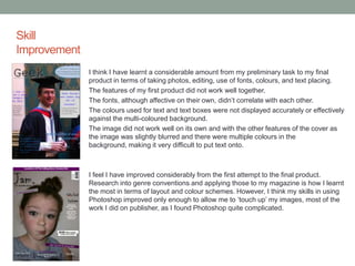
I think I have learnt a considerable amount from my preliminary task to my final
product in terms of taking photos, editing, use of fonts, colours, and text placing.
The features of my first product did not work well together.
The fonts, although affective on their own, didn‟t correlate with each other.
The colours used for text and text boxes were not displayed accurately or effectively
against the multi-coloured background.
The image did not work well on its own and with the other features of the cover as
the image was slightly blurred and there were multiple colours in the
background, making it very difficult to put text onto.
I feel I have improved considerably from the first attempt to the final product.
Research into genre conventions and applying those to my magazine is how I learnt
the most in terms of layout and colour schemes. However, I think my skills in using
Photoshop improved only enough to allow me to „touch up‟ my images, most of the
work I did on publisher, as I found Photoshop quite complicated.

AS Media Studies Evaluation

  • 1.
  • 2.
    The 7 Questions •In what ways does your media product use, develop or challenge forms and conventions of real media products? • How does your media product representation particular social groups? • What kind of media institution might distribute your media product and why? • Who would be the audience for your media product? • How did you attract/address your audience? • What have you learnt about technologies from the process of constructing this product? • Looking back at your preliminary task, what do you feel you have learnt in the progression from it to the full product?
  • 3.
    Developing and ChallengingConventions • Concerning my front cover, the basic conventions of the rock genre are followed by use of an inconsistent colour scheme. The basic black and white are usually followed, but each issue a third colour is used which is different each time to represent an artist, while black and grey are used to connote violence and aggression. • The masthead is located in the first third of the magazine and is bold to catch the readers attention. I chose to use the font „Chiller‟ because the rmessy lettering I felt represented the rock genre by looking less tidy, which emulates the cluttered layout of other rock magazines but still remained easily readable as it is large and bold. Throughout the front cover, contents page, and double page spread 3 different fonts were used; Chiller, Aharoni, and Lucinda Sans, as all together they still represented the right image, but having the „straight‟ fonts Aharoni and Lucinda Sans the smaller text is still easily readable. • My main image includes dark clothing, but rather than a miserable facial expression, I had the model do a side pout as it best represents the attitude of the artist I am trying to create. I pulled quotes from my articles to interest the reader and included free poster give away‟s to make the reader want to buy the magazine, as the audience are young and free things appeal to them. I featured famous rock bands and artists in the magazine to attract the audience, if they see a band they know they are more likely to buy the magazine.
  • 4.
    Representation As my magazineis of a rock genre, I used the following features to represent this; • Concerning my front cover, the usual feature of an inconsistent colour scheme us used. I chose to have the basic black and white but as my artist is a young teenage girl I also used a dark purple. As she is an young rock star, I stayed away from bright colours to represent the darker tone of the music genre, whilst still using a stereotypically female colour, purple. • I chose to use the font „Chiller‟ for the masthead because the messy lettering I felt represented the rock genre by looking less tidy, but still remained easily readable as it is large and bold. Throughout the front cover, contents page, and double page spread 3 different fonts were used; Chiller, Aharoni, and Lucinda Sans, as all today they still represented the right image whilst being bold and easily readable. • For my images, the model used was dressed in dark but young clothing and make-up, this allowed me to represent the young age of the artist and her typically rock attitude also. The lighting used in the images was used to create a dark background but to aluminate the subject so she would stand out. The use of shadows and the bare backgrounds which allow her to be the sole focus of the image imply that she is in the spotlight, which is an underlying representation of her current status within the industry.
  • 5.
    Institutions I think athe media institution Freeway Press Inc. may distribute my magazine as it is the publisher for the British magazine Rocksound which is similar to the magazine as it is aimed at a more underground audience, being less commercial whilst also giving coverage to well-known acts. Another institution that might also distribute my product is Future Publishing, which also publish rock magazines Metal Hammer and Revolver. Although aimed at a more underground audience, these titles are heavy metal publications, which would put my product at an advantage to the company as it is of a different genre and will attract a new and possibly larger audience. Another possible media institution is Emap/Bauer who as responsible for distributing the popular titles Q, Mojo, and Kerrang!. However, the more „underground‟ titles that the company have previously published have been closed, so the prospects for my magazine doing well with this company and poor.
  • 6.
    Target Audience • Mytarget audience is a younger demographic aged between 16 and 25. This age group are often looking for the newest trends in music and fashion, therefore my magazine, that focuses on new and upcoming artists will be suitable for them. Also I have priced my magazine at £2.30 to appeal to this particular age group as they often have low paying jobs to support themselves whilst still in education. Despite this they would still be able to afford my magazine each issue. My survey results have also helped me establish what people of this age range would like to see in the magazine, therefore I can meet their expectations. • Magazines aimed at 16-25 year olds are more likely to get extra publicity because of the readers. As this age of people are more willing to look at new magazines and are more likely to spread the news of the magazine quickly through social media and word of mouth, increasing the chances of the magazines popularity rising quickly.
  • 7.
    Attracting an Audience Asmy magazine is aimed at bother male and female young adults I had to be careful not to alienate the male members of the audience as this issue is about young female artist and may appeal more to women. • To attract the audience I used the classic features of bold fonts and contrasting colours to initially grab their attention. The colours were used more to represent the artist rather than attract an audience, but the colour scheme I believe is indicative of a rock magazine and would still attract potential readers. To appeal further to the readers I used plugs such as „6 AMAZING POSTERS‟ to advertise the magazine in addition to the feature articles to essentially „hook‟ them into buying it. • The artists used in my feature articles; Muse, Noel Gallagher, David Bowie, Bastille, The Rolling Stones, Hayley Williams, Def Leppard, and Lacey are old and new bands/artists that I hoped would appeal to different types of fans, whether they prefer old rock or new. In terms of my cover articles, I attempted to create ones that would appeal to the fans of that particular artist, for example “Noel Opens Up” causing interest for the Oasis fans. But additionally the majority of readers I think would be interested in confessions for Noel Gallagher. I also made up a conflicting quote from David Bowie, a respected artist in the rock community, throwing blame on the most well known pop band in the world right now “THE 1D‟S OF THIS WORLD ARE TO BLAME”. As 1D have an immense following, a comment like that is bound to cause interest in either area of the industry, broadening the number of people that article will appeal to. So if the main cover article is not enough to interest a potential reader, hopefully the other cover articles will be appealing.
  • 8.
    Technologies Whilst creating myproduct I used very little equipment; • The camera I used was a FujiFilm FinePix JZ500. The camera allowed me to take good quality photo‟s in high definition and the autofocus track ability came in handy when capturing when I had found the perfect shot as the model was moving. It was very easy for a beginner to navigate. • I used a laptop and computer to run the programmes; Publisher, Photoshop, and Blogger. I used Photoshop to edit the images, mainly just using the crop and touch up tools to „touch up‟ my images as I didn‟t want them too heavily or noticeable edited unless necessary. Publisher allowed me to put my product together as a whole, using the crop tool, text tool, and various shape tools to create my complete image. I used Blogger to present my work online throughout the process of making the product.
  • 9.
    Skill Improvement I think Ihave learnt a considerable amount from my preliminary task to my final product in terms of taking photos, editing, use of fonts, colours, and text placing. The features of my first product did not work well together. The fonts, although affective on their own, didn‟t correlate with each other. The colours used for text and text boxes were not displayed accurately or effectively against the multi-coloured background. The image did not work well on its own and with the other features of the cover as the image was slightly blurred and there were multiple colours in the background, making it very difficult to put text onto. I feel I have improved considerably from the first attempt to the final product. Research into genre conventions and applying those to my magazine is how I learnt the most in terms of layout and colour schemes. However, I think my skills in using Photoshop improved only enough to allow me to „touch up‟ my images, most of the work I did on publisher, as I found Photoshop quite complicated.