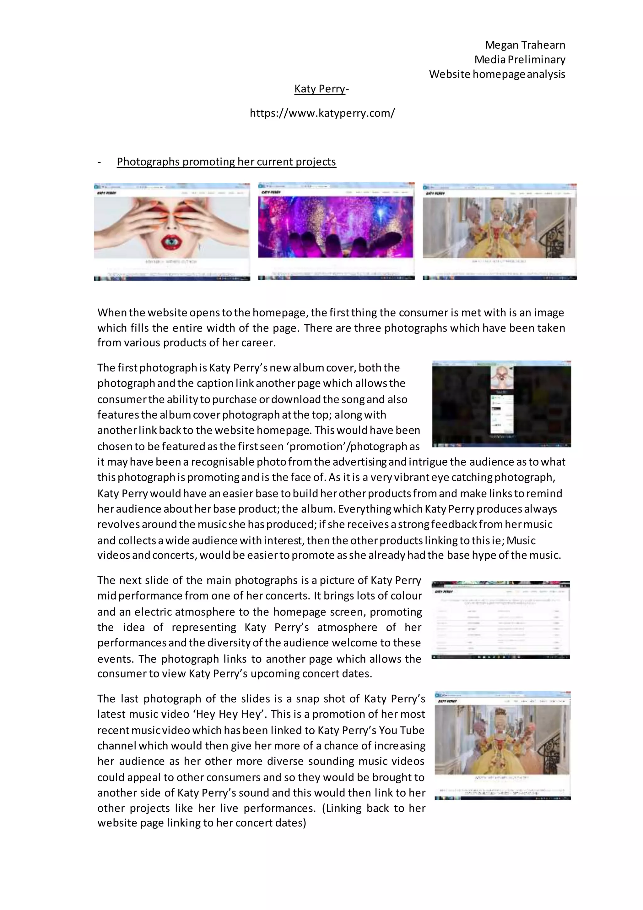
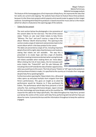
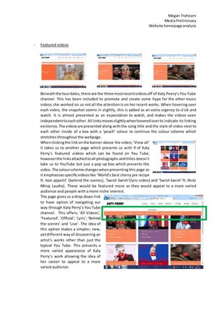
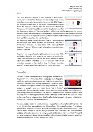
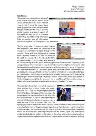
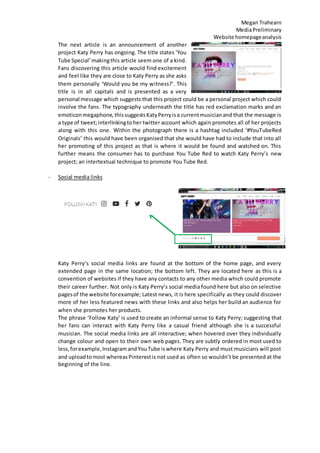
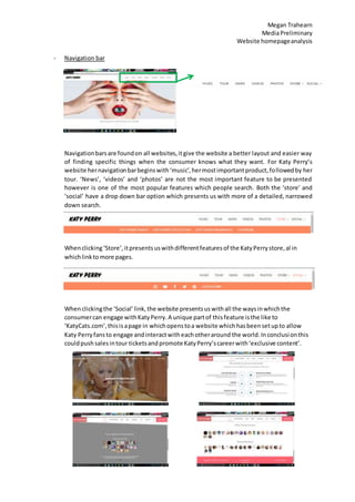
Megan Trahearn
MediaPreliminary
Website homepageanalysis
Katy Perry-
https://www.katyperry.com/
- Photographs promoting her current projects
Whenthe website openstothe homepage,the firstthing the consumer is met with is an image
which fills the entire width of the page. There are three photographs which have been taken
from various products of her career.
The firstphotographisKaty Perry’snew albumcover,boththe
photographandthe captionlinkanotherpage which allowsthe
consumerthe abilitytopurchase ordownloadthe songand also
features the albumcoverphotographatthe top; alongwith
anotherlinkbackto the website homepage. Thiswouldhave been
chosento be featuredasthe firstseen ‘promotion’/photograph as
it mayhave beena recognisable photofromthe advertisingandintrigue the audience astowhat
thisphotographispromotingandis the face of.As itis a veryvibranteye catchingphotograph,
Katy Perrywouldhave aneasier base tobuildherotherproductsfromand make linkstoremind
heraudience aboutherbase product;the album. EverythingwhichKatyPerryproducesalways
revolvesaroundthe musicshe hasproduced;if she receivesastrongfeedbackfromhermusic
and collectsawide audience withinterest,thenthe otherproductslinkingtothisie;Music
videosandconcerts,wouldbe easiertopromote asshe alreadyhadthe base hype of the music.
The next slide of the main photographs is a picture of Katy Perry
midperformance from one of her concerts. It brings lots of colour
and an electric atmosphere to the homepage screen, promoting
the idea of representing Katy Perry’s atmosphere of her
performancesandthe diversityof the audience welcome to these
events. The photograph links to another page which allows the
consumer to view Katy Perry’s upcoming concert dates.
The last photograph of the slides is a snap shot of Katy Perry’s
latest music video ‘Hey Hey Hey’. This is a promotion of her most
recentmusicvideo whichhasbeen linked to Katy Perry’s You Tube
channel which would then give her more of a chance of increasing
her audience as her other more diverse sounding music videos
could appeal to other consumers and so they would be brought to
another side of Katy Perry’s sound and this would then link to her
other projects like her live performances. (Linking back to her
website page linking to her concert dates)
Megan Trahearn
MediaPreliminary
Website homepageanalysis
Thisfeature of thishomepage givesafirstimpressionof KatyPerry, thisrepresentsthe idea that
her works are current and ongoing. The website have chosen to feature these three products
because itis the three mainprojects which popular artist would create to appeal to their target
audience. EverythingwhichKatyPerryproduces is based around her music and so is the reason
which her album is featured on the opening page of the website.
- Tickets for her concert
The next section below the photographs is her promotion of
the concert dates for her next tour. The title of the section
states ‘Tickets on sale now! Order tickets to Katy Perry's
"Witness: The Tour" and you'll receive a copy of her new
album 'Witness' (North America Only)’. This opening to the
sectioncreatesa type of statement and promotes back to her
recent album which is the base product to her career.
The dates are presented as a type of list, including important
details(fromleft toright);date of performance and locations,
stating that tickets are still available. The way this is
presented is to create hype and like a type of checklist,
therefore creatingimmenseexcitementwhenseeingthereare
still tickets available when reading there are ‘more dates’.
When clicking the link of more dates, the list increases with
extra tickets like ‘Tickets/VIP’ and ‘On sale February 20’.
IncludinglinkstoVIP extendsthe ideaof better opportunities
whenyoucould have to this event. The linksof every‘Tickets’or‘VIP’opentothe website in
whichpurchase of ticketsismade,itis specified to the country as it includes their language
despite Katy Perry speaking English.
Furthermore whenopeningthe Tokyo tickets link, a 30 second
video opens up and plays multiple short snippets from Katy
Perry’s performances. This gives an insight as to what the
performance would be likewise to if they purchased the
tickets. The performance which Katy Perry presents is full of
colourful, fast, exciting performance designs. Japan is known
for their technology and new designs and so this could be the
reasonfor this add on for Tokyo specifically. The video throughout has ‘Katy Perry’ printed
just below the centre of the screen with Katy Perry performing behind with her face just
above hername.It presentsthe tourand the information throughout to keep the audience
engaged.
Megan Trahearn
MediaPreliminary
Website homepageanalysis
- Featured videos
Beneaththe tourdates,there are the three mostrecentvideosoff of Katy Peery’s You Tube
channel. This has been included to promote and create some hype for the other music
videos she worked on so not all the attention is on her recent works. When hovering over
each video, the snapshot zooms in slightly, this is added as an extra urgency to click and
watch. It is almost presented as an expectation to watch, and makes the videos seen
independenttoeachother. All linksmovesslightlywhenhoveredoverto indicate its linking
existence. The videosare presented along with the song title and the style of video next to
each other inside of a box with a ‘peach’ colour to continue the colour scheme which
stretches throughout the webpage.
Whenclickingthe linkonthe banner above the video; ‘View all’
it takes us to another page which presents us with 9 of Katy
Perry’s featured videos which can be found on You Tube,
howeverthe linksattachedtoall photographs and titles doesn’t
take us to YouTube but just a pop up box which presents the
video. The colourscheme changeswhenpresenting this page as
it emphasisesspecificvideoslike ‘World’s best cherry pie recipe
ft. bon appetit’ (behind the scenes), ‘Swish Swish’(lyric video) and ‘Swish Swish’ ft. Nicki
Minaj (audio). These would be featured more as they would appeal to a more varied
audience and people with a more niche interest.
The page gives us a drop down link
to have option of navigating our
way through Katy Perry’s You Tube
channel. This offers; ‘All Videos’,
‘Featured’,‘Official’,‘Lyric’, ‘Behind
the scenes’ and ‘Live’. The idea of
this option makes a simpler, new,
yetdifferent way of discovering an
artist’s works other than just the
typical You Tube. This presents a
more varied appearance of Katy
Perry’s work allowing the idea of
her career to appeal to a more
varied audience.
Megan Trahearn
MediaPreliminary
Website homepageanalysis
- Store
The next featured section of this website is Katy Perry’s
merchandise online shop.There are fivefeatured products on this
slide;fromjumpersto t-shirts, priced between $30- $75. They are
not modelledby Katy Perry or any model, just simply the product
itself. All products featured here are merchandise from Katy
Perry’s new line and they all feature either Katy Perry herself or
the albumname ‘Witness’. The merchandise is sold to help Katy Perry promote her career,
and also allows the consumer feel closer to Katy Perry and makes the whole situation of
musicmore personal;especiallypromotingthe ideatoherfansthat theywouldbe more like
their idol if they purchase the merchandise.
On the bannerabove, there is a link to ‘View all’, which opens to
an additional page which presents the whole of Katy Perry’s
merchandise products. The page opens with a close up shot of
Katy Perry’sface ina differentangletoheralbumcover to link the
products together.
Katy Perry not only sells clothing like socks, jumpers, hats, shirts
and jackets, but also sells artworks and patches promoting her
career. On thisonline store the firsttwoproductsfeaturedare the
album produced on CD and Lp. These two products are the most
important products to have sell as Katy Perry’s as a musician
wouldn’t be a successful artist without her music being sold.
- Photo gallery
The next section is another slide of photographs, these feature
Katy Perry’slive performances. There are 3 pagesof photographs
visible to begin with however as you click the arrow to look
throughto the right,more photographsappear.Thiswouldmake
the audience feel special and feel like they are one of a small
amount of people who have seen these ‘secret hidden’
photographs. The photographs are very bright, bold and vibrant and are not easily missed;
contrasting to the colour scheme of the website. They feature not only Katy Perry but also
the productionof the live performance and the different outfits which she is seen in when
performing. ThisnotonlyappealstoKatyPerryfansbut alsopeople interested in fashion or
production; expanding the target audience.
The bannerabove states‘Viewall’,linkingtoa pagesof photoalbums from different events
in her life; the first featured being the Witness Tour. This ranges from Katy Perry’s tour,
musicvideos,photoshootsandart works inchronological order;eachalbumfeatures a very
vibrant theme and so all albums strongly contrast from each other. This addition to the
webpage allows the consumer to easily navigate and discover more about Katy Perry and
see whather careerisabout; alsoallowingfanstofeel closertoKaty Perry as they would be
able to understand her journey through her career.
Megan Trahearn
MediaPreliminary
Website homepageanalysis
- Latest News
The nextsectionfeaturesthree articlesof
Katy Perry’s most recent events. Each
article is laid out with the music video of
‘Hey Hey Hey’ being the largest. Each
photographvisiblezoomsinslightlywhen
the consume hovers theirmouse overthe
photo, this acts as a type of urgency of
clickingon and feels like it’s an expected
action they should be doing. All articles
links to another page of information
when clicking either the photograph or the ‘Read more’.
The firstarticle isKaty Perry’smusic video ‘Hey Hey
Hey’ opens to a page which has screen shot of the
musicvideowhich seems to repeat throughout the
website. Along with this photograph a message
from Katy Perry herself to her fans, and also a link
to watch the music video. The idea behind this
message isforKaty Perryto explainwhatisgoing to
be up and coming after this event. The message connects the fans with Katy Perry as she
adds puns towardsher most recent project and little inspirational phrases in which is what
her target audience is subconsciously waiting for within a musician for a type of escapism.
This page also features 3 of Katy Perry’s social media accounts so that fans can reply and
post about the message. The idea of this means that when others who see a tweet or post
on Facebooktheytryto findthe original website to read it for their own self, meaning that
theynavigate themselvesthroughKatyPerry’swebsite.Thisarticle isfoundatthe bottom of
the home page meaning that the consumer has to scroll through the whole homepage of
tickets, photographs and merchandise which promotes Katy Perry’s career.
The secondarticle visible isalink which presents us
with another link to Katy Perry’s tour tickets
purchase site. There is a very bold photograph on
the lefthandside of the page whichencourages the
consumerto readthe informationonthe right. They
title of the article is in capitals creating an urgency
of the article butalsomakesthe typography easy to
read and one of the first things they read. The
typographyunderneaththe title states ‘Get your tickets to WITNESS’ this is another typical
example of ahard sell astheydo notsuggest purchasingthe tickets,theyare directing them
to buythe ticketsandalsopresentthe linktodoso right after. The layout of the typography
makes the action so quick and simple to purchase the tickets. Again, Katy Perry’s social
media is included at the bottom of this article in the colour scheme; this would have been
addedto promote hersocial mediawhichovertime promotesherself to her other projects.
Megan Trahearn
MediaPreliminary
Website homepageanalysis
The next article is an announcement of another
project Katy Perry has ongoing. The title states ‘You
Tube Special’makingthis article seem one of a kind.
Fans discovering this article would find excitement
and feel like they are close to Katy Perry as she asks
them personally ‘Would you be my witness?’. This
title is in all capitals and is presented as a very
personal message which suggests that this project could be a personal project which could
involve the fans. The typography underneath the title has red exclamation marks and an
emoticonmegaphone,thissuggestsKatyPerryisa currentmusicianand that the message is
a type of tweet;interlinkingtoher twitter account which again promotes all of her projects
along with this one. Within the photograph there is a hashtag included ‘#YouTubeRed
Originals’ this would have been organised that she would have had to include that into all
her promoting of this project as that is where it would be found and watched on. This
further means the consumer has to purchase You Tube Red to watch Katy Perry’s new
project; an intertextual technique to promote You Tube Red.
- Social media links
Katy Perry’s social media links are found at the bottom of the home page, and every
extended page in the same location; the bottom left. They are located here as this is a
convention of websites if they have any contacts to any other media which could promote
their career further. Not only is Katy Perry’s social media found here but also on selective
pagesof the website forexample; Latest news, it is here specifically as they could discover
more of her less featured news with these links and also helps her build an audience for
when she promotes her products.
The phrase ‘Follow Katy’ is used to create an informal sense to Katy Perry; suggesting that
her fans can interact with Katy Perry like a casual friend although she is a successful
musician. The social media links are all interactive; when hovered over they individually
change colour and open to their own web pages. They are subtly ordered in most used to
less,forexample,InstagramandYouTube iswhere Katy Perry and must musicians will post
and uploadtomost whereasPinterestis not used as often so wouldn’t be presented at the
beginning of the line.
Megan Trahearn
MediaPreliminary
Website homepageanalysis
- ‘Mailing list’
As well asKatyPerry’ssocial mediapresentedatthe bottomleftof every page, there is also
another link in which states ‘Join Katy Perry’s mailing list’, when hovering this link a quick
colourchange happensand(whenactivated) the link presents a new page which features a
signup page whichyourdetailsof email isneeded. This mailing list is a way in which allows
us to communicate and interact with Katy Perry; which for fans is an ultimate dream, for
business people it’s is more accessible way of organising projects.
- Logo
Throughout the whole navigation of the website, the top bar (logo/ navigation bar) and
bottombar (social media/ Mailing list) stay the same. The Katy Perry logo is printed on the
top left of the bar, making the website feel official and original to the artist. It is a very
minimalistic logo which doesn’t take much attention of the consumer so they can
concentrate of the featured articles and slides which is promoting her work.
Megan Trahearn
MediaPreliminary
Website homepageanalysis
- Navigation bar
Navigationbarsare foundon all websites,itgive the website a better layout and easier way
of finding specific things when the consumer knows what they want. For Katy Perry’s
website hernavigationbarbeginswith‘music’,hermostimportantproduct,followedby her
tour. ‘News’, ‘videos’ and ‘photos’ are not the most important feature to be presented
however is one of the most popular features which people search. Both the ‘store’ and
‘social’ have a drop down bar option which presents us with more of a detailed, narrowed
down search.
Whenclicking‘Store’,itpresentsuswithdifferentfeaturesof the KatyPerrystore,al in
whichlinktomore pages.
Whenclickingthe ‘Social’link,the website presentsuswithall the waysinwhichthe
consumercan engage withKatyPerry.A unique partof thisfeature isthe like to
‘KatyCats.com’,thisisapage in whichopenstoa website whichhasbeensetupto allow
Katy Perryfansto engage andinteractwitheachotheraround the world.Inconclusionthis
couldpushsalesintour ticketsandpromote KatyPerry’scareerwith‘exclusive content’.
Megan Trahearn
MediaPreliminary
Website homepageanalysis
- Extra imformation
Everythingonthe website homepage isone after another taking up the whole width of the
page. This represents the fact that there are always ongoing products which Katy Perry is
creatingand theyare alwaysworththe wait and are successful enough to design the whole
page with each project taking up a big sector.
 All links moves slightly when hovered over to indicate its linking existence.
 Colour scheme: pastel/peach links all sections together and makes the website seem
ongoing – makes bold statements when presenting photographs of her performances.
 As you scroll down the next section fades in slowly.
 Alwayscansee a little hintof whatthe next section will be. Title of the next section is seen
at the bottom of the page.
 Has to be easy to use, not too many clicks or features on one page over lapping. Have the
most important things visible straight away because consumer will not go searching for
something they haven’t got in front of them.
 The webpage Tab name changes for each link, ‘WATCH HEY HEY HEY’, ‘Katy Perry WITNESS’
Every link promotes different parts of the artist career and these titles are bold and sound
like they are being told with no other choice.

Preliminary- Website homepage analysis

  • 1.
    Megan Trahearn MediaPreliminary Website homepageanalysis KatyPerry- https://www.katyperry.com/ - Photographs promoting her current projects Whenthe website openstothe homepage,the firstthing the consumer is met with is an image which fills the entire width of the page. There are three photographs which have been taken from various products of her career. The firstphotographisKaty Perry’snew albumcover,boththe photographandthe captionlinkanotherpage which allowsthe consumerthe abilitytopurchase ordownloadthe songand also features the albumcoverphotographatthe top; alongwith anotherlinkbackto the website homepage. Thiswouldhave been chosento be featuredasthe firstseen ‘promotion’/photograph as it mayhave beena recognisable photofromthe advertisingandintrigue the audience astowhat thisphotographispromotingandis the face of.As itis a veryvibranteye catchingphotograph, Katy Perrywouldhave aneasier base tobuildherotherproductsfromand make linkstoremind heraudience aboutherbase product;the album. EverythingwhichKatyPerryproducesalways revolvesaroundthe musicshe hasproduced;if she receivesastrongfeedbackfromhermusic and collectsawide audience withinterest,thenthe otherproductslinkingtothisie;Music videosandconcerts,wouldbe easiertopromote asshe alreadyhadthe base hype of the music. The next slide of the main photographs is a picture of Katy Perry midperformance from one of her concerts. It brings lots of colour and an electric atmosphere to the homepage screen, promoting the idea of representing Katy Perry’s atmosphere of her performancesandthe diversityof the audience welcome to these events. The photograph links to another page which allows the consumer to view Katy Perry’s upcoming concert dates. The last photograph of the slides is a snap shot of Katy Perry’s latest music video ‘Hey Hey Hey’. This is a promotion of her most recentmusicvideo whichhasbeen linked to Katy Perry’s You Tube channel which would then give her more of a chance of increasing her audience as her other more diverse sounding music videos could appeal to other consumers and so they would be brought to another side of Katy Perry’s sound and this would then link to her other projects like her live performances. (Linking back to her website page linking to her concert dates)
  • 2.
    Megan Trahearn MediaPreliminary Website homepageanalysis Thisfeatureof thishomepage givesafirstimpressionof KatyPerry, thisrepresentsthe idea that her works are current and ongoing. The website have chosen to feature these three products because itis the three mainprojects which popular artist would create to appeal to their target audience. EverythingwhichKatyPerryproduces is based around her music and so is the reason which her album is featured on the opening page of the website. - Tickets for her concert The next section below the photographs is her promotion of the concert dates for her next tour. The title of the section states ‘Tickets on sale now! Order tickets to Katy Perry's "Witness: The Tour" and you'll receive a copy of her new album 'Witness' (North America Only)’. This opening to the sectioncreatesa type of statement and promotes back to her recent album which is the base product to her career. The dates are presented as a type of list, including important details(fromleft toright);date of performance and locations, stating that tickets are still available. The way this is presented is to create hype and like a type of checklist, therefore creatingimmenseexcitementwhenseeingthereare still tickets available when reading there are ‘more dates’. When clicking the link of more dates, the list increases with extra tickets like ‘Tickets/VIP’ and ‘On sale February 20’. IncludinglinkstoVIP extendsthe ideaof better opportunities whenyoucould have to this event. The linksof every‘Tickets’or‘VIP’opentothe website in whichpurchase of ticketsismade,itis specified to the country as it includes their language despite Katy Perry speaking English. Furthermore whenopeningthe Tokyo tickets link, a 30 second video opens up and plays multiple short snippets from Katy Perry’s performances. This gives an insight as to what the performance would be likewise to if they purchased the tickets. The performance which Katy Perry presents is full of colourful, fast, exciting performance designs. Japan is known for their technology and new designs and so this could be the reasonfor this add on for Tokyo specifically. The video throughout has ‘Katy Perry’ printed just below the centre of the screen with Katy Perry performing behind with her face just above hername.It presentsthe tourand the information throughout to keep the audience engaged.
  • 3.
    Megan Trahearn MediaPreliminary Website homepageanalysis -Featured videos Beneaththe tourdates,there are the three mostrecentvideosoff of Katy Peery’s You Tube channel. This has been included to promote and create some hype for the other music videos she worked on so not all the attention is on her recent works. When hovering over each video, the snapshot zooms in slightly, this is added as an extra urgency to click and watch. It is almost presented as an expectation to watch, and makes the videos seen independenttoeachother. All linksmovesslightlywhenhoveredoverto indicate its linking existence. The videosare presented along with the song title and the style of video next to each other inside of a box with a ‘peach’ colour to continue the colour scheme which stretches throughout the webpage. Whenclickingthe linkonthe banner above the video; ‘View all’ it takes us to another page which presents us with 9 of Katy Perry’s featured videos which can be found on You Tube, howeverthe linksattachedtoall photographs and titles doesn’t take us to YouTube but just a pop up box which presents the video. The colourscheme changeswhenpresenting this page as it emphasisesspecificvideoslike ‘World’s best cherry pie recipe ft. bon appetit’ (behind the scenes), ‘Swish Swish’(lyric video) and ‘Swish Swish’ ft. Nicki Minaj (audio). These would be featured more as they would appeal to a more varied audience and people with a more niche interest. The page gives us a drop down link to have option of navigating our way through Katy Perry’s You Tube channel. This offers; ‘All Videos’, ‘Featured’,‘Official’,‘Lyric’, ‘Behind the scenes’ and ‘Live’. The idea of this option makes a simpler, new, yetdifferent way of discovering an artist’s works other than just the typical You Tube. This presents a more varied appearance of Katy Perry’s work allowing the idea of her career to appeal to a more varied audience.
  • 4.
    Megan Trahearn MediaPreliminary Website homepageanalysis -Store The next featured section of this website is Katy Perry’s merchandise online shop.There are fivefeatured products on this slide;fromjumpersto t-shirts, priced between $30- $75. They are not modelledby Katy Perry or any model, just simply the product itself. All products featured here are merchandise from Katy Perry’s new line and they all feature either Katy Perry herself or the albumname ‘Witness’. The merchandise is sold to help Katy Perry promote her career, and also allows the consumer feel closer to Katy Perry and makes the whole situation of musicmore personal;especiallypromotingthe ideatoherfansthat theywouldbe more like their idol if they purchase the merchandise. On the bannerabove, there is a link to ‘View all’, which opens to an additional page which presents the whole of Katy Perry’s merchandise products. The page opens with a close up shot of Katy Perry’sface ina differentangletoheralbumcover to link the products together. Katy Perry not only sells clothing like socks, jumpers, hats, shirts and jackets, but also sells artworks and patches promoting her career. On thisonline store the firsttwoproductsfeaturedare the album produced on CD and Lp. These two products are the most important products to have sell as Katy Perry’s as a musician wouldn’t be a successful artist without her music being sold. - Photo gallery The next section is another slide of photographs, these feature Katy Perry’slive performances. There are 3 pagesof photographs visible to begin with however as you click the arrow to look throughto the right,more photographsappear.Thiswouldmake the audience feel special and feel like they are one of a small amount of people who have seen these ‘secret hidden’ photographs. The photographs are very bright, bold and vibrant and are not easily missed; contrasting to the colour scheme of the website. They feature not only Katy Perry but also the productionof the live performance and the different outfits which she is seen in when performing. ThisnotonlyappealstoKatyPerryfansbut alsopeople interested in fashion or production; expanding the target audience. The bannerabove states‘Viewall’,linkingtoa pagesof photoalbums from different events in her life; the first featured being the Witness Tour. This ranges from Katy Perry’s tour, musicvideos,photoshootsandart works inchronological order;eachalbumfeatures a very vibrant theme and so all albums strongly contrast from each other. This addition to the webpage allows the consumer to easily navigate and discover more about Katy Perry and see whather careerisabout; alsoallowingfanstofeel closertoKaty Perry as they would be able to understand her journey through her career.
  • 5.
    Megan Trahearn MediaPreliminary Website homepageanalysis -Latest News The nextsectionfeaturesthree articlesof Katy Perry’s most recent events. Each article is laid out with the music video of ‘Hey Hey Hey’ being the largest. Each photographvisiblezoomsinslightlywhen the consume hovers theirmouse overthe photo, this acts as a type of urgency of clickingon and feels like it’s an expected action they should be doing. All articles links to another page of information when clicking either the photograph or the ‘Read more’. The firstarticle isKaty Perry’smusic video ‘Hey Hey Hey’ opens to a page which has screen shot of the musicvideowhich seems to repeat throughout the website. Along with this photograph a message from Katy Perry herself to her fans, and also a link to watch the music video. The idea behind this message isforKaty Perryto explainwhatisgoing to be up and coming after this event. The message connects the fans with Katy Perry as she adds puns towardsher most recent project and little inspirational phrases in which is what her target audience is subconsciously waiting for within a musician for a type of escapism. This page also features 3 of Katy Perry’s social media accounts so that fans can reply and post about the message. The idea of this means that when others who see a tweet or post on Facebooktheytryto findthe original website to read it for their own self, meaning that theynavigate themselvesthroughKatyPerry’swebsite.Thisarticle isfoundatthe bottom of the home page meaning that the consumer has to scroll through the whole homepage of tickets, photographs and merchandise which promotes Katy Perry’s career. The secondarticle visible isalink which presents us with another link to Katy Perry’s tour tickets purchase site. There is a very bold photograph on the lefthandside of the page whichencourages the consumerto readthe informationonthe right. They title of the article is in capitals creating an urgency of the article butalsomakesthe typography easy to read and one of the first things they read. The typographyunderneaththe title states ‘Get your tickets to WITNESS’ this is another typical example of ahard sell astheydo notsuggest purchasingthe tickets,theyare directing them to buythe ticketsandalsopresentthe linktodoso right after. The layout of the typography makes the action so quick and simple to purchase the tickets. Again, Katy Perry’s social media is included at the bottom of this article in the colour scheme; this would have been addedto promote hersocial mediawhichovertime promotesherself to her other projects.
  • 6.
    Megan Trahearn MediaPreliminary Website homepageanalysis Thenext article is an announcement of another project Katy Perry has ongoing. The title states ‘You Tube Special’makingthis article seem one of a kind. Fans discovering this article would find excitement and feel like they are close to Katy Perry as she asks them personally ‘Would you be my witness?’. This title is in all capitals and is presented as a very personal message which suggests that this project could be a personal project which could involve the fans. The typography underneath the title has red exclamation marks and an emoticonmegaphone,thissuggestsKatyPerryisa currentmusicianand that the message is a type of tweet;interlinkingtoher twitter account which again promotes all of her projects along with this one. Within the photograph there is a hashtag included ‘#YouTubeRed Originals’ this would have been organised that she would have had to include that into all her promoting of this project as that is where it would be found and watched on. This further means the consumer has to purchase You Tube Red to watch Katy Perry’s new project; an intertextual technique to promote You Tube Red. - Social media links Katy Perry’s social media links are found at the bottom of the home page, and every extended page in the same location; the bottom left. They are located here as this is a convention of websites if they have any contacts to any other media which could promote their career further. Not only is Katy Perry’s social media found here but also on selective pagesof the website forexample; Latest news, it is here specifically as they could discover more of her less featured news with these links and also helps her build an audience for when she promotes her products. The phrase ‘Follow Katy’ is used to create an informal sense to Katy Perry; suggesting that her fans can interact with Katy Perry like a casual friend although she is a successful musician. The social media links are all interactive; when hovered over they individually change colour and open to their own web pages. They are subtly ordered in most used to less,forexample,InstagramandYouTube iswhere Katy Perry and must musicians will post and uploadtomost whereasPinterestis not used as often so wouldn’t be presented at the beginning of the line.
  • 7.
    Megan Trahearn MediaPreliminary Website homepageanalysis -‘Mailing list’ As well asKatyPerry’ssocial mediapresentedatthe bottomleftof every page, there is also another link in which states ‘Join Katy Perry’s mailing list’, when hovering this link a quick colourchange happensand(whenactivated) the link presents a new page which features a signup page whichyourdetailsof email isneeded. This mailing list is a way in which allows us to communicate and interact with Katy Perry; which for fans is an ultimate dream, for business people it’s is more accessible way of organising projects. - Logo Throughout the whole navigation of the website, the top bar (logo/ navigation bar) and bottombar (social media/ Mailing list) stay the same. The Katy Perry logo is printed on the top left of the bar, making the website feel official and original to the artist. It is a very minimalistic logo which doesn’t take much attention of the consumer so they can concentrate of the featured articles and slides which is promoting her work.
  • 8.
    Megan Trahearn MediaPreliminary Website homepageanalysis -Navigation bar Navigationbarsare foundon all websites,itgive the website a better layout and easier way of finding specific things when the consumer knows what they want. For Katy Perry’s website hernavigationbarbeginswith‘music’,hermostimportantproduct,followedby her tour. ‘News’, ‘videos’ and ‘photos’ are not the most important feature to be presented however is one of the most popular features which people search. Both the ‘store’ and ‘social’ have a drop down bar option which presents us with more of a detailed, narrowed down search. Whenclicking‘Store’,itpresentsuswithdifferentfeaturesof the KatyPerrystore,al in whichlinktomore pages. Whenclickingthe ‘Social’link,the website presentsuswithall the waysinwhichthe consumercan engage withKatyPerry.A unique partof thisfeature isthe like to ‘KatyCats.com’,thisisapage in whichopenstoa website whichhasbeensetupto allow Katy Perryfansto engage andinteractwitheachotheraround the world.Inconclusionthis couldpushsalesintour ticketsandpromote KatyPerry’scareerwith‘exclusive content’.
  • 9.
    Megan Trahearn MediaPreliminary Website homepageanalysis -Extra imformation Everythingonthe website homepage isone after another taking up the whole width of the page. This represents the fact that there are always ongoing products which Katy Perry is creatingand theyare alwaysworththe wait and are successful enough to design the whole page with each project taking up a big sector.  All links moves slightly when hovered over to indicate its linking existence.  Colour scheme: pastel/peach links all sections together and makes the website seem ongoing – makes bold statements when presenting photographs of her performances.  As you scroll down the next section fades in slowly.  Alwayscansee a little hintof whatthe next section will be. Title of the next section is seen at the bottom of the page.  Has to be easy to use, not too many clicks or features on one page over lapping. Have the most important things visible straight away because consumer will not go searching for something they haven’t got in front of them.  The webpage Tab name changes for each link, ‘WATCH HEY HEY HEY’, ‘Katy Perry WITNESS’ Every link promotes different parts of the artist career and these titles are bold and sound like they are being told with no other choice.