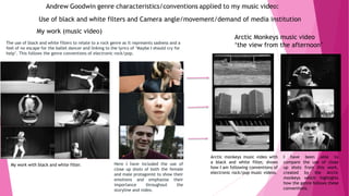
The document discusses conventions of music videos and how they were applied in the student's music video project. It begins by outlining several common conventions like the link between music and visuals, camera angles/movement, and performance characteristics. It then examines how the student incorporated these conventions in their video for the song "Sail" by Awolnation. Specific examples are provided of how close-ups, cuts on the beat, genre-appropriate camera work, and a lone dancer were used. The student also discusses challenging conventions by not including a band performance. Overall, the document analyzes the application of music video conventions in the student's project and how it both followed and subverted expectations.
Multi-cluster Kubernetes Networking- Patterns, Projects and GuidelinesSanjeev Rampal
Talk presented at Kubernetes Community Day, New York, May 2024.
Technical summary of Multi-Cluster Kubernetes Networking architectures with focus on 4 key topics.
1) Key patterns for Multi-cluster architectures
2) Architectural comparison of several OSS/ CNCF projects to address these patterns
3) Evolution trends for the APIs of these projects
4) Some design recommendations & guidelines for adopting/ deploying these solutions.
This 7-second Brain Wave Ritual Attracts Money To You.!nirahealhty
Discover the power of a simple 7-second brain wave ritual that can attract wealth and abundance into your life. By tapping into specific brain frequencies, this technique helps you manifest financial success effortlessly. Ready to transform your financial future? Try this powerful ritual and start attracting money today!
ER(Entity Relationship) Diagram for online shopping - TAEHimani415946
https://bit.ly/3KACoyV
The ER diagram for the project is the foundation for the building of the database of the project. The properties, datatypes, and attributes are defined by the ER diagram.
1.Wireless Communication System_Wireless communication is a broad term that i...JeyaPerumal1
Wireless communication involves the transmission of information over a distance without the help of wires, cables or any other forms of electrical conductors.
Wireless communication is a broad term that incorporates all procedures and forms of connecting and communicating between two or more devices using a wireless signal through wireless communication technologies and devices.
Features of Wireless Communication
The evolution of wireless technology has brought many advancements with its effective features.
The transmitted distance can be anywhere between a few meters (for example, a television's remote control) and thousands of kilometers (for example, radio communication).
Wireless communication can be used for cellular telephony, wireless access to the internet, wireless home networking, and so on.
guildmasters guide to ravnica Dungeons & Dragons 5...
Evaluation question 1
1. Evaluation Question 1
In what way does your media product use, develop or challenge forms
and conventions of real media products?
2. Common Conventions of music videos
Link between music and visuals-
The mise en scene that is used is extremely important as it
should relate to the genre of the music, for example below
Katy Perry in ‘California Girls’ is seen in a made up world full
of candy. This mise en scene highlights a fantasy world that
man have through using the male gaze to show how women
are expected to be in ‘California’. Because the mise en
scene is not real it then relates to the song and how the
lyrics are a mans fantasy world.
Camera angles/movement/demands of record label
The use of camera angles can give a certain message to the
audience. Many music videos follow a rule of using close ups
to promote the video, and build and understanding for the
audience so they can see who the artist is, so when looking
for the album in store or online, they can recognise the artist
on the front of the album cover. It is important that angles
are used to the best ability and the use of camera movement
through zooms and cranes can also emphasise the mood of
the artist and the genre. An example is shown through Pia
Mia – Do it again.
Performance/ genre characteristics
Performance includes the use of choreographed dancers
who are usually surrounding the artist so that the music
video is given more energy and depth. This is used to
entertain the audience in a big way and it is mainly used in
pop videos to show the audience how the song is easy to
dance to for example. This performance can be shown in
Beyoncé's Love on Top video, and for genres of more rock
nature, it can be shown through performance of a band. An
example of this is Green Day American Idiot.
Andrew Goodwin's 6 key aspects are applied to most music videos, these 6 areas are:
• Narrative and performance
• The star image (close ups)
• Relationship between music and visuals
• Relationship between lyrics and visuals
• The notion of looking
• Intertextual references
These aspects are shown in more detail below and can all be related to professional music videos. I have tried to use some of
these conventions within my music video which is shown on slide 4.
Intertextual references-
These can be explored through music videos that
include the narrative/storyline of other media
ideas such as a book/novel, a film or television.
This can be just the use of colours or a filter when
editing, or it can include the costume, mise en
scene and characters as well. This link can help to
tell the audience a different story that doesn’t
relate to the music video. And it also offer
continuity where the audience will feel as though
they are watching the film, with the same message
being portrayed. An example of this is shown
through Iggy Azalea music video Fancy, and how it
relates to the film Clueless.
Link between music and lyrics
The link between music and lyrics can be used to
tell the audience a certain story/message that will
be shown by both the lyrics and the video. This will
be able to make the audience feel more emotive
towards the artist/band/characters within the
video and understand the lyrics of the video In
more depth.
Voyeuristic treatment of the female body-
this area is used a lot in music videos and is shown
through the use of close up shots that are able to
highlight the female body due to their sex.
Carol Vernallis- I have been able to include the theory of Vernallis within my music video through narrative and
editing. She believes that music videos will hint at the mood or personality of the characters slightly, but not in
full. This has been included within my music video with then male protagonist being portrayed as happy with
close up shots, and the female protagonist as trapped and unhappy shown through 180 degree surrounding shots.
The use of Narrative Fuzz can also be applied to in my music video as the storyline is not completely displayed to
the audience and this is due to the audience not knowing why the female protagonist is inside of the building and
why she is dancing.
3. What did I learn about what the conventions/ genre conventions were of
real music videos? And how have they been involved/ not involved within
the music video I have created?
I have learnt about a large amount of conventions/theories that have helped with the development of my music video and the ability to make it more professional by following some of
these conventions/theories, as well as frequently subverting conventions to present a certain message for the target audience. These conventions include common features that are seen
within a music video or are used to film the video. An example of this can be shown through the use of camera angles e.g. close ups, cutting to the beat of the audio and low angles. These
are known as common and are applied to most genres, however the genre of my music is electronic rock/pop which focuses on other more specific conventions such as slow motion shots,
close ups, the sliding/tracking of the protagonist as well as mise en scene and the way the clips are edited. The use of different shots are able to emphasise the artist by making the video
focused solely around them, enabling the artist to be advertised through the video as the audience can see that they are the reason the video has been created. The mise en scene is
important as it allows the media institution and artist to represent the genre of the song to attract the audience and suit what they would normally search for based on clothing, props and
colour. What I have learnt:
I have learnt that the use of conventions and the way they are followed so religiously is to make sure that the target audience is satisfied with the end product to make sure that
they want to watch the video, share, comment and like the video. This creates a great and positive sense of two step flow that will promote the video using just the audience.
This will enable the artist to become more popular and more likely to continue creating media content. I have learnt that different genres use different conventions, but as a
general common convention rule the use of close ups are used frequently to advertise the artist and remind the audience who created the video. Another common convention
that is used is cutting to the beat or using a mise en scene that matches the lyrics. This can widely be seen in major videos such as Katy Perry California Girls, where the mise en
scene is created solely for the development and narrative of the video and lyrics. An example of cutting on the beat can be shown through Little Mix Touch where there is a cut
between each member of the group on the hit of each beat for around 10 seconds of the music video. I have learnt that this is a very popular way of introducing a band that has a
large amount of members, but also is use to remind the audience on previous clips from the video, where the story was developing so the video is understood. I have also learnt,
from producing my own music video that music videos are not just always following conventions due to some artists wanting the video to be completely different. This can be
done to make the audience feel opposite to the lyrics of the video to add a false sense of understanding. And this is purposely done to subvert conventions.
How I have used conventions within the music video I have created:
Within my Awolnation ‘Sail’ music video I have included conventions of music videos for the electronic rock/pop genre that relate to the narrative/storyline of the music video. I
have used close up shots of the female protagonist as she sings and lip syncs the lyrics as this means that there is a sole focus on her which highlights the main reason for the
music video. This close up shot is usually used to show the artists, but because the artist is not included within my music video it is still important that the audience feels as
though there is a main character/s so that they relate to them and connect with them. I have also included cuts on the beat of the audio as this enables to clips of both the urban
mise en scene and the ballet dancing to flow in a smooth pattern, with the visuals working alongside the lyrics/audio not trying to compete. I like the cuts on the beat as it helps
to make the most of the audio and this can demonstrate how the audio is the main aspect and purpose of the video being created, giving the audience a reason to watch the
video through the visuals offer entertainment with a storyline suiting the genre. I have also made sure that there are fast cuts as these used in a large amount of videos following
a electronic rock/pop genre and I have also used editing to include conventions of a black and white filter to highlight the sadness of the lyrics and the way the ballet Dancers life
is perceived. I have been able to address both common conventions and conventions that relate to the electronic rock/pop genre specifically as this means that the audience are
well suited. I decided not to include any of the performance band playing conventions to subvert at least one to make the music video more unique, as it would not have worked
for Sail.
4. Camera angles and movement in my work that follows the genre characteristics of electronic
rock/pop genre: Lorde -TeamMy work
This wide shot shows the location of the
urban setting to which my music video is
set in. This shot from the music video
also shows camera movement as it is a
crane from the top of the buildings to
the bottom of the street with cobbles
being included. This shot is able to
shows the location and can show an
atmosphere to the audience.
Here I have included a straight shot that
shows two characters talking. It is
important that this shot shows the
connection between the two characters
as this means that the audience can see
the connection. This wide shot is able
to show the location too and this is
great when wanting to follow
conventions of electronic rock and
relationships are often shown in detail.
This close up shot shows the male
protagonist in great detail and is able
to show emotion when he is walking
away. This is frequently used within
real examples of music videos for the
selected genre as it shows reactions.
This allows the audience to see how
the character is feeling and what they
are going to expect to see. This also
using backwards tracking movement to
highlight that he is walking away.
This shot has been used to show the
female protagonist closely but also
showing the mise en scene. It is
important that this clip used as the
subtle 180 degree camera movement
highlights that she is surrounding by
walls and her life is isolated and inside
the building.
5. The use of black and white filters to relate to a rock genre as it represents sadness and a
feel of no escape for the ballet dancer and linking to the lyrics of ‘Maybe I should cry for
help’. This follows the genre conventions of electronic rock/pop.
Here I have included the use of
close up shots of both the female
and male protagonist to show their
emotions and emphasise their
importance throughout the
storyline and video.
My work with black and white filter.
Arctic monkeys music video with
a black and white filter, shows
how I am following conventions of
electronic rock/pop music videos.
I have been able to
compare the use of close
up shots from this work,
created by the Arctic
monkeys which highlights
how the genre follows these
conventions.
Arctic Monkeys music video
‘the view from the afternoon’
My work (music video)
Use of black and white filters and Camera angle/movement/demand of media institution
6. Link between lyrics and visuals in my music video -
Andrew Goodwin genre characteristics/conventions applied to my music video:
Here I have included the male
protagonist saying ‘this is how an
angel dies’ as this clip is before he
looks sad on the bench in the park.
This is said at a point where he looks
sad, before he meets the female
actress who then brings happiness into
his life. It is very suiting to this line of
lyrics as it demonstrates his previous
relationship breaking down known as
the angel dying in the lyrics.
Here I have included a close up of the
female protagonists face to show how
she is sad, and blaming herself for the
bullies actions previously in the video.
The close up shows her emotions and
gives a strong message of sadness to
the audience.
Here I have used a close up
shot to show the emotion
of the actress. This is also
emphasised with the
ghosting effect as this
shows how her world is not
all real as it makes her life
look fantasy like. This can
also be seen through her
always being inside in
comparison to the male
protagonist always being
outside.
For this line I have include a
side shot, to show the
costume of the female actress
as it enables the audience to
see that she is in the same
mise en scene and same
costume to add continuity to
the video. With this shot I am
able to show the actress with
her head resting on her signs
which is known to be a sign of
unhappiness and depression.
7. Performance
Here I have made sure that there are uses of performance. This does not
necessarily mean that there is a large group of dancers, but it does include one
ballet dancer, the female protagonist, who has used choreographed dance to show
a sense of performance throughout the song. However this type of performance
does not follow conventions completely as for electronic rock/pop genre music
videos it is common that there is a band that are seen to be performing. The use
of a ballet dancer subverts stereotype conventions that will be used for this genre
of music which is great because it challenges and changes the views of the
audience to make sure that they remember the music video for a while after they
have watched it. Within the music video I have made sure that there are well
known dance moves so that the audience can relate and also make the music
video look more professional.
Sia -ChandelierMy work
Here is a real example of a music video that has only used one
lone dancer throughout the music video. This is able to be
compared to my music video as it is contemporary style and the
music video/camera movement is centred around the movement
of the dancer.
8. The voyeuristic treatment of women
I have used the voyeuristic treatment of women
to make sure that my music video follows the
common conventions of music videos. I have
included these shots to emphasise the body of
the female protagonist through a straight male
audience members view.
Laura Mulvey’s Male Gaze theory:
I have also applied the male gaze theory where
the camera views the female body in the way a
male audience member would. This is
demonstrated in videos with female artists to
make them look sexual and seen as a sexual
object. It can also do the opposite and turn the
female character into an innocent person for
the audience. This depends on the genre of the
music video and the audience that will be
watching the videos. For example In Pop songs
by artists such as Rhianna it is common to see
the artist with little clothing, with camera
angles that shows off the female body to the
audience. An example of this is Kanye West
Fade, where the female model is used to be
shown in a sexual way.
My work Kanye west - Fade
9. What did I learn about real digipack conventions and what conventions have I
included?
Understanding the conventions of Digipack adverts and albums has helped me to develop my project and pieces of work into more professional looking work. This is
due to the amount of information and detail that I have included. The digipaks are used to promote the album along with the music video. I have created my
digipacks through Photoshop an this has meant that I have been able to use a large amount of effects to make them a high quality piece of work. The use of colour,
font, information, copyright information, images and institution logos is included within my projects that I have created to make sure that they look correct. I have
taken a long period of time to make sure they are 100% right and flow well with the music video and genre. I have been able to follow conventions that relate to
the electronic rock/pop genre as these will make the target audience more attracted to buying them with the right colours and font giving off the correct or wrong
message. What I have learnt:
I have learnt that all areas/aspects of the digipack have conventions that are followed in great depth to guarantee that the audience will be interested and satisfied
with the pieces of media. For the spine of the album I have learnt that this needs to include the identity of the band/artist and the name of the album that is inside.
This aspect is able to tell customers what the album is on the shop floor so that access to the media is easier. It is important that these look aesthetically pleasing as
the spine will need to help sell the product to the customers. This is usually used to create artist identity and is fairly simple with examples showed in the next few
slides. I have also learnt that the front cover is one of the most important features as it should be the selling image. This can be done by using bold and large fonts as
well as striking images and bright colours. It is important that there is a link between the media products (digipack) and the music video to add a sense of continuity
and also use cross advertising. It is also important to include basic information about what will be found inside of the album, this may include a track list on the back
of the album as well as a barcode to make the product accessible across the world. It is likely that most of these albums are adapted for different countries to make
sure that all cultures and languages can understand the name of the album etc. The inside of the Digipak is usually able to include a page dedicated for the CD to be
placed in to add a sense of organisation, some albums make sure that the CD matches the theme and can be coloured or have an image printed on top.
How these conventions have been applied to my Digipak:
I have been able to apply a lot of conventions to my music video as I wanted to make sure that the album looks professional and well made/designed. It is
important that conventions are followed to suit the audience or challenged to show the audience that a sense of creativity and ambition has been used. I have
used conventions on the spine of my album as I have used the same font from the front, the same colour as the background and the name of the artist. However
I have challenged some conventions of always having the name of the album as I believed it look to cramped having all of the writing on the spine. This has lead
to the spine only including the artist name so that the audience have basic information about the album. I think that this is good because it allows the audience
to have basic knowledge and is likely to make them intrigue and look further to find out more. I have made sure that I contain the male protagonist from the
music video within the album cover to create a sense of continuity with it also following Goodwin's theory of close up shots that are demanded by the institution
to promote. Within my album I have also included a CD page inside, the middle square on the inside strip of three squares. This will allow the audience to have a
tidy place to put the CD (hard copy media) back into the album case to keep in good condition. This shows that I have thought about the audience and what they
will want to see from the piece of media. I have made sure that the use of font is suiting to the genre as it is ragged and black which shows a messy style,
relating back to the rock/electronic genre. I have use images that use the female gaze which subverts Laura Mulvey’s theory, where the audience are seeing the
male protagonist through the eyes of straight women. This is not normally seen in the pop genre but seen in rock due to the lack of clothing when on stage.
10. Conventions of Digipaks applied to my work-
Subverting the male gaze- using female gaze
This photograph that I have chosen
for my digipack album shows the
male protagonists body through the
eyes of a straight female audience
member and this means that the
album is subverting the male gaze
theory that is used in a large
amount of artists work. This is a
straight shot that shows the actors
body as the centre focus with paint
being shown on his body to see
him as a sexual object.
This image is also able to show the
female gaze as it is a close up which is
able to show the audience in great
depth what the body looks like and
they can see the actor is posing for
the photographs. By using two
opposing colours I have been able to
show a large contrast. This is able to
highlight the body in comparison to
the little mise en scene which is used.
I have found a real life example of an
album cover that uses the female gaze to
promote the music. This can appeal to
women internationally and is used to
attract a certain audience. This is similar
to the album cover I have created as the
male artists have no tops on and are
showing their bodies to the audience.
My work
Diary of a Mad Band
11. The spine
Here are the two spines from my work, as
you can see I have included the name and
kept the theme of colour running. This has
meant that the album is easier to find
when on a shelf in a supermarket/retailer.
I have not included a large amount of
information as this will mean that the
audience will be intrigued and want to
find out more when buying this media
product.
My work
Arctic monkeys
Here is an example of a spine by Arctic monkeys
that shows how simplicity is key when wanting to
suit the electronic rock/pop genre. I have used
these spines as inspiration for my album as I like
the use of contrasting colours.
Using the same protagonist
for the album cover and
close up shots
Here I have shown an example from my album
cover that displays the continuity I have included.
This is due to me using the same male
protagonist/actor from my music video in the
album cover to make sure that the audience can
relate back to the music video and there is an
obvious link. I have also been able to use a close
up shot to follow Goodwin’s conventions of
institution demands.
Real example
Here I have found an
album cover that is
similar to the one I
have made as it
includes the face of
the main artist that
is also in the video.
This has allowed me
to be inspired by this
work and use
extreme close ups of
my male actor to see
emotion and connect
with the audience.
Using information (copyright) &
Institution logo
I have included information about
the copy of the album. This has been
created on Word and I have been
able to tell the audience that the
album is the property of Red Bull
Records and that if the audience
were to use this music on a public
video without permission their video
would be taken off the internet. I
have also included the Logo of the
institution to make sure that the
audience are aware of the media
company that has created the music
and is in charge of the Band.
Here is a real example of a
back of an electronic
rock/pop genre album cover.
It has included all of the
information that I have in my
album cover as I have used
this reverse of the album as
inspiration for my work. I like
how the information is simple
and this has lead to my
decision to include minimal
information to allow the
audience to take in the
information without feeling
overwhelmed.
Real example
12. What did you learn about real Advert conventions and what have
you included and why?
What I have learnt:
I have learnt that there are a lot of conventions that can be applied/followed by large institutions when it comes to creating an advert for a
music album. It is important that these conventions are either followed or challenged to intrigue and suit the audience. I have learnt that there
are certain conventions that apply to most common adverts which includes a photograph of the artist/band, the same font as the album cover,
information about release dates of the album and a critique review from a magazine, rating the album so that the audience can see whether they
should buy it. It is important that these are used to make sure that the audience understands the release and also where it can be bought. The
sole purpose is to advertise the album and make sure that the audience purchases the media product, and this is why it is important to make sure
hat conventions of electronic pop/rock genre are followed so that the target audience is suited and approached in an effective way.
How it has been applied to my own advert:
I have made sure that I have included common and genre specific conventions of music videos to guarantee attraction to the target audience. I
have included a sole and only image of the male protagonist from the music video so that there is a link between the two, allowing the audience to
understand the character. I have also done this so that I am following the demands of large institutions, in this case Red Bull records, where they
want to advertise the music video and album using one of the most well known figures of the song. This is usually the artist or main protagonist.
However I have not included the face of the protagonist but just the figure/outline of his body and the focus is on the hand around his neck. This
links to the narrative of the music video as it shows who he is suffocated and upset after his break up. This have then turned this image into black
and white, which follows the conventions of electronic rock/pop genre adverts, where darker colours are the most commonly used. Furthermore I
have also included the use of the same font from the album so there is the maintained use of font which will allow continuity. This is usually seen
throughout different genres, but I have made sure that the advert suits the genre of the music due to the ragged font that has been used. I have
also included the use of information about where to buy the album including the iTunes logo and Red Bull records sign to advertise the institution. I
have also followed common conventions by including a review from a critique, in this case the NME. Tis makes the advert look more professional
and also allows the audience to trust the poster/band because it has already been used and listened to by companies that are well known in the
music industry. I think that it is important to include genre characteristics such as a black and white photo and the use of ragged and untidy font
to make sure that the advert is suiting to the target audience. I have also chosen to review the magazine from a more unique source because this is
the type of magazine someone of the electronic rock/pop genre would read.
13. Codes and conventions of magazine adverts that I have applied to my work:
List of all conventions that
are included in most common
magazine adverts.
Artist name
I have included the artist/band name as the top text. It is situated at the top of the advert by the head of the protagonist. This is
due to the dark background, with the white font being in contrast. This font is able to follow genre characteristics because it is
white and black, most commonly used in electronic rock/pop adverts, and looks as though it has been stamped onto the page. This
offers a more hand made look onto the advert to add a more rustic yet professional feel.
Image of the artist
I have decided to challenge this convention as I have included an image of the protagonist from the music video instead a member
of Awolnation themselves. It is important that I have challenged this convention to add a unique feeling to the advert which is
usually seen within real examples of electronic rock/pop genre magazine adverts. It is important that this can be shown so that my
advert includes genre characteristics. I have used this image of the male protagonist facing away from the camera in black and
white. I then edited the picture to highlight the contrast between black and white and this has enabled the actor to have a curve In
his back and the hand around his neck to stand out. Instead of relating to the audience, there can be a relation to the male actor
in the video and the album cover.
Where it can be purchased and record label/logo
I have included the logo of Red Bull records so that the audience can see who has produced the album and who the songs copyrights
belong to. This will benefit the sales and research if the audience want to find out more information about the artist or institution.
By including the website address for the artist the audience are able to find out details about the new album and also about Tour
dates in the future. I have also include the logo of ITunes because this is where the album will be able to be purchased for paid
legal downloading.
These have appealed to the target audience due to their unique style.
They make sure that the audience can see the genre clearly and this is
done through making sure that dark colours (contrasting colours are
used) which is the sort of area that the audience will be most
attracted by. Along with the font. The font is rather bold and this will
be able to grab the attention of the audience due to its contrast with
the background and the way it is positioned.