The Making of…
My Double Page Spread
By Janet Bargmann
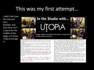
This was my first attempt…
I didn’t like how
the text was
very
blocked, and
also there isn’t
a space for the
middle of the
page, so I knew
I had to change
it.
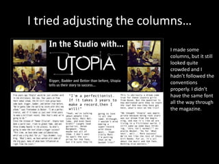
I tried adjusting the columns…
I made some
columns, but it still
looked quite
crowded and I
hadn’t followed the
conventions
properly. I didn’t
have the same font
all the way through
the magazine.
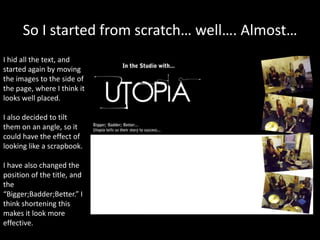
So I started from scratch… well…. Almost…
I hid all the text, and
started again by moving
the images to the side of
the page, where I think it
looks well placed.
I also decided to tilt
them on an angle, so it
could have the effect of
looking like a scrapbook.
I have also changed the
position of the title, and
the
“Bigger;Badder;Better.” I
think shortening this
makes it look more
effective.
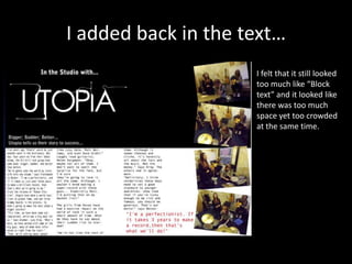
I added back in the text…
I felt that it still looked
too much like “Block
text” and it looked like
there was too much
space yet too crowded
at the same time.
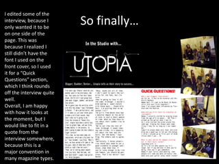
So finally…
I edited some of the
interview, because I
only wanted it to be
on one side of the
page. This was
because I realized I
still didn’t have the
font I used on the
front cover, so I used
it for a “Quick
Questions” section,
which I think rounds
off the interview quite
well.
Overall, I am happy
with how it looks at
the moment, but I
would like to fit in a
quote from the
interview somewhere,
because this is a
major convention in
many magazine types.

Double page spread

  • 1.
    The Making of… MyDouble Page Spread By Janet Bargmann
  • 2.
    This was myfirst attempt… I didn’t like how the text was very blocked, and also there isn’t a space for the middle of the page, so I knew I had to change it.
  • 3.
    I tried adjustingthe columns… I made some columns, but it still looked quite crowded and I hadn’t followed the conventions properly. I didn’t have the same font all the way through the magazine.
  • 4.
    So I startedfrom scratch… well…. Almost… I hid all the text, and started again by moving the images to the side of the page, where I think it looks well placed. I also decided to tilt them on an angle, so it could have the effect of looking like a scrapbook. I have also changed the position of the title, and the “Bigger;Badder;Better.” I think shortening this makes it look more effective.
  • 5.
    I added backin the text… I felt that it still looked too much like “Block text” and it looked like there was too much space yet too crowded at the same time.
  • 6.
    So finally… I editedsome of the interview, because I only wanted it to be on one side of the page. This was because I realized I still didn’t have the font I used on the front cover, so I used it for a “Quick Questions” section, which I think rounds off the interview quite well. Overall, I am happy with how it looks at the moment, but I would like to fit in a quote from the interview somewhere, because this is a major convention in many magazine types.