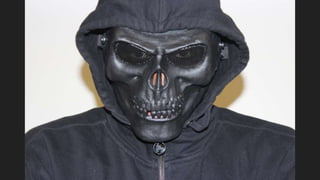
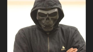
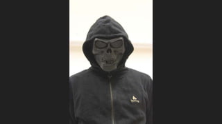
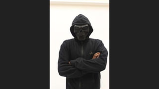
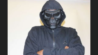
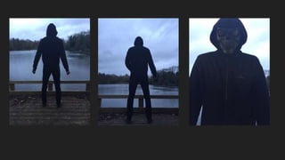
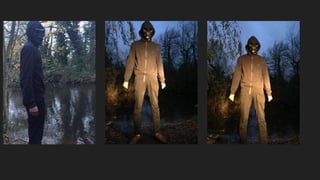
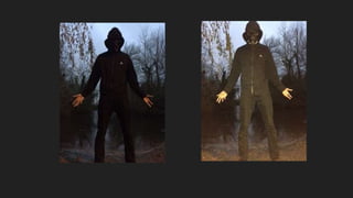
Practice Shots
Magazine Front Cover
The images on the previous slides were all taken for our magazine front cover. The use of the white screen behind
our antagonist allows the focus more to be on him. Furthermore, this would be better use for us as it would make it
easier for us to edit the image on photoshop. It would also give the front cover the professional look we are aiming
to achieve.
Based on the size of a typical magazine front cover, we wanted to use a medium long shot. Which would be fine to
use, as magazines do not have a conventional shot type for the main image. This made it easy for us to select
which image to use as we only managed to get one good image to fit the look we was going for. It would e easy to fit
sell lines around the image and due to the length of it we would not need to worry about the image stretching in
size.
However, we all agreed that the first image was definitely the best out of all the image we took, so we did not want
it to go to waste. However, because it is a close up it made it difficult to use it on a magazine front cover or poster.
So we decided to use it for the teaser poster instead.
Poster
As a group we are majorly inspired by Friday the 13th and we wanted our
poster to be similar to the promotional poster for the film itself. Therefore,
we decided it would be better for us to take these images outside in a
woodland area. We found this rather difficult as it was hard to take an image
in the dark as nothing came out very well so we had to do it during the
daytime, which we all agreed had a significantly less effect. Additionally, at
the time we was taking practice shots we did not have access to our main
prop, the axe, therefore making these images less effective once again.
However, we managed to work with these drawbacks to produce some
images that we were able to edit to a standard that we all agreed on.

Practice shots

  • 1.
  • 7.
    Magazine Front Cover Theimages on the previous slides were all taken for our magazine front cover. The use of the white screen behind our antagonist allows the focus more to be on him. Furthermore, this would be better use for us as it would make it easier for us to edit the image on photoshop. It would also give the front cover the professional look we are aiming to achieve. Based on the size of a typical magazine front cover, we wanted to use a medium long shot. Which would be fine to use, as magazines do not have a conventional shot type for the main image. This made it easy for us to select which image to use as we only managed to get one good image to fit the look we was going for. It would e easy to fit sell lines around the image and due to the length of it we would not need to worry about the image stretching in size. However, we all agreed that the first image was definitely the best out of all the image we took, so we did not want it to go to waste. However, because it is a close up it made it difficult to use it on a magazine front cover or poster. So we decided to use it for the teaser poster instead.
  • 11.
    Poster As a groupwe are majorly inspired by Friday the 13th and we wanted our poster to be similar to the promotional poster for the film itself. Therefore, we decided it would be better for us to take these images outside in a woodland area. We found this rather difficult as it was hard to take an image in the dark as nothing came out very well so we had to do it during the daytime, which we all agreed had a significantly less effect. Additionally, at the time we was taking practice shots we did not have access to our main prop, the axe, therefore making these images less effective once again. However, we managed to work with these drawbacks to produce some images that we were able to edit to a standard that we all agreed on.