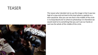
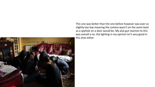
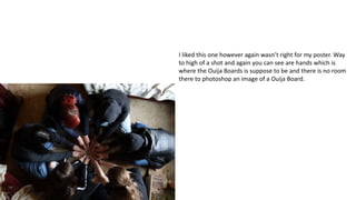
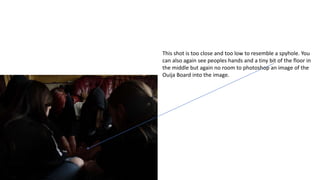
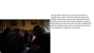
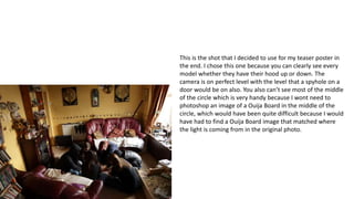
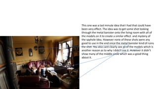
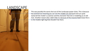
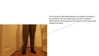
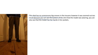
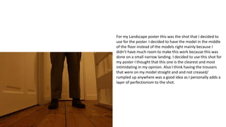
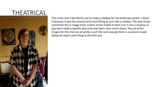
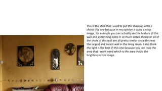
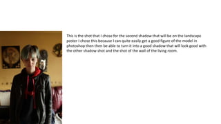
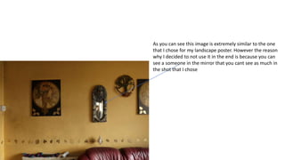
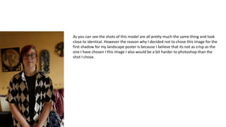
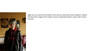
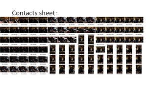
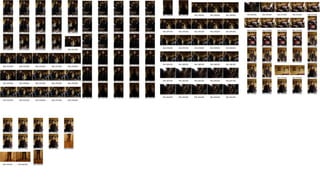
CONTACT SHEET
TEASER
The reason why I decided not to use this image is that it was too
high of a view and not level to the level where a spyhole in a
door would be. Also you can see that in the middle of the circle
is no Ouija Board and no where to photoshop it in therefore we
would need to try something that you can’t see our hands or
cant see the whole of the middle of the circle.
This one was better than the one before however was ever so
slightly too low meaning the camera wasn’t on the same level
as a spyhole on a door would be. My also gut reaction to this
was overall a no. the lighting in my opinion isn’t very good in
this shot either.
I liked this one however again wasn’t right for my poster. Way
to high of a shot and again you can see are hands which is
where the Ouija Boards is suppose to be and there is no room
there to photoshop an image of a Ouija Board.
This shot is too close and too low to resemble a spyhole. You
can also again see peoples hands and a tiny bit of the floor in
the middle but again no room to photoshop an image of the
Ouija Board into the image.
Too low which means it isn’t on the same level as a
spyhole from a door. This shot is also too close to the
models. Also because of how close and low the shot is
you also cant see all of the models. However the good
thing about this shot is that you can’t see anything to do
with the middle of the circle so I wouldn’t need to edit
in/ photoshop an image of a Ouija Board.
This is the shot that I decided to use for my teaser poster in
the end. I chose this one because you can clearly see every
model whether they have their hood up or down. The
camera is on perfect level with the level that a spyhole on a
door would be on also. You also can’t see most of the middle
of the circle which is very handy because I wont need to
photoshop an image of a Ouija Board in the middle of the
circle, which would have been quite difficult because I would
have had to find a Ouija Board image that matched where
the light is coming from in the original photo.
This one was a last minute idea that I had that could have
been very effect. The idea was to get some shot looking
through the metal banister onto the living room with all of
the models on it to create a similar effect and mystery of
the spyhole idea. However none of these shots were any
good to use in the end since the metal banister kind of ruins
the shot. You also cant clearly see all of the models which is
another reason as to why I didn’t use it. However it didn’t
show many of the middle circle which was a good thing
about it.
LANDSCAPE
This was possibly the worst shot out of the Landscape poster shots. This is because
too zoomed out meaning you can see the models are and hand and can quite
easily tell the model is a woman and the character that she is modelling as an old
man. Another reason why I didn’t like it is because of the massive fold/crease the is
in the models right leg that shouldn’t be there.
This shot was a little better because its zoomed in enough to
not be able to see the models hand and shirt. However i
didn’t pick this shot because of the crease on the trousers that
shouldn’t be there
This shot has no unnecessary big creases in the trousers however it was zoomed out too
much because you can see the bottom of the shirt that the model was wearing, you can
also see that the model has her hands in her pockets.
For my Landscape poster this was the shot that I decided to
use for the poster. I decided to have the model in the middle
of the floor instead of the models right mainly because I
didn’t have much room to make this work because this was
done on a small narrow landing. I decided to use this shot for
my poster I thought that this one is the clearest and most
intimidating in my opinion. Also I think having the trousers
that were on my model straight and and not creased/
rumpled up anywhere was a good idea as I personally adds a
layer of perfectionism to the shot.
THEATRICAL
This is the shot I decided to use to make a shadow for my landscape poster. I chose
it because it was the clearest and most fitting to turn into a shadow. The only thing I
need from this is image it the outline of the model to then turn it into a shadow so
you don’t need a specific shot only one that’s clear and in focus. Plus all of the
images for this shot are all pretty much the same except there is a second model
doing the exact same thing as this first one.
This is the shot that I used to put the shadows onto. I
chose this one because in my opinion it quite a crisp
image, for example you can actually see the texture of the
wall and everything looks in so much detail. However all of
the shots of this wall are all pretty similar since this was
the largest and barest wall in the living room. I also think
the light is the best in this one because you can crop the
area that I wont need which is the area that is the
brightest in this image.
This is the shot that I chose for the second shadow that will be on the landscape
poster I chose this because I can quite easily get a good figure of the model in
photoshop then then be able to turn it into a good shadow that will look good with
the other shadow shot and the shot of the wall of the living room.
As you can see this image is extremely similar to the one
that I chose for my landscape poster. However the reason
why I decided to not use it in the end is because you can
see a someone in the mirror that you cant see as much in
the shot that I chose
As you can see the shots of this model are all pretty much the same thing and look
close to identical. However the reason why I decided not to chose this image for the
first shadow for my landscape poster is because I believe that its not as crisp as the
one I have chosen I this image I also would be a bit harder to photoshop than the
shot I chose.
Again you can see that the models in this shot are extremely similar however I believe
that the other image of this model is easier to photoshop which is why I didn’t chose
this shot.
Contacts sheet:
CONTACT SHEET FOR IMAGE LOG actual.pptx

CONTACT SHEET FOR IMAGE LOG actual.pptx

  • 1.
  • 2.
    TEASER The reason whyI decided not to use this image is that it was too high of a view and not level to the level where a spyhole in a door would be. Also you can see that in the middle of the circle is no Ouija Board and no where to photoshop it in therefore we would need to try something that you can’t see our hands or cant see the whole of the middle of the circle.
  • 3.
    This one wasbetter than the one before however was ever so slightly too low meaning the camera wasn’t on the same level as a spyhole on a door would be. My also gut reaction to this was overall a no. the lighting in my opinion isn’t very good in this shot either.
  • 4.
    I liked thisone however again wasn’t right for my poster. Way to high of a shot and again you can see are hands which is where the Ouija Boards is suppose to be and there is no room there to photoshop an image of a Ouija Board.
  • 5.
    This shot istoo close and too low to resemble a spyhole. You can also again see peoples hands and a tiny bit of the floor in the middle but again no room to photoshop an image of the Ouija Board into the image.
  • 6.
    Too low whichmeans it isn’t on the same level as a spyhole from a door. This shot is also too close to the models. Also because of how close and low the shot is you also cant see all of the models. However the good thing about this shot is that you can’t see anything to do with the middle of the circle so I wouldn’t need to edit in/ photoshop an image of a Ouija Board.
  • 7.
    This is theshot that I decided to use for my teaser poster in the end. I chose this one because you can clearly see every model whether they have their hood up or down. The camera is on perfect level with the level that a spyhole on a door would be on also. You also can’t see most of the middle of the circle which is very handy because I wont need to photoshop an image of a Ouija Board in the middle of the circle, which would have been quite difficult because I would have had to find a Ouija Board image that matched where the light is coming from in the original photo.
  • 8.
    This one wasa last minute idea that I had that could have been very effect. The idea was to get some shot looking through the metal banister onto the living room with all of the models on it to create a similar effect and mystery of the spyhole idea. However none of these shots were any good to use in the end since the metal banister kind of ruins the shot. You also cant clearly see all of the models which is another reason as to why I didn’t use it. However it didn’t show many of the middle circle which was a good thing about it.
  • 9.
    LANDSCAPE This was possiblythe worst shot out of the Landscape poster shots. This is because too zoomed out meaning you can see the models are and hand and can quite easily tell the model is a woman and the character that she is modelling as an old man. Another reason why I didn’t like it is because of the massive fold/crease the is in the models right leg that shouldn’t be there.
  • 10.
    This shot wasa little better because its zoomed in enough to not be able to see the models hand and shirt. However i didn’t pick this shot because of the crease on the trousers that shouldn’t be there
  • 11.
    This shot hasno unnecessary big creases in the trousers however it was zoomed out too much because you can see the bottom of the shirt that the model was wearing, you can also see that the model has her hands in her pockets.
  • 12.
    For my Landscapeposter this was the shot that I decided to use for the poster. I decided to have the model in the middle of the floor instead of the models right mainly because I didn’t have much room to make this work because this was done on a small narrow landing. I decided to use this shot for my poster I thought that this one is the clearest and most intimidating in my opinion. Also I think having the trousers that were on my model straight and and not creased/ rumpled up anywhere was a good idea as I personally adds a layer of perfectionism to the shot.
  • 13.
    THEATRICAL This is theshot I decided to use to make a shadow for my landscape poster. I chose it because it was the clearest and most fitting to turn into a shadow. The only thing I need from this is image it the outline of the model to then turn it into a shadow so you don’t need a specific shot only one that’s clear and in focus. Plus all of the images for this shot are all pretty much the same except there is a second model doing the exact same thing as this first one.
  • 14.
    This is theshot that I used to put the shadows onto. I chose this one because in my opinion it quite a crisp image, for example you can actually see the texture of the wall and everything looks in so much detail. However all of the shots of this wall are all pretty similar since this was the largest and barest wall in the living room. I also think the light is the best in this one because you can crop the area that I wont need which is the area that is the brightest in this image.
  • 15.
    This is theshot that I chose for the second shadow that will be on the landscape poster I chose this because I can quite easily get a good figure of the model in photoshop then then be able to turn it into a good shadow that will look good with the other shadow shot and the shot of the wall of the living room.
  • 16.
    As you cansee this image is extremely similar to the one that I chose for my landscape poster. However the reason why I decided to not use it in the end is because you can see a someone in the mirror that you cant see as much in the shot that I chose
  • 17.
    As you cansee the shots of this model are all pretty much the same thing and look close to identical. However the reason why I decided not to chose this image for the first shadow for my landscape poster is because I believe that its not as crisp as the one I have chosen I this image I also would be a bit harder to photoshop than the shot I chose.
  • 18.
    Again you cansee that the models in this shot are extremely similar however I believe that the other image of this model is easier to photoshop which is why I didn’t chose this shot.
  • 19.