
Recommended
More Related Content
What's hot
What's hot (20)
Similar to How to Analyze a Pop Magazine Cover
Similar to How to Analyze a Pop Magazine Cover (20)
How to Analyze a Pop Magazine Cover
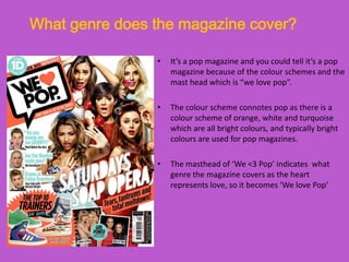
- 1. What genre does the magazine cover? • It’s a pop magazine and you could tell it’s a pop magazine because of the colour schemes and the mast head which is “we love pop”. • The colour scheme connotes pop as there is a colour scheme of orange, white and turquoise which are all bright colours, and typically bright colours are used for pop magazines. • The masthead of ‘We <3 Pop’ indicates what genre the magazine covers as the heart represents love, so it becomes ‘We love Pop’
- 2. What are the connotations of the masthead? • It’s in a speech bubble which connotes loudness and the heart indicates love. • If you look carefully at the front cover you would recognise that the masthead is in as speech bubble which could connote loudness. • The word ‘pop’ summarises what genre the magazine covers and it gives the target audience the chance to automatically recognise what genre the magazine is. • The ‘we’ indicates a unison of people, a community that shares the same love for the Pop genre.
- 3. Language techniques used by the headline and sell lines? • The sell lines in the magazine range from; ‘Are The Wanted really poor?’ ‘Do you wanna see me GRUMPY?’ The language used in the sell lines are quite in formal, words such as ‘wanna’ aren’t really formal language. • Casual language is frequently used in the front cover such as ‘tantrums’ and ‘total meltdown’ which teenagers will able to comprehend. • The headline is ‘Saturday’s Soap Opera’ and the language used in the headline is also quite informal, it is language that teenagers would be common with.
- 4. Layout style, fonts and colour scheme • To summarise the layout style of the front cover in one word, it would be busy, as there is a lot going on all over the front cover. • The style of the fonts are fun and stand out amongst the strong images in the front cover. • The font of the masthead indicates fun and coolness, which appeals to the young target audience. • The colour scheme is white, turquoise and orange which suggests that it is a pop magazine. • The size of the fonts are sizes that are not too big or too small, it’s in small chunks that audiences can quickly take in.
- 5. Photography in the Magazine • The main image is a group, mid shot of the girl band ‘The Saturdays’ who are all doing different poses, which appeal to various teenage girls as they can feel as if they can relate to certain members. • All 5 of the band members have different props they are using, it gives the impression that they are a fun group. • There are smaller images in the magazine which relate to the sell line they are promoting such as the picture of Max from The Wanted is above the sell line of ‘Are The Wanted really poor?’
- 6. Other layout conventions & target audience • There are other features that the front cover has, such as having the typical convention of a barcode and a strapline of ‘Tears, tantrums and total meltdown!’ • There is also a pull quote in the front cover; ‘Do you wanna see me GRUMPY?’ the pull quote is from an article in the magazine, the purpose of it is to attract readers to buy the magazine to find out more. • The information is laid out quite well as it’s overlapping the picture so the audience focus on the information more than the picture. The target audience are teenage girls that listen to pop music.