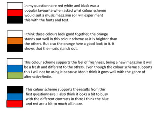
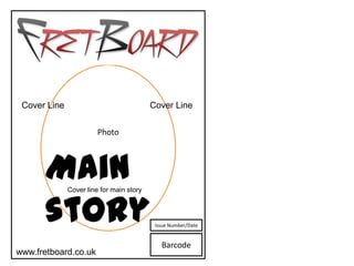
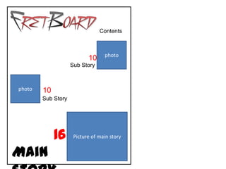
Download to read offline
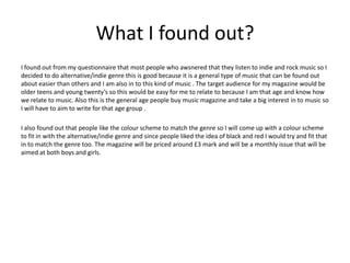
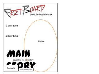
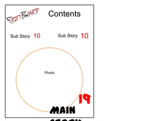
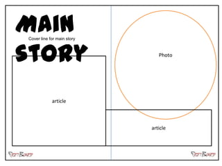

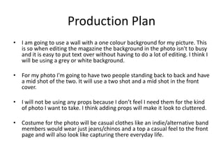

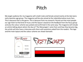

The magazine will target late teens and early twenties who enjoy indie/alternative music. It will feature an article on the rising duo "The Messengers" including an interview with questions from readers. The logo, layout, and color scheme were chosen based on feedback from a focus group and aim to match the genre. The production plan outlines photographing the band members and drafting the article text in a question and answer format.


