Download to read offline

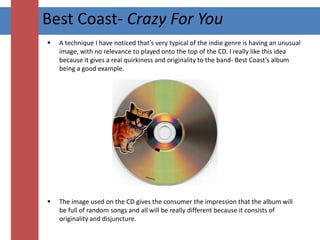
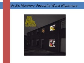

The document discusses and analyzes several album covers, summarizing: 1) The Strokes' "Angles" cover uses bright abstract colors and shapes with no relevance to the band, catching attention on shelves. 2) Best Coast's "Crazy For You" uses a bright, summery image filling the cover with happy feeling, and relates elements to the band name through a map and coastline. 3) Arctic Monkeys' "Favourite Worst Nightmare" initially shows a house with lights inside but reveals psychedelic wall patterns, though risks not standing out with its lack of color.


