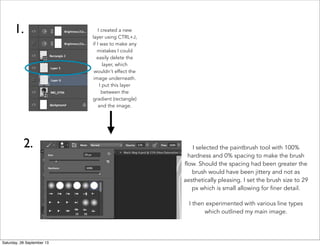
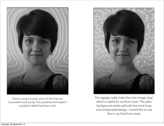
Skills Development
Paintbrush Tool
Hayley McCarthy
GCE AS Media Studies
City College Norwich
The paintbrush tool is very simple to use, but can also be very versatile when it
comes to effects and layering. In this example I layered the white paintbrush under a
gradient to give a further tone. Here I experimented with smoother lines vs. zigzags.
I also demonstrated this skill to the class.
Saturday, 28 September 13
I created a new
layer using CTRL+J,
if I was to make any
mistakes I could
easily delete the
layer, which
wouldn't effect the
image underneath.
I put this layer
between the
gradient (rectangle)
and the image.
1.
2. I selected the paintbrush tool with 100%
hardness and 0% spacing to make the brush
flow. Should the spacing had been greater the
brush would have been jittery and not as
aesthetically pleasing. I set the brush size to 29
px which is small allowing for finer detail.
I then experimented with various line types
which outlined my main image.
Saturday, 28 September 13
Due to using a mouse, some of the lines are
inconsistent and wonky. This would be eliminated if
a graphics tablet had been used. 
The zigzags really make the main image 'pop'
which is useful for my front cover. The plain
background works well with the more busy
and complicated design. I would like to use
this in my final front cover.
Saturday, 28 September 13

Paintbrush tool

  • 1.
    Skills Development Paintbrush Tool HayleyMcCarthy GCE AS Media Studies City College Norwich The paintbrush tool is very simple to use, but can also be very versatile when it comes to effects and layering. In this example I layered the white paintbrush under a gradient to give a further tone. Here I experimented with smoother lines vs. zigzags. I also demonstrated this skill to the class. Saturday, 28 September 13
  • 2.
    I created anew layer using CTRL+J, if I was to make any mistakes I could easily delete the layer, which wouldn't effect the image underneath. I put this layer between the gradient (rectangle) and the image. 1. 2. I selected the paintbrush tool with 100% hardness and 0% spacing to make the brush flow. Should the spacing had been greater the brush would have been jittery and not as aesthetically pleasing. I set the brush size to 29 px which is small allowing for finer detail. I then experimented with various line types which outlined my main image. Saturday, 28 September 13
  • 3.
    Due to usinga mouse, some of the lines are inconsistent and wonky. This would be eliminated if a graphics tablet had been used.  The zigzags really make the main image 'pop' which is useful for my front cover. The plain background works well with the more busy and complicated design. I would like to use this in my final front cover. Saturday, 28 September 13