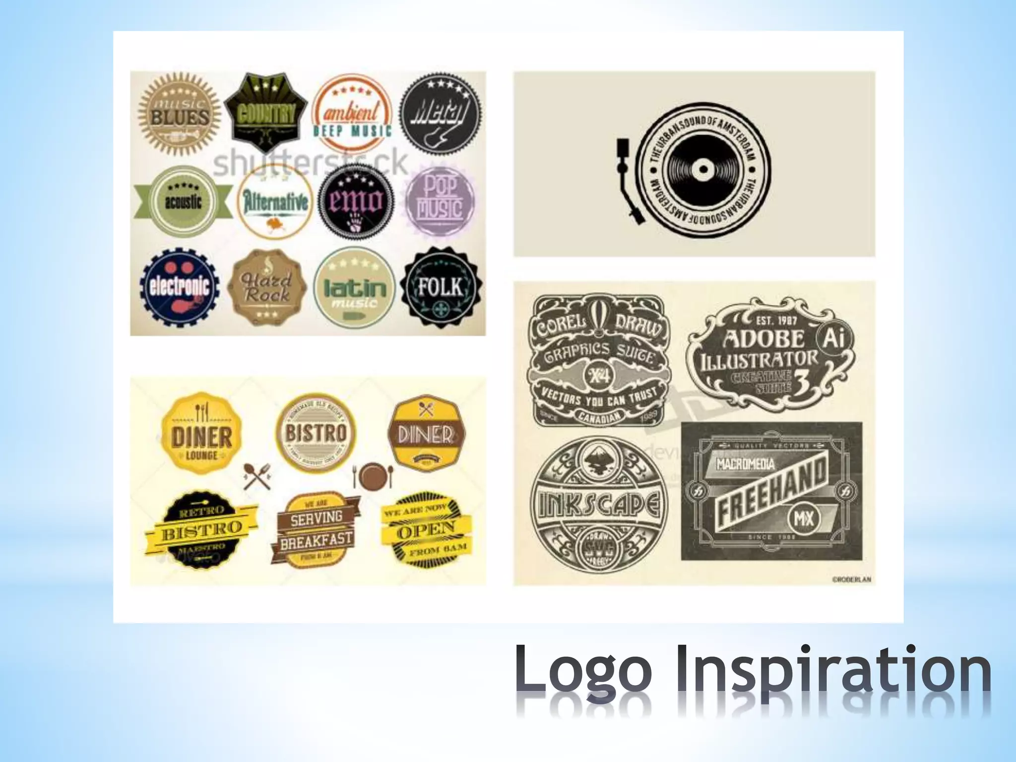
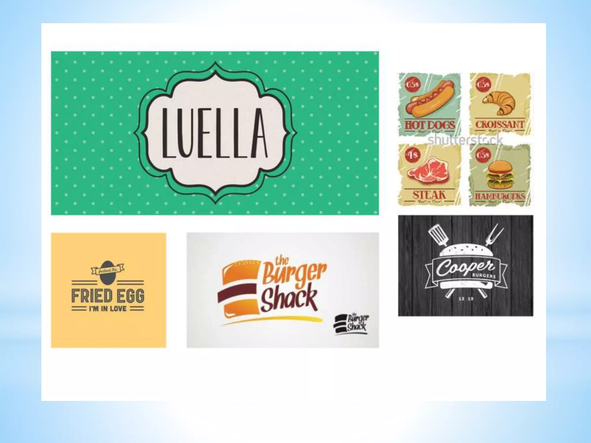
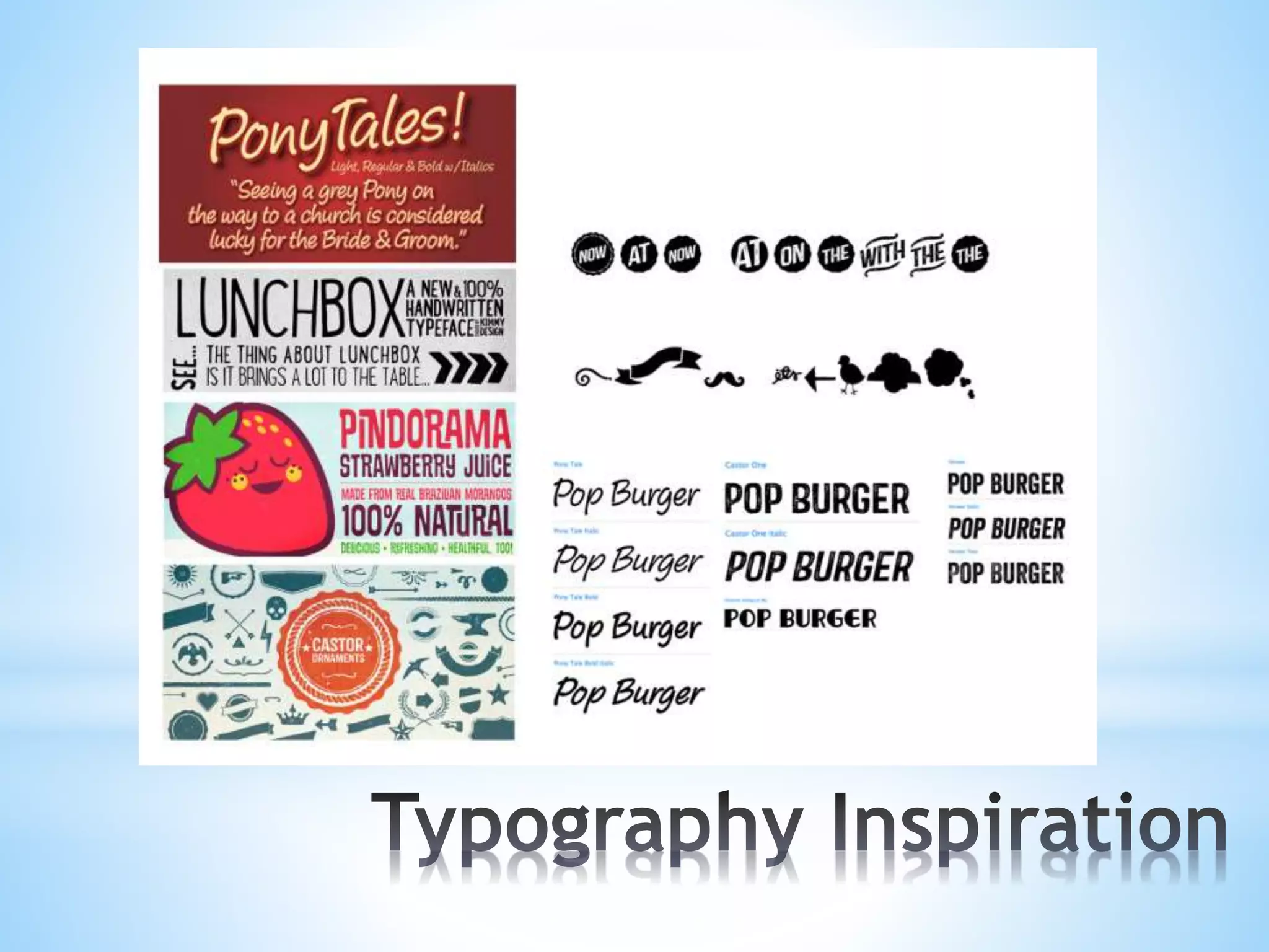
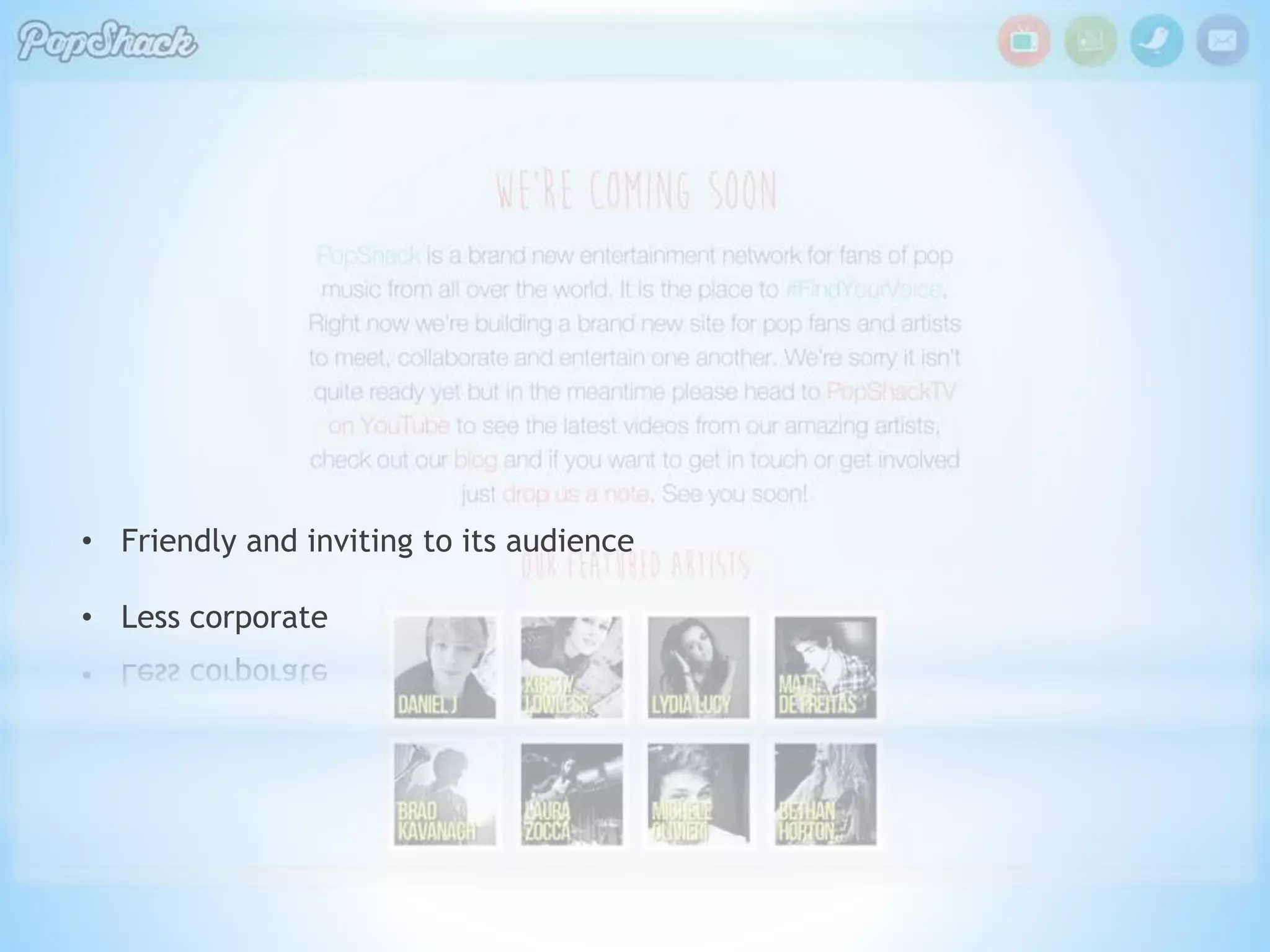
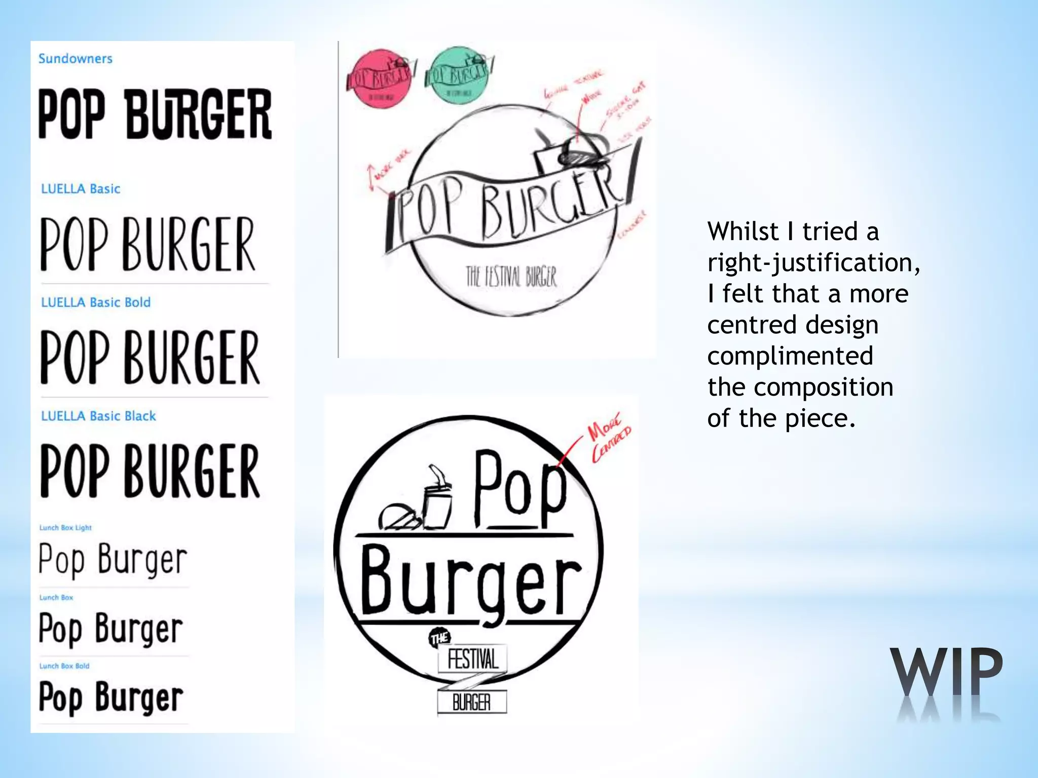
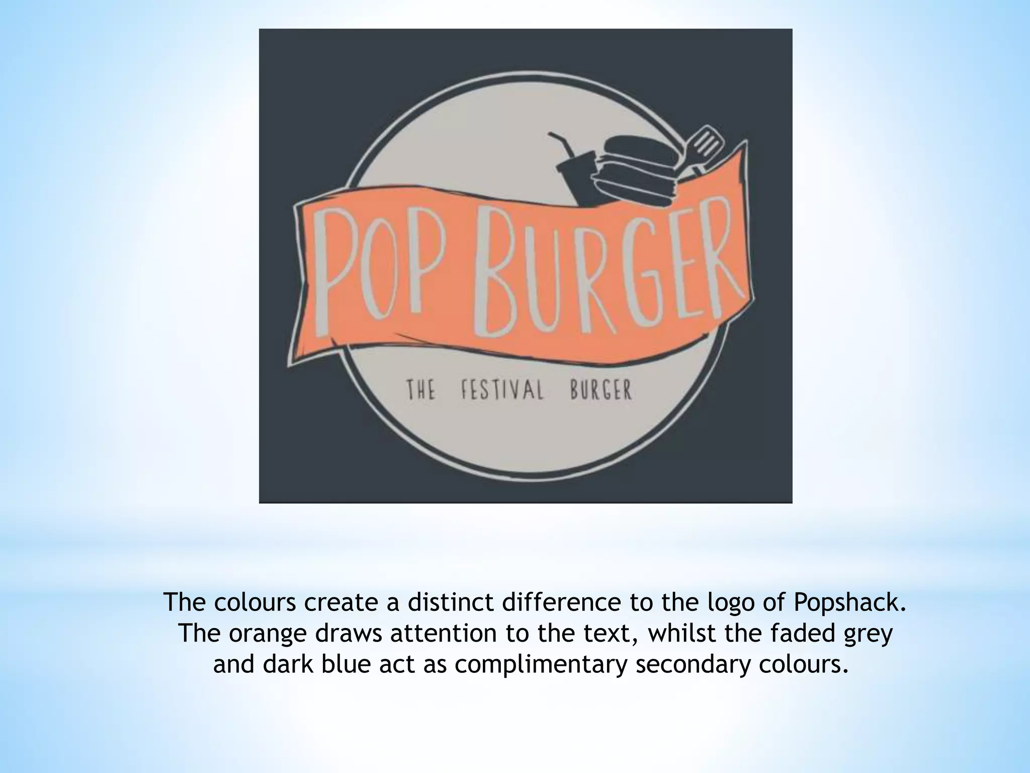
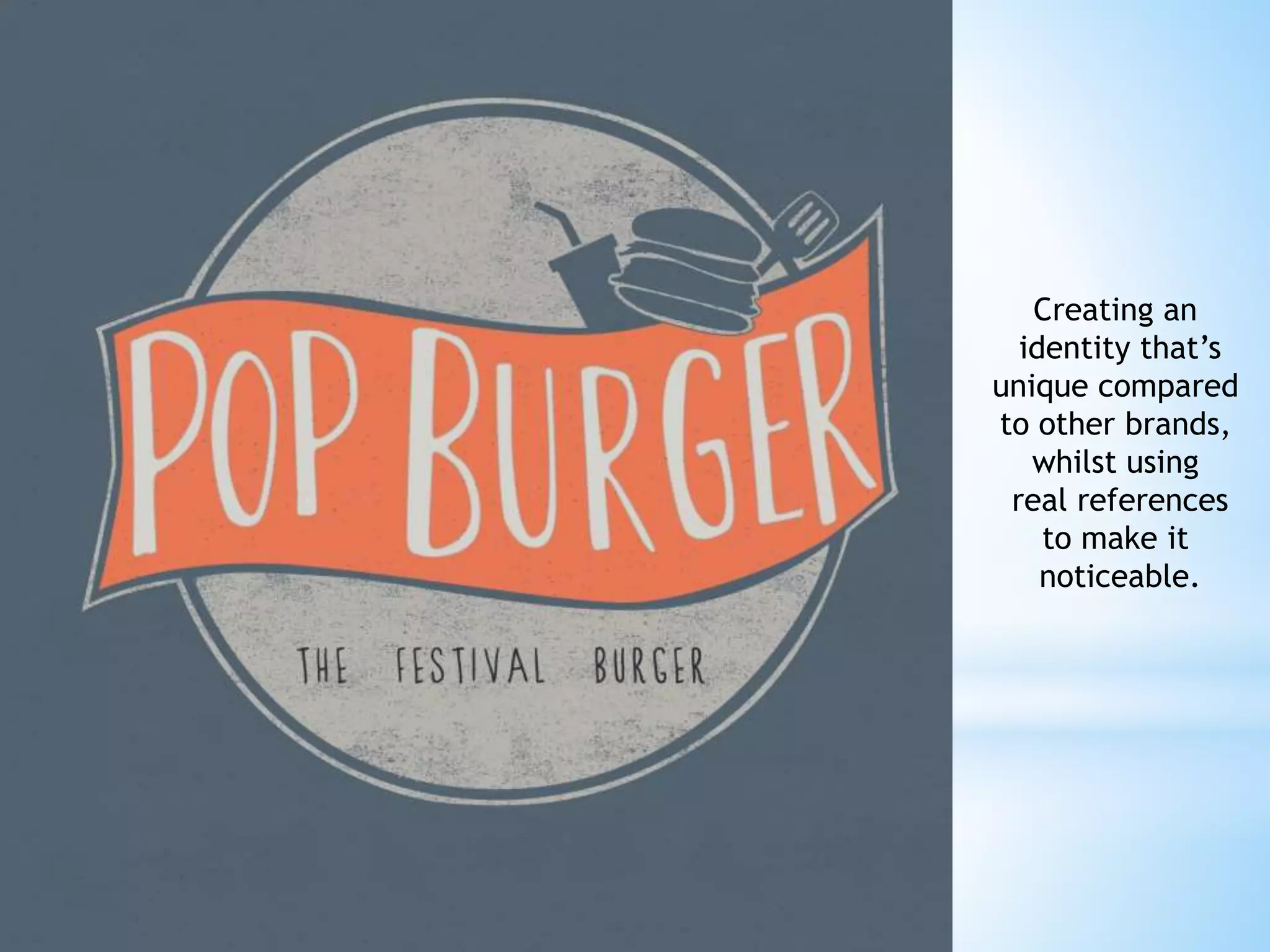
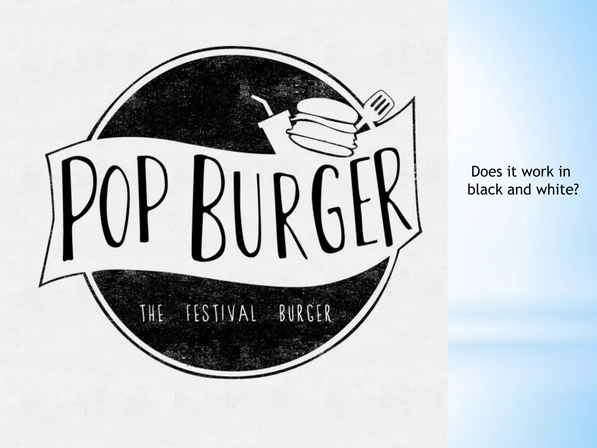
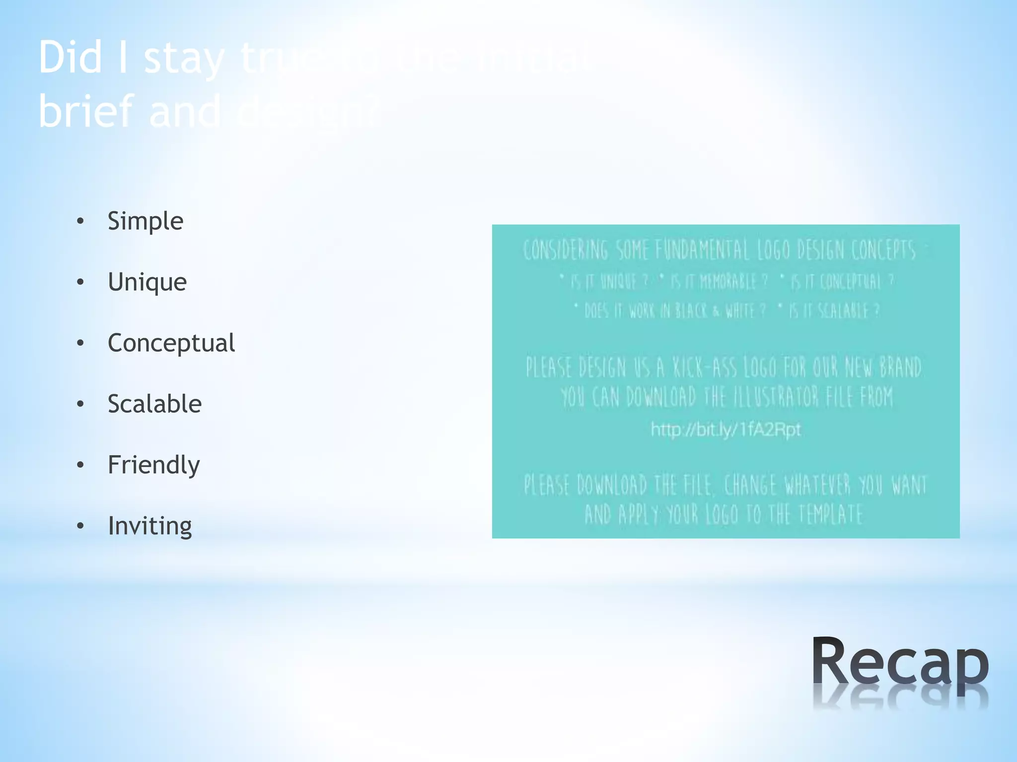
Inspiration
&
Reference
Developing an
Idea
* Staying true to Popshack as a brand and
identity

* Portraying a similar image, whilst establishing
character

* The Festival Burger
Concepts
• Conceptual
• Timeless
• Composition

• Versatility
• Typography
• Colour
• Simplicity
• Friendly and inviting to its audience
• Less corporate
Whilst I tried a
right-justification,
I felt that a more
centred design
complimented
the composition
of the piece.
Freehand Digital Design
The colours create a distinct difference to the logo of Popshack.
The orange draws attention to the text, whilst the faded grey
and dark blue act as complimentary secondary colours.
A simple trace using Illustrator.
Final product
Creating an
identity that’s
unique compared
to other brands,
whilst using
real references
to make it
noticeable.
Does it work in
black and white?
Did I stay true to the initial
brief and design?
• Simple
• Unique
• Conceptual
• Scalable
• Friendly

• Inviting
Popburger

Popburger