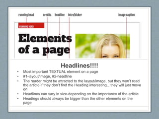
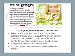
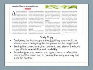
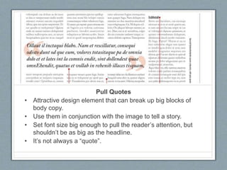
Downloaded 198 times
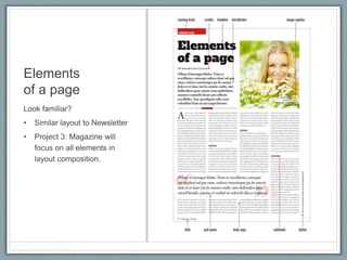


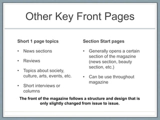
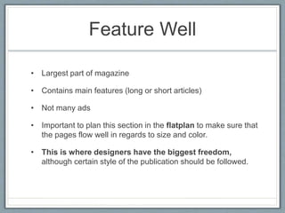
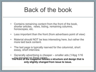
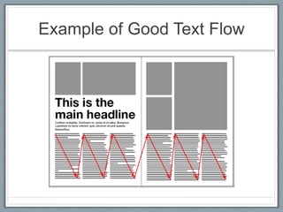

The document discusses key elements in magazine layout and design, including headlines, kickers, body copy, pull quotes, subheads, images, captions, bylines, folios, and flatplans. It provides guidance on using elements like kickers to summarize articles, designing body copy for readability, and placing captions below images. The document also covers magazine structure, such as front page sections, features, and ads in the back; and best practices for magazine spreads considering a reader's eye movement across facing pages.