Download as PDF, PPTX


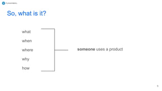


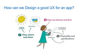


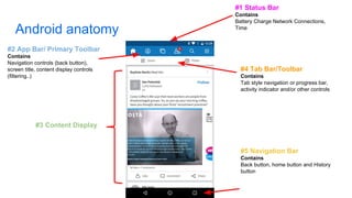
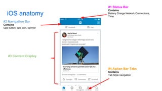
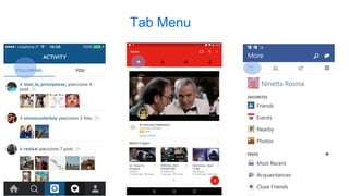
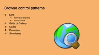
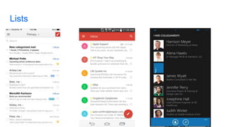
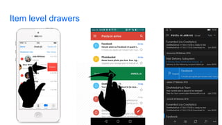
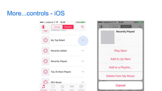
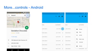
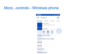
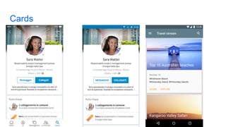
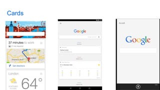
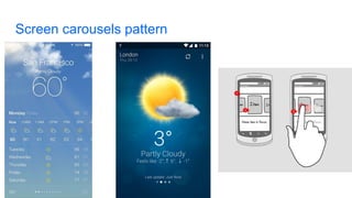
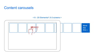

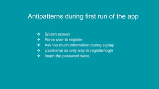

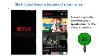


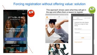
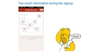
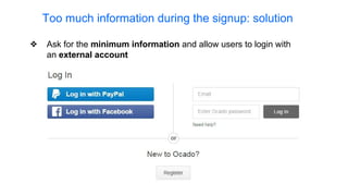
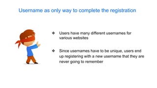
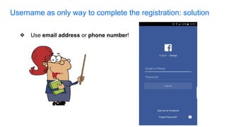
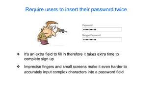
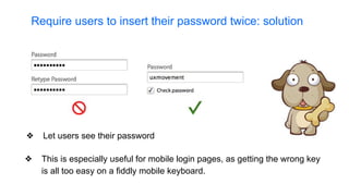

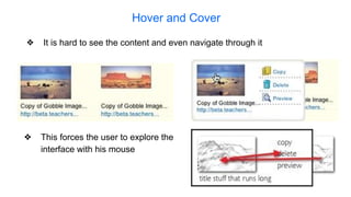
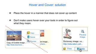


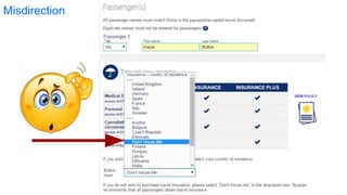

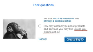

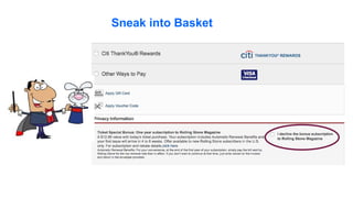
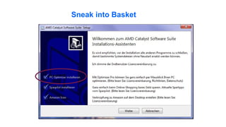


This document discusses various user experience (UX) patterns and antipatterns for multiplatform mobile app design. It begins with definitions of UX and provides overviews of common mobile navigation patterns like side drawers and tab menus. The document then covers antipatterns to avoid such as splash screens, forcing registration, and excessive confirmation messages. It also discusses dark patterns designed to mislead users. Throughout, it provides examples and recommendations for implementing positive patterns and avoiding antipatterns to create a good user experience.


![[Deck] What's New in Spark-Iceberg Integration via DSV2.pptx](https://cdn.slidesharecdn.com/ss_thumbnails/deckwhatsnewinspark-icebergintegrationviadsv2-260210005337-25955b12-thumbnail.jpg?width=640&height=640&fit=bounds)