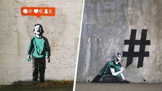
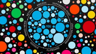
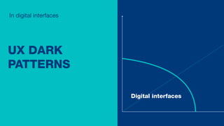
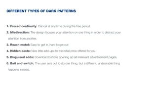
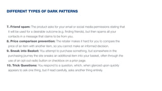
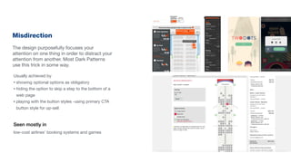
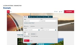
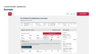
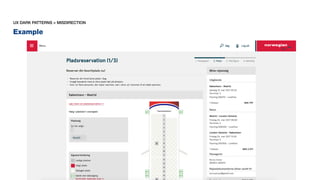
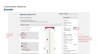
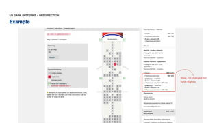
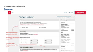
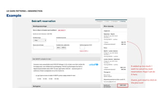
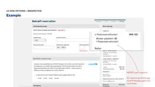
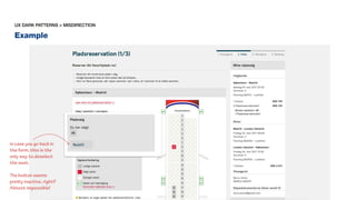
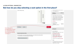
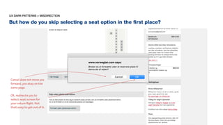
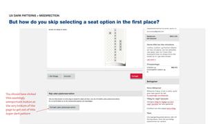
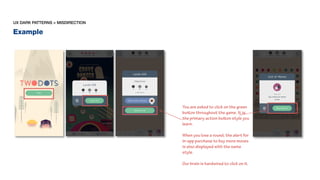
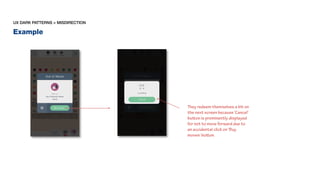
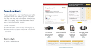
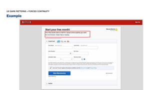
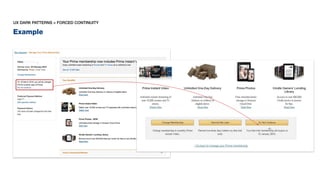
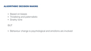
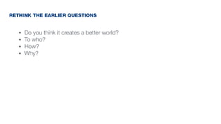
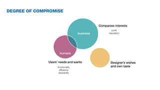
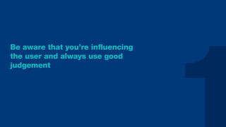
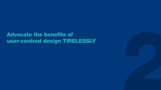
Ethics in Design
WHERE TO DRAW THE
LINE AND WHO IS TO
DRAW IT?
burcuarsoy@gmail.com
Burcu Arsoy
IxDA Malmö
31.03.2017
Senior User Experience Designer @ Designit CPH
BURCU
My name is
DESIGNER
I am a
FACILITATOR
DOER
LEARNER
OBSERVER
EVER EXPANDING
WORLD OF DESIGN
Complexity
in ethics
Scale of abstraction
Digital interfaces
Services
Innovation
• Do you think it creates a better world?
• To who?
• How?
• Why?
SOME QUESTIONS FOR MORALITY TEST
UX DARK
PATTERNS
In digital interfaces
Digital interfaces
• More clicks
• Sign-ups
• Personal information
• Sales
WHY DARK PATTERNS ARE USED
1. Forced continuity: Cancel at any time during the free period
2. Misdirection: The design focuses your attention on one thing in order to distract your
attention from another.
3. Roach motel: Easy to get in. hard to get out
4. Hidden costs: Nice little add-ups to the initial price offered to you
5. Disguised adds: Download buttons opening up all irrelevant advertisement pages.
6. Bait and switch: The user sets out to do one thing, but a different, undesirable thing
happens instead.
DIFFERENT TYPES OF DARK PATTERNS
7. Friend spam: The product asks for your email or social media permissions stating that
it will be used for a desirable outcome (e.g. finding friends), but then spams all your
contacts in a message that claims to be from you.
8. Price comparison prevention: The retailer makes it hard for you to compare the
price of an item with another item, so you cannot make an informed decision.
9. Sneak into Basket: You attempt to purchase something, but somewhere in the
purchasing journey the site sneaks an additional item into your basket, often through the
use of an opt-out radio button or checkbox on a prior page.
10. Trick Questions: You respond to a question, which, when glanced upon quickly
appears to ask one thing, but if read carefully, asks another thing entirely.
DIFFERENT TYPES OF DARK PATTERNS
Misdirection
The design purposefully focuses your
attention on one thing in order to distract your
attention from another. Most Dark Patterns
use this trick in some way.
Seen mostly in
low-cost airlines’ booking systems and games
Usually achieved by
• showing optional options as obligatory
• hiding the option to skip a step to the bottom of a
web page
• playing with the button styles -using primary CTA
button style for up-sell
Example
UX DARK PATTERNS > MISDIRECTION
Example
UX DARK PATTERNS > MISDIRECTION
Example
UX DARK PATTERNS > MISDIRECTION
Example
UX DARK PATTERNS > MISDIRECTION
Does not end here.
There is also a returning
flight which is through a
connecting flight
Great, now I
selected my
seat.
Example
UX DARK PATTERNS > MISDIRECTION
Wow, I’m charged for
both flights
Example
UX DARK PATTERNS > MISDIRECTION
even more questions
and options to add.
pff where is the continue
button????
Oh, there we go.
At the bottom of the
page!
Example
UX DARK PATTERNS > MISDIRECTION
It added up too much. I
want to cancel my seat
reservation. Hope I can do
it here.
Guess, just need to click on
the plus icon!
Example
UX DARK PATTERNS > MISDIRECTION
NOPE!! I can’t cancel it.
Do I have to go all the way
back?? Already spent too
much time.
Example
UX DARK PATTERNS > MISDIRECTION
in case you go back in
the form, this is the
only way to deselect
the seat.
The button seems
pretty inactive, right?
Almost impossible!
But how do you skip selecting a seat option in the first place?
UX DARK PATTERNS > MISDIRECTION
first time you’re
prompted this screen,
you scroll all the way
down and try clicking
‘Continue’ ?
But how do you skip selecting a seat option in the first place?
UX DARK PATTERNS > MISDIRECTION
Cancel does not move you
forward, you stay on the
same page.
OK, redirects you to
select seat screen for
your return flight. Not
that easy to get out of it.
But how do you skip selecting a seat option in the first place?
UX DARK PATTERNS > MISDIRECTION
You should have clicked
this seemingly
unimportant button at
the very bottom of the
page to get out of this
super dark pattern
• Be fully awake (not even tipsy)
• Keep your eyes on the target
NEXT TIME YOU WANT TO BOOK A FLIGHT
Example
UX DARK PATTERNS > MISDIRECTION
You are asked to click on the green
button throughout the game. It is
the primary action button style you
learn.
When you lose a round, the alert for
in-app purchase to buy more moves
is also displayed with the same
style.
Our brain is hardwired to click on it.
Example
UX DARK PATTERNS > MISDIRECTION
They redeem themselves a bit on
the next screen because ‘Cancel’
button is prominently displayed
for not to move forward due to
an accidental click on ‘Buy
moves’ button.
Forced continuity
A user signs up for a free trial of a service, but is
asked for credit card details up front. Once the
trial period is over, the customer is automatically
billed. The user is not notified beforehand and
some make it difficult to cancel.
Seen mostly in
all kinds of digital services
Usually achieved by
• unclear/deceptive communication when signing up
• hidden cancel subscription buttons OR complicated
processes
Example
UX DARK PATTERNS > FORCED CONTINUITY
Example
UX DARK PATTERNS > FORCED CONTINUITY
GENERALIZING
APPROACH
In services
Services
• Based on biases
• Trivialising and paternalistic
• Snarky tone
BUT
• Behaviour change is psychological and emotions are involved
ALGORITHMIC DECISION MAKING
In innovation
Innovation
MULTIPLE
PERSPECTIVES
• Do you think it creates a better world?
• To who?
• How?
• Why?
RETHINK THE EARLIER QUESTIONS
• Do you think it creates a better world?
• To who?
• How?
• Why?
• Is someone's good someone else's bad?
RETHINK THE EARLIER QUESTIONS
Is someone's good someone else's bad?
RIDERS
UBER DRIVERS
OTHER TAXI DRIVERS
DESIGN IS A
COMPLEX
ACTIVITY
business
humans
Users’ needs and wants
Companies interests
functionality
efficiency
desirability
profit
reputation
Designer’s wishes
and own taste
DEGREE OF COMPROMISE
WHAT YOU CAN DO
Be aware that you’re influencing
the user and always use good
judgement
Advocate the benefits of
user-centred design TIRELESSLY
Educate your coworkers and
your clients TIRELESSLY
Remember you are not authority,
you are the facilitator
Ethics can’t be a side hustle
Mike Monteiro
Exponential growth devours and corrupts
DHH
Design, White Lies & Ethics
Dan Turner
The ethics of good design:
A principle for the connected age
Aaron Weyenberg
FURTHER READING
THANK YOU
burcuarsoy@gmail.com
Burcu Arsoy

Ethics in design

  • 1.
    Ethics in Design WHERETO DRAW THE LINE AND WHO IS TO DRAW IT? burcuarsoy@gmail.com Burcu Arsoy IxDA Malmö 31.03.2017 Senior User Experience Designer @ Designit CPH
  • 2.
  • 3.
  • 9.
  • 10.
    Complexity in ethics Scale ofabstraction Digital interfaces Services Innovation
  • 11.
    • Do youthink it creates a better world? • To who? • How? • Why? SOME QUESTIONS FOR MORALITY TEST
  • 13.
    UX DARK PATTERNS In digitalinterfaces Digital interfaces
  • 14.
    • More clicks •Sign-ups • Personal information • Sales WHY DARK PATTERNS ARE USED
  • 15.
    1. Forced continuity:Cancel at any time during the free period 2. Misdirection: The design focuses your attention on one thing in order to distract your attention from another. 3. Roach motel: Easy to get in. hard to get out 4. Hidden costs: Nice little add-ups to the initial price offered to you 5. Disguised adds: Download buttons opening up all irrelevant advertisement pages. 6. Bait and switch: The user sets out to do one thing, but a different, undesirable thing happens instead. DIFFERENT TYPES OF DARK PATTERNS
  • 16.
    7. Friend spam:The product asks for your email or social media permissions stating that it will be used for a desirable outcome (e.g. finding friends), but then spams all your contacts in a message that claims to be from you. 8. Price comparison prevention: The retailer makes it hard for you to compare the price of an item with another item, so you cannot make an informed decision. 9. Sneak into Basket: You attempt to purchase something, but somewhere in the purchasing journey the site sneaks an additional item into your basket, often through the use of an opt-out radio button or checkbox on a prior page. 10. Trick Questions: You respond to a question, which, when glanced upon quickly appears to ask one thing, but if read carefully, asks another thing entirely. DIFFERENT TYPES OF DARK PATTERNS
  • 17.
    Misdirection The design purposefullyfocuses your attention on one thing in order to distract your attention from another. Most Dark Patterns use this trick in some way. Seen mostly in low-cost airlines’ booking systems and games Usually achieved by • showing optional options as obligatory • hiding the option to skip a step to the bottom of a web page • playing with the button styles -using primary CTA button style for up-sell
  • 18.
  • 19.
  • 20.
  • 21.
    Example UX DARK PATTERNS> MISDIRECTION Does not end here. There is also a returning flight which is through a connecting flight Great, now I selected my seat.
  • 22.
    Example UX DARK PATTERNS> MISDIRECTION Wow, I’m charged for both flights
  • 23.
    Example UX DARK PATTERNS> MISDIRECTION even more questions and options to add. pff where is the continue button???? Oh, there we go. At the bottom of the page!
  • 24.
    Example UX DARK PATTERNS> MISDIRECTION It added up too much. I want to cancel my seat reservation. Hope I can do it here. Guess, just need to click on the plus icon!
  • 25.
    Example UX DARK PATTERNS> MISDIRECTION NOPE!! I can’t cancel it. Do I have to go all the way back?? Already spent too much time.
  • 26.
    Example UX DARK PATTERNS> MISDIRECTION in case you go back in the form, this is the only way to deselect the seat. The button seems pretty inactive, right? Almost impossible!
  • 27.
    But how doyou skip selecting a seat option in the first place? UX DARK PATTERNS > MISDIRECTION first time you’re prompted this screen, you scroll all the way down and try clicking ‘Continue’ ?
  • 28.
    But how doyou skip selecting a seat option in the first place? UX DARK PATTERNS > MISDIRECTION Cancel does not move you forward, you stay on the same page. OK, redirects you to select seat screen for your return flight. Not that easy to get out of it.
  • 29.
    But how doyou skip selecting a seat option in the first place? UX DARK PATTERNS > MISDIRECTION You should have clicked this seemingly unimportant button at the very bottom of the page to get out of this super dark pattern
  • 30.
    • Be fullyawake (not even tipsy) • Keep your eyes on the target NEXT TIME YOU WANT TO BOOK A FLIGHT
  • 31.
    Example UX DARK PATTERNS> MISDIRECTION You are asked to click on the green button throughout the game. It is the primary action button style you learn. When you lose a round, the alert for in-app purchase to buy more moves is also displayed with the same style. Our brain is hardwired to click on it.
  • 32.
    Example UX DARK PATTERNS> MISDIRECTION They redeem themselves a bit on the next screen because ‘Cancel’ button is prominently displayed for not to move forward due to an accidental click on ‘Buy moves’ button.
  • 33.
    Forced continuity A usersigns up for a free trial of a service, but is asked for credit card details up front. Once the trial period is over, the customer is automatically billed. The user is not notified beforehand and some make it difficult to cancel. Seen mostly in all kinds of digital services Usually achieved by • unclear/deceptive communication when signing up • hidden cancel subscription buttons OR complicated processes
  • 34.
    Example UX DARK PATTERNS> FORCED CONTINUITY
  • 35.
    Example UX DARK PATTERNS> FORCED CONTINUITY
  • 36.
  • 37.
    • Based onbiases • Trivialising and paternalistic • Snarky tone BUT • Behaviour change is psychological and emotions are involved ALGORITHMIC DECISION MAKING
  • 41.
  • 42.
    • Do youthink it creates a better world? • To who? • How? • Why? RETHINK THE EARLIER QUESTIONS
  • 43.
    • Do youthink it creates a better world? • To who? • How? • Why? • Is someone's good someone else's bad? RETHINK THE EARLIER QUESTIONS
  • 47.
    Is someone's goodsomeone else's bad? RIDERS UBER DRIVERS OTHER TAXI DRIVERS
  • 52.
  • 53.
    business humans Users’ needs andwants Companies interests functionality efficiency desirability profit reputation Designer’s wishes and own taste DEGREE OF COMPROMISE
  • 54.
  • 55.
    Be aware thatyou’re influencing the user and always use good judgement
  • 56.
    Advocate the benefitsof user-centred design TIRELESSLY
  • 57.
    Educate your coworkersand your clients TIRELESSLY
  • 58.
    Remember you arenot authority, you are the facilitator
  • 59.
    Ethics can’t bea side hustle Mike Monteiro Exponential growth devours and corrupts DHH Design, White Lies & Ethics Dan Turner The ethics of good design: A principle for the connected age Aaron Weyenberg FURTHER READING
  • 60.