Download to read offline


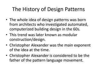


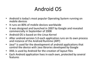


This thesis explores the use of design patterns in Android application development to solve common design problems effectively. A sample application, 'messeme,' was developed to demonstrate these principles, emphasizing user experience and efficient interaction design. The study highlights how proven design patterns can enhance app usability, facilitate development, and improve communication among designers.