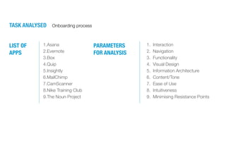
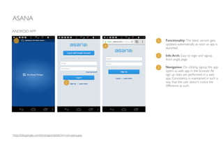
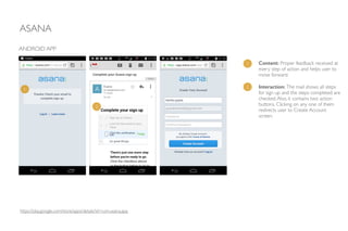
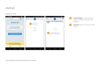
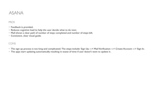
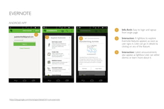
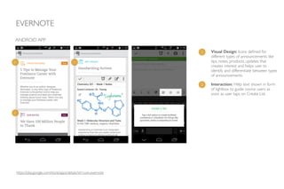
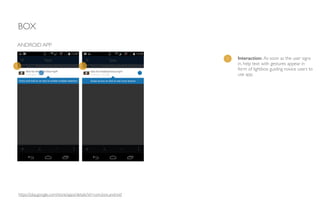
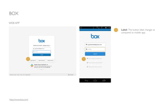
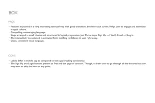
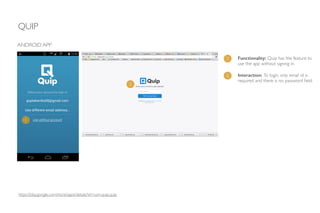
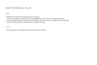
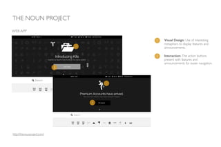
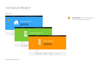
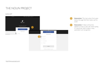
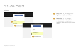
ONBOARDING
EXPERIENCE
PARAMETERS
FOR ANALYSIS
1.Asana
2.Evernote
3.Box
4.Quip
5.Insightly
6.MailChimp
7.CamScanner
8.Nike Training Club
9.The Noun Project
LIST OF
APPS
1. Interaction
2. Navigation
3. Functionality
4. Visual Design
5. Information Architecture
6. Content/Tone
7. Ease of Use
8. Intuitiveness
9. Minimising Resistance Points
TASK ANALYSED Onboarding process
ASANA
https://play.google.com/store/apps/details?id=com.asana.app
Functionality:The latest version gets
updated automatically as soon as app is
launched.	

!
Info Arch: Easy to login and signup
from single page. 	

!
Navigation: On clicking signup, the app
opens as web app in the browser.All
sign up tasks are performed in a web
app. Consistency is maintained in such a
way that the user doesn’t notice the
difference as such.
ANDROID APP
1
2
3
1
2
3
ASANA
ANDROID APP
Content: Proper feedback received at
every step of action and helps user to
move forward.	

!
Interaction: The mail shows all steps
for sign up and the steps completed are
checked.Also, it contains two action
buttons. Clicking on any one of them
redirects user to Create Account
screen.
1
2
1
2
https://play.google.com/store/apps/details?id=com.asana.app
ASANA
ANDROID APP
Visual Design: A visual element is
shown to create an interest while
logging in.	

!
Content: Help text shown for Next
action.
1
2
1
2
https://play.google.com/store/apps/details?id=com.asana.app
ASANA
• Feedback is provided.
• Reduces cognitive load to help the user decide what to do next.
• Mail shows a clear path of number of steps completed and number of steps left.
• Consistent, clear visual guide.
!
PROS
CONS
• The sign up process is too long and complicated. The steps include: Sign Up —> Mail Verification —> Create Account —> Sign In.
• The apps start updating automatically resulting in waste of time if user doesn’t want to update it.
EVERNOTE
https://play.google.com/store/apps/details?id=com.evernote
ANDROID APP
Info Arch: Easy to login and signup
from single page.	

!
Interaction: A lightbox to explore
Evernote features appears as soon as
user signs in. User can go in details by
clicking on any of the feature.	

!
Interaction: Latest announcements
also appear as lightbox. User can either
dismiss or learn more about it.
1
2
3
1
2
3
EVERNOTE
ANDROID APP
1
1
1
Visual Design: Icons defined for
different types of announcements like
tips, notes, products, updates that
creates interest and helps user to
identify and differentiate between types
of announcements.
1
2 Interaction: Help text shown in form
of lightbox to guide novice users as
soon as user taps on Create List.
https://play.google.com/store/apps/details?id=com.evernote
EVERNOTE
• The announcements and features displayed at the home page, helping novice users to understand the app.
• Types of announcements differentiated by icons creating interest and easy recognition.
!
PROS
CONS
• Inconsistency in visual language of icons.
BOX
https://play.google.com/store/apps/details?id=com.box.android
ANDROID APP
1 Interaction: Features shown in form of
carousel. User can navigate through
different features by just swiping left to
right. It helps user to have a better
understanding of the app.
2 Info Arch: The Login and Sign Up
buttons appear on the first and last
screens (on next page) of carousel.
1 1 1
2
BOX
ANDROID APP
1 Info Arch: For Sign up, only email
address and password required. No
extra fields like name & confirm
password appear eliminating ‘Create
Account’ step as shown in Asana.
1
https://play.google.com/store/apps/details?id=com.box.android
BOX
ANDROID APP
1 Content: The tone of the content is
such that it motivates and leads user to
take just one more step.
2 Content: Very crisp and clear content
in mail explaining the need to verify
credentials.1
2
3
3 Interaction: Action button inside the
mail that redirects user to the Login
screen.
3
https://play.google.com/store/apps/details?id=com.box.android
BOX
ANDROID APP
1 Interaction: As soon as the user signs
in, help text with gestures appear in
form of lightbox guiding novice users to
use app.
1 1
https://play.google.com/store/apps/details?id=com.box.android
BOX
https://www.box.com/
WEB APP
1 Label: The button label changes as
compared to mobile app.
1 1
BOX
WEB APP
1 Interaction: A tour is given to the user
for understanding functionalities in the
form of lightbox.
1
https://www.box.com/
BOX
• Features explained in a very interesting carousel way with good transitions between each screen. Helps user to engage and assimilate
in app’s culture.
• Compelling, encouraging language.
• Steps arranged in small chunks and structured in logical progression. Just Three steps: Sign Up —> Verify Email —>Log in
• The interactivity is explained in animated form instilling confidence in user right away.
• Clean, consistent visual language.
!
PROS
CONS
• Labels differ in mobile app as compared to web app breaking consistency.
• The Sign Up and Login buttons present at first and last page of carousel. Though, it draws user to go through all the features but user
may want to skip the intro at any point.
QUIP
https://play.google.com/store/apps/details?id=com.quip.quip
ANDROID APP
1 Functionality: Quip has the feature to
use the app without signing in.
1
2
2 Interaction: To login, only email id is
required and there is no password field.
QUIP
ANDROID APP
1 Interaction: Examples for different
types of documents appear as soon as
the user signs in. It gives user an idea
about how a document would look like
and he can quickly start composing.This
feature is different from other apps
wherein screens are mostly shown
empty and user has to start from
scratch.
1 1 1
https://play.google.com/store/apps/details?id=com.quip.quip
QUIP
• Multiple access options for user like sign in with or without account. It gives a sense of freedom to the user and makes them explore
the app.
• The examples are shown for better understanding.
!
!
!
PROS
INSIGHTLY
http://www.insightly.com/Home/Index005
WEB APP
1 Interaction: The process for signing up
is linear. User doesn’t have to move
through mailbox or any other app to
complete sign up.
1 2
3 4 5
INSIGHTLY
WEB APP
1 Interaction: As soon as the user signs
in, help text appears. User can hide the
information.
1
http://www.insightly.com/Home/Index005
INSIGHTLY
• Linear Sign Up process without having to navigate through different apps reducing efforts and time.
• Detailed help text giving the exact location of buttons.
PROS
CONS
• No information about where the Help text can be found once hidden.
MAILCHIMP
WEB APP
1 Visual Design: Sign Up Free button
highlighted by red colour in order to
grab attention and add members.
http://mailchimp.com/
1
2 Interaction: Instructions for username
and password is displayed as soon as
user starts typing.
2
MAILCHIMP
WEB APP
1 Visual Design: Successful message
clearly demarcated by using green
coloured box.
1
2
2 Content: Clear mail with no
unnecessary information.
http://mailchimp.com/
MAILCHIMP
WEB APP
1 Content: Humour added to the
content.
1
http://mailchimp.com/
MAILCHIMP
WEB APP
1 Interaction: As soon as the user signs
in, help text appears.
1
2
2 Interaction: The help text box also
informs user about the shortcut for
future access.
http://mailchimp.com/
MAILCHIMP
MOBILE APP
1 Visual Design: The mobile app is
designed just for viewing content and
icons are used in interesting way to
show information.
1 1
http://mailchimp.com/
MAILCHIMP
• Limited amount of info shown on each panel making user to focus on one info at one time.
• Consistent, clear visual guide using colours.
• Instructions provided to avoid errors by users.
• Use of humorous language making it more human and interesting.
• Phased information shown after login so that user doesn’t have to digest all information at once.
• The needs for intermediate and experts users are also fulfilled by providing options shortcut.
PROS
CAMSCANNER
MOBILE APP
1 Content: The features/use cases are
explained with the help of personas that
helps people from different fields to be
able to relate easily.
https://play.google.com/store/apps/details?id=com.intsig.camscanner
1 1 1
CAMSCANNER
MOBILE APP
1 Interaction: The action button
displayed at the end of the intro
screens.
2 Functionality: The option to use app
without Login is provided.
1
2
https://play.google.com/store/apps/details?id=com.intsig.camscanner
CAMSCANNER
MOBILE APP
1 Interaction: Clear hierarchy with
appropriate action buttons at right time.
1
1
1
https://play.google.com/store/apps/details?id=com.intsig.camscanner
CAMSCANNER
MOBILE APP
1 Interaction: User is assisted with the
most important functionality to start
working.
2 Visual Design: User’s attention is easily
grabbed by using small orange dots.
1
2
https://play.google.com/store/apps/details?id=com.intsig.camscanner
• The use cases of the app shown if form of personas making it easier for the users to relate.
• Freedom to use the app without login.
• Action buttons displayed at right time giving an easy flow to users to navigate.
• The way to grab user’s attention is interesting by using orange dots. It makes the screen look clean and yet the purpose is solved.
!
!
!
PROS
CAMSCANNER
CONS
• No option for the user to skip the intro. User has to go through all the pages to find Login/Register/Use the app options.
NIKETRAINING CLUB
MOBILE APP
1 Navigation: Login present on each
screen giving user freedom to skip the
intro at any point.
https://play.google.com/store/apps/details?id=com.nike.ntc
1 1 1
NIKETRAINING CLUB
MOBILE APP
1 Interaction: Big buttons for easy
interaction.Also clear hierarchy of the
tasks.1
2
2 Navigation/Interaction: The carousel
gives a hint to the user that there are
other actions as well that can be taken.
3 Interaction: The main action button
kept out of the carousel.
3
https://play.google.com/store/apps/details?id=com.nike.ntc
NIKETRAINING CLUB
MOBILE APP
1 Visual Design: Use of attractive
pictures explaining the workout plus
also creating an interest to look into the
details.
1
2
2 Visual Design: The action button gets
hidden because of the background.
3
3 Info Arch: The option toTour the App
is present under top right corner button
helping user to understand the features
even if he skips the intro at Login page.
https://play.google.com/store/apps/details?id=com.nike.ntc
• Freedom to skip the intro and Login from any page.
• The intro can later be viewed from the top right button, if user wants to know the features.
• The use of big size buttons helps in easy interaction. Also the tasks are arranged in clear hierarchy.
• Use of attractive pictures motivates user to explore the app.
!
!
!
PROS
CONS
• At some places, the background dominates the action buttons.
NIKETRAINING CLUB
THE NOUN PROJECT
WEB APP
1 Visual Design: Use of interesting
metaphors to display features and
announcements.
http://thenounproject.com/
2 Interaction: The action buttons
present with features and
announcements for easier navigation.
1
1
2
2
1 Visual Design: The visual language of
the banners changes suddenly.
THE NOUN PROJECT
WEB APP
1
1
1
http://thenounproject.com/
1 Interaction: The main action form goes
below the page fold that makes user to
scroll.	

THE NOUN PROJECT
WEB APP
1
2
2 Interaction: A black vertical line
appears as soon as the user starts typing
in a particular field. It helps in easy
association and recognition.
http://thenounproject.com/
1 Interaction: The important fields get
highlighted once the form is filled.
THE NOUN PROJECT
WEB APP
2 Interaction: The Sign up button
changes into icon on mouse hover. 	

Since, the website is all about icons,
these small details help in building strong
identity.
1
2
2
http://thenounproject.com/
1 Visual Design: Continuity of use of
metaphors in mail as well, maintaining
consistency all over.
THE NOUN PROJECT
WEB APP
1 1
2
2 Functionality: Monthly newsletter
shows new additions and an action
button for upgrading the account,
motivating user to upgrade.
http://thenounproject.com/
1 Visual Design: Interesting design for
Password Reset and Page Not Found
also mentioning the instructions for next
actions.
THE NOUN PROJECT
WEB APP
1
1
http://thenounproject.com/
1 Interaction: The secondary menu
appears on hovering the logo.
THE NOUN PROJECT
WEB APP
1
1
http://thenounproject.com/
1 Interaction: On clicking the profile
name, mega menu with all the details
related to that profile appear.
THE NOUN PROJECT
WEB APP
1
http://thenounproject.com/
• Interesting use of metaphors, creating a strong brand identity.
• Display of important information and associated action helping user to act at the same point, without having to search and
navigate to different pages.
• Highlighting the important fields.
• Instructions to follow path, mentioned everywhere.
!
!
!
!
PROS
CONS
• The use of colours break consistency at some points like the banners.
• The main actions are below the page fold that may lead to confusion sometimes.
THE NOUN PROJECT
BEST PRACTICES
Get them into the game: Engage customers before asking them to commit.
!
Be Welcoming + Action oriented.
!
Confirm that it’s them: Provide their name/username on the screen.
!
One path, Many doors: Give freedom. Provide multiple options for Login.
!
Make it hard to do wrong: Provide instructions.
Prepare them: Instil confidence by telling the important and hidden features they will
need, up front.
!
Show by example.
!
Keep it human: Use motivating, humorous tone.
!
Treat everyone equal: Fulfil needs of Beginners, Intermediate and Experts.
!
Be Minimalistic: Keep limited content on each screen and let them digest info.
!
!
BEST PRACTICES
THANKS.
Kanika Gupta
UX Designer
www.guptakanika.com

Onboarding experience

  • 1.
  • 2.
    PARAMETERS FOR ANALYSIS 1.Asana 2.Evernote 3.Box 4.Quip 5.Insightly 6.MailChimp 7.CamScanner 8.Nike TrainingClub 9.The Noun Project LIST OF APPS 1. Interaction 2. Navigation 3. Functionality 4. Visual Design 5. Information Architecture 6. Content/Tone 7. Ease of Use 8. Intuitiveness 9. Minimising Resistance Points TASK ANALYSED Onboarding process
  • 3.
    ASANA https://play.google.com/store/apps/details?id=com.asana.app Functionality:The latest versiongets updated automatically as soon as app is launched. ! Info Arch: Easy to login and signup from single page. ! Navigation: On clicking signup, the app opens as web app in the browser.All sign up tasks are performed in a web app. Consistency is maintained in such a way that the user doesn’t notice the difference as such. ANDROID APP 1 2 3 1 2 3
  • 4.
    ASANA ANDROID APP Content: Properfeedback received at every step of action and helps user to move forward. ! Interaction: The mail shows all steps for sign up and the steps completed are checked.Also, it contains two action buttons. Clicking on any one of them redirects user to Create Account screen. 1 2 1 2 https://play.google.com/store/apps/details?id=com.asana.app
  • 5.
    ASANA ANDROID APP Visual Design:A visual element is shown to create an interest while logging in. ! Content: Help text shown for Next action. 1 2 1 2 https://play.google.com/store/apps/details?id=com.asana.app
  • 6.
    ASANA • Feedback isprovided. • Reduces cognitive load to help the user decide what to do next. • Mail shows a clear path of number of steps completed and number of steps left. • Consistent, clear visual guide. ! PROS CONS • The sign up process is too long and complicated. The steps include: Sign Up —> Mail Verification —> Create Account —> Sign In. • The apps start updating automatically resulting in waste of time if user doesn’t want to update it.
  • 7.
    EVERNOTE https://play.google.com/store/apps/details?id=com.evernote ANDROID APP Info Arch:Easy to login and signup from single page. ! Interaction: A lightbox to explore Evernote features appears as soon as user signs in. User can go in details by clicking on any of the feature. ! Interaction: Latest announcements also appear as lightbox. User can either dismiss or learn more about it. 1 2 3 1 2 3
  • 8.
    EVERNOTE ANDROID APP 1 1 1 Visual Design:Icons defined for different types of announcements like tips, notes, products, updates that creates interest and helps user to identify and differentiate between types of announcements. 1 2 Interaction: Help text shown in form of lightbox to guide novice users as soon as user taps on Create List. https://play.google.com/store/apps/details?id=com.evernote
  • 9.
    EVERNOTE • The announcementsand features displayed at the home page, helping novice users to understand the app. • Types of announcements differentiated by icons creating interest and easy recognition. ! PROS CONS • Inconsistency in visual language of icons.
  • 10.
    BOX https://play.google.com/store/apps/details?id=com.box.android ANDROID APP 1 Interaction:Features shown in form of carousel. User can navigate through different features by just swiping left to right. It helps user to have a better understanding of the app. 2 Info Arch: The Login and Sign Up buttons appear on the first and last screens (on next page) of carousel. 1 1 1 2
  • 11.
    BOX ANDROID APP 1 InfoArch: For Sign up, only email address and password required. No extra fields like name & confirm password appear eliminating ‘Create Account’ step as shown in Asana. 1 https://play.google.com/store/apps/details?id=com.box.android
  • 12.
    BOX ANDROID APP 1 Content:The tone of the content is such that it motivates and leads user to take just one more step. 2 Content: Very crisp and clear content in mail explaining the need to verify credentials.1 2 3 3 Interaction: Action button inside the mail that redirects user to the Login screen. 3 https://play.google.com/store/apps/details?id=com.box.android
  • 13.
    BOX ANDROID APP 1 Interaction:As soon as the user signs in, help text with gestures appear in form of lightbox guiding novice users to use app. 1 1 https://play.google.com/store/apps/details?id=com.box.android
  • 14.
    BOX https://www.box.com/ WEB APP 1 Label:The button label changes as compared to mobile app. 1 1
  • 15.
    BOX WEB APP 1 Interaction:A tour is given to the user for understanding functionalities in the form of lightbox. 1 https://www.box.com/
  • 16.
    BOX • Features explainedin a very interesting carousel way with good transitions between each screen. Helps user to engage and assimilate in app’s culture. • Compelling, encouraging language. • Steps arranged in small chunks and structured in logical progression. Just Three steps: Sign Up —> Verify Email —>Log in • The interactivity is explained in animated form instilling confidence in user right away. • Clean, consistent visual language. ! PROS CONS • Labels differ in mobile app as compared to web app breaking consistency. • The Sign Up and Login buttons present at first and last page of carousel. Though, it draws user to go through all the features but user may want to skip the intro at any point.
  • 17.
    QUIP https://play.google.com/store/apps/details?id=com.quip.quip ANDROID APP 1 Functionality:Quip has the feature to use the app without signing in. 1 2 2 Interaction: To login, only email id is required and there is no password field.
  • 18.
    QUIP ANDROID APP 1 Interaction:Examples for different types of documents appear as soon as the user signs in. It gives user an idea about how a document would look like and he can quickly start composing.This feature is different from other apps wherein screens are mostly shown empty and user has to start from scratch. 1 1 1 https://play.google.com/store/apps/details?id=com.quip.quip
  • 19.
    QUIP • Multiple accessoptions for user like sign in with or without account. It gives a sense of freedom to the user and makes them explore the app. • The examples are shown for better understanding. ! ! ! PROS
  • 20.
    INSIGHTLY http://www.insightly.com/Home/Index005 WEB APP 1 Interaction:The process for signing up is linear. User doesn’t have to move through mailbox or any other app to complete sign up. 1 2 3 4 5
  • 21.
    INSIGHTLY WEB APP 1 Interaction:As soon as the user signs in, help text appears. User can hide the information. 1 http://www.insightly.com/Home/Index005
  • 22.
    INSIGHTLY • Linear SignUp process without having to navigate through different apps reducing efforts and time. • Detailed help text giving the exact location of buttons. PROS CONS • No information about where the Help text can be found once hidden.
  • 23.
    MAILCHIMP WEB APP 1 VisualDesign: Sign Up Free button highlighted by red colour in order to grab attention and add members. http://mailchimp.com/ 1 2 Interaction: Instructions for username and password is displayed as soon as user starts typing. 2
  • 24.
    MAILCHIMP WEB APP 1 VisualDesign: Successful message clearly demarcated by using green coloured box. 1 2 2 Content: Clear mail with no unnecessary information. http://mailchimp.com/
  • 25.
    MAILCHIMP WEB APP 1 Content:Humour added to the content. 1 http://mailchimp.com/
  • 26.
    MAILCHIMP WEB APP 1 Interaction:As soon as the user signs in, help text appears. 1 2 2 Interaction: The help text box also informs user about the shortcut for future access. http://mailchimp.com/
  • 27.
    MAILCHIMP MOBILE APP 1 VisualDesign: The mobile app is designed just for viewing content and icons are used in interesting way to show information. 1 1 http://mailchimp.com/
  • 28.
    MAILCHIMP • Limited amountof info shown on each panel making user to focus on one info at one time. • Consistent, clear visual guide using colours. • Instructions provided to avoid errors by users. • Use of humorous language making it more human and interesting. • Phased information shown after login so that user doesn’t have to digest all information at once. • The needs for intermediate and experts users are also fulfilled by providing options shortcut. PROS
  • 29.
    CAMSCANNER MOBILE APP 1 Content:The features/use cases are explained with the help of personas that helps people from different fields to be able to relate easily. https://play.google.com/store/apps/details?id=com.intsig.camscanner 1 1 1
  • 30.
    CAMSCANNER MOBILE APP 1 Interaction:The action button displayed at the end of the intro screens. 2 Functionality: The option to use app without Login is provided. 1 2 https://play.google.com/store/apps/details?id=com.intsig.camscanner
  • 31.
    CAMSCANNER MOBILE APP 1 Interaction:Clear hierarchy with appropriate action buttons at right time. 1 1 1 https://play.google.com/store/apps/details?id=com.intsig.camscanner
  • 32.
    CAMSCANNER MOBILE APP 1 Interaction:User is assisted with the most important functionality to start working. 2 Visual Design: User’s attention is easily grabbed by using small orange dots. 1 2 https://play.google.com/store/apps/details?id=com.intsig.camscanner
  • 33.
    • The usecases of the app shown if form of personas making it easier for the users to relate. • Freedom to use the app without login. • Action buttons displayed at right time giving an easy flow to users to navigate. • The way to grab user’s attention is interesting by using orange dots. It makes the screen look clean and yet the purpose is solved. ! ! ! PROS CAMSCANNER CONS • No option for the user to skip the intro. User has to go through all the pages to find Login/Register/Use the app options.
  • 34.
    NIKETRAINING CLUB MOBILE APP 1Navigation: Login present on each screen giving user freedom to skip the intro at any point. https://play.google.com/store/apps/details?id=com.nike.ntc 1 1 1
  • 35.
    NIKETRAINING CLUB MOBILE APP 1Interaction: Big buttons for easy interaction.Also clear hierarchy of the tasks.1 2 2 Navigation/Interaction: The carousel gives a hint to the user that there are other actions as well that can be taken. 3 Interaction: The main action button kept out of the carousel. 3 https://play.google.com/store/apps/details?id=com.nike.ntc
  • 36.
    NIKETRAINING CLUB MOBILE APP 1Visual Design: Use of attractive pictures explaining the workout plus also creating an interest to look into the details. 1 2 2 Visual Design: The action button gets hidden because of the background. 3 3 Info Arch: The option toTour the App is present under top right corner button helping user to understand the features even if he skips the intro at Login page. https://play.google.com/store/apps/details?id=com.nike.ntc
  • 37.
    • Freedom toskip the intro and Login from any page. • The intro can later be viewed from the top right button, if user wants to know the features. • The use of big size buttons helps in easy interaction. Also the tasks are arranged in clear hierarchy. • Use of attractive pictures motivates user to explore the app. ! ! ! PROS CONS • At some places, the background dominates the action buttons. NIKETRAINING CLUB
  • 38.
    THE NOUN PROJECT WEBAPP 1 Visual Design: Use of interesting metaphors to display features and announcements. http://thenounproject.com/ 2 Interaction: The action buttons present with features and announcements for easier navigation. 1 1 2 2
  • 39.
    1 Visual Design:The visual language of the banners changes suddenly. THE NOUN PROJECT WEB APP 1 1 1 http://thenounproject.com/
  • 40.
    1 Interaction: Themain action form goes below the page fold that makes user to scroll. THE NOUN PROJECT WEB APP 1 2 2 Interaction: A black vertical line appears as soon as the user starts typing in a particular field. It helps in easy association and recognition. http://thenounproject.com/
  • 41.
    1 Interaction: Theimportant fields get highlighted once the form is filled. THE NOUN PROJECT WEB APP 2 Interaction: The Sign up button changes into icon on mouse hover. Since, the website is all about icons, these small details help in building strong identity. 1 2 2 http://thenounproject.com/
  • 42.
    1 Visual Design:Continuity of use of metaphors in mail as well, maintaining consistency all over. THE NOUN PROJECT WEB APP 1 1 2 2 Functionality: Monthly newsletter shows new additions and an action button for upgrading the account, motivating user to upgrade. http://thenounproject.com/
  • 43.
    1 Visual Design:Interesting design for Password Reset and Page Not Found also mentioning the instructions for next actions. THE NOUN PROJECT WEB APP 1 1 http://thenounproject.com/
  • 44.
    1 Interaction: Thesecondary menu appears on hovering the logo. THE NOUN PROJECT WEB APP 1 1 http://thenounproject.com/
  • 45.
    1 Interaction: Onclicking the profile name, mega menu with all the details related to that profile appear. THE NOUN PROJECT WEB APP 1 http://thenounproject.com/
  • 46.
    • Interesting useof metaphors, creating a strong brand identity. • Display of important information and associated action helping user to act at the same point, without having to search and navigate to different pages. • Highlighting the important fields. • Instructions to follow path, mentioned everywhere. ! ! ! ! PROS CONS • The use of colours break consistency at some points like the banners. • The main actions are below the page fold that may lead to confusion sometimes. THE NOUN PROJECT
  • 47.
    BEST PRACTICES Get theminto the game: Engage customers before asking them to commit. ! Be Welcoming + Action oriented. ! Confirm that it’s them: Provide their name/username on the screen. ! One path, Many doors: Give freedom. Provide multiple options for Login. ! Make it hard to do wrong: Provide instructions.
  • 48.
    Prepare them: Instilconfidence by telling the important and hidden features they will need, up front. ! Show by example. ! Keep it human: Use motivating, humorous tone. ! Treat everyone equal: Fulfil needs of Beginners, Intermediate and Experts. ! Be Minimalistic: Keep limited content on each screen and let them digest info. ! ! BEST PRACTICES
  • 49.